First chipset- First concept Art (1 Viewer)

Jdswaff87

High Hand
Supporter
Joined
Jun 23, 2023
Messages
50
Reaction score
71
Location
orlando, florida
Good evening everyone,
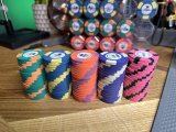
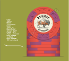
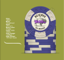
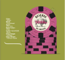
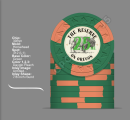
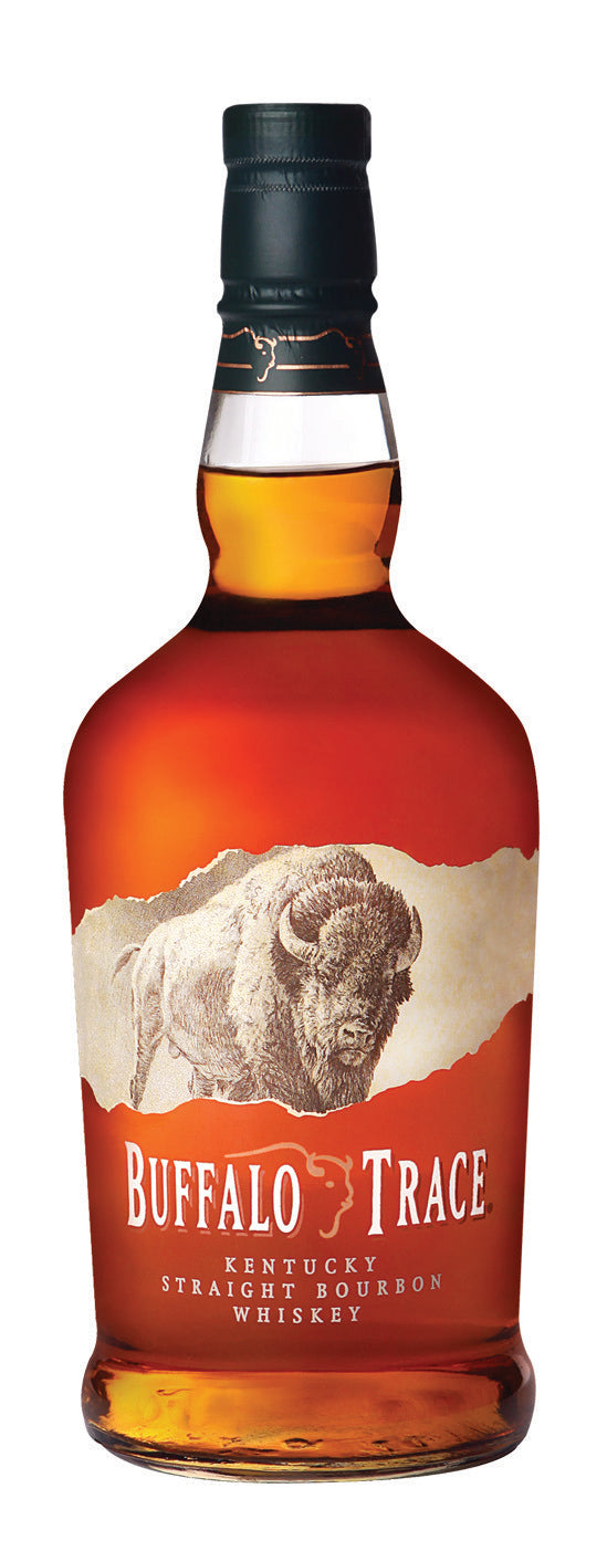
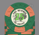
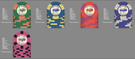
Just completed my first chip set of CPC/ASM HHR 312's, added in a 614 in as a 5th denom. This is meant to act as a tourney set for a game I started in 2019. pretty strong core group that all appreciate good bourbon. "The Reserve" is a reference to bourbon that gets tossed around and sounded catchy and "on oregon" is the street in which the game happens. Under the buffalo i have very small text which was meant to read "hand bottled by hand in 2019 at 100 proof" but the text is very small and may be omitted. On the fence whether to color coordinate denom text (will do a better job matching if this theme sticks) or simply make them all red. The "ML" next to the denom is also just meant to add to the bourbon theme. Looking for some feedback or thoughts for those of you that have already been there and done that. Also i'm no graphic designer as you'll see from the pics so any constructive criticism of concept or formatting is welcomed! :)
thank you for any input or wisdom.

P.S. Not over the moon about the closeness of the blue/yellow and purple/white but i needed a 4th color to get this set on the felt so concessions were made. eagerly awaiting a better contrasting barrel or two to pop up.
 

Attachments

  • IMG_6125.JPG
    IMG_6125.JPG
    172.1 KB · Views: 165
  • Screenshot 2023-08-21 at 7.50.16 PM.png
    Screenshot 2023-08-21 at 7.50.16 PM.png
    437.7 KB · Views: 162
  • Screenshot 2023-08-21 at 7.50.25 PM.png
    Screenshot 2023-08-21 at 7.50.25 PM.png
    510.1 KB · Views: 135
  • Screenshot 2023-08-21 at 7.50.31 PM.png
    Screenshot 2023-08-21 at 7.50.31 PM.png
    531.2 KB · Views: 133
  • Screenshot 2023-08-21 at 7.50.37 PM.png
    Screenshot 2023-08-21 at 7.50.37 PM.png
    520.1 KB · Views: 135
  • Screenshot 2023-08-21 at 7.50.45 PM.png
    Screenshot 2023-08-21 at 7.50.45 PM.png
    428.2 KB · Views: 135
  • 2EC22996-EF95-4F1C-B74A-0A0E62D0F7EA.PNG
    2EC22996-EF95-4F1C-B74A-0A0E62D0F7EA.PNG
    225.1 KB · Views: 159
Love the bison. Any reason the last chip is the only one with different edge spots?

And the denom font needs some work; the lighter colors are getting lost. Love bourbon and love custom sets but Id be squinting at the 100s and no shot at understanding the 25s. Need some outline or bolding or something.
 
Under the buffalo i have very small text which was meant to read "hand bottled by hand in 2019 at 100 proof" but the text is very small and may be omitted.
Your instincts are correct -- that text is WAY too small to be legible. It will just look like more of the grass the bison is standing on.
 
Bison, thank you for the correction!

The pink was a just in case purchase/bandaid, it popped up and I was already purchasing other chips from David. Our group normally is 6-7 handed but occasionally can be two tables. My thought was that it would allow me to get those couple extras in, albeit not ideal, until i could continue to build out the set.

made the above changes, thank you for all the feedback!

considering nixing the "ml", could make it less busy...

Thank you!
 

Attachments

  • Screenshot 2023-08-21 at 9.12.05 PM.png
    Screenshot 2023-08-21 at 9.12.05 PM.png
    508.6 KB · Views: 64
Love the buffalo theme. References Buffalo Trace while maintaining its own feel.

buffalo_720x.jpg


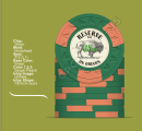
The denom is not very readable. I wonder if it makes more sense to consider outlining or adding a small white buffer around the strokes. It should also be more prominent than the title and location. If you like colored text, I would use it for Reserve and Oregon instead of the denom.
 
I like it. And the fact that you know the colors you want. I think what you’re going to struggle with is the denom over the bison.
 
Updated with suggested changes. I think the outlining helps a ton. included it without the watermark from the chip designer tool.

Thank again!
 

Attachments

  • Screenshot 2023-08-21 at 9.41.04 PM.png
    Screenshot 2023-08-21 at 9.41.04 PM.png
    431.9 KB · Views: 51
  • Untitled design (7).png
    Untitled design (7).png
    68.9 KB · Views: 49
New number is great. The top end of the chip is a bit crowded, I'd shrink the denom a little or push it down. I'd also shrink the title a little or the image a little to give them a little space.
 
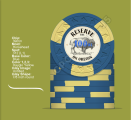
I'd say try to match the denomination colors to the base chip color. The aged look of the inlay clashes with the brighter neon denom colors, imo.
 
New number is great. The top end of the chip is a bit crowded, I'd shrink the denom a little or push it down. I'd also shrink the title a little or the image a little to give them a little space.
Working thru these scaling adjustments now...
The aged look of the inlay clashes with the brighter neon denom colors, imo
The end goal was to match the base colors, however you bring up a good point with the yellowed/aged background. the DG tiger and pink bases are pretty loud and may inherently clash if i stay with the yellowed background.
 
Before you get too far down the line- are you using the CPC template? The dotted line seems a bit too close to the edge… would be good to verify it’s fine
 
No B mold for the Bison theme?
maybe on the cash set!
Before you get too far down the line- are you using the CPC template? The dotted line seems a bit too close to the edge… would be good to verify it’s fine
i created this design with canva, it was meant to be a murder/relabel with print work done from Gear depending on back log. i assumed the cpc template applied to the cpc factory inlays, but i will go ahead and build in an offset though. good looking out!

current status, adjusted denom font to be more legible & still need to color match.

thanks everyone for the input, made a ton of great progress!
 

Attachments

  • Screenshot 2023-08-21 at 11.27.44 PM.png
    Screenshot 2023-08-21 at 11.27.44 PM.png
    234.2 KB · Views: 61
maybe on the cash set!

i created this design with canva, it was meant to be a murder/relabel with print work done from Gear depending on back log. i assumed the cpc template applied to the cpc factory inlays, but i will go ahead and build in an offset though. good looking out!

current status, adjusted denom font to be more legible & still need to color match.

thanks everyone for the input, made a ton of great progress!
My mistake, you can use all of space on Gear’s labels. I thought the chips you had were samples you collected. I didn’t read closely enough.

If you’re using Gear labels, design away! If it doesn’t turn out well, iterate! Best thing about relabeling chips.
 
haha, yeah “the” under reserve was a misstep for sure.

Love it! Yeah I went back and forth on color matching but I like all the changes you suggested. Much appreciated!!
 
@chipinla for the win with the label!
Are you getting new chips made? My comment was going to be that the 100 and 1000 may create dirty stacks but then I looked at your original post and you mentioned the same.
 
Yeah he killed it!
I’m hoping to find a rack of black 312s (DG green pips) or purple with a darker pip. If I’m unable to find them on here then yeah I’ll throw in an order.
 
Last edited:
I like where this is going but I agree with you that the 100 and 1000 are way to close in colors. I would ask in upcoming molds thread if someone has an order on this mold where you could new 1000's just blanks and have them labled the same way as the rest of the set.

Love the Bison btw
 
One more thought….

For some reason, we inherently see left facing objects as moving forward and right facing objects as moving backwards. I would flip the bison so it’s looking left and moving forward. Then see how it makes you feel and pick the direction you like best.

This is going to be a great set.
 

Create an account or login to comment

You must be a member in order to leave a comment

Create account

Create an account and join our community. It's easy!

Log in

Already have an account? Log in here.

Back
Top Bottom