Jdswaff87
High Hand
Good evening everyone,
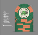
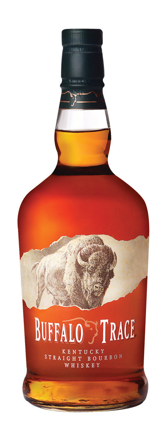
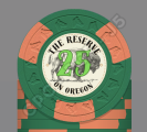
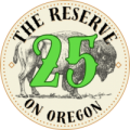
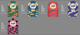
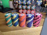
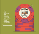
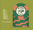
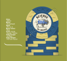
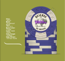
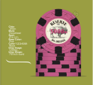
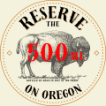
Just completed my first chip set of CPC/ASM HHR 312's, added in a 614 in as a 5th denom. This is meant to act as a tourney set for a game I started in 2019. pretty strong core group that all appreciate good bourbon. "The Reserve" is a reference to bourbon that gets tossed around and sounded catchy and "on oregon" is the street in which the game happens. Under the buffalo i have very small text which was meant to read "hand bottled by hand in 2019 at 100 proof" but the text is very small and may be omitted. On the fence whether to color coordinate denom text (will do a better job matching if this theme sticks) or simply make them all red. The "ML" next to the denom is also just meant to add to the bourbon theme. Looking for some feedback or thoughts for those of you that have already been there and done that. Also i'm no graphic designer as you'll see from the pics so any constructive criticism of concept or formatting is welcomed!")
thank you for any input or wisdom.
P.S. Not over the moon about the closeness of the blue/yellow and purple/white but i needed a 4th color to get this set on the felt so concessions were made. eagerly awaiting a better contrasting barrel or two to pop up.
Just completed my first chip set of CPC/ASM HHR 312's, added in a 614 in as a 5th denom. This is meant to act as a tourney set for a game I started in 2019. pretty strong core group that all appreciate good bourbon. "The Reserve" is a reference to bourbon that gets tossed around and sounded catchy and "on oregon" is the street in which the game happens. Under the buffalo i have very small text which was meant to read "hand bottled by hand in 2019 at 100 proof" but the text is very small and may be omitted. On the fence whether to color coordinate denom text (will do a better job matching if this theme sticks) or simply make them all red. The "ML" next to the denom is also just meant to add to the bourbon theme. Looking for some feedback or thoughts for those of you that have already been there and done that. Also i'm no graphic designer as you'll see from the pics so any constructive criticism of concept or formatting is welcomed!
thank you for any input or wisdom.
P.S. Not over the moon about the closeness of the blue/yellow and purple/white but i needed a 4th color to get this set on the felt so concessions were made. eagerly awaiting a better contrasting barrel or two to pop up.
Attachments
-
 IMG_6125.JPG172.1 KB · Views: 203
 -
 Screenshot 2023-08-21 at 7.50.16 PM.png437.7 KB · Views: 200
 -
 Screenshot 2023-08-21 at 7.50.25 PM.png510.1 KB · Views: 169
 -
 Screenshot 2023-08-21 at 7.50.31 PM.png531.2 KB · Views: 167
 -
 Screenshot 2023-08-21 at 7.50.37 PM.png520.1 KB · Views: 170
 -
 Screenshot 2023-08-21 at 7.50.45 PM.png428.2 KB · Views: 169
 -
 2EC22996-EF95-4F1C-B74A-0A0E62D0F7EA.PNG225.1 KB · Views: 197