CPC Small Crown Bourbon Theme (1 Viewer)

BearMetal

4 of a Kind
Supporter
Joined
May 23, 2019
Messages
5,730
Reaction score
14,136
Location
East Windsor, NJ
My brother-in-law and I are starting down a design journey for a custom CPC set. If you remember, he's the main driving force behind my poker table. Part of this is that I want a CPC custom set ... and the other is that I love working with him b/c it's bonding time for us.

TL;DR:
For anyone who followed this thread, the wait is over! They have arrived!

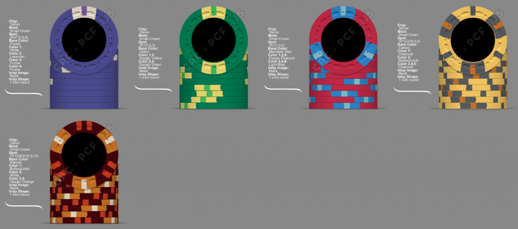
Bottled-In-Bond Bourbon CPC Small Crown

And Here's a link to the final artwork/chip designs.

Here are some basic pieces of info about the set:
  • It will have 4 denominations 5 denominations (25c, $1, $5, $20, $100) and most likely be around 500 chips
  • I love chips and the more on the table, the better. I'm moving to 5 denoms because future-proofing is a good idea, and I might travel to a meetup with this set where the stakes are higher than my home game. It's hard with only 4 denominations and I really don't want to expand to 5 because of cost. So, 4 it is!
  • The theme will be bourbon; we're working on the artwork now, but our general thought will be to have each chip be 2-sided. The first side is the denomination and the 2nd is a bourbon-themed image with supporting text.
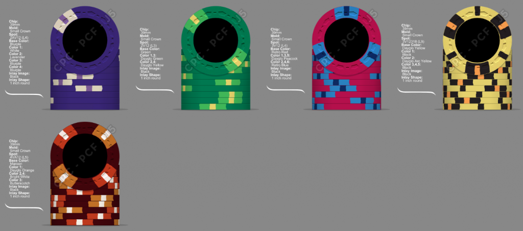
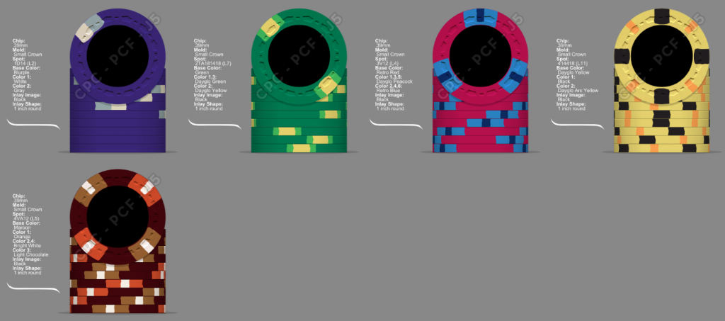
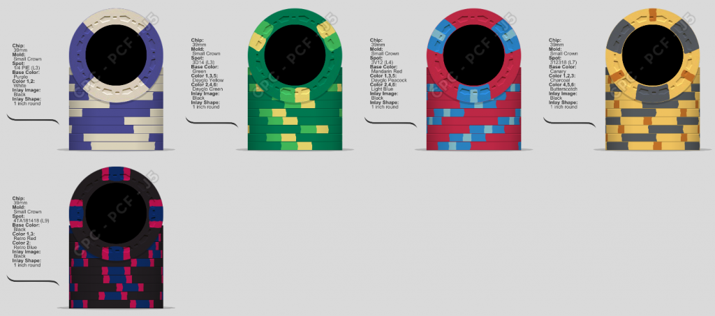
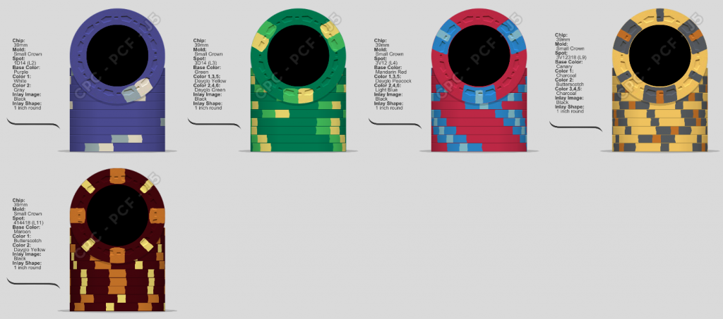
So, I had a choice here: I can go either "clown" or "serious". Big Top Poker makes me all gooey with its colors, but I felt that this set (especially with the scrown mold) should try to be more vintage and have more muted colors for the base chip. If you know me, you know I'm all ga-ga about blue $1s ... but this was my chance to have a green $1 which is different and awesome. IMO red $5 is a must ... which left purple and yellow to fit into the mix. I love purple and decided to make it my frac. But none of the CPC sample yellows really "did it for me" as the base color for the $20, so I went black with yellow spots.

Official Vote Poll for Final Candidates

Here's what I'm looking for from all-you-alls:
  • Edge spot progression hasn't been a concern in my mixed sets, but I felt like I wanted some kind of progression here. How'd I do? Suggestions for different patterns?
  • We spent most of Thanksgiving picking out colors. I'm not averse to suggestions, but these really did hit the sweet spot visually. If I'm being honest, the $20 black/yellow is the one that I would be most likely to change out
  • All feedback is welcome; it's a fun thing to do and I'm willing to try out different stuff. I know to stay away from unweighted colors as the base (unless all are unweighted).
  • When the artwork gets more refined, I will add it
Current Design Leaders (25c / $1 / $5 / $20 / $100)

xV-Style:
1607384788287.png


xD / 21A / 414 / xV Mixed:
1607384830149.png


25c Frac Choices:

1606840876148.png


History of Changes
d702709e-8197-4459-b0d4-3a620774c720.png

1606496151645.png

1606582755378.png

1606589470329.png

1606925560355.png
 
Last edited:
Question #1 for PCF: My brother-in-law is convinced that a 1" inlay is the way to go. I know from my Paulson chips, that I like a smaller inlay with more clay chip surface; it just feels better. In your opinions CPC owners, do you like the smaller 7/8" inlay better or is it more about the artwork and going 1" is fine?
 
@detroitdad I came across this set in my searches. I did briefly consider the quarter-pie chips, but I felt like I'd need to make them all quarter pies (like you did) and I personally wanted edge spots. But, yes, I do think this set is sexy as hell.

Here's a question: does the denomination need to be on both sides or is only 1 side OK?
 
Here's a question: does the denomination need to be on both sides or is only 1 side OK?

Its completely personal preference. I've had several sets where the denomination is only on one side and it works just fine with my group. Then this leaves more room for artwork on the non denomination side. Especially if your going with the 7/8th inlay (which I do prefer).
 
Especially if your going with the 7/8th inlay (which I do prefer).
This is a huge piece of the puzzle and one of the huge disagreements between myself and my brother-in-law. Can you deep dive into why you prefer the 7/8"?
 
I agree, QP's are hard to fit into a rotation. Scott's QP set inspired me to do one. I limited my color choices because I wanted to try and stay mostly muted for what I believed to be a "classic, vintage theme".

I had the set for a few years. Received a ton of compliments on it, a ton of requests for it to travel to meet ups, ect.. @p5woody and I must have done something right. Then when I put it up for sale @Ben8257 was pretty quick to buy it lol. Hopefully one day I'll get together with them and be able to play on it again :)
 
This is a huge piece of the puzzle and one of the huge disagreements between myself and my brother-in-law. Can you deep dive into why you prefer the 7/8"?

For exactly why you stated. More chip surface exposure, more of the chip color our front and center. I also have a large inlay set. Its on the FDL mold. I don't love the mold, but it worked best for what I wanted to do.
 
Have you gotten any mold samples? Have you handled the scrown cpc mold? Have you handled other molds? Do you have a color sample set?

If the answer is no to any of the above questions I recommend that you acquire mold and color samples either through borrowing/renting them or purchasing from cpc.

Reach out to @Sprouty if your interested in renting some. He has a few different molds/colors.
Yes Yes Yes and Yes :)

Our original color choices were very wrong once we got the color samples in hand. So, the above rendering was done with the actual color samples in hand. I also have the molds; my top-2 for this were scrown and H-mold, but I really like the vintage look of the scrown. Here is a SUPER ROUGH idea of the chip artwork (since we haven't created SVGs/rasters yet):

1606493085352.png
 
@detroitdad... I seriously think the only reason you let your customs go is because you know they will be PLAYED!! loved and cherished with Brie and I. They will continue to make appearances at meet ups for years to come!

@BearMetal I disagree on if you do a quarter pue that you would have to do the entire set! I actually would love to see the purple frac as a 2 tone purple half pie myself (like Bill's $100 chip in the Burbon series). but I don't see anything wrong with what you did for that chip.

You know I am obsessed with green chips, green $1s are my favorite!! Why not as they will probably be the most used chip... always on the table!

I'm not sold on the $5... it is very close to the $20 in spot progression and just seems like too much going on for a $5 chip.

I get the whole darker and retro theme but the as a whole it still seems a bit too dark. Unless you are playing in a very bright room, which most of us aren't a fan of... I would be a bit worried that the set would loose its appeal. But again it's your baby.

I would rather see 7/8" inlays... there are series with awesome design work that I think large inlays help... but for a traditional/ retro theme... I think 7/8" would be the way to go!!

Remember I'm an idiot and it's quite possible I am actually no help here at all!! Lmao

Ben
I actually did the purple frac as a quarter pie and I just didn't dig it. I'll have to try it again.

Yes a green $1 being on the table all the time is going to be HOT. How do you like my green?

OK, so the $5 is off for you. I typically don't like split edge spots, so maybe I need to play with the progression a bit.

The dark theme is actually the other huge disagreement my brother-in-law have. I think he's turned me; in person, the colors are a bit brighter. Is it the $20 black base? If I lightened that up a bit, would it be better?

.... crappity crap crap on the 7/8" inlay; I think that is my preference too, but he's the graphical artist in the family and he's really pushing back on the 1". I have to convince him of the feel of the smaller inlay.
I don't think a full out argument over inlay size is worth it!! Just let him know he needs to nail the design, almost needs a little more going on than a normal inlay if he wants to go large.

I think personally I would go gray rather than black on the $20. The Green is great and I don't think it is in the base colors where the dark overall sense is coming from... I just think the edge spots could brighten it up a bit. Not really sure, but also with only 4 chips in the line up, not sure about the big yellow spot on the $1 and even bigger on the $20... seems like an overlap to me.

Looking at it again... maybe it's the black blank inlays that are making it seem really dark.

I will shut up and crawl back in a hole! Lol
 
My 2¢ worth, without suggesting too much to start :x
  • The fiver seems out of place, a bit too complex and too many colors, given the relatively simple patterns on the 25¢ and $1. I would suggest keeping the spot pattern and sticking with 2 spot colors instead of 3, or perhaps considering something like a 4D316 or 4V12 spot pattern (again with 2 spot colors instead of 3)
  • I feel like the quarter needs a tiny splash of color. Nothing crazy like DG pink but perhaps retro lavender to complement the purple base color
  • Given the bourbon theme, maybe swap black for maroon for the $20 base color. They're really close in color but the maroon would give you a slightly different hue that would complement the bourbon them
I also typically prefer the smaller 7/8" inlay as I like to see the clay but with small crown it's close, given the mold impressions are pushed further to the edge of the chip vs their other molds like A mold, HHR, H, etc.. Depends on the design too, with what it looks like you're proposing (more graphic intensive) you may be better off with the larger inlay.

edit to add - digging the base colors on the main workhorse chips, the green $1 is cool :)
 
@Ben8257 and @Irish - Thanks Ben and Matt for your input. The maroon was so brown when I looked at it, which is why I discarded it right away. It was actually the original $5 base color. OK, I hear your about the $5; but I've always loved the red/blue combo, so I changed it a bit to only have 2 edge spot colors and to be simpler. Let me know what you think. As for the purple, we tried purple along with retro lavender but there wasn't enough contrast. However, this was with the smaller spots; maybe quarter pie would look better. OK, I've got some thinking to do; need to go back to the color samples and try again.

I think a big problem here is the $20 and I need to redo it completely; so that's what I'll focus on. However, here's a simple re-render taking some suggestions into account. High level thoughts on its comparison to the OP?

1606494362235.png
 
When I'm helping someone with customs, I always recommend focusing on your workhorse chips first, as those are the ones that you'll have on the table, in bulk - and enjoy the most. For now, I would honestly just put the $20 on pause and figure out where you want to go with the main denoms, then pick the $20 back up later.

I personally think this new fiver works much better with the quarter and $1. I like the red/blue combo as well. Could also go with a more PCA feel and use retro blue/dg blue for the spot combo. I'm not typically a big fan of quarter pies, but I like the one you posted.

All that being said, remember custom chip rule #1 - get what YOU want. ;) Getting feedback/suggestions is always nice for things like dirty stacks, overall flow, spot progression, etc. but at the end of the day these will be yours. Spend your money how you like!
 
@Ben8257 and @Irish - Thanks Ben and Matt for your input. The maroon was so brown when I looked at it, which is why I discarded it right away. It was actually the original $5 base color. OK, I hear your about the $5; but I've always loved the red/blue combo, so I changed it a bit to only have 2 edge spot colors and to be simpler. Let me know what you think. As for the purple, we tried purple along with retro lavender but there wasn't enough contrast. However, this was with the smaller spots; maybe quarter pie would look better. OK, I've got some thinking to do; need to go back to the color samples and try again.

I think a big problem here is the $20 and I need to redo it completely; so that's what I'll focus on. However, here's a simple re-render taking some suggestions into account. High level thoughts on its comparison to the OP?

View attachment 581148

I like the first 3 chips a lot. The $20 looks off, colors and edge spots. You mention in OP that cost is part of the reason for not getting more chips. By lowering the edge spot levels of the $5 & $20 you are saving a lot of money. And if you are ordering 500 chips you can get 5 different designs. So adding 20-40 $100 chips is not a big cost to fill out the set.

for the small crown mold I like the look of a 1” inlay more than the 7/8”. Normally I’m always in the 7/8” camp though.
 
When I'm helping someone with customs, I always recommend focusing on your workhorse chips first, as those are the ones that you'll have on the table, in bulk - and enjoy the most. For now, I would honestly just put the $20 on pause and figure out where you want to go with the main denoms, then pick the $20 back up later.

I personally think this new fiver works much better with the quarter and $1. I like the red/blue combo as well. Could also go with a more PCA feel and use retro blue/dg blue for the spot combo. I'm not typically a big fan of quarter pies, but I like the one you posted.

All that being said, remember custom chip rule #1 - get what YOU want. ;) Getting feedback/suggestions is always nice for things like dirty stacks, overall flow, spot progression, etc. but at the end of the day these will be yours. Spend your money how you like!
Absolutely! The feedback on the inlay size is quite important because feel of the chips is important and there is a difference. And yes, dirty stack possibilities must be pointed out. But if I like something, then I like it, regardless of what PCF says.

Something was wrong with the $5 and I think you pointed it out... It was the complexity of the spots.

I also understand what you mean about choosing your workhorse chips first. however, the problem with only four chips is that I want to ensure that I get the base colors that I really like. If I only focus on the work horseships then I might choose color combinations that prevent me from picking a base color for the $20 that I wanted.
 
I like the first 3 chips a lot. The $20 looks off, colors and edge spots. You mention in OP that cost is part of the reason for not getting more chips. By lowering the edge spot levels of the $5 & $20 you are saving a lot of money. And if you are ordering 500 chips you can get 5 different designs. So adding 20-40 $100 chips is not a big cost to fill out the set.

for the small crown mold I like the look of a 1” inlay more than the 7/8”. Normally I’m always in the 7/8” camp though.
Thank you for that feedback on the inlay size for the scrown!

I agree, the $20 is off somehow still.

So here's my problem with $100s; I can't ever see them getting into play. So I wouldn't want to affect my other choices in chips by making sure that a chip that will never make it into the table works with them. Like I think I've literally tossed a single $100 on the table once just for giggles. Is a set incomplete without a barrel of hundos?
It's your customs Brother! For the record you got two amazing chippers to respond, but Matt and Adam are awesome guys... so I am quickly headed back under my rock!!

@Irish awesome input as always!!

On the barrel of hundos, it is your set don't waste money you don't have to... but for me, I would like to see you add a $100... you never know when that rainy day will hit and you don't want to run out of chips in the middle of an 8 hour session.

I mean you could always grab something that doesn't match and cover it! But in the spirit of a custom series I would like to see the $100 added!

Also what if someone asks you to bring your customs for a PCF meet up game and it runs larger than your typical game... just a thought!

Much bigger fan of the new $5!!

Ok I'll shut up again!! Lmao
 
It's your customs Brother! For the record you got two amazing chippers to respond, but Matt and Adam are awesome guys... so I am quickly headed back under my rock!!
Hell yeah! That's why I love PCF! Great suggestions!
I mean you could always grab something that doesn't match and cover it! But in the spirit of a custom series I would like to see the $100 added!
That's a great point. Also with the bourbon theme, $100 and 100 proof bottled-in-bond is too good to pass up. Guess I'll open it up to a 5th chip!
 
Having a $100 is not required if you know for certain you will never use it. But this is a set you are building to have for the rest of your life. I’d rather make sure I have it “just in case”. Inflation, games grow, etc. Future proofing the set now is much easier than trying to do a small add-on later. You could have lead time issues, or need to order more chips than you need. Color variation could come into play.

I would suggest get the main 4 chips set. Then afterwards add the $100 to fit with them.
 
I would 100% go with 1” inlay on small crown (or 1 1/8” if it was offered) and I usually prefer 7/8” inlay over everything (cuz THC love). However due to the shape of the small crown mold and larger center inlay area they feel more authentic (go look at old casino scrowns) AND most importantly they sound better with a larger inlay. The larger the inlay the lower the sound, more of a “clack” vs higher pitched “click” which sounds more like old TRK despite the lighter CPC formula.

On a side note, a vivid green $1 would tilt the shit out of me and any other players used to standard casino denoms, just sayin.

Otherwise love the concept and prefer the bottom lineup.
I do prefer a lower pitch clack vs the higher pitch click, so that's good. But I did want them to feel more vintage. I guess since I don't have any vintage chips or different really matter :LOL: :laugh:. But what I'm hearing is that the mold of the scrown is acceptable for 1" inlays, where as on other molds it's definitely not desirable.

I think these colors would tilt anyone from California to Jersey to Transylvania... That's where the "I don't care, I like them" comes in :LOL: :laugh:

Bottom lineup is the first evolution based on PCF feedback. They're will be more!
 
A big problem that I see with your version 2 lineup, is that you have colours that are typically used (White, Green, Red, Black) but in a different progression on just 2 of them (the green and red).

I am a fan of using different colours for denoms, but for me, once you change, you need to change them all. Otherwise it will just lead to confusion for the majority of regular casino players. In other words, if the lineup is completely scrambled, people will make more of an effort to remember the value order. With only one switch, you're going to get a lot of people meaning to bet a green, thinking it is a higher value than the red.
That's an interesting point. Nobody who plays at my games would care; but as Ben pointed out, if I take it anywhere to a meetup then the colors being half-standard, half-bonkers could make the players not like it.

Is it enough to deter me? Probably not. I'm dead set on a red $5, which means it's going to be a mix. I tried a lineup with a yellow $5 (the only other acceptable $5 IMO) and I just didn't like the yellow for a base color.

Maybe when I add a 5th chip in, that could change. But I think it's going to most likely stay mixed.
 
If you add a $100 would you use black for it?

if so you could move the purple to the $20 and green to the 25c. Still get to use the same colors, but different spots. Cali casinos use green fracs so it is not that crazy.
 

Create an account or login to comment

You must be a member in order to leave a comment

Create account

Create an account and join our community. It's easy!

Log in

Already have an account? Log in here.

Back
Top Bottom