I might use black for it, and try for yellow again for the $20. The problem with moving the purple up to $20 is that it's going to be very rare for it to come out. Probably only a few of them per night and it's my favorite color.If you add a $100 would you use black for it?
if so you could move the purple to the $20 and green to the 25c. Still get to use the same colors, but different spots. Cali casinos use green fracs so it is not that crazy.
You are using an out of date browser. It may not display this or other websites correctly.
You should upgrade or use an alternative browser.
You should upgrade or use an alternative browser.
CPC Small Crown Bourbon Theme (3 Viewers)
- Thread starter BearMetal
- Start date
How about swapping the green for the frac and the purple for the dollar?I might use black for it, and try for yellow again for the $20. The problem with moving the purple up to $20 is that it's going to be very rare for it to come out. Probably only a few of them per night and it's my favorite color.
detroitdad
Royal Flush
just messing around. The only problem with this is that grey and light blue are pretty similar.

I've always wanted a green $1How about swapping the green for the frac and the purple for the dollar?
Ok, so I also tried the tri-moons and I really didn't like them. I want to keep the frac to the quarter pie or the 2d18. Interesting on the $5. I've always felt that 4 spots was too much on a $5. But I do like this one. Just not sure if I like it more then the 3V12.just messing around. The only problem with this is that grey and light blue are pretty similar.
View attachment 581263
So something still seems wrong with that $20 (or $100 depending on what my 5th chip will be). Maybe it's too uniform...
detroitdad
Royal Flush
Ok, so I also tried the tri-moons and I really didn't like them. I want to keep the frac to the quarter pie or the 2d18. Interesting on the $5. I've always felt that 4 spots was too much on a $5. But I do like this one. Just not sure if I like it more then the 3V12.
So something still seems wrong with that $20 (or $100 depending on what my 5th chip will be). Maybe it's too uniform...
I like the progression from three spots to four going from the 1 to the 5. That, or what about a 2 color, 3 color, 4 color progression for the frac, 1, and 5
detroitdad
Royal Flush
This is kind of what I'm looking if I go with another custom set. I agree, the tri moons are difficult to work with. There are ways that you can make them work.
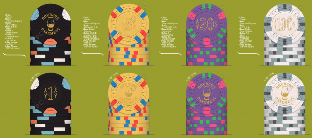
I don’t need much of an excuse to start mocking up sets!
Trying to keep your ideas and colors as much as possible and not repeat colors while keeping spot levels reasonable.
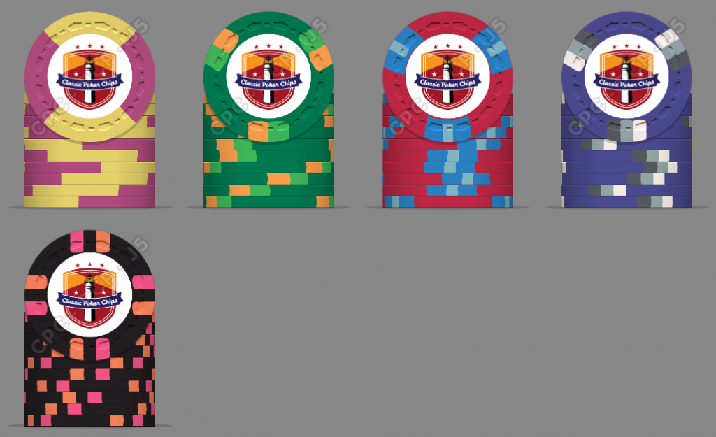
Trying to keep your ideas and colors as much as possible and not repeat colors while keeping spot levels reasonable.
detroitdad
Royal Flush
I don’t need much of an excuse to start mocking up sets!
yep!!!!
Trying to keep your ideas and colors as much as possible and not repeat colors while keeping spot levels reasonable.
Excellent mock up Adam. I'm not a fan of the progression from the 5 to the 20. It almost feels like a step in the wrong direction. Its not. It feels that way to me. I honestly think its the charcoal color that is throwing me off.
detroitdad
Royal Flush
@detroitdad... I seriously think the only reason you let your customs go is because you know they will be PLAYED!! loved and cherished with Brie and I. They will continue to make appearances at meet ups for years to come!
That does help. Especially when they were moved to an active forum member.
yep!!!!
Excellent mock up Adam. I'm not a fan of the progression from the 5 to the 20. It almost feels like a step in the wrong direction. Its not. It feels that way to me. I honestly think its the charcoal color that is throwing me off.
what about Retro Blue instead of charcoal?
detroitdad
Royal Flush
I was just doing a mock up and using retro blue. I think it looks a ton better!
I do too. I was trying to do a monotone look, but the blue fits with the purple.
I don't know about the yellow/link quarter pie. I just wish CPC had a better yellow because I just don't like their options for a base color.
detroitdad
Royal Flush
I just wish CPC had a better yellow
A bunch of us share the same complaint
I don't know about the yellow/link quarter pie. I just wish CPC had a better yellow because I just don't like their options for a base color.
that is Retro Lavender and DG yellow in my mock up. DG yellow is the best yellow by far.
I took some inspiration from the above images and tried to add a 5th chip in:
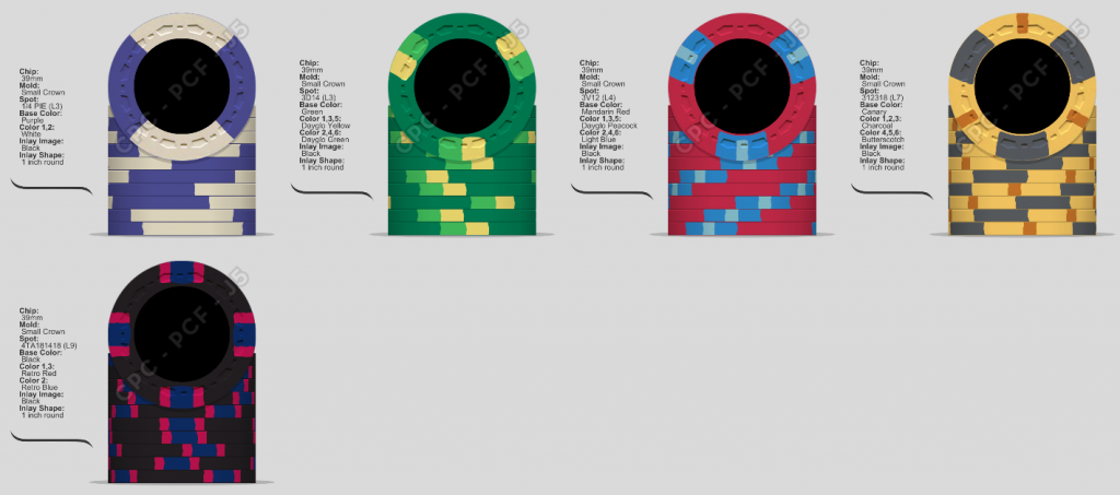
I took some inspiration from the above images and tried to add a 5th chip in:
View attachment 581574
retro blue is a very dark blue. Paired with black it is going to be even darker looking. Much like you shouldn’t wear black and blue together, neither should your chips.
OK OK ... I didn't use my color samples for the new chip; I'll re-adjust it with a better color sample. But that's the idea.retro blue is a very dark blue. Paired with black it is going to be even darker looking. Much like you shouldn’t wear black and blue together, neither should your chips.
I guess I am more interested in whether:
- spot progression works
- how we feel about that lone quarter pie
- the look of the yellow $20
Nothing wrong with a single 1/4 pie chip. Progression looks good, $20 still doesn’t to me.
Arg! I liked this $20 better too ...Nothing wrong with a single 1/4 pie chip. Progression looks good, $20 still doesn’t to me.
Arg! I liked this $20 better too ...
If you like it then don’t worry about it. It is your set!
True ... true ... but by having everyone neg my original $20, I was able to take a harder look at it and make a better one (IMO)If you like it then don’t worry about it. It is your set!
SixSpeedFury
Full House
The problem is that in the OP you suggested muted and vintage, and the current mock-up does not reflect that. I would go all monochrome and select contrasting colors off of the base colors. Butterscotch works well for $20 as the base.
I think I was OK with muted/vintage with only 4 chips ... it gets harder with 5. I'll have to go back to the samples in the morning...The problem is that in the OP you suggested muted and vintage, and the current mock-up does not reflect that. I would go all monochrome and select contrasting colors off of the base colors. Butterscotch works well for $20.
I guess I am more interested in whether:
- spot progression works
- how we feel about that lone quarter pie
- the look of the yellow $20
Overall I think the spot progression works. I'm 50/50 on the quarter pie, I like the chip itself (and it definitely has the vintage feel to it), just can't decide if I like it with the rest of the set. I'm leaning towards the look of the original 2D18 spot you originally had, but again I'm not big on quarter pies in general (with a few notable exceptions). The $20 to me is OK, my knee jerk reaction is the 1/2" spot jumps out too much compared to the rest of the set, I would consider moving to the 314318.
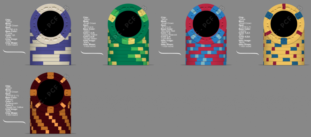
Reservedly posting some alternate ideas for the $20 & $100:
Last pitch for maroon I promise.... 

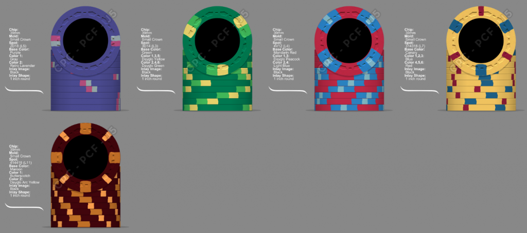
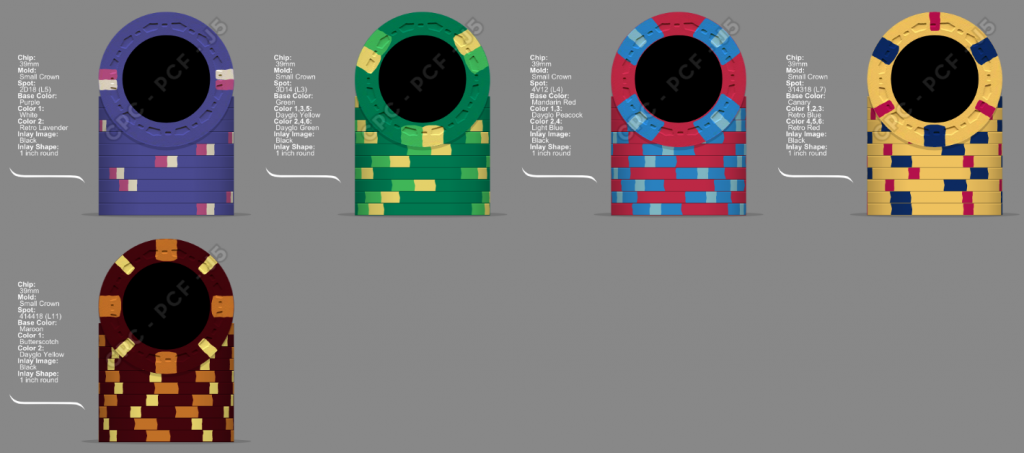
And this one here is probably too much on the $100 but I though the edge spot matched with the fiver:
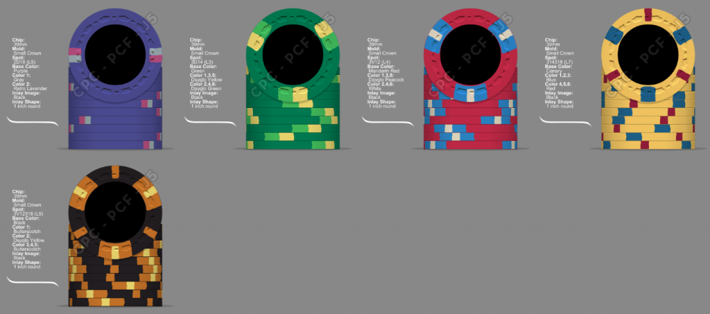
And this one here is probably too much on the $100 but I though the edge spot matched with the fiver:
Matt, thank you for those great ideas. I'm going to take out the maroon today and try it out as proposed.Overall I think the spot progression works. I'm 50/50 on the quarter pie, I like the chip itself (and it definitely has the vintage feel to it), just can't decide if I like it with the rest of the set. I'm leaning towards the look of the original 2D18
I'm the same way with the quarter pie; in general in not big on them but I think it works. Do I like it as much as the 2D18? Crap, I don't know.
I actually really like the 414418 pattern for the hundo. But I also like the 312318 for the $20 and it might be too busy together. The 314318 is classic and classy, but is it special enough for the $20? The $100 isn't coming out normally, but that $20 will make an appearance in every game, and I want people to instantly bow down before it (hence the 312318)
Matt, thank you for those great ideas. I'm going to take out the maroon today and try it out as proposed.
I'm the same way with the quarter pie; in general in not big on them but I think it works. Do I like it as much as the 2D18? Crap, I don't know.
I actually really like the 414418 pattern for the hundo. But I also like the 312318 for the $20 and it might be too busy together. The 314318 is classic and classy, but is it special enough for the $20? The $100 isn't coming out normally, but that $20 will make an appearance in every game, and I want people to instantly bow down before it (hence the 312318)
Play around with the color samples a bit today, then put everything away for a couple of days (including the chip designer). You've had a lot thrown at you the past couple of days, give it a break and come back with some fresh eyes after the weekend.
OK, @Irish seems to be moving me in the direction of Maroon (I know, right). OP updated, but I'll repost the current iteration here:
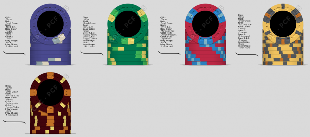
- Moved away from a quarter-pie back to a single spot. There's also 212+ (a smaller version of quarter pie where the 2nd color isn't as wide)
- Kept the spot pattern on #4 the same, but only used 2 colors for edge spots
- Added $100 maroon with some yellow
Last edited:
Similar threads
- Replies
- 9
- Views
- 452
- Replies
- 46
- Views
- 2K
