CPC Small Crown Bourbon Theme (1 Viewer)

I think I was OK with muted/vintage with only 4 chips ... it gets harder with 5. I'll have to go back to the samples in the morning...

I was in the same boat as you. I had these colors in mind but they just didn't gel well.
download (1).png

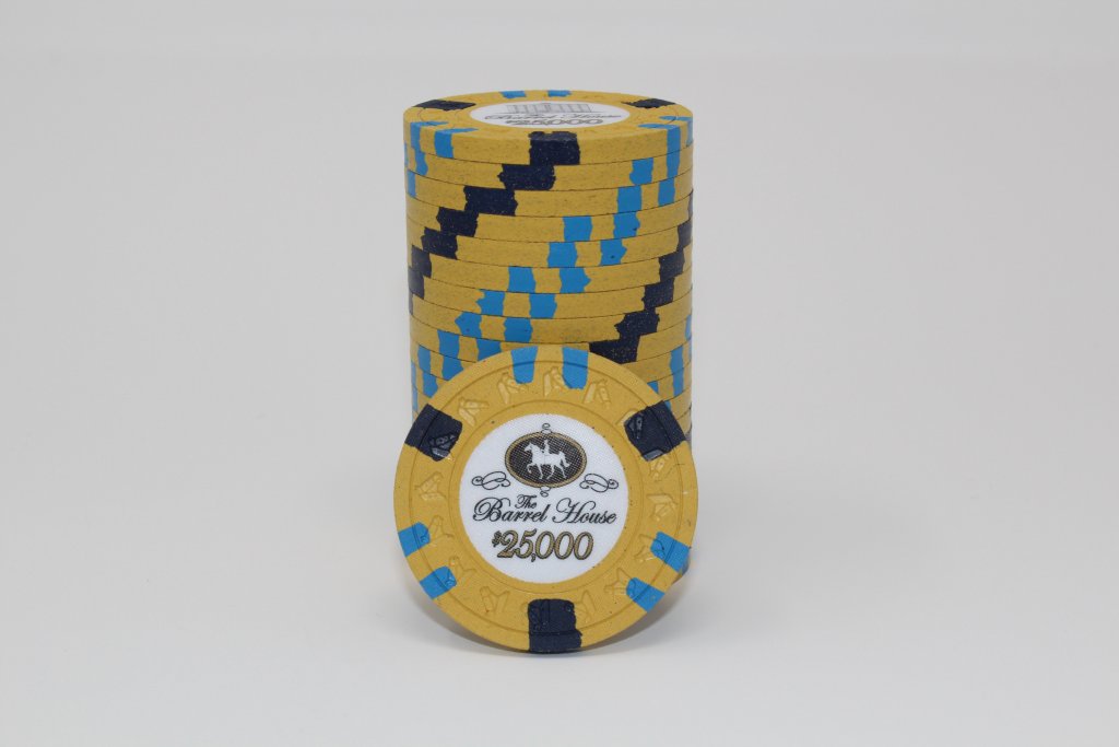
With some great input from the community I settled on the final mock-up:
download (4).png

Muted and colorful are usually hard to pull off unless you can really make it work. Just something to consider.
 
Muted and colorful are usually hard to pull off unless you can really make it work.
Yes, especially with CPCs color palette. I don't think it's as important to stick to "muted" or "vintage" colors for my set religiously. It's more a matter of what works together. That maroon is really growing on me...
 
OK, @Irish seems to be moving me in the direction of Maroon (I know, right). OP updated, but I'll repost the current iteration here:
  • Moved away from a quarter-pie back to a single spot. There's also 212+ (a smaller version of quarter pie where the 2nd color isn't as wide)
  • Kept the spot pattern on #4 the same, but only used 2 colors for edge spots
  • Added $5 maroon with some yellow
I love the spotted bird! Matt is correct on the maroon!! Getting back to a bit more retro... but I like this new line up!! Major improvements brother!!
 
I love the spotted bird! Matt is correct on the maroon!! Getting back to a bit more retro... but I like this new line up!! Major improvements brother!!
Yup, it's a great balance between "this is my set" and "I'm open to improve any part of it with ideas from PCF".

Everyone's suggestions helped me get from v1 to where it is today. I had an error in my quoted post; the maroon is $100, not $5.

Ben, I put a bunch of ideas for the frac in the OP, but I am leaning toward a spotted quarter now...
 
OK, @Irish seems to be moving me in the direction of Maroon (I know, right). OP updated, but I'll repost the current iteration here:
1606595416397.png


;):LOL: :laugh: Sorry but maroon is just a sick color when done right (next year's Jersey meetup chip will be maroon!), it can just be tough to work into a set and look right. A bourbon themed set would be the perfect spot for it.

Ben, I put a bunch of ideas for the frac in the OP, but I am leaning toward a spotted quarter now...

oooo actually I really like the 2A12 frac as well!
 
Sorry but maroon is just a sick color when done right (next year's Jersey meetup chip will be maroon!),
Yeah, it's hard not to use maroon in a bourbon themed set. I wasn't married too the black chip either, and the more I looked at it, the more I liked it.
oooo actually I really like the 2A12 frac as well!
I know, right. I like it more than the quarter pie.
 
The QP bourbon themed set was one of my favorite pr0n sets of the entire forum. Watching this second build/discussion with interest.
 
The QP bourbon themed set was one of my favorite pr0n sets of the entire forum. Watching this second build/discussion with interest.
I'll be honest, seeing the original Bourbon Basement set get sold recently is what kinda kickstarted this idea. Also, my BIL has been jonesing for some new design work to do :LOL: :laugh:

I'll do my best to keep this thread updated, especially as artwork comes together. Of course, I'll never stop taking suggestions.
 
What the hell is 3V123SA18!? This one seems to expand upon the pattern on the $20 in the OP and just add an extra 1/8 tick mark in each quadrant. Do we like it better than the OP's 414418? Or is this too complex and will cause massive headaches and dizzyness.

3V123SA18
OP's 414418
1606605122470.png
1606605214094.png
 
Updated OP with the most recent modifications. I decided that the green $1 with it's 3D14 edge spots was the only that didn't really match the set. Although I love the 3D14-style, I thought that since every other chip had the V-style, I should try to actually be consistent.

Frac, however, can go a bunch of different ways. It SUCKS that as-rendered, the 25c chip is an L4. It's going to end up costing me a lot more to keep it with the 2AV12. I then realized that I don't necessarily need a "V" on the frac; I can use the same side edge spot and drop it down to an L1 or L2 (see OP rendering of frac choices).

Any suggestions? Do we like/dislike?
 
Definitely like, but I'll admit I'm biased - used the V12 edge spot as the basis for my design for the cards mold GB Round 2 (being finished up right now - will be revealed shortly). For my frac did the same thing as you're proposing in options 1 and 2 - 112 edge spot without the V.

I personally like the white better between your two 112 options (gives it a little more contrast), but both the white and lavender work. If you're going to with a 212, I would say make both edgespots the same color (either both white or both lavender). Bottom line - almost all those frac options work for me.

Have you considered using 4V12 for the $20 or $100? Same level in price as the 3V12 but keeps the progression going. Might also look at 4VA12.

Overall it's looking good!
Thanks for the feedback! The only reason I'm considering other frac options is cost; the difference between an L1/L2 and the current L4 will be between $150 and $250 dollars. But, honestly, I think I like the 21V12 the best, so maybe I just suck it up and spend the dough. I do agree with you that if I'm going to do 212, then I should just stick to 1 color (probably white).

The 4V12 is interesting; I tried it initially, but moved away from it because I felt that the spots kind of "took over". So, for progression, I kept the 3V on the $20 and $100 and just added 1/8 and 2x1/8.
 
I'm not personally a fan of the repeating spot type (xV12) for cash sets, and I really liked the $1 from your original lineup. Just my 2¢ opinion though, either lineup works.
 
I'm not personally a fan of the repeating spot type (xV12) for cash sets, and I really liked the $1 from your original lineup. Just my 2¢ opinion though, either lineup works.
So is repeating it on 3 chips still something you try to avoid? The frac and the $1 can be different, but the 5/20/100 can be xV12?
 
So is repeating it on 3 chips still something you try to avoid? The frac and the $1 can be different, but the 5/20/100 can be xV12?

It's just a preference, I would likely say the same thing if it were something like a 1D14, 2D14, 3D14, 4D14 progression as well.

Yep I'd be OK with the 5/20 and even 100 having the xV12 spot (with 25¢ and $1 different) because it's not just the xV12 spot, the 20 and 100 have the added 1/8" spots as well, plus they're not going to be on the table in large quantities like the 25¢ - $1 - $5. IMHO CPC offers all these cool different edge spots, I like a little more variety, especially for a cash set. Again though just my personal opinion.
 
Alright @Irish - I think you convinced me with this one line:
IMHO CPC offers all these cool different edge spots, I like a little more variety, especially for a cash set.

So, I've updated the OP with some variations. I really, really like the xV-style (like @JZPdub), but I get it that all xV-style almost feels like wasting the amazing combinations that CPC allows. Looking for feedback between OP rendering and Proof #5 spoiler.
 
I like it. Just remember custom chip rule #1.... ;)
 
Yessir. It's your money, get what you really want. Plus I hear that Irish guy is always under the influence, he may not give the best advice.... :LOL: :laugh:
 
CPC Friends (@SixSpeedFury and @Irish) So, how bad is it to mix an unweighted base color with weighted base colors? I'm struggling with the actual yellow to use. I just don't love Canary; Dayglow Yellow is much more awesome for a base color. But all of my other base colors are weighted.

These are $20 chips and will not be out "in stacks" ... like, I get that a stack of weighted vs a stack of unweighted isn't good. But I can't see people having 10 of these suckers at once.
 
I have used DG colors as base colors for a few of my chips and I don’t notice any big difference compared to the weighted chips. I’ve never had any players say anything either.
 
Likewise, my CPC tourney set has 2 chips with DG base colors, I can't tell the difference between those stacks and the weighted stacks.
 
Your $25 ....... Dayglo Green! :)

Yep and the 1k is DG tiger. I weighed them once, there's about a 5g difference between a barrel of 20 chips, that's something like a 3% difference in weight. Insignificant IMHO.
 
And DG yellow is definitely the brighter and more "wow" of the two. Canary is nice though too, just different, I used canary from my 25k chip:

full
 
@Irish Do you know how you ended up with a smooth inlay on the HHR Barrel House $100? I thought the only mold with smooth inlays were FLD?
 
@Irish Do you know how you ended up with a smooth inlay on the HHR Barrel House $100? I thought the only mold with smooth inlays were FLD?

You pay extra for that..... ;)


I had to go back and look, I never even realized there's a bit of difference in the 100s. If you do look on the 100s though, there is still a little cross hatching, but you're right the 100s do feel a little smoother. That's the beauty of hand made chips, maybe the 100s were done with a different cup or by a different craftsman. But in general the inlays do change the feel of the chip a bit in comparison to a blank chip.
 
Moved away from a quarter-pie back to a single spot. There's also 212+ (a smaller version of quarter pie where the 2nd color isn't as wide)
The single spot isn't my thing. I know a lot of people love that Flamingo $1 - I don't get it; it tilts me out of my chair.
Cool project!
 

Create an account or login to comment

You must be a member in order to leave a comment

Create account

Create an account and join our community. It's easy!

Log in

Already have an account? Log in here.

Back
Top Bottom