The Back Eddy (Fly Fishing Theme) (2 Viewers)

JohnnyD

High Hand
Joined
May 28, 2024
Messages
60
Reaction score
89
Rewards
218
Location
Cincinnati, OH
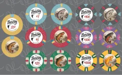
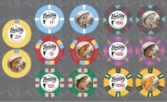
First time working a custom design. Many thanks to @Okku who has been fantastic to work with on this. Please poke holes at the set…all feedback is welcome!

Set name is The Back Eddy. Going for a speakeasy fly fishing feel. This design will be a combo cash set + casino game tourney set (craps/blackjack), the frac and $1000 will never play at the same time. Plan is to order Tina’s on the web mold.

1777552308867.webp
 
Cool! Pics may look very similar to people like me. I would prefer a different background in someway behind the fish, I wouldn't know which denom is which by a glance. Love the Back Eddy inlay, font is really cool. Make sure the 25c and $1 are thick enough fonts on the denoms.

The 500 and 1k share some colors, don't know what your lighting is like or whether you should be worried about any crossover.
 
Thanks for the feedback! We started with fish only on back design and it was too plain, scenery may now be too much. Back inlay design includes different trout (Brown, Rainbow, Cutthroat, Brook, Lake, Arctic Char, and Golden) with slight color matches. Definitely want those nuances to stand out. Maybe simplify and/or pull back the scenery behind the fish will correct this.

Wasn’t thinking about lighting, but my lighting is currently terrible. Furthermore, I play a lot at various vacation rentals so lighting cannot be guaranteed. What would you suggest to make sure the 500 and 1k are not confused?
 
Great, love the theme.

For 500 and 1k I'd just be wary of using each other's colors in the spots. It may not look like a problem but in stacks it may make it tougher to discern. But Eh, whatever you like will work.
 
What did everyone think about the spot color changes to the $1000 chip shown here (left is the update and right is the original). Any feedback is greatly appreciated!

1778595646399.webp
 
My take: love the inlay, but it's too busy for no reason
  • Get rid of the spelled-out denominations at the bottom
  • Move the numeric red ones down and to the left (centered in the white space) + experiment with increased size
Much cleaner IMO
 
Here is the latest version. Recent changes listed below. Let me know what you think…any and all feedback welcomed and appreciated!

1. Changed the scenic background to make the fish pop (gray scale).
2. Enlarged fish image a bit
3. Tonal change on $25 fish (more green, less orange)
4. Changed fish image on $500.
5. Updated $100 to make fish stand out more.
6. Changed spot colors on the $1000 (currently shown only on back design for comparison).

IMG_8421.webp
 
Thanks for the feedback @acezag, Really appreciate it. I’ll try to work on some changes to the front inlay as suggested on next version.

Also, thanks for posting the link to the musky jacks. Love the musky jack design @Cratty. I wonder what other fish theme design are out in the wild.
 
Working some tweaks on the inlay design.

Any feedback on the chip/spot colors and progression?
 
Bumping for feedback. I’m targeting final edits this week and sending to production. Really appreciate any feedback (inlay design, chip colors, spot progression, etc) as this is my first go at a custom design! Please feel free to let loose and be critical 😆
 
Thanks for the feedback @acezag, Really appreciate it. I’ll try to work on some changes to the front inlay as suggested on next version.

Also, thanks for posting the link to the musky jacks. Love the musky jack design @Cratty. I wonder what other fish theme design are out in the wild.
You’ve got mine (check the sig), and @Kam with Roros card room (sorry on mobile so no link).
 
@Jacks thanks for sharing! Love your fish theme chipset (and jealous of your fishing adventures). I couldn’t find the Roros card room one you mentioned. Maybe I didn’t search properly. @Kam can you share a link?
 
Hey @JohnnyD

Here’s where I ended up on my relabel:
https://www.pokerchipforum.com/threads/first-cpc-cash-set-draft-design.102904/post-2683197

Line up with @Jacks
IMG_2591.webp


Really like your concept. My only thought would be the amount of detail in the mountain backdrop (it might be too much and/or not be that clear).

Lesson learned for me was the difference between a zoomed in backlight design on screen, vs the size of a tiny printed label. I ended up simplifying mine multiple times. Recommend to try to print off to scale at home and cut out so you get a feel for the size.

GL!
 
Hey @JohnnyD

Here’s where I ended up on my relabel:
https://www.pokerchipforum.com/threads/first-cpc-cash-set-draft-design.102904/post-2683197

Line up with @Jacks
View attachment 1680715

Really like your concept. My only thought would be the amount of detail in the mountain backdrop (it might be too much and/or not be that clear).

Lesson learned for me was the difference between a zoomed in backlight design on screen, vs the size of a tiny printed label. I ended up simplifying mine multiple times. Recommend to try to print off to scale at home and cut out so you get a feel for the size.

GL!
Somehow I've missed your entire lineup until now. The whole thing is so great, and DAMN on that $25! Smokin'! (Sorry for the derail OP)
 
Hey @JohnnyD

Here’s where I ended up on my relabel:
https://www.pokerchipforum.com/threads/first-cpc-cash-set-draft-design.102904/post-2683197

Line up with @Jacks
View attachment 1680715

Really like your concept. My only thought would be the amount of detail in the mountain backdrop (it might be too much and/or not be that clear).

Lesson learned for me was the difference between a zoomed in backlight design on screen, vs the size of a tiny printed label. I ended up simplifying mine multiple times. Recommend to try to print off to scale at home and cut out so you get a feel for the size.

GL!
Thanks for the feedback! I share the same concern on the back design. I’ll give it the true size print test that you recommend. Started with just the fish on the back, and it felt too simple/plain, but still may be too busy.
 
  • Like
Reactions: Kam
Latest near final. Let me know what you think!
 

Attachments

  • IMG_8576.webp
    IMG_8576.webp
    140.3 KB · Views: 23
  • Like
Reactions: Kam
After printing full scale and laying on some actual chips, decided to change the chip colors to brighten things up. Here is the latest version. Please send feedback before I waste my money on MOAR chips 😆!
 

Attachments

  • IMG_8664.webp
    IMG_8664.webp
    140.9 KB · Views: 10

Create an account or login to comment

You must be a member in order to leave a comment

Create account

Create an account and join our community. It's easy!

Log in

Already have an account? Log in here.

Back
Top Bottom