Final design check now that CPC is taking orders again. (1 Viewer)

lovetowel

Sitting Out
Joined
Apr 6, 2024
Messages
11
Reaction score
10
Rewards
85
Location
Denver
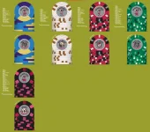
Thanks to the excellent graphic design work of @Matross on the inlay, and way too many hours on the CPC design tool, I'm about ready to submit a chip order. Posting one last time on the design to see if I'm missing anything significant.

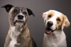
This set is inspired by my alma mater, the University of Georgia, and both my dogs who monitor the poker table when in session.
  • The Frac I wanted some fun colors.
  • The $1 I wanted to stay white. With my white dog with a brown eye and ear spot, thought the chip design (although simple) worked really well.
  • For the $5, I leaned into the UGA colors and stayed with traditional $5 coloring.
  • For the $25, it made sense to follow the $5 and design it like a football field.
  • For the $100, just wanted to have a bit of color again like in the frac, but it probably won't see the table anytime soon. It also mirrors the UGA 4th quarter Krypton song stadium environment.

Note, the white lines around the inlay are just from quick screenshotting, the actual inlays will be fully grey.

The set was designed to accommodate from 25c/50c up to 1/2 or 1/3 or possibly higher. Currently considering the following breakdown:
  • .25 x 200
  • $1 x 400
  • $5 x 400
  • $25 x 100
  • $100 x 100
This is overkill for a single table, but I'm getting close to running a second table and just want to be prepared if/when that happens. I have more $20s or $100s than needed but I want a full rack of each for the sole reason of having a full rack.

Appreciate all potential feedback on if I've missed anything, mainly just sharing a final time to calm the nerves (or have someone catch a fatal error).
 

Attachments

  • Updated 2026 Design.webp
    Updated 2026 Design.webp
    134.7 KB · Views: 143
(or have someone catch a fatal error).
There is inconsistent white outlining on the inlays. You and @mattross1313 will definitely want to fix that before submission, or have him show you how to properly submit it. I would definitely consider it a "fatal error" myself as currently shown here.
 
There is inconsistent white outlining on the inlays. You and @mattross1313 will definitely want to fix that before submission or have him show you how to properly submit it. I would definitely consider it a "fatal error" myself.
That's just a quick snip job by me in uploading the inlay to the chip designer. The actual inlays are all grey, which you can see in the $5 front design. Thanks for looking out though!
 
looks pretty good.

But if this is your one big purchase - since you will be using this set - essentially forever - if your budget could afford it - you might want to consider a little more pizazz (not pizza :)) for the White 1 dollar chip, rather than just a white chip with 6 brownish stripes on it.

If you have the budget - consider colorful options for the edge spots or a more complicated attractive Edge Spots design.

Just some thoughts.

Defiantly upload pictures when these are on the felt!

enjoy.
 
Agreed that Grey doesn't feel good.

Are those real photos of your dogs? I would lean towards drawings that look older school and align with old school clay chips.

2 themes in one set doesn't work for me. How about a micro stakes dog set and a university $1/$2/$3 set?
 
Last edited:
Agree with the general feedback - I like your edge spots/colors. 50/50 on the $1 if you should ‘spice it up’ or not vs all brown edge spots.

My only ‘gripe’ is the all grey background, think it’d look sharper with a lighter background. Another thought is vs all grey is to have some color matching to give a little more variety:

IMG_5401.webp


GL
 
Cute dogo's!

My favourite chip is your hundred, that's sick! Second is your $1, I actually like the simple white/brown.

But otherwise I basically agree with most above, I would spend a little more time and try out some more versions/iterations. They look a little unfinished to me.

And I don't hate having real dogs on one side and a cartoon dog on the other but personally I'd rather see one of these headshot logos as the cartoon version to "match" the headshots of the real puppies.

1783473732805.webp
1783473742918.webp
1783473750940.webp
 
Thanks all. A lot to think about.

Bucking some of the advice, I'm pretty committed to the $1 being white with brown. The dog in question its modeled after is . . . just white and brown. It's his chip.

I will definitely think and play around with the background changing from grey.

Said dog is attached (well both dogs).
 

Attachments

  • Copy of 1_0T9A9308 copy.webp
    Copy of 1_0T9A9308 copy.webp
    159 KB · Views: 15

Create an account or login to comment

You must be a member in order to leave a comment

Create account

Create an account and join our community. It's easy!

Log in

Already have an account? Log in here.

Back
Top Bottom