The Flying Pig Poker Room: a CPC cash set. Looking for input! (1 Viewer)

catalyzeme

3 of a Kind
Joined
Nov 8, 2014
Messages
626
Reaction score
492
Location
Austin, TX
Hey everyone,

I am not 100% sold on the colors I have here, mostly on the quarter and $25 chip. I would love some input on colors here.

The $5 is pretty much set, and I'm happy with the $100 and $1, but I feel like the quarter and $25 could be improved.

I just sent my check in to CPC but I have a few weeks if I want to change colors. What do you think?
EDIT: Updated with final mockup
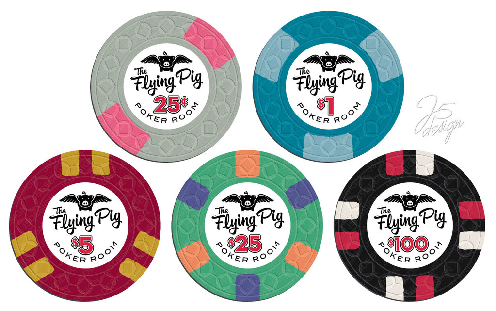
mc_fp_mock_final.jpg
 
Last edited:
your pig image is fawesome and i also love the flying pig font.

the only thing i am not a huge fan of regarding the inlay is the POKER ROOM wording, it looks too spread out or something. not sure how I would fix it and its a very small issue
 
I would try charcoal as the base for the quarter. IMO almost any bright color spot will look good on it and it'll contrast nicely with the imp blue(?) base of the $1 chip
 
your pig image is fawesome and i also love the flying pig font.

the only thing i am not a huge fan of regarding the inlay is the POKER ROOM wording, it looks too spread out or something. not sure how I would fix it and its a very small issue

your pig image is fawesome and i also love the flying pig font.

the only thing i am not a huge fan of regarding the inlay is the POKER ROOM wording, it looks too spread out or something. not sure how I would fix it and its a very small issue

Thanks for the input! J5 did a great job on these. The inlay designs are all done, I decided to go without community input for these because I wanted to make sure it matched my vision and didn't get too distracted by what other people liked. I think with a less spread out text on the bottom it would be too small a curve and wouldn't as nice, personally


I would try charcoal as the base for the quarter. IMO almost any bright color spot will look good on it and it'll contrast nicely with the imp blue(?) base of the $1 chip

I like the idea of charcoal and pink (I think my first color selection actually had those) and I can't imagine they would be on the table with the $100s at the same time, but I am afraid they might still be too close for my liking. I think I'm probably more likely to end up with a yellow or maybe a lavender or something rather than a color that dark. Charcoal is a possibility, though...
 
Lots of love here for The Flying Pig. Great concept and execution. You and John did a fantastic job with them.

I love the gray and pink quarter. Is that new pink or dayglo pink? I think you need a lighter quarter because Imperial Blue chips are more dark than light and you want some contrast there. Personally, I would shy away from a charcoal quarter for that reason.

The circle-square mold is a nice choice.
 
Nice looking set, I'm not a fan of the yellow on the 5, although I do not have a solution, and I am not sure that I like the blue on the 25.

It still looks good though, I am a fan of the pig.
 
I agree with manamongkids on the "poker room" font. I think it looks out of place because of the script wording on "The Flying Pig". I also think there could be more pizazz on the $100. The others look good to me.

Love the idea.
 
Great looking set.

Love all the chips except the $25 isn't doing much for me, and I'd be worried about that chip clashing with the $1.

Personally I'd change the spot colors on it to something a bit brighter. Maybe dg peach and retro lavender?
 
I agree with manamongkids on the "poker room" font. I think it looks out of place because of the script wording on "The Flying Pig". I also think there could be more pizazz on the $100. The others look good to me.

Love the idea.

The Hundo is actually my favourite of the set.
 
Here's the $25 with DG peach and retro lav. I do like that a lot better.

The $5 is pretty much non-negotiable. School colors :)


dgpeachretrolav25.png
 
Yeah not the greatest....

Are you married to the spot on the $25? Green chips IMO are the hardest to nail down.
 
Great set! Personally, I love the quarter. You might try switching the 212 on the quarter to top and bottom as a comparison but I love the color combo. I also like your colors for the $25 and would leave it alone if you like the pattern. If I were to change any colors it would be on the $5. Try a red $5 with a dg peach spot as a comparison.
 
Great set! Personally, I love the quarter. You might try switching the 212 on the quarter to top and bottom as a comparison but I love the color combo. I also like your colors for the $25 and would leave it alone if you like the pattern. If I were to change any colors it would be on the $5. Try a red $5 with a dg peach spot as a comparison.

I do think rotating the quarter would be a good idea. For me though, the $5 is the star. USC colored :) That's the chip this set is built around. I'm still pondering the $25 though.

Maybe some Laker colored spots?

lakerchips.png


I could also change the spot on the $1 if I want to use light blue in the $25, but I'm not sure what I would change it to.
 
Let me also cast my vote for Charcoal instead of Gray on the quarters. Their Gray is actually "pale blue" and really misleading; and pink on charcoal really pops!

I like the $1 with the blue spots on the Imperial Blue chip...nice work.

Definitely like your DG Peach/Retro Lav $25.

Not a fan of the $5, but it's your school colors, your set :)

Hundo looks good.

And definitely love the inlay as is! I think your set is well on its way!
 
If the five is the star because of USC's colors than go for it! Of the four shown above I prefer the 412 with the light green base on the right. I also like Stocky's green with the light blue and the bright white a lot!
 
Love these. Flying Pig is what I always order at local Tom-Chee restaurant: turkey and bacon grilled cheese. mmmmm. ;)

The chip design tool wouldn't let me load your inlay as a png or jpg file, dunno why, so apologies for the standard inlay. I've tweaked a few of the colors but you get the idea. A yellow quarter would be sweet with these, I think. And I went with light green $25 and a different spot combo.

flyingpig1.png
 
Lots of love here for The Flying Pig. Great concept and execution. You and John did a fantastic job with them.

I love the gray and pink quarter. Is that new pink or dayglo pink? I think you need a lighter quarter because Imperial Blue chips are more dark than light and you want some contrast there. Personally, I would shy away from a charcoal quarter for that reason.

The circle-square mold is a nice choice.

I just wanted to echo what Marsha said. I'm liking this set a lot and the inlay is awesome! I personally really like the $5 chip.

I do think rotating the quarter would be a good idea. For me though, the $5 is the star. USC colored :) That's the chip this set is built around. I'm still pondering the $25 though.

Maybe some Laker colored spots?

View attachment 11061


I could also change the spot on the $1 if I want to use light blue in the $25, but I'm not sure what I would change it to.

I really like the idea of using light green for the $25, and I agree with stocky; green chips are for sure the hardest chips to settle on. The only thing that bothers me is using the same spot pattern for the $5 and the $25. Maybe something like this?

download (1).png


The only reason I suggested a 614 spot is because on all of the other chips, none of the spots are touching each other and that's something I tried to keep in mind when designing my cash set. I didn't want one denomination having spots that were touching while the rest were separated.
 
Clear $25 winner below. I like the gray quarter, but would go with a brighter pink spot. Keep all the others as-is in the first post.

download-1-png.11066

mc_fp_set1b-jpg.11055
 
These are shaping up real nice!

A minor thing on the inlay that sets my OCDy sense tingling is that the angled Flying Pig text creates additional whitespace to the right of the denom. Most noticeably on the $1 and $5 chips.

Irrespective, love your fp logo. It's kick ass! :)
 
Thanks for the input everyone! I hadn't considered the 6A14 spots before. It looks pretty good. I think it's probably more acceptable for the $25 to have a similar spot color (a yellow) to the $5 than the $1 since the base colors differ so much that mixing them up still won't be an issue.

Toby, I had J5 mock up the same font with straight text when we were refining and the slanted text looks much better to me. Could be worse, at least there's a "g" at the end to take up some of the white space :)
Respectfully disagree. In most sets I find it distracting when a spot color or close family color is repeated, esp the closer the denom, so I usually strive to use unique spot colors to set each chip apart. 4d18 would prolly work better than the 3d18 I posted for the $25. 6a14 is good too but may want more complex spot on the hundo then.
 
I really appreciate everyone's help! I have been staring at my samples and I think I like the DG peach more than the arc yellow for this.

This is where I am right now. I am thinking of going with an offset on the quarter rather than top bottom/left right

FlyingPigColors.png
 
Last edited:
Let me also cast my vote for Charcoal instead of Gray on the quarters. Their Gray is actually "pale blue" and really misleading; and pink on charcoal really pops!

I like the $1 with the blue spots on the Imperial Blue chip...nice work.

Definitely like your DG Peach/Retro Lav $25.

Not a fan of the $5, but it's your school colors, your set :)

Hundo looks good.

And definitely love the inlay as is! I think your set is well on its way!
I disagree. the gray has no blue tinge to it at all imo. its a beautiful base color with the dg pink


Create an account or login to comment

You must be a member in order to leave a comment

Create account

Create an account and join our community. It's easy!

Log in

Already have an account? Log in here.

Back
Top Bottom