catalyzeme
3 of a Kind
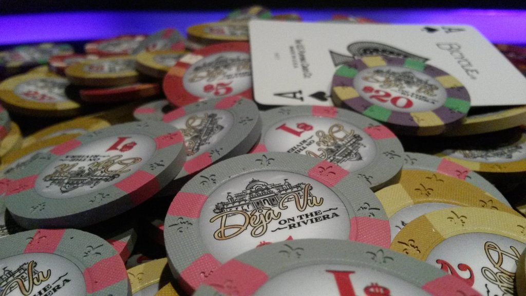
Hey everyone,
I am not 100% sold on the colors I have here, mostly on the quarter and $25 chip. I would love some input on colors here.
The $5 is pretty much set, and I'm happy with the $100 and $1, but I feel like the quarter and $25 could be improved.
I just sent my check in to CPC but I have a few weeks if I want to change colors. What do you think?
EDIT: Updated with final mockup
Last edited:
")
")