MrRossKeys
3 of a Kind
Canary isn't a terrible color, it's just not that bright. I did Dayglo Yellow instead of Canary in one of my sets and I liked it so much more. It's definetely a "light" yellow but it is much brighter.
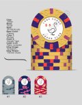
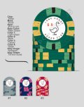
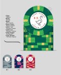
Since your set is only 4 chips you can go with pretty much any of the yellows and it would work. I liked your original $20 more than the latest two that you've uploaded... because the original seems warmer overall and the latest two are yellow with blue/purple cooler spots. Your .25¢ and $1 are already on the cool side, so the progression to warmer $5 and $20 are something I enjoy.
Cheers!