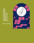
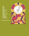
CPC cash is set coming along. Inlay is still extremely rough. I believe I'll be reaching out for help from one of our professionals. I'm pretty locked in on colors. Grey .25 Retro Blue $1.00 Retro Red $5.00 and Canary $20.00 I can't believe how the Scroll mold has grown on me. Have had a shuffle stack for a couple weeks now. I am going to ask Mr. Spragg when the next deadline is. Any input is appreciated.
-
PCF is an eBay Partner. If you make a purchase through one of our links, we may earn a commission at no extra cost to you. Thank you for your support!
You are using an out of date browser. It may not display this or other websites correctly.
You should upgrade or use an alternative browser.
You should upgrade or use an alternative browser.
CPC Cash Set (1 Viewer)
- Thread starter Huskerchipper
- Start date

Natskule
3 of a Kind
Scroll mold goes so well with your logo, should make a wonderful set. Really like the quarter and the one.
drdr
Flush
Shorten the text to 'Lone Goose Poker', since club is implied. Make the text one continuous string rather than separated, start it at the goose's tail wrapping around to the beak. That frees up the area to the upper left of the goose (which already has more empty space) for a larger chip value that is easily seen.
/ sorry, complete newb on design.
// is just what leaped out to me.
/ sorry, complete newb on design.
// is just what leaped out to me.
Natskule
3 of a Kind
That logo would make a great hot stamp.
You had me until the spot colors on the 20. I know they’re different from the colors on $1 but it still feels like you’re moving back in that general direction.
I would go a completely different route, maybe throw in one of the greens and/or dg peacock. Looks great on canary.
I would go a completely different route, maybe throw in one of the greens and/or dg peacock. Looks great on canary.
OfficerLovejoy
Full House
Agree with Erik. The first three denoms are awesome though.
Definitely! Great job on thoseThe first three denoms are awesome though.
Love where you’re headed with the inlay. Professional help should get it to the finish line no problem.
Agreed with others that the $20 colors need work
One general spot thought, I think there’s something very heavy about the v12 spots that clashes with the delicate line drawing on the inlay and in some ways also the scroll mold in general. Give that some thought
Agreed with others that the $20 colors need work
One general spot thought, I think there’s something very heavy about the v12 spots that clashes with the delicate line drawing on the inlay and in some ways also the scroll mold in general. Give that some thought
improviseallday
Flush
Agree that I would love to see a hotstamp version of this set. Single line grawing plus scroll mold is a win.
The denom should be way larger for legibility, it could fit in the top left if you shift the goose toward the bottom right.
If you decide to keep the top text instead of merging as @drdr recommended, I would move it away from the edge a little, matching your bottom text.
The denom should be way larger for legibility, it could fit in the top left if you shift the goose toward the bottom right.
If you decide to keep the top text instead of merging as @drdr recommended, I would move it away from the edge a little, matching your bottom text.
MrRossKeys
3 of a Kind
I like all of your base colors except canary. I’ve ordered 3x cpc sets and 2 of them included a canary base color, and it’s my least favorite of both sets. Do you have samples? If you’ve compared it and like it better than the other “yellow” options then ignore me. However, the computer graphic of canary is more vibrant than the actual color in hand in my opinion.
- Joined
- Jul 12, 2020
- Messages
- 10,690
- Reaction score
- 16,809
- Rewards
- 257
Arc Yellow $20. You're welcome!
Three tips.
1. Click on the background button on the left. Try the gray.
2. You can save all the chips in a single set, then create a single PNG image containing all of them- it’s a much better way to view them as a set.
3. You can save the PNG image directly so the image appears cleanly in the post- much better for us to view your chips and provide feedback.
Hit me up if you need help with any of those three.
I feel like you're required to use Canary and Peacock in there somewhere.
OP
OP
I completely agree and have had a similar vision. It was simply my first time playing with Canva to try to make something resembling an inlay...lol!Shorten the text to 'Lone Goose Poker', since club is implied. Make the text one continuous string rather than separated, start it at the goose's tail wrapping around to the beak. That frees up the area to the upper left of the goose (which already has more empty space) for a larger chip value that is easily seen.
/ sorry, complete newb on design.
// is just what leaped out to me.
OP
OP
Thanks for the feedback. I understand what your saying and I would have never thought about that. I'll kick that around but wanted some edge spots different than my other CPC chips that incorporate 14 or 18 edge spots.Love where you’re headed with the inlay. Professional help should get it to the finish line no problem.
Agreed with others that the $20 colors need work
One general spot thought, I think there’s something very heavy about the v12 spots that clashes with the delicate line drawing on the inlay and in some ways also the scroll mold in general. Give that some thought
CPC cash is set coming along. Inlay is still extremely rough. I believe I'll be reaching out for help from one of our professionals. I'm pretty locked in on colors. Grey .25 Retro Blue $1.00 Retro Red $5.00 and Canary $20.00 I can't believe how the Scroll mold has grown on me. Have had a shuffle stack for a couple weeks now. I am going to ask Mr. Spragg when the next deadline is. Any input is appreciated.
I like your inlay design but your denom is very small. I think the overall chip utility would benefit from offsetting the bird a bit left and adding 4-8 points to your font size for the denom only.
Also, the canary chip seems a bit busy for my tastes. However, I tend to prefer more simple/traditional spots so if that one works for you, go for it.
OP
OP
I agree on the denomination. I was just trying to play with Canva and the inlay isn't even nearly complete. Thank you for your input.I like your inlay design but your denom is very small. I think the overall chip utility would benefit from offsetting the bird a bit left and adding 4-8 points to your font size for the denom only.
Also, the canary chip seems a bit busy for my tastes. However, I tend to prefer more simple/traditional spots so if that one works for you, go for it.
OP
OP
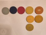
I do have color samples...thoughts on Dayglo Saturn??? That was my initial pick then I changed to Canary.
Generally that color is a hard pass for me. But I’ve seen a couple of examples where people actually managed to pull off a saturn base. Course, I’ve never seen any of those ones in real life but looked good on photos at least.View attachment 1223364
I do have color samples...thoughts on Dayglo Saturn??? That was my initial pick then I changed to Canary.
OP
OP
Found the set I was thinking of:
https://www.pokerchipforum.com/thre...wagon-wheel-high-roller-tournament-set.55260/
https://www.pokerchipforum.com/thre...wagon-wheel-high-roller-tournament-set.55260/
improviseallday
Flush
I'm not a fan of any of the CPC yellows. Is it sacrilege to go with arc yellow?
OP
OP
Hmmmmm...Thats a second vote for Arc Yellow. I have it right here in front of me and to my eyes it's a light orange that just isn't doing it for me. I still think I like the Canary. Doesn't mean I don't value your opinions....much appreciated. I might be missing something. The Canary is the one without the HotStamp showing.I'm not a fan of any of the CPC yellows. Is it sacrilege to go with arc yellow?
Attachments
Last edited:
OP
OP
Thank you. I do think Dayglo Saturn is a very difficult base chip color. I'm taking it out of consideration.Found the set I was thinking of:
https://www.pokerchipforum.com/thre...wagon-wheel-high-roller-tournament-set.55260/
improviseallday
Flush
I think it's just personal preference. IMO, CPC has no true yellows, arc is the best orange-yellow, and canary is too light and unsaturated to be a base color.Hmmmmm...Thats a second vote for Arc Yellow. I have it right here in front of me and to my eyes it's a light orange that just isn't doing it for me. I still think I like the Canary. Doesn't mean I don't value your opinions....much appreciated. I might be missing something
But you have the samples, so you know best about what you like!
OP
OP
I have been doing a ton of reading the last month. The dissatisfaction with CPC's Yellows are a common topic. Thank you for your input. Obviously there are others that feel the same as you do. I am undecided at the moment.I think it's just personal preference. IMO, CPC has no true yellows, arc is the best orange-yellow, and canary is too light and unsaturated to be a base color.
But you have the samples, so you know best about what you like!
OP
OP
Last edited:
They aren’t TRK-leaded-yellow brilliant, but CPC yellows (canary, yellow, butterscotch) have a warm look and can be wonderful if you use them correctly.I have been doing a ton of reading the last month. The dissatisfaction with CPC's Yellows are a common topic. Thank you for your input. Obviously there are others that feel the same as you do. I am undecided at the moment.
OP
OP
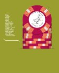
Anyone think this simpler edge spot selection would fit this set better?
OP
OP
Similar threads
- Replies
- 3
- Views
- 616
- Locked
- Replies
- 29
- Views
- 2K