You are using an out of date browser. It may not display this or other websites correctly.
You should upgrade or use an alternative browser.
You should upgrade or use an alternative browser.
CPC Cash Set (1 Viewer)
- Thread starter Huskerchipper
- Start date
Normally I like shaped inlays, but with the amount you're trying to fit, it would force everything to be even smaller, don't think it makes sense here.
Huskerchipper
3 of a Kind
I'm not sure yet either. We will see once the inlay is further along. Again the inlay was a VERY rough draft. I want to try moving the goose up and the words under.Normally I like shaped inlays, but with the amount you're trying to fit, it would force everything to be even smaller, don't think it makes sense here.
Natskule
3 of a Kind
Love shaped inlays, but they are tough to make look right.
Huskerchipper
3 of a Kind
I agree... the drastic limitation of inlay size is tough to get around imoLove shaped inlays, but they are tough to make look right.
maxim_666666
Flush
For me also.. Canarri is too light and paleI think it's just personal preference. IMO, CPC has no true yellows, arc is the best orange-yellow, and canary is too light and unsaturated to be a base color.
But you have the samples, so you know best about what you like!
DG is light and pale. Canary is darker.For me also.. Canarri is too light and pale
DG Yellow on the left, Canary on the right. (Paulson in the center, but not sure which yellow)
Huskerchipper
3 of a Kind
Fantastic example of the CPC Yellows!! I have decided to go away from yellow all together. This is where i am right now with the set. Probably wont do the .50¢ lavendar but have it in there as a possible addition down the road.DG is light and pale. Canary is darker.
DG Yellow on the left, Canary on the right. (Paulson in the center, but not sure which yellow)
View attachment 1227798View attachment 1227799
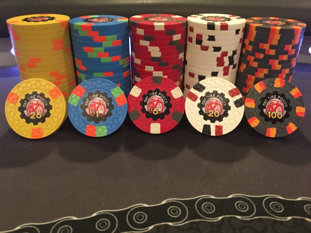
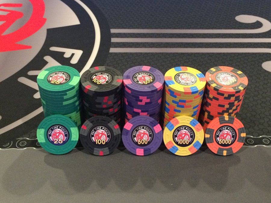
My main advice is take your time. Many great sets take months, even years to complete and tweak.. I spent about two years on my Fat Tire build, and I went through so many changes and iterations, I can't imagine what I'd have gotten had I rushed...
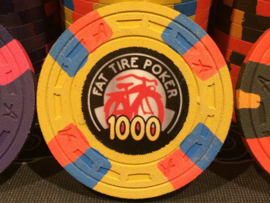
Also, don't be swayed from yellows, if that's your wish. I think CPC yellows can't compare to Paulson, but it shouldn't be a comparison. CPC yellows can look vibrant, but it depends greatly on the contrasting spot colors you use. Here are my canary chips in both my FT sets.


Also, don't be swayed from yellows, if that's your wish. I think CPC yellows can't compare to Paulson, but it shouldn't be a comparison. CPC yellows can look vibrant, but it depends greatly on the contrasting spot colors you use. Here are my canary chips in both my FT sets.
Last edited:
Huskerchipper
3 of a Kind
Absolutely and thats excellent advice. Hell i just finished my order with CPC that i started designing over 15 years ago with ASM. Anyways, there is no rush in this one either as Scroll Mold is in production right now so we are about a year out. I do want to make that deadline though for next years run. Im pretty much at peace with my current color/spot selection. I know exactly what u mean by changing i have made probably 6 changes in the last 48hrs...lol. The yellow wasn't a huge deal either. I plan on that chip being the $20 so it seemed like an obvious choice to try a Yellow. I have no problem marking the Green chip a $20. Thank you for the excellent Canary examples in your sets. I do have a Canary $20 planned on my next tournament set for certain. Im going to start focusing on the inlay here soon.My main advice is take your time. Many great sets take months, even years to complete and tweak.. I spent about two years on my Fat Tire build, and I went through so many changes and iterations, I can't imagine what I'd have gotten had I rushed...
Also, don't be swayed from yellows, if that's your wish. I think CPC yellows can't compare to Paulson, but it shouldn't be a comparison. CPC yellows can look vibrant, but it depends greatly on the contrasting spot colors you use. Here are my canary chips in both my FT sets.
View attachment 1227998View attachment 1227999View attachment 1228000
Last edited:
kirchhausen
Flush
Oooh I really like that inlay design!CPC cash is set coming along. Inlay is still extremely rough. I believe I'll be reaching out for help from one of our professionals. I'm pretty locked in on colors. Grey .25 Retro Blue $1.00 Retro Red $5.00 and Canary $20.00 I can't believe how the Scroll mold has grown on me. Have had a shuffle stack for a couple weeks now. I am going to ask Mr. Spragg when the next deadline is. Any input is appreciated.
Huskerchipper
3 of a Kind
Thank you very much for the kind words. I am going to work on finishing the inlay here soon. It is a fairly good rough draft but i think i need someone to fine tune it and give it some finishing touches.Oooh I really like that inlay design!
You had me until the spot colors on the 20. I know they’re different from the colors on $1 but it still feels like you’re moving back in that general direction.
I would go a completely different route, maybe throw in one of the greens and/or dg peacock. Looks great on canary.
DG is light and pale. Canary is darker.
DG Yellow on the left, Canary on the right. (Paulson in the center, but not sure which yellow)
View attachment 1227798View attachment 1227799
If I could add ONE color to CPC's repertoire it would be the exact yellow in the center.
CPC's dg yellow has just the slightest hint of green in its tinge; while, their canary is dingy on the rolling edge given the brass flakes. IMHO they have no good yellow unless one is ok with dg arc yellow in their set (which is yellow-orange, but a stellar color).
ThatVeritas
Pair
Damn....hard to go with a CPC yellow with that Paulson comparison in between them!DG is light and pale. Canary is darker.
DG Yellow on the left, Canary on the right. (Paulson in the center, but not sure which yellow)
View attachment 1227798View attachment 1227799
I think the lighting is at play there, it’s a bit brighter to me; still, more fall than spring. It’s definitely not as bright as Paulson or the historic TRK yellow.Damn....hard to go with a CPC yellow with that Paulson comparison in between them!
Similar threads
- Replies
- 31
- Views
- 1K
- Locked
- Replies
- 20
- Views
- 1K
- Replies
- 7
- Views
- 425
