BLADES (v.2) CPC Mock-ups and ideas (2 Viewers)

Phantom

Full House
Joined
Nov 6, 2014
Messages
2,667
Reaction score
3,797
Location
Blades
Hi,

Even the stalwart members of Blades understand that after 240 years, some things must change. This thread is not for discussing the 'whys' and the 'wherefores' as such (this is dealt with at committee level), but rather, how Blades will come into the 21st Century.

My dabble into the Casino Royales made me realise how much fun the extra spot colours could be :).

(1) I want to maintain the Blades theme as I have no other interests that I would like to combine with this project. (My ANZAC Club project was something I pored over a great deal, for a long time, but have decided the pending book is the medium best able to serve that cause).

(2) In recent times I have found myself drawn to the Bellagio/Aria chips, particularly the 1K and 5K. The inlays are also simple and elegant and what I would like for Blades V.2.

(3) Am probably going to change to CSQ to achieve a nice clean 1" inlay. I love the B-mold, and yes it suits the theme, but probably not a nice clean 1" inlay. The CSQ has no 'theme' as such, so it should not be a problem. I can live with knowing there is a B-mold in existence, and not use it on a B-themed set :).

(4) We play a 6-handed (sometimes 7), game, 1/mth for 25c/25c ($25max buy-in) at the moment. I think they would be okay with 25c/25c with a Max $50, but will have to work up to it. The crew are generally not aggressive betters as such and will mostly use the 25c, however, we can loosen up from time to time.

(5) From all the great threads and advice on breakdowns, I figure we need 120 x 25c; 180 x $1; and 50 x $5 to allow up to 7 people to play for up to $50. I personally don't feel like losing that much in one night, so I cannot see us going up or needing more than that.

(6) We play mainly NLHE, but have recently branched out into PLO. I know, boring :). I am learning 7-card stud, - but this would be a Limit game, and I may throw in some 5-card draw .

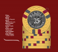
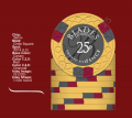
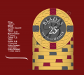
(7) The CDT mock-ups are for the yellow 25p, based on the Bellagio/Aria $1K. I would like to keep it a Level 3. I lean towards the 412 on this. Any thoughts are welcome.

1654a369-5b0a-4a29-89ee-d587b033d7b5.png

c919f017-0f07-4fa7-8fca-b23c6d0a30f1.png 39e4b11b-5ec1-4ccc-8682-3f4c3352be2b.png 815cc88c-a48a-423d-aaf1-409f9f90408d.png b42d85e5-f759-4997-9414-e515e6c9f6b8.png

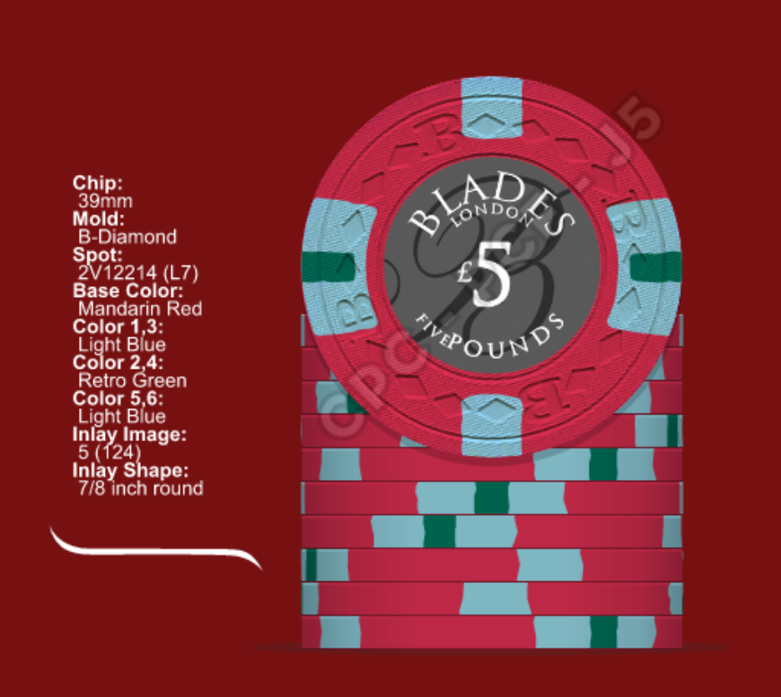
(8) The CDT mock-up for the white 814 is based on the Bellagio/Aria $5K, and has been a chip I have wanted to do for ages. It almost made it into the CR line-up as the 100K. I went between Mandarin Red and Retro Red several times, but think Mandarin might be best. Any thoughts are welcome, but I think this chip is the reason for the set... :)
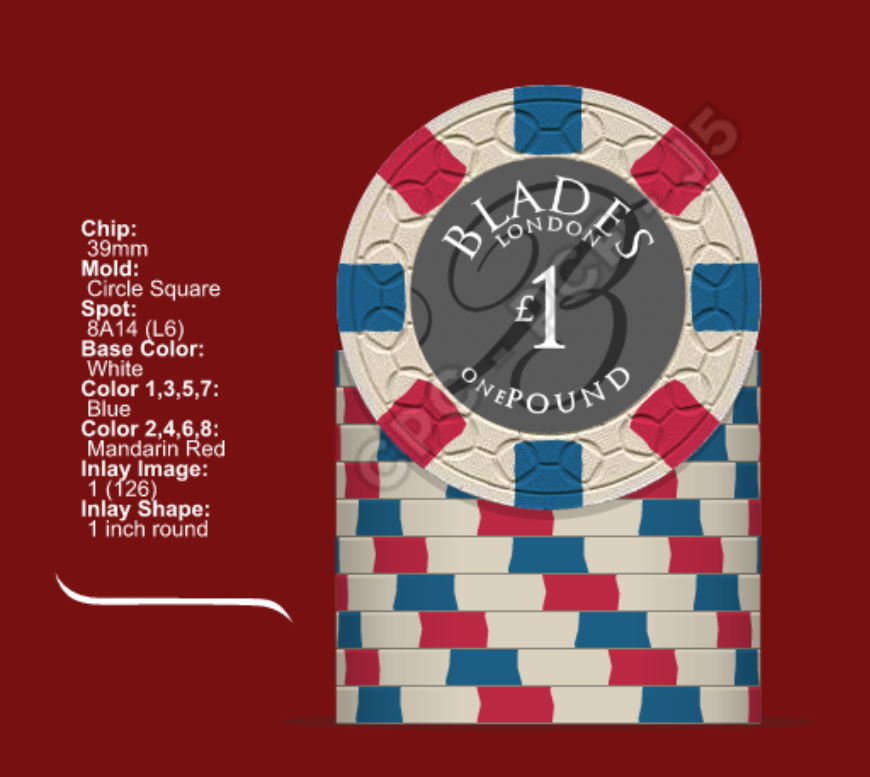
29abcb02-a39f-408a-b899-786c73648869.png


(9) The CDT mock-up for the 5 has been the most challenging - am willing to go to Level 4 I reckon. I mocked this up loosely based on the Bellagio/Aria $500, but later saw it also looked like the Horseshoe one more obviously. This is one I would welcome ideas and thoughts on the most.
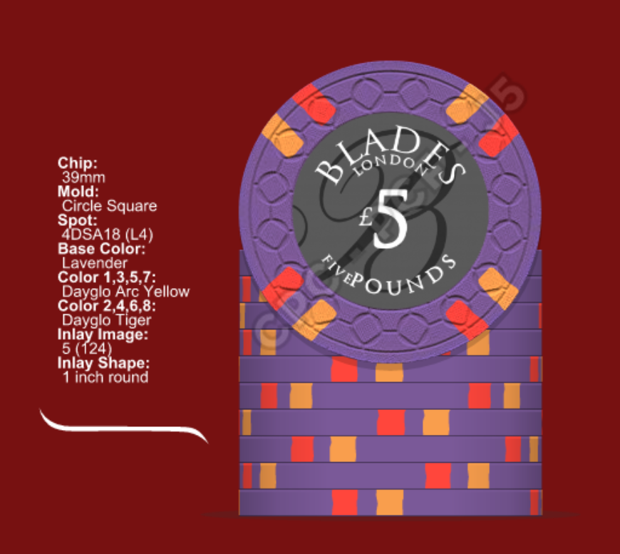
fab48aa0-a206-4cc2-ac83-d30ff229b27a.png


441048a6-c2ef-40a9-885d-d37af2b41d74.png


(10) Inlays are a tribute based on Bellagio.


Anyway, happy to hear you thoughts and receive input and suggestions as always.

Cheers,
 
Last edited:
Wow. First off, I love the inlays! You've obviously put a lot of thought into this update and you are well on your way. I think the CSQ would be a great choice for this project.

For the 25p, I like 3DSA316 spot the best, followed by the 4A14. I think the colors are spot on.

On the 1£, I'm torn... I love that chip. Buuuut.... It's pretty complex. You then follow up with a chip that's way less complex.

I'm a fan of your 5£ for sure. Nice color combos.

Those chips are great individually, but I think the L6 1£ stands out a bit too much when the other chips.

On the breakdown, you're at 350. I'd add 30 more 5£ chips and then a barrel of 20£ chips.

Overall, great direction, just need to resolve the cohesiveness of the set.
 
Thanks mate. The wording sizes being different make it interesting.

Yes, I am leaning towards the 3DSA... the more I look at it :)

I know what you mean by the 1 :), but I really want to see stacks of that on the table haha.

I had another idea for the 5 which is attached, and might flow better. What do you think?

0355154d-d03f-4b22-bb3a-71f5d4db79b3.png


8bb0698f-6ce9-4fce-91c0-742ca2ae82b1.png


I had mocked up some 20, but in all honesty, we'll never use them and my budget is limited :).

Thanks so much for taking the time check it out and provide feedback, please continue to do so :).
 
I like that five, but as individual chips, I like the purple five a bit better. The color combo reminds me of this.

10430.jpg


As a set, I think that 5 works better due to the increase in complexity, BUT (sorry!) that's a lot of red across the chips. I've been tinkering in CDT, but nothing solid yet...

We can make this 1 work!

Edit: Also is 1" GTG on the CSQ? CDT throws a warning.
 
Cheers mate :)

It does seem a lot of red doesn't it? The latest red 5 is borrowed from the Bellagio/Aria 25K though :).I think I would prefer a lavender though. Can't wait to see what you come up with in CDT.

My understanding is the 1" works a treat (@Mr. Cheese did a fine job on the Gangster Squad). Have also sent an e-mail to David Spragg to confirm. Cheers (y) :thumbsup:

What about this purple version with same spot colours, but a little more complex (L9) :eek: was the original one, but cost .... David confirmed it is doable.

8dd3e72e-aed0-4302-9c9c-00916b26628e.png
f30a44ae-ef70-488e-a183-b7ffa5eeacc7.png
 
Cheers mate :)

It does seem a lot of red doesn't it? The latest red 5 is borrowed from the Bellagio/Aria 25K though :).I think I would prefer a lavender though. Can't wait to see what you come up with in CDT.

My understanding is the 1" works a treat (@Mr. Cheese did a fine job on the Gangster Squad). Have also sent an e-mail to David Spragg to confirm. Cheers (y) :thumbsup:

What about this purple version with same spot colours, but a little more complex (L9) :eek: was the original one, but cost .... David confirmed it is doable.

View attachment 65999 View attachment 66000

Looking good! Yeah 1 inch is fine for the inlay as long as no font is close to the edge.
 
Cheers mate :)

It does seem a lot of red doesn't it? The latest red 5 is borrowed from the Bellagio/Aria 25K though :).I think I would prefer a lavender though. Can't wait to see what you come up with in CDT.

My understanding is the 1" works a treat (@Mr. Cheese did a fine job on the Gangster Squad). Have also sent an e-mail to David Spragg to confirm. Cheers (y) :thumbsup:

What about this purple version with same spot colours, but a little more complex (L9) :eek: was the original one, but cost .... David confirmed it is doable.

View attachment 65999 View attachment 66000

Good to hear the 1" is GTG. (y) :thumbsup:

I like that chip, but I believe I read in another thread that the middle spot can't be matched to the base color. Also, I don't believe the effect is dramatic enough to warrant the price increase. If you're going to pay that much, I'd rather bump it up to L10 and use this one.

Solves the complexity issue and is friggin' awesome. Downside, it L10! :eek:

ded79fc2-a964-4c1e-b295-051b4f86aca0.png


Other, more budget options. I agree with lavender base being the better base color option here.

456891ef-86a3-4237-9bda-5b0debd129d3.png
 
I read that too, and it was my concern, but David said it would be fine :). I agree about the 'effect' for the $$$ :), so (L9) is out of my price range for sure, let alone L10 haha. It is one that I mocked up though :), just a bit too busy.

If I were to go a 3-spot pattern on the 5, I feel that I would have to revisit the 25p and take it back to a 4-spot perhaps. Or 4 spot for the 5. Getting the balance right ... :)

Thanks for the suggestions, will keep tinkering and see what else comes along :).

Cheers,
Adam
 
Nice one - the top one.

4467c8bb-629f-48d4-a860-97a80867ad69.png


And with 412, so I have a variety of spot types between 25p and 1. Same price.

cced2225-9733-4e9c-8d30-a5d2b40dd637.png


Also with 4DSA318 (L4) same price - more discreet spots.

1adf41ca-2f2d-47cf-a875-8e13a8f74e50.png


73c4d62d-55f4-40c3-bbd5-5c8674228d1b.png


fghxhc.png
 
Last edited:
Right, I sure know how to add stress to my life. I had been planning on this being a B-mold job, and had until the end of the year before I had to order. Two days ago - I think "This is a CSQ job". I check with David and I now have about 10 days to get this sorted. Haha, honestly. Still, I have been thinking on this for a while, so not a huge drama.

Open to any ideas regarding the 25p and 5 :).
 
Nice one - the top one.

View attachment 66018

And with 412, so I have a variety of spot types between 25p and 1. Same price.

View attachment 66019

Also with 4DSA318 (L4) same price - more discreet spots.

View attachment 66020

View attachment 66026

View attachment 66027

Adam,

I don't care for the one dollar chip for a couple of reasons. 1. I don't think it rolls well with the other chips. 2. It was a CT chip. I think this set deserves it's own color and spots.

As you know. As a stand alone chip I love it. I just don't love it for Blades 2.0
 
They're a little heavy on red tones across chipes. I'd try to get some additional colors in there to mix things up a bit... Lovin' the new design!
 
Perhaps this for your 1? I like red too but it emphasizes the blue more

canvas.png
 
What about swapping the flag to the $5 chip. I know you want big stacks of them in the game, but making the $5 the best looking chip means that people having a good night will have the big stack of the awesome looking chip. Makes the reward of running good that much sweeter.
 
Morning all,

Many thanks for taking the time to make comments and provide feedback, it is much appreciated.

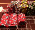
I should have posted these pics as well, although I am sure everyone knows what I am talking about with the Bellagio/Aria colour line-up between 500 and 25K. It is rather heavy on the red for sure. Just because they do it, doesn't make it right, I know :). Thanks for the feedback as I happen to agree that it would be too much red in a 3-denom set, cheers.

chips.jpg dan-bilzerian-chips.jpg

I guess the main reason for this set is the use of the 1 as the work-horse/flag-ship of the set. In our style of game, it will see the table more often than the 5, and in the numbers we are using, only the 1 can stack.

I did orginally mock it as white with Retro BLue/Retro Red, but thought it was a bit to severe. I think I prefer the muted colours.

be44e9a1-d3cc-4a96-9bc6-b9e6a2ebda67.png

That said, I should also add that I have only ever been drawn to a few poker chips in my life where I have mocked them up incessantly. The Bellagio/Aria 5000 is one, and the WSOP 5000 would be the other. From watching High Stakes Poker for years, I also got to like the Golden Nugget 500 and 1K. The 1K can't be replicated so I thought a tribute to the colours of the 500 and add the lavender to this set in that fashion. As such, I have inlcuded a previous mock with the WSOP 5K as the 25p, and the new 5.

I also like the charcoal Samurai Palace, so could use that as 25p.

The stacks would start with 20 x 25p, 25-30 x 1, and the rest 5 (3 - 4). So you see, the two bigger lots if chips are the 25p and 1 :).

I hope it doesn't sound obstinate, or strike you as pointless to comment if I won't change the 1, but I am happy to muck around with the 25p and 5 to make it fit. I'm not sure if flow is something I am overly concerned about. What do you think of these as a line-up? :)

007B.png
007C.png

007D.png
007E.png


Adam,

I don't care for the one dollar chip for a couple of reasons. 1. I don't think it rolls well with the other chips. 2. It was a CT chip. I think this set deserves it's own color and spots.

As you know. As a stand alone chip I love it. I just don't love it for Blades 2.0

Thanks Bill, as always I look forward to your honest appraisal bloke. (y) :thumbsup: I just can't get it out of my head. How does it look in the new line-ups mate?

They're a little heavy on red tones across chipes. I'd try to get some additional colors in there to mix things up a bit... Lovin' the new design!

Hey Toby, cheers mate. Good advice on moving away from the bloodbath mate - what say you to the new line-ups and reasonings?

I think I'm a fan of the varied-sized fonts, but the lack of space between the number and pence/pound irks me.

Loving the set concept and direction, though.

Hullo MN, cheers mate, I can take care of that in the final draft, perhaps move it a smidge. Cheers.

Perhaps this for your 1? I like red too but it emphasizes the blue more

View attachment 66064

Thanks Mr. C, but at 180 x (L11), ouch haha. I did mock it up though. How does the line-up look now do you think?

What about swapping the flag to the $5 chip. I know you want big stacks of them in the game, but making the $5 the best looking chip means that people having a good night will have the big stack of the awesome looking chip. Makes the reward of running good that much sweeter.

Hey Ad, looked at swapping colours, but there just won't be enough 5's in play for the big stacks and with our style of game, the (3-4) 5's everyone starts with, will most likley be still in front of them haha. Our game is definitely 25/1 dependent for the most part.


Thanks all,
 
What about swapping the flag to the $5 chip. I know you want big stacks of them in the game, but making the $5 the best looking chip means that people having a good night will have the big stack of the awesome looking chip. Makes the reward of running good that much sweeter.

I think this may be the answer given the budget.
 
Hmmm I love both the orange quarter and the yellow fiver but not in the same set. So in keeping the orange quarter, i mocked my suggestion for a purple fiver. Just throwing it out there.

I love where you're heading man!

IMG_1435.PNG
 
Hmmm I love both the orange quarter and the yellow fiver but not in the same set. So in keeping the orange quarter, i mocked my suggestion for a purple fiver. Just throwing it out there.

I love where you're heading man!

View attachment 66125
I love this lineup, but I think the L10 fiver is off limits. We're trying to pick a lower level spot that has the look of added complexity from the 1, but at a lower level.
 
Ah gotcha. I figured Phantom didn't need that many of em so...it's easy to spend other peoples money. :D

You could still use your lvl 4 pattern from above I think then.

IMG_1436.PNG
 
Last edited:
Hey @dew4au and @72o , thanks for the input chaps :).

Ah gotcha. I figured Phantom didn't need that many of em so...it's easy to spend other peoples money. :D

You could still use your lvl 4 pattern from above I think then.

View attachment 66126

Haha, love it ^^^ yes, believe me, some of the L10 and L11 spots are good. I have never considered green for the 5, so it will take some thinking - thanks for the mock. I also seem to prefer the 4V12 to the 3V12, and it is the same price would you believe. Any particular reason we should go with 312? :)

I appreciate your earlier observation regarding the orange 25p and the yellow 5, and it was a thought of mine, then I saw the Mapes line up, and it seemed to work :).

For some reason the 4DSA316 and 318 are the same price, so I thought 318 to ease up on the red if I went the yellow 5. I also thought perhaps a charcoal 5 with yellow/blue spots

Whaddya think?

b283c773-72ba-410f-ac7e-875900a865aa.png
 
Last edited:
Hey @dew4au and @72o , thanks for the input chaps :).


Haha, love it ^^^ yes, believe me, some of the L10 and L11 spots are good. I have never considered green for the 5, so it will take some thinking - thanks for the mock. I also seem to prefer the 4V12 to the 3V12, and it is the same price would you believe. Any particular reason we should go with 312? :)

I appreciate your earlier observation regarding the orange 25p and the yellow 5, and it was a thought of mine, then I saw the Mapes line up, and it seemed to work :).

For some reason the 4DSA316 and 318 are the same price, so I thought 318 to ease up on the red if I went the yellow 5. I also thought perhaps a charcoal 5 with yellow/blue spots

Whaddya think?

View attachment 66133


I think I like the second row best.
 
Still like second row. I like that charcoal base 5, but with the inlay and the amount of gray and black on the 25p, it makes the whole set look a Lil dark.
 
Still like second row. I like that charcoal base 5, but with the inlay and the amount of gray and black on the 25p, it makes the whole set look a Lil dark.

Good call, more of a white inlay kinda thing. I like the second row, but still liking the first row :).

BTW @72o , our previous 'arrangement' carries over to this set :)
 
  • Like
Reactions: 72o
Good call, more of a white inlay kinda thing. I like the second row, but still liking the first row :).

BTW @72o , our previous 'arrangement' carries over to this set :)
Hey man...very generous but not necessary! This is fun though. (y) :thumbsup::)
 

Create an account or login to comment

You must be a member in order to leave a comment

Create account

Create an account and join our community. It's easy!

Log in

Already have an account? Log in here.

Back
Top Bottom