FordPickup92
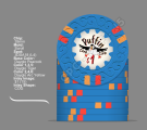
Royal Flush
I love love love the red denom! Cool mock ups! Can't wait to see how they turn out. I like scroll here, also a big fan of CSQ
 I searched for half an hour for cracked eggs vector images but all I found ain't fit at all to the overall theme... Since the puffin is Cartoon-ish the egg must be as well but it looks weird below the puffin ...
I like the slight tilt as well. A significant part of my life has been spent chasing waterfowl across the US and Canada and thats EXACTLY what those kind of birds look like coming in. Look at any artwork of waterfowl and you will see this slight tilt on a very significant amount of pieces. Its honestly kind of iconic to these types of birds.Thx for the suggestion... Yeah, I know exactly what you mean... But there is a little problem here since the Puffin vector is out of axis itself... I don't know if you can see it by rotating the zoomed in Inlay until the Puffin is horizontaly alligned: it just ain't look right ... and honestly I like the non alligned look here very much. I already tried to use a stronger off-axis but it ain't work very good since I have to adjust the text as well.

I actually agree with this 100% and I would go all DG Tiger as well. I am also hoping the Mandarin Red shows up on the Maroon as well as it does here. I will have to look at my color samples when I get home.I think the text is vastly improved on this latest iteration vs. previous versions.
The only thing that stands out to me are the DG Tiger/Peach edge spots on the NCV chip - to me they’re a miss. IMO, all DG Tiger or all peach would be an improvement (Tiger would be my choice)
I appreciate the use of maroon here. It's an under used color (though, for reasons that make sense considering how dark it is when seen in person). I've never figured out a way to incorporate it in any of my customs. It looks good here and works well in the set. I'm looking forward to seeing pics of these when they show up!The reason for the Mandarin Red was that it has a bit orange in it compared to the other reds so it will match the warm color tone of the maroon nicely...
Strong tendency for the double row here too!I made a last change to the "special" chip since I wasn't sure which way to go: all in chip / NCV or Nit... And so I came back to my first idea and I came up with these two new versions by using "Iceland" as some sort of a neutral text without limiting the intended use... I like both versions, with little tendencies towards the bigger text using two rows...
View attachment 1291350
View attachment 1291351
I thought a lot about a way to include Spot colors but in the end I had no "good" idea how to realise that in a nice way... I could use the spot colors alternately for each letter of the second text layer behind that black front letter... But since this layer obviously will be hard to see on a 7/8 inch inlay I ain't sure if this will be a good idea... I hope to get some time today to test this... Thx for the suggestion!!An idea that you could play with is to change the text colour of Puffin Card Club to match the darkest clay colour on each chip. Or maybe not the text itself but the colour of the shadow…
So. I actually found some time to make these adjustments today - I took all the edgespot colors to use these for the shadowed background text layer... long story short: my wife thinks, that it looks too busy on some of these chips, and I think that's true... on the 25ct chip it wasn't a good idea to use the bright white since it was too hard to see, even on the bigger images. On a real chip I bet that it wouldn't be visible at all, so I used the base color as the second color...An idea that you could play with is to change the text colour of Puffin Card Club to match the darkest clay colour on each chip. Or maybe not the text itself but the colour of the shadow…
 Not sure if that's worth much though! LOL
say no moremy wife thinks,
")
I am blessed since she accepts all my purchases so farsay no more
 man, that's a gooood wife!!! so in the end I have no complain ....