CPC Custom Set - Hotel Rubidoux (2 Viewers)

Salmonblaster

Two Pair
Joined
Feb 25, 2023
Messages
253
Reaction score
572
Location
Riverside, CA
With my Flamingo set designed for now and awaiting my ability to order, it's time to share another project I've been tinkering with in the meantime.

I think this one would be my CPC purchase if I ever get to that point, since the look of it feels like it is screaming out for compressed clay craftsmanship. I may order it on another medium in the meantime to be able to play them sooner, but this one would ultimately be my keeper set next to the good bourbon and cigars, so to speak.

For some backstory on the idea, there is a generally widely known landmark in Riverside known as Mount Rubidoux. The locals know it from the steep hiking trails, large cross at the top and for catching fire every July 4th when the fireworks go off...iykyk.

As the story goes, in the late-1880s, a development group had plans for a sprawling hotel and resort to sit atop the mount, facing downtown Riverside. With the real estate boom in full effect, the idea was to capitalize on that by making the picturesque resort a destination for all of Southern California and her newest residents.

With construction issues, weather issues and budget overruns, the plan never got past the foundation and some framing work before it was ultimately abandoned as the boom market fizzled before the 1890's had begun. All that's left are some drawings and stories about what was meant to be.

After taking all of this fascinating information in, I decided to make a California colored poker chip set. I it based on what it could have looked like in a fantasy world where the hotel was completed, a casino was integrated into the site and the site became a gambling mecca for SoCal at the start of the 20th century.

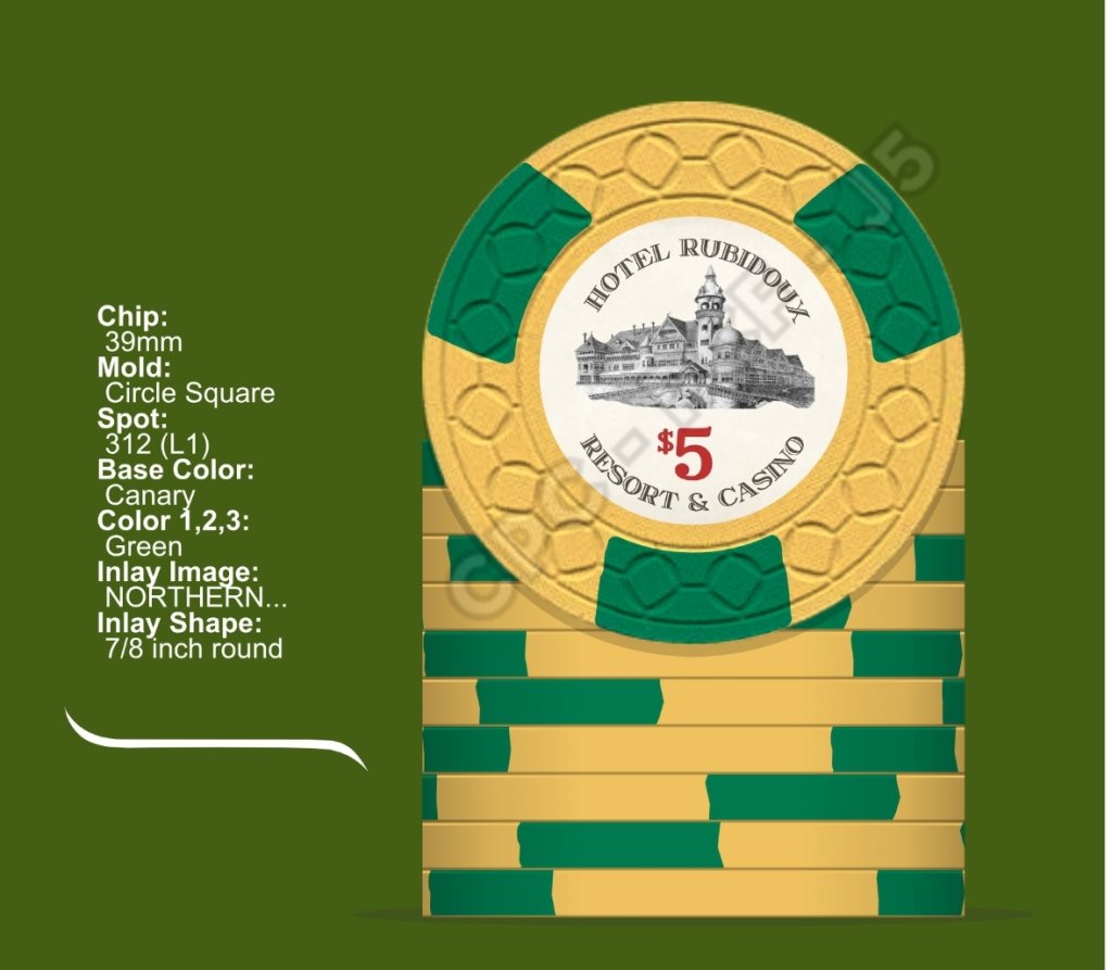
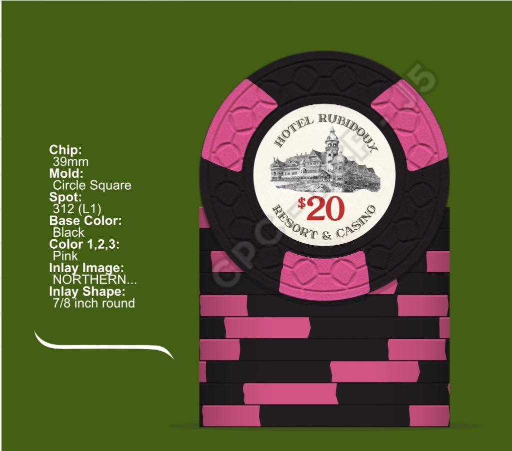
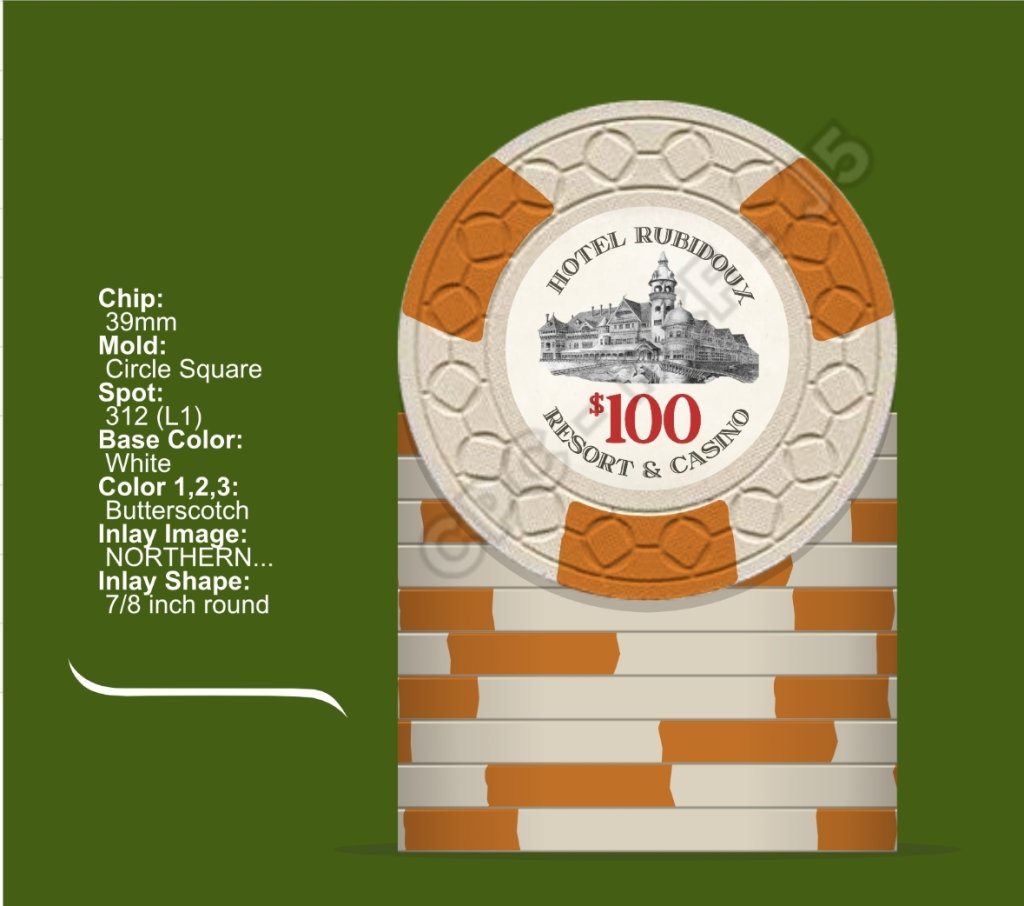
I've spent a lot of time on the inlay, settling on a simple design featuring one of the few architectural drawings of the hotel that remain. Similarly with the spot pattern, going simple would likely best replicate the era while also likely keeping my CPC pricetag at a reasonable level.

With all of that out of the way, here's where I am at after a year and a bit of countless font changes, pattern changes, color changes and more....

Thoughts, suggestions, etc. are all welcomed and encouraged. Thanks for checking it out!!
Screenshot_20240327_163820_Opera Mini.jpg


Screenshot_20240327_163848_Opera Mini.jpg


Screenshot_20240327_163931_Opera Mini.jpg


Screenshot_20240327_164013_Opera Mini.jpg


Screenshot_20240327_164040_Opera Mini.jpg


Screenshot_20240327_165448_Opera Mini.jpg
 
I love the back story for this set! I lived and worked in the area my entire life, so i have some connections to it.

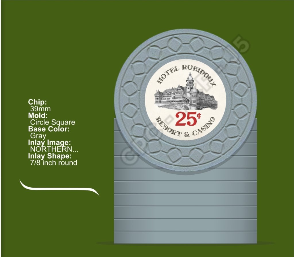
If i may add, i'd apply the same spot pattern to the frac with a duller color. I know fracs shouldn't stand out and are usually solids, but in this case, i feel like it stands out a lot more than it should being a grey solid. Just my 2c
It really is one of those cool "what if" scenarios that I love about history. Add in the fact that it's local and it adds that extra touch to make it a keeper imo.

I hadn't thought of keeping the spot pattern on the frac, but it does make a lot of sense now that you mention it. Going to take a shot at that today and see how it looks!
 
I like it. Can you make the bottom of the hotel image gradient so it blends into the blank space?

I'd also go with spots on the frac, maybe white?

Finally, although I love the canary and green combo, have you considered yellow for a more retro look (check out the suicide queen set to see how it would look)?
 
With my Flamingo set designed for now and awaiting my ability to order, it's time to share another project I've been tinkering with in the meantime.

I think this one would be my CPC purchase if I ever get to that point, since the look of it feels like it is screaming out for compressed clay craftsmanship. I may order it on another medium in the meantime to be able to play them sooner, but this one would ultimately be my keeper set next to the good bourbon and cigars, so to speak.

For some backstory on the idea, there is a generally widely known landmark in Riverside known as Mount Rubidoux. The locals know it from the steep hiking trails, large cross at the top and for catching fire every July 4th when the fireworks go off...iykyk.

As the story goes, in the late-1880s, a development group had plans for a sprawling hotel and resort to sit atop the mount, facing downtown Riverside. With the real estate boom in full effect, the idea was to capitalize on that by making the picturesque resort a destination for all of Southern California and her newest residents.

With construction issues, weather issues and budget overruns, the plan never got past the foundation and some framing work before it was ultimately abandoned as the boom market fizzled before the 1890's had begun. All that's left are some drawings and stories about what was meant to be.

After taking all of this fascinating information in, I decided to make a California colored poker chip set. I it based on what it could have looked like in a fantasy world where the hotel was completed, a casino was integrated into the site and the site became a gambling mecca for SoCal at the start of the 20th century.

I've spent a lot of time on the inlay, settling on a simple design featuring one of the few architectural drawings of the hotel that remain. Similarly with the spot pattern, going simple would likely best replicate the era while also likely keeping my CPC pricetag at a reasonable level.

With all of that out of the way, here's where I am at after a year and a bit of countless font changes, pattern changes, color changes and more....

Thoughts, suggestions, etc. are all welcomed and encouraged. Thanks for checking it out!!
View attachment 1300455

View attachment 1300456

View attachment 1300458

View attachment 1300459

View attachment 1300460

View attachment 1300461
Another Suicide Queen Connaisseur as I see. And I mean this in the highest regard, it’s an incredible set and I found myself enjoying the color combinations as well. Love your inlay!
 
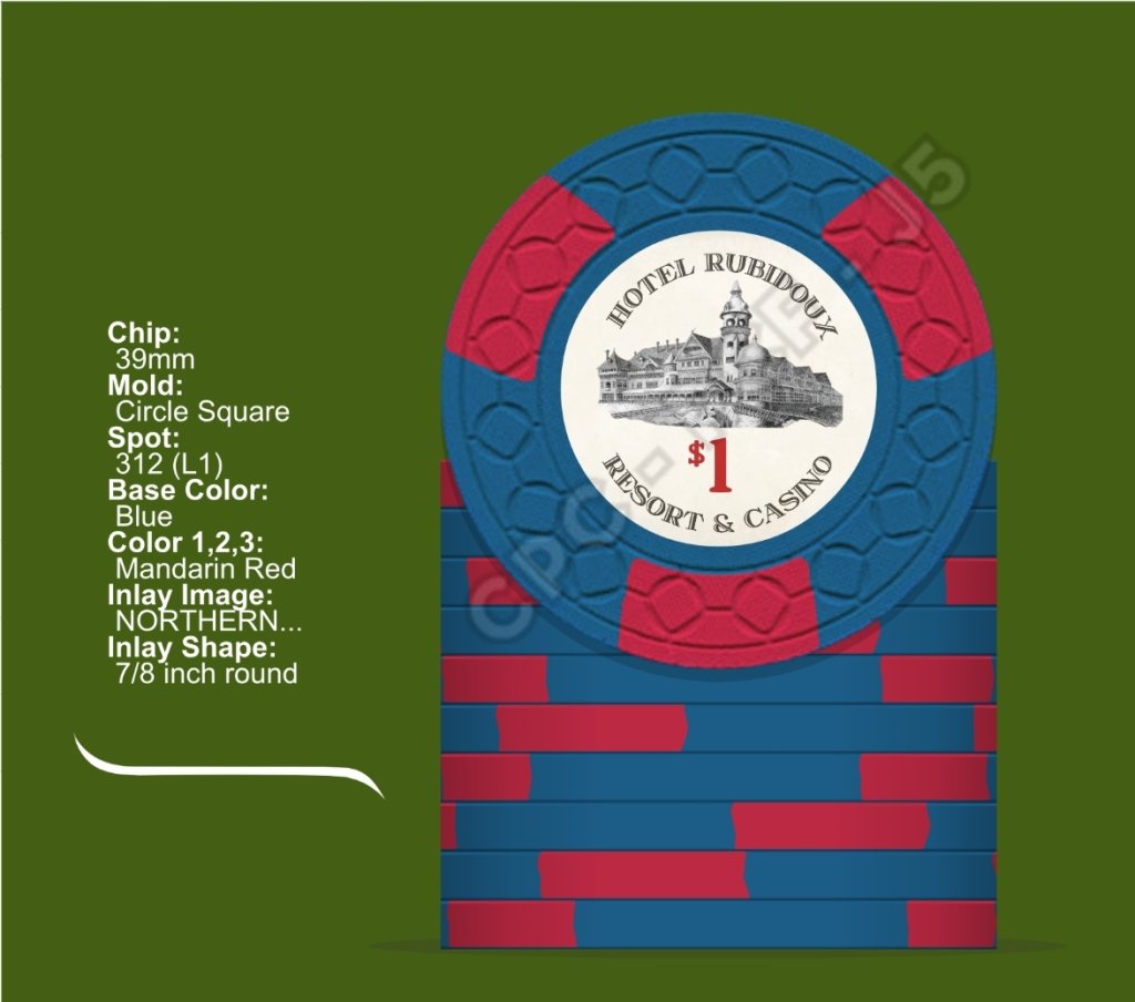
I like it. Can you make the bottom of the hotel image gradient so it blends into the blank space?

I'd also go with spots on the frac, maybe white?

Finally, although I love the canary and green combo, have you considered yellow for a more retro look (check out the suicide queen set to see how it would look)?
Trying yellow is the next step on the journey! Thank you for the suggestion. Also, I may be showing my noobness here, but I am not familiar with the Suicide Queen set...checking it out now.
 
Another Suicide Queen Connaisseur as I see. And I mean this in the highest regard, it’s an incredible set and I found myself enjoying the color combinations as well. Love your inlay!
I genuinely hadn't seen that set until it was mentioned here, or if I had I had completely forgotten about it. I may have to change some colors around so it doesn't feel as direct with the 1 and the 5. I would hate to have someone thinking I had cribbed their spots/colors...
 
I genuinely hadn't seen that set until it was mentioned here, or if I had I had completely forgotten about it. I may have to change some colors around so it doesn't feel as direct with the 1 and the 5. I would hate to have someone thinking I had cribbed their spots/colors...
Was not meant to be an accusation of any sort! Some people take it as a compliment if you have similar chips :)
 
Was not meant to be an accusation of any sort! Some people take it as a compliment if you have similar chips :)
No worries, I hadn't thought of it that way at all. Was more me worrying that someone would feel like I was ripping off their design/idea, which I would never want to happen.

The crazy thing is that I have been working on some form of this project before I even found PCF and all of the resources that are available to me here. I was literally just sketching out circles and doing spots with colored pencils in the very very beginning.... :LOL: :laugh:
 
Tried some things....if I stick with the 1 and 5 as is, I love the darker yellow...

Screenshot_20240328_104156_Opera Mini.jpg


If I change it up a little so that the 1 and 5 aren't as direct a match to the SQ set, I feel like this could be good too....

Screenshot_20240328_104015_Opera Mini.jpg


Screenshot_20240328_104130_Opera Mini.jpg
 
Is that the rendering of the actual proposed buildings?
Yes, that was what the hotel was meant to look like from architectural drawings of the time period. It was described at the time as “a combination of English, Gothic, and Swiss styles of architecture with a touch now and then of Old Holland timber work.”
 
Love the idea. I had no idea there were ever plans to build a hotel up there... Riverside, born and raised... and very familiar with the 4th of July "tradition."
I hadn't either until I got to talking to someone at the Heritage House about this and that and the subject came up about the old hotel that never was. Intriguing to think about how much would have changed if it had been built and thrived at that location.
 
You’re playing with the same color combos I’ve been futzing with for a couple of years.

Other options to get you going:
Lt gray & DG Tiger
White & Maroon
DG Peacock & DG Pink
Imperial blue & DG Pink
Black & Retro Lavender
 
You’re playing with the same color combos I’ve been futzing with for a couple of years.

Other options to get you going:
White & Maroon
Imperial blue & DG Pink
Black & Retro Lavender
I liked these three the best, especially the black/retro lavender. That one is a strong consideration to go into the lineup as the $20 to replace the black/pink.
 
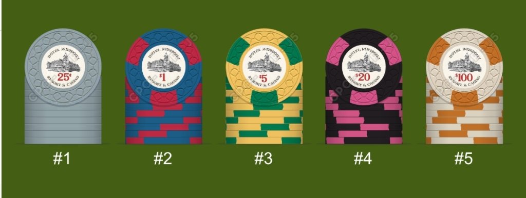
New lineup with the changes to the 1 & 5....

View attachment 1300889
I love what you’ve got going. The $5 and $100s are clear winners for me. The $5 especially is incredibly evocative of an older era of chips. I think a better combo for the $1 is out there. I don’t know what specifically but it stands out to me. Love the inlay! Agree about trying to apply a gradient to it
 
I love what you’ve got going. The $5 and $100s are clear winners for me. The $5 especially is incredibly evocative of an older era of chips. I think a better combo for the $1 is out there. I don’t know what specifically but it stands out to me. Love the inlay! Agree about trying to apply a gradient to it
I agree with everything you're saying and thank you for the kind words as well. I have tweaked the 1 and 5 probably the most out of all of the chips and I really like where the 5 is right now. The 1, I have a couple more color concepts that I want to see in the scope of the full set but it has been a tough one for me to nail up to this point.

In terms of the gradient, I have attempted it a couple of times but admittedly am struggling with the execution of the concept. I agree that it would look very nice, I am just working on how to get there at the moment..haha.

ETA: If anyone knows how to pull it off, I'd love to get some tips on applying the gradient to the hotel drawing...
 
Last edited:
Here's the lineup with the retro lavender $20. Love it! Now to tackle that damn $1...

View attachment 1301385

Really good looking Line-Up so far.
You could try the light blue/light green 1.
Another combo that looks great is an imperial blue/light chocolate. the light chocolate owuld fit nicely in the color family of the other spots. (red/lavender/butterscotch/light chocolate)

Edit: and definitely try a white background, it will change the looks of the set.
 

Create an account or login to comment

You must be a member in order to leave a comment

Create account

Create an account and join our community. It's easy!

Log in

Already have an account? Log in here.

Back
Top Bottom