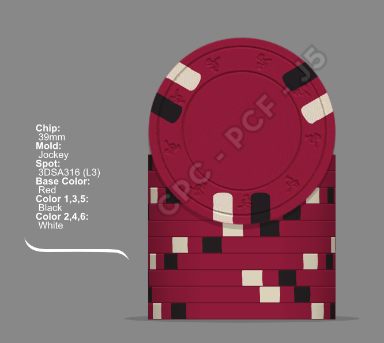
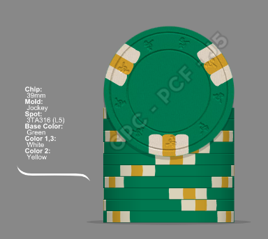
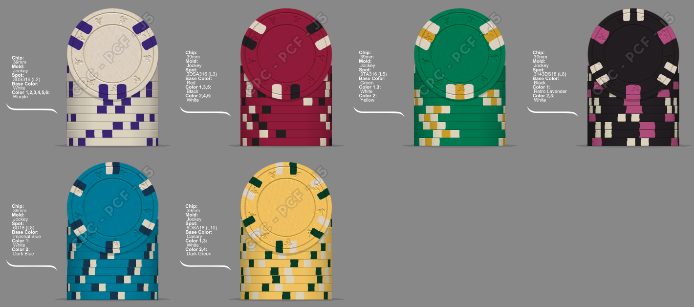
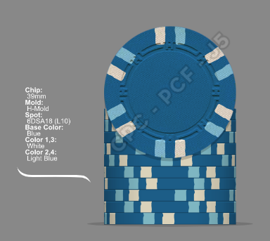
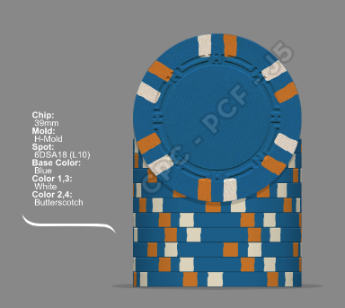
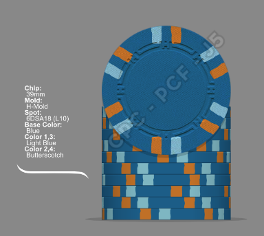
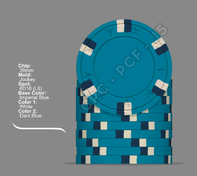
Delivering a broadside of unrequested pics ...


Short list of subjective impressions (sorry, in a hurry atm)
like
- theme
- helmet
not so much
- double denom (too small as well for my taste)
- Font for 'Heraldry Room' (there has to be an authentic one out there that can be arranged in an arch without looking ugly)
- Retro Lavender (in this lineup)
- not having samples (someone already mentioned this? oh, never mind") )
)
Constructive suggestions as soon as I have some time on my hands.
Short list of subjective impressions (sorry, in a hurry atm)
like
- theme
- helmet
not so much
- double denom (too small as well for my taste)
- Font for 'Heraldry Room' (there has to be an authentic one out there that can be arranged in an arch without looking ugly)
- Retro Lavender (in this lineup)
- not having samples (someone already mentioned this? oh, never mind
)Constructive suggestions as soon as I have some time on my hands.

![bHf31K.png[img]](/proxy.php?image=https%3A%2F%2Fimagizer.imageshack.us%2Fv2%2F384x343q90%2Fr%2F924%2FbHf31K.png%5Bimg%5D&hash=f6f86e3faeea7b4c196d4ea78fbd2eb3)