Looking for feedback on first set design (3 Viewers)

southsound

Sitting Out
Supporter
Joined
Jan 16, 2024
Messages
22
Reaction score
39
Location
Fox Island, WA
I'm planning a 600 chip order of Greek mold hybrid chips for a 25c/50c game. This is my first custom chip design so looking for any feedback on the label design, colors, etc. Here are the chip designs:
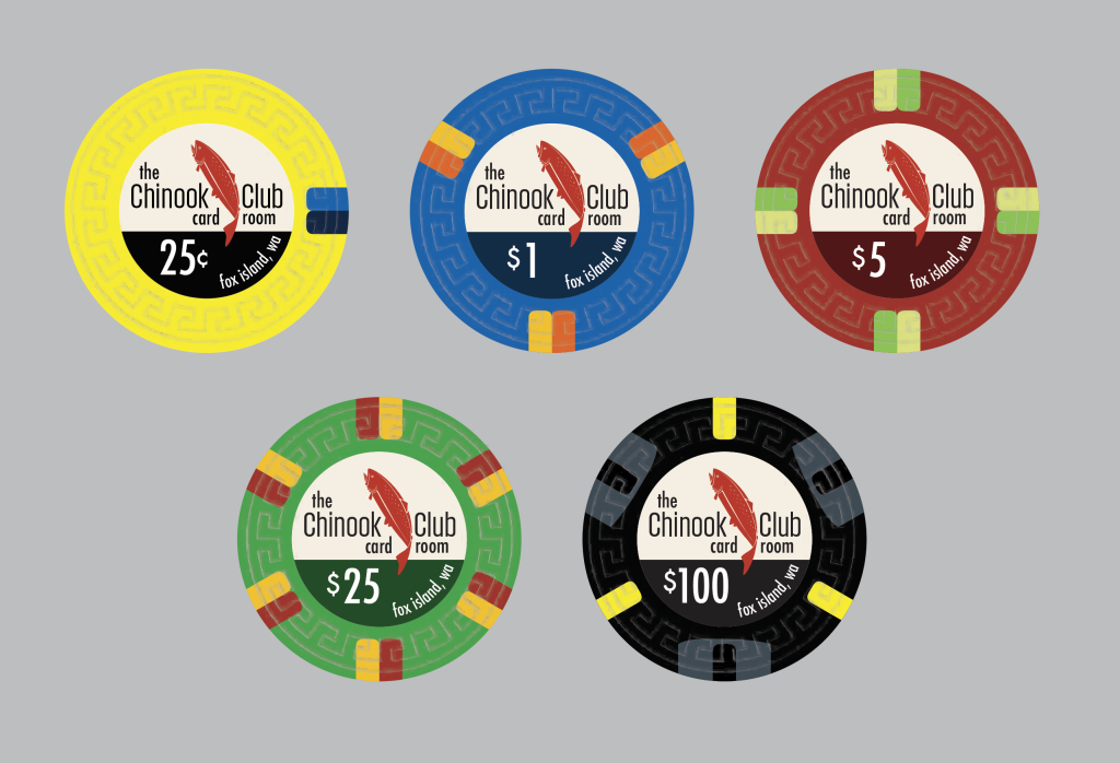
chipdesign_v1.png


I'm planning to order this breakdown:
  • 100 - 25c
  • 200 - $1
  • 200 - $5
  • 75 - $25
  • 25 - $100
We'll probably never use the $100s, but figured I'd order 25 of them just to have some.

Thanks!
 
Looks good, the only thing I'd say is I don't love the 25c chip having black as the bottom of the label, did it not look good with a dark yellow/tan?
I did have it as a dark yellow, but it ended up looking dark brown to me (which I didn't like) and anything that still looked yellow didn't have enough contrast for the text. You're definitely right that it does feel out of place with the others though. I'll play with that some more, maybe a tan color would look good. Thanks!
 
I really like this new version!
I wonder if it’s totally necessary to have the “the” on the label? It just looks to be hanging out there…and Chinook Club Card Room sounds better to me. Just my .02….
 
Well done, impressed by it. I'm off opposite mind of @Colquhoun , I'd keep "the" and get rid of "card room". The Chinook Club, CC, instead of CCCR. Our opinion doesn't matter, stick to whatever you want, just input. Love the colors. Those $1s will really pop.

How sure are you that your stakes will remain the same? With chips like these shipping is expensive and I'm not sure colors will be the same from year to year. I'd throw on a bunch of extras to make sure I could cover higher stakes just in case. I'm team 200 fracs, but even if not there, at least more $5s or fill out the rack of $25s. I say this as a person who's Tina set included nickels and could handle up to $1/$1 lol
 
What?!?! no palm tree? Is it even a custom chip if there is no palm tree on it?
All jokes aside. I like it. The single edge design on the .25 bugs me but that is just me probably lol.
 
What?!?! no palm tree? Is it even a custom chip if there is no palm tree on it?
All jokes aside. I like it. The single edge design on the .25 bugs me but that is just me probably lol.
No I agree, I think that’d work better as a solid and +1 on putting a bright spot on the 100. Overall, I think it’s a great design although I would like to find a way to center the denom
 
Thanks all for all the great feedback! I'll try out a lot of these suggestions later tonight.

The long name including both "the" and "card room" is kind of an inside joke cause I like to give stuff long, over the top names (ridiculous joke names for every fishing rod I have, super long nick names for the dogs, etc.). It does make it a little busy though so I might play with that a bit.

Making the 25c a solid is a good idea, it seemed kind of boring, but maybe that's a good thing for a 25c.
Never go full solid. It is boring. Unless it’s a full set of solids.
 
The set looks perfect! From someone who hosts a game that plays .25/.25, I don't know if you will have a need for $100 chip. I would consider bulking up on the work horse chips which would likely be 1's or 5's.
 
Love it!

Try bright pink instead of black spots on the $100.

I like the asymmetric spots on the 25c. I would be tempted to make it three spots like the Flamingo $1.
 
They look really good :cool

The colours of the edge spots on the $1 and $25 are a bit too similar though imo.
 
Made a few changes. I found a "dark yellow" color that I think looks fairly good on the 25c and fits better with the others that all have dark variants of the main chip color in the label. Also tried a third color on the 25c edge spot which I think I like. Added pink to the 100 and it feels a lot better to me than the gray. I haven't decided on the text yet. I've been staring at all the options and really can't decide what I like best.

Thanks again for all the feedback!

chipdesign_v2.png
 
Made a few changes. I found a "dark yellow" color that I think looks fairly good on the 25c and fits better with the others that all have dark variants of the main chip color in the label. Also tried a third color on the 25c edge spot which I think I like. Added pink to the 100 and it feels a lot better to me than the gray. I haven't decided on the text yet. I've been staring at all the options and really can't decide what I like best.

Thanks again for all the feedback!

View attachment 1265023
I like the words card room, but if you’re going to remove them, maybe try moving the dark separating line higher, in between chinook an the denom, but not raising the fish? Just an idea…
 
My eye likes this one best, without "the"
1706727261329.png


An idea (and maybe you are already thinking about it)...you can make the spots "wavy" by playing with the lines both on the face and on the edges. If you are working in Illustrator, you can add vector points randomly along the edges of the spots and then use the anchor tool to move them slightly and the curvature tool to make the lines look more natural. If done right (see @Colquhoun 's Pioneer clubs) they look really good. Maybe @Colquhoun knows a better way (unless he does not want to give away his secrets). When the spots are too perfect, in my opinion, it can still look good but is clearly printed on ceramic.

Also, it is more work, but you could make multiple versions of the wavy spots for each chip. For example if you are ordering 200 of the $1, you could make four versions with different wavy spots and order 50 of each in order to mix it up a bit.

This first design of yours is looking like a home run!
 
My eye likes this one best, without "the"
View attachment 1265076

An idea (and maybe you are already thinking about it)...you can make the spots "wavy" by playing with the lines both on the face and on the edges. If you are working in Illustrator, you can add vector points randomly along the edges of the spots and then use the anchor tool to move them slightly and the curvature tool to make the lines look more natural. If done right (see @Colquhoun 's Pioneer clubs) they look really good. Maybe @Colquhoun knows a better way (unless he does not want to give away his secrets). When the spots are too perfect, in my opinion, it can still look good but is clearly printed on ceramic.

Also, it is more work, but you could make multiple versions of the wavy spots for each chip. For example if you are ordering 200 of the $1, you could make four versions with different wavy spots and order 50 of each in order to mix it up a bit.

This first design of yours is looking like a home run!
Two votes for no "the" then. :) That one is growing on me.

I have started working on getting the edge spots looking more natural, it's done on the 25c chip in that last mockup. I was using the zig zag and roughen effects along with the warp tool, but if anyone knows a better/faster approach would love to know.
 

Create an account or login to comment

You must be a member in order to leave a comment

Create account

Create an account and join our community. It's easy!

Log in

Already have an account? Log in here.

Back
Top Bottom