The Heraldry Room - First Custom Set - Input Requested (5 Viewers)

That has been effectively answered.
Even still, @LinkyBabe is right, as is @BGinGA, @links_slayer, @72o, and my signature. Best to get samples. Even if you're not going to buy some, at least seek to borrow some. Pay $16 for round-trip shipping in an SFRB and look at someone else's samples. Truly, money well spent.

Samples. Get them. Tell your friends.
 
I understand everyone's concern. I do believe in samples. I've been at this more than 10 years (I am a migrant from Old Blue) and I have a whole box full of samples. However, I only order samples when I have specific concerns that they can address. I'm a bit flexible on color. You have to be. Look at the red chip. If you stick to weighted colors (which is what I want to do), you have two choices; some version of a primary red and a variant derived from primary red. It's a pretty obvious choice if you want to use primary colors for your set. Getting samples isn't going to help me make that choice. Same situation on most of the other chips. Green is the glaring exception, that's why I asked about it. My concern wasn't even what shade is it was exactly. I only wanted to know if it clashed with the black as a practical matter of putting them in play.

....Now if there were 15 shades of red to choose from, I would definitely get samples.
 
We're only trying to help you honestly. The samples will let you see first hand if you may have clashing/distinguishing issues between denoms though. You might not be able to tell from the chip design tool that light gray and light blue can look very similar under certain lighting conditions. Even light green and light blue would/could get lost together. The only way to get a feel for these types of things is to have the color samples in front of you and stack your chip colors you choose right next to each other.

And if you, for example, have an old asm chip with blue base and light blue spot that you may want to use as a reference, that same exact light blue spot will look different on a chip with a different base color. Sometimes the colors affect each other. Kinda hard to explain unless you see it in person with samples.

That's all man. Good luck.
 
I don't know if the consensus will positive or negative, but I'm pretty sure this is going to be my final design...

J2 small.png


It's a long way from where I started in the first post, but I think this is the best I can come up with.
 
Wow. A thumbs up from one of the leading designers on the forum. I guess that settles it. Consider the design final. Thanks to everyone for your input.

I want to specially thank two people:

Thanks to QuiQuog for directing me to the actual history of the period, rather than the impression of the period that I had in my head. I did some research and learned a lot. It really helped me focus the color palate.

Thanks to Psypher for providing the critical photographic evidence I needed.
 
Wow...just read through this. Get samples. You will NOT regret it, particularly since a lot of your spot patterns are on the upper side and you're going to spend a chunk of change on the order.

Get samples. And don't commit before your inlay is done and mocked-up, obviously, as the chips can take on a much different appearance.
 
I can only confirm samples are much required. Mold maybe not so much, but colors definitely.
More than just a few of the colors displayed in the chip design tool are WAY off and look completely different on the actual material.
You alrady had the example with dark green and dark blue but there's even more, e.g. the browns, butterscotch, DG orange, DG saturn, the normal blue, DG peach, orange...

I'm currently working on a custom CPC set myself, and if I didn't have color samples at hand to do a sanity check on each chip's body/spot palette, I'd probably have ended up with a bunch of barely distinguishable denoms without knowing about it up front. Even with the samples, I am still highly undecided, but in the end I will at least know exactly what I'm going to get before I order.

And yes, I confirm, the overall design will look completely different when you put your inlay graphic on it. You don't have to design everything, but finalize at least a draft for one denom's label and then slap that on all the chip mockups - that will already enable you to get a much better impression.

Regarding your inlay background graphics, neither of them look very appealing to me. I feel they are too uneasy on the eye. Any text you put on that will likely be hard to read, even when you put an outline or drop shadow around it, as the background just distracts so much. If I were you, I'd choose a smoother graphic, or heavily blur the ones you have, maybe also desaturating and brightening the overall graphic, and maybe slightly tinting it in the chip body color to have it blend in better. In addition, the straight lines from the wood and brick wall graphics heavily clash with the rounded borders of the inlay and the overall chip shape. Aesthetically they don't fit in there at all imo.
 
Last edited:
I can only confirm samples are much required. Mold maybe not so much, but colors definitely.
More than just a few of the colors displayed in the chip design tool are WAY off and look completely different on the actual material.
You alrady had the example with dark green and dark blue but there's even more, e.g. the browns, butterscotch, DG orange, DG saturn, the normal blue, DG peach, orange...

I'm currently working on a custom CPC set myself, and if I didn't have color samples at hand to do a sanity check on each chip's body/spot palette, I'd probably have ended up with a bunch of barely distinguishable denoms without knowing about it up front. Even with the samples, I am still highly undecided, but in the end I will at least know exactly what I'm going to get before I order.

And yes, I confirm, the overall design will look completely different when you put your inlay graphic on it. You don't have to design everything, but finalize at least a draft for one denom's label and then slap that on all the chip mockups - that will already enable you to get a much better impression.

Regarding your inlay background graphics, neither of them look very appealing to me. I feel they are too uneasy on the eye. Any text you put on that will likely be hard to read, even when you put an outline or drop shadow around it, as the background just distracts so much. If I were you, I'd choose a smoother graphic, or heavily blur the ones you have, maybe also desaturating and brightening the overall graphic, and maybe slightly tinting it in the chip body color to have it blend in better. In addition, the straight lines from the wood and brick wall graphics heavily clash with the rounded borders of the inlay and the overall chip shape. Aesthetically they don't fit in there at all imo.
I agree with all of this, regarding the background graphics. And fwiw, I can't imagine why you'd want your top two chips (or any two chips for that matter) to have the same spot patterns. But it's all subjective, and if you've been into chips for ten years, you know what you like.
 
...And fwiw, I can't imagine why you'd want your top two chips (or any two chips for that matter) to have the same spot patterns.

The top two chips will never be in a pot, and likely won't be in the same game. They will basically be re-buy chips. The $500 for a 2/5 game and the $1000 for a 5/10 game.
 
I would stay away from photo graphics completely. Maybe something similar to period art, but never photo art.
 
Is that because they don't print well, or is it because it seems out of place on a poker chip?
Mostly because I don't like the look of it. Some people dig it though. A lot of people like the PNY chips. But in this case, you want to add other stuff like you said, "Heraldry (obviously), the Age of Chivalry, Arthur and his Knights, Jousting, etc, etc". If you start adding other photos, it's going to look very busy and probably cheesy. If you add graphics, the two mediums will clash and end up looking like something out of Roger Rabbit.

Maybe the question should be "should I have a background?". I would say that given the limited space, a full graphic background doesn't work, and will only distract from the main graphic elements.

But my opinion is only worth what you paid for it. If you think you can pull it off, you should post a mock up.
 
..Some people dig it though. A lot of people like the PNY chips.
I guess I would be one of those. I have a two table cash set of PNYs.

..you want to add other stuff like you said, "Heraldry (obviously), the Age of Chivalry, Arthur and his Knights, Jousting, etc, etc". If you start adding other photos, it's going to look very busy and probably cheesy.
I understand that concern. I plan on representing all that in a single symbolic image, like a shield or helmet.

Maybe the question should be "should I have a background?"
That is a good question. Maybe it will come to that.

If you think you can pull it off, you should post a mock up.
I have that being worked on.
 
Thinking about the inlay background. Wood or Stone???
In the vacuum of that post and the inlays used, wood is the only one I would consider. That said, I don't know that I'd use any of them as a blanket background like that. The rough stone is indiscernible. The brick/block could just as easily be a modern building. The wood could simply be a new fence. It's possible my opinion would change when I see a full inlay designed over it, of course, but none of them resonate at all as posted.

Rather than a full blanket background like that, What about using a large wooden shield instead? That would add some additional context.
 
I like the design, especially the helmet. I can't help but think your background would look better with a washed out manuscript look though. Plus it would fit the theme since it's from the time period.
IMG_0568.jpg
 
The helmet is cool. The denomination font is okay, but is the name font just a place holder for now, because it doesn't fit at all?
 
The design was tested with several shades of coloring on the wood. It turned out to my surprise that a darker background worked the best.
 
The helmet is cool. The denomination font is okay, but is the name font just a place holder for now, because it doesn't fit at all?

The design initially used Old English for the font. That worked fine if the text was in a straight line, but when it was curved it became a bit disjointed.
 
I want to thank p5woody for doing the design for me. He gave me exactly the design I wanted, perfectly executed. If there are any flaws, blame me.
 
Not digging the doubling up on the denom, but I definitely dig the overall look. Be sure to do the arms length test, if you haven't already, especially for a 7/8" inlay. Nice work!
 
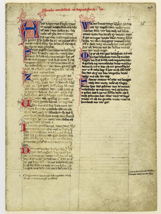
The washed out manuscript idea would fit this perfectly! Also allows for a lot of creativity while staying inside the boundaries that make it look genuine (well obviously there were no compression molded chips in that age, but the inlay itself...).

Codex-Manesse-Die-Grosse-Heidelberger-Liederhandschrift-Faksimile_791032_3.png

Codex_Manesse_193r_-_Albrecht_von_Rapperswil.jpg
 
Not digging the doubling up on the denom,

To be honest, I debated over that myself. I would prefer one denomination, but it just didn't seem balanced, so I decided to go with two. I felt better when I saw that the Vineyards rack is the same way.
 
On the surface, the washed out manuscript is a great idea. However, a light background was tried and it really changed the feel of the chips in a way that just didn't work for me. They have a much better feel with a dark background.
 
Here's what happens with a light color background. The light background gives the inlay more emphasis, but the dark background makes the colors on the chips pop more...

parch example.png
 
Definitely go with the darker version if that's what you prefer, since you are the one that will use them. I like the look of the wood more when it's on the chips though.
 

Create an account or login to comment

You must be a member in order to leave a comment

Create account

Create an account and join our community. It's easy!

Log in

Already have an account? Log in here.

Back
Top Bottom