-
PCF is an eBay Partner. If you make a purchase through one of our links, we may earn a commission at no extra cost to you. Thank you for your support!
You are using an out of date browser. It may not display this or other websites correctly.
You should upgrade or use an alternative browser.
You should upgrade or use an alternative browser.
Post Your Mockup and I Will Brutally Eviscerate It (With Words) (6 Viewers)
- Thread starter MrCatPants
- Start date
ryanoreilly1511
Sitting Out
OK let me have it
Oh buddy. Well you definitely have the total bank covered, I can say that as a complimentOK let me have it
OP
OP
MrCatPants
Full House
OK let me have it
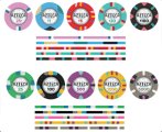
Tldr - it's the same.Cardinal sin #1 - don't mix tournament chips with cash chips. And tournament chips shouldn't have dollar signs on them as they are not currency.
That $5. It's ugly. a) discount tri-moon b) represents the four shades of sickly elderly man feces.
You'll never use a $10 chip. Unless you are playing 5/10 limit. Which since you made $1s and $1000s, you're not. And that said you'll never use a $2.50 chip unless you're doing casino nights with odds that casinos don't pay anymore.
The $100 is also a discount tri moon.
The $500 is an actual tri-moon. GTFO.
No need to do different designs on each side. It's all too much.
Now the inlay. Well, it's simple. But I have a great number of questions. Is OR an acronym? Or an abbreviation? Because it's a word that actually means something, you're not supposed to do that. Like, also don't change it to LOL entertainment. Why is there a bull? Why are you planning to print entertainment at 1/3 of a point font on the front? Why not have the denomination on both sides as that's the most critical information an inlay can have?
ryanoreilly1511
Sitting Out
It’s an acronym. These are not tournament chips
@MrCatPants it's been a very unfortunate non-coincidence that we did not play together back in 2019 when I visited Houston on a business trip. Chances are I 'll never come there in my life again.
I guess you keep contact with my beloved fellow-players, @Ethan , @Darson , and @crussader
I guess you keep contact with my beloved fellow-players, @Ethan , @Darson , and @crussader
bergs
Royal Flush
Let you have it OR what?OK let me have it
OP
OP
MrCatPants
Full House
Ho, ho, ho. Who wants to hear exactly why their chip mockup is no, no, no?
spartan037
Two Pair
Sure opinions on this?

OP
OP
MrCatPants
Full House
no inlay, no evisceration.Sure opinions on this?
View attachment 1239625
Freeroll
Two Pair
Can't seem to get the inlay design on the chip mockup, but fire away.


OP
OP
MrCatPants
Full House
If you can't figure out how to load an inlay on the designer, you probably shouldn't trust yourself with a 4-digit poker chip purchase.Can't seem to get the inlay design on the chip mockup, but fire away.
View attachment 1241936View attachment 1241937
Is that a white edge spot on every chip? Or a placeholder? I hope it's a placeholder.
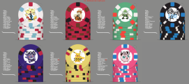
Glace Bay sounds like something someone drunk says when trying to say Glacier Bay. I looked this place up. There's 16,000 people there. Are you sure there are enough people who like poker tournaments there to warrant a set that has both t25s and t25,000s?
Red is not a traditional choice for a T5k. You do you though.
Did you intentionally make the T100 look like that? Gray with black and white spots? At least upgrade to technicolor.
So the inlay. Why does the light not source from a spotlight, but from dark windows? WHAT SORCERY IS THIS? IS THIS SATAN'S LIGHTHOUSE?
I really don't have any more to say about the inlay. It's plain. It's dark. It's creepy and isolating. It makes me sad and I don't want to look at it anymore.
Freeroll
Two Pair
Ouch. Got what I asked for. Lol
OP
OP
MrCatPants
Full House
Much like the Aztec empire, these things should have been wiped out by the Spanish like 600 years ago.Sure wynut…
I do understand the font style, but it will translate horribly to print and just look like it's low print quality.
I am unable to zoom on this lackluster image. What is the water mark? A weird ass spider? To be clear, I don't want you to answer the question as I don't particularly care. But I can't tell what it is and your players wont be able to either.
The $1 is a discount tri-moon. It sucks.
Green is for $25s, not $20s. Your $100 should become your $20 and you should do a white hundred.
The T5K should be nicknamed "Pornhub".
Last edited:
Thank you for your feedback and kind words
chipinla
Straight Flush
- Joined
- Apr 12, 2018
- Messages
- 9,714
- Reaction score
- 26,306
- Rewards
- 571
Thank you for your feedback and kind words
I don't even think @MrCatPants even reads this thread anymore, too busy finding people to lick cards.
.25/1/5/20

.25/1/5/20
This post should be retitled I PUT THE MOCK IN MOCKUP
OP
OP
MrCatPants
Full House
No inlay, no evisceration.I don't even think @MrCatPants even reads this thread anymore, too busy finding people to lick cards.
.25/1/5/20
View attachment 1259958
chipinla
Straight Flush
- Joined
- Apr 12, 2018
- Messages
- 9,714
- Reaction score
- 26,306
- Rewards
- 571
OP
OP
MrCatPants
Full House
Steve's 25 cent Kansas City hooker in a skort?View attachment 1260426
Stick it in me… I’m feeling frisky
Why is she holding a dead bird head?
Why did you put those edge spots on the $25? It's weird. It looks like two infected weiners coming right at Steve's Kansas City hooker.
The 25 cent looks like the paint card sample area at Lowe's. "Should we do Mint Green?' "No no, Basil is better." "Lets take samples of all of them home and put them on the same poker chip."
Last edited:
OP
OP
MrCatPants
Full House
That's ladyparts.
spartan037
Two Pair
Ok here they are with an inlayno inlay, no evisceration.
Attachments
OP
OP
MrCatPants
Full House
That took you two months? CLOCKOk here they are with an inlay
ekricket
Royal Flush
Hell this one’s easy. Your inlays too dark, can’t see the denominations. Is it a black bear at midnight eating blackberries?
OP
OP
MrCatPants
Full House
No inlay, no evisceration.
Similar threads
- Replies
- 34
- Views
- 3K
- Replies
- 36
- Views
- 9K
- Replies
- 171
- Views
- 11K
- Replies
- 97
- Views
- 15K