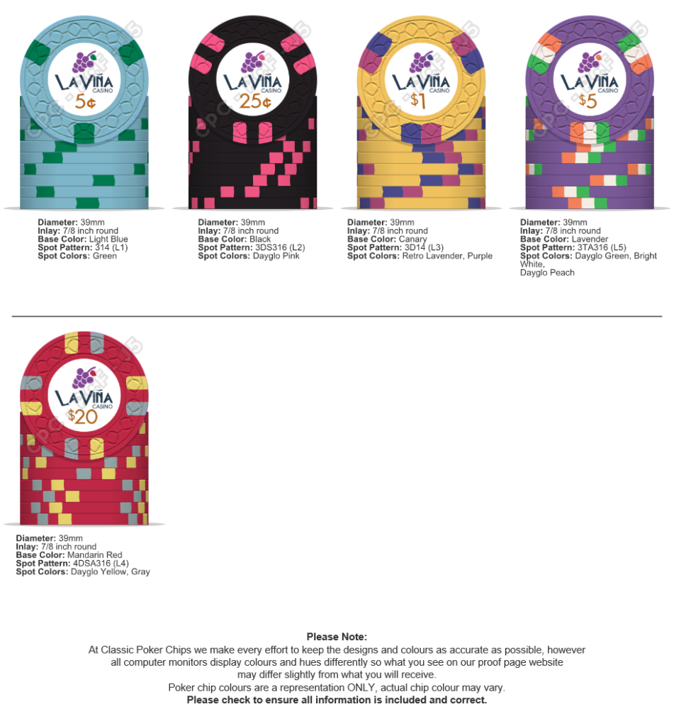
La Viña Casino CPC cash set (1 Viewer)

CarlosStorm

3 of a Kind
Joined
Sep 17, 2020
Messages
699
Reaction score
844
Location
Barcelona
Hi everyone!

"When I was a kid, my father had a tiny piece of land where he grew some fruit trees and vegetables. He had a few vine trees and every year we made a couple of barrels of white wine. Not much, but I have good memories of those years. All my family went there to help him and stay together at the weekend. The name of the land is Vineyard, but in Spanish, we say the more familiar 'La Viña' (n with a tilde)"

This is the little story behind the future set. I tried a relabel project, but I wasn't sure to use labels, and for a bunch of extra dollars I'm planning to make the CPC 'La Viña Casino" cash set.
I usually play tourneys and already have a nice Paulson set with traditional colors, that's why for this set I want to use the colors I like more. My idea is to order the set before the end of the year, so I appreciate your opinion.

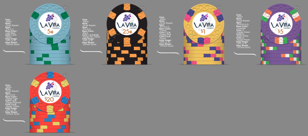
This is the set:
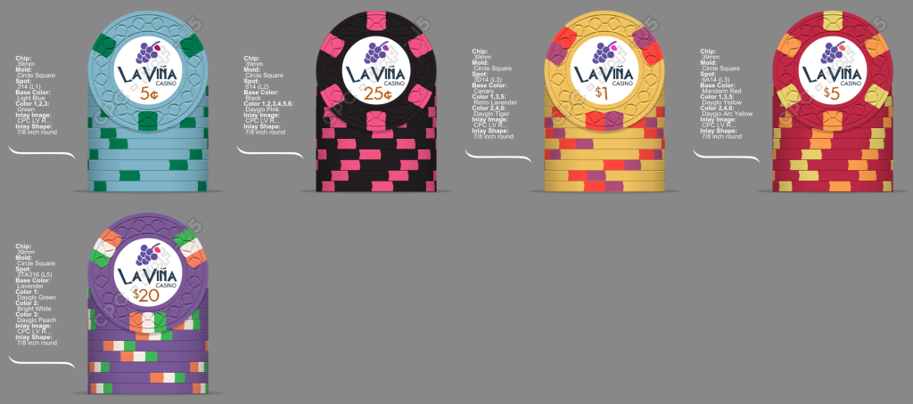
Mock up CPC La Viña DEF v7.png


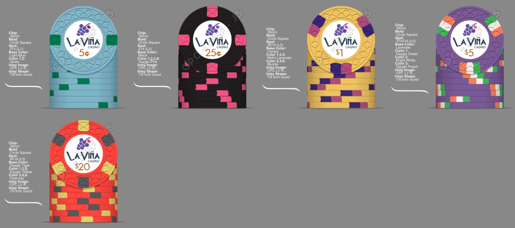
I may change some edge colors, but I think the progression is definitive. I have doubts about using Charcoal instead of black for the 25c chip, what do you think?
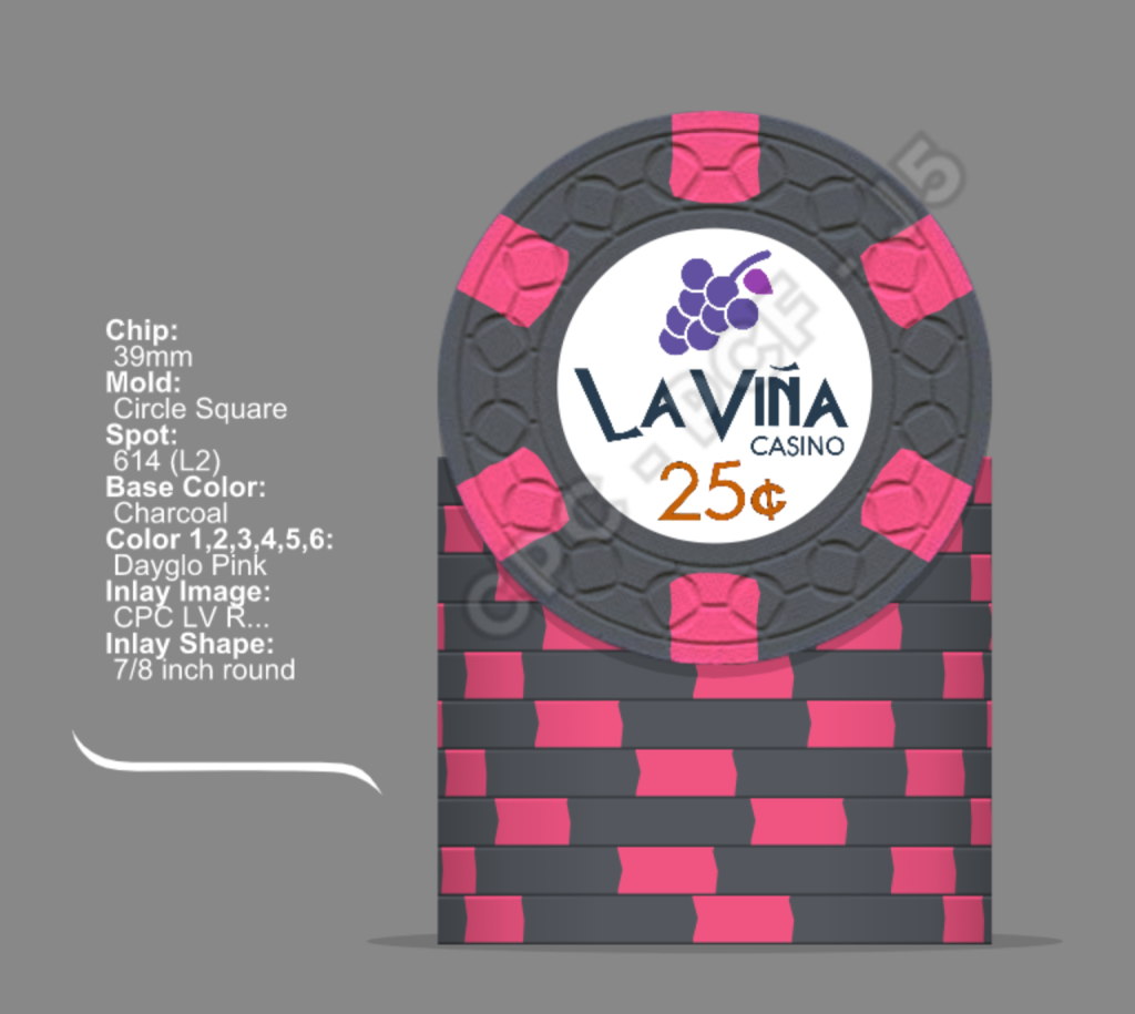
M25c-charcoal- Dg Pink.png


Thank you so much for all of you that have helped me in the past, I really appreciate your opinions and I'm very happy with the results (until now :))

Edit: new version
Mock up La Viña Cash Set.png


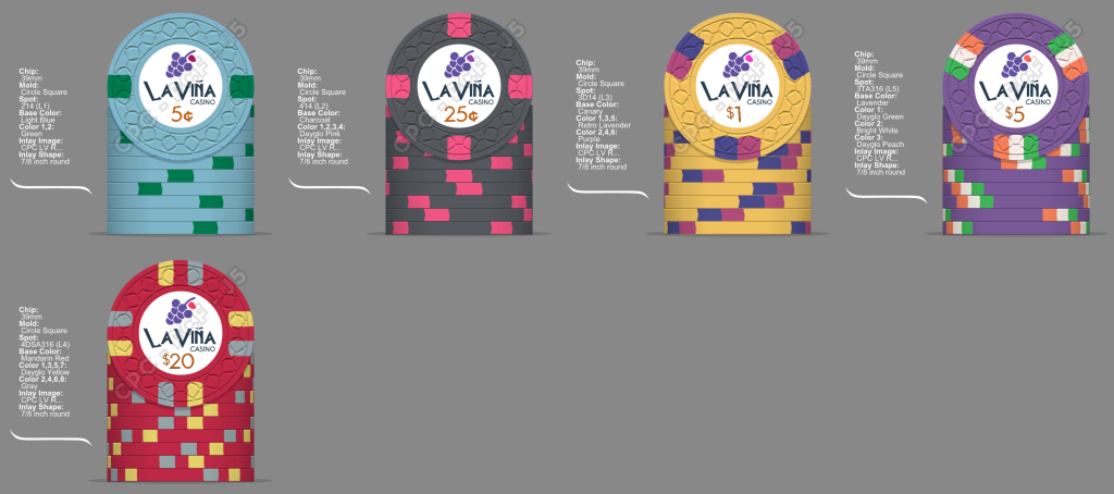
Edit 2: last version until now ;)
MU_LV_v24.png


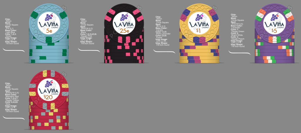
Edit 3: the last :)
MU_LV_v26.png


Last and definitive edit.
MU_LV_Carlos Ruiz.png


The "proof" :)
Prof_LaViña.png

First version of La Viña Dealer button :)
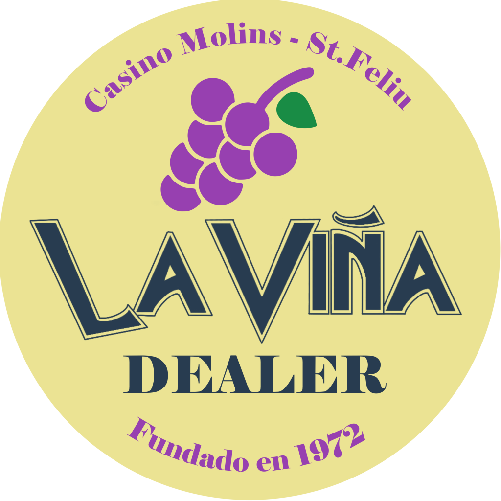
Dealer button.png

side.png

Greetings,
Carlos.
 
Last edited:
Love the story, and the theme. The chips are all great individually. My only concern would be dirty stacks between the $1 and $5 chips.

But that $20 is fantastic!
 
would be dirty stacks between the $1 and $5 chips.
Thanks for your feedback. I've been playing a lot with my color sample set and working a lot to avoid dirty stacks. Do you think it would need some change in color of the edges in the $5 chip?
 
Have you considered a different spot pattern for the frac as it repeats in the $5. 414 perhaps?

I also noticed the leaf is a different colour on each denom. Are you planning to colour match it to the base colour or is there a theme?
 
is it a coincidence the edgespots in the $20 chip is the flag of Ireland?
Yes, it's a coincidence, but I like a lot the colours :)
you’re locked in on CSQ as the mold
Yes, I like a lot the mold and his price. In addition, the mold simulates the place where people keep the bottles of wine (bottle rack?)
Have you considered a different spot pattern for the frac as it repeats in the $5. 414 perhaps?
I have a progretion in my mind: (5c) 3 spots 1 color - (25c) 6 spots 1 color - ($1) 3 spots 2 colors - ($5) 6 spots 2 colos - ($20) 3 spots 3 colors
I think 414 break this idea :unsure:,
Are you planning to colour match it to the base colour or is there a theme?
Not sure, I still have work with the inlay.
 
I've been thinking about dirty stacks between $1 and $5 chips.

This is another option for the $5 chip. What do you prefer?
View attachment 822486
Have you tried something other than the arc yellow? I ask since you would have DG tiger, arc yellow and DG peach in consecutive chips. Certainly not saying this would be dirty by any means but they’re in the same spectrum to me. Maybe switch that arc yellow up?
 
Have you tried something other than the arc yellow? I ask since you would have DG tiger, arc yellow and DG peach in consecutive chips. Certainly not saying this would be dirty by any means but they’re in the same spectrum to me. Maybe switch that arc yellow up?
Yes, you're right. I love that spectrum of colors, Haha
I have another option, also love it :love:
06b8b421-06a3-4221-b8a8-1597892c441c.png
 
Too much red?...
Yes, you're right. I really love the 'red's spectrum on CPC color set, that's why I've abused a bit of them.
I think some color matching on the inlay with the grapes would be cool too.
Yes. I want to have a definitive choice of base and spots colors, and later I'll play matching colors on the grapes.
 
I love the family story. White wine was made from red grapes? What colour were the grapes on the land?

Maybe instead of white background inlay do a gradient cream-white to make the chip look old (like the old Bellagio chips) and black and white grapes (like the first inlay design you did with the black and white art with the tree). Also if a detailed black and white pencil style drawing would work better on a larger inlay maybe consider the FDL mold. Looks like you've decided against this though.

I really don't like 614 for the quarter. I would change the nickel to 212 or 214 and make the quarter 314, 414, 312 or the tri moon spot.

Also blurple goes well as a spot for a canary base. Dayglo peach, white, or butterscotch too.
 
White wine was made from red grapes? What colour were the grapes on the land?
Yes, the grapes were white, and the wine was white too. But white grapes are more difficult to paint :rolleyes:
Maybe instead of white background inlay do a gradient cream-white to make the chip look old (like the old Bellagio chips) and black and white grapes (like the first inlay design you did with the black and white art with the tree)
Thanks, I think is a good option. I have to talk with my nephew, he's a graphic designer and for sure he'll help me improving the inlay.
I really don't like 614 for the quarter. I would change the nickel to 212 or 214 and make the quarter 314, 414, 312 or the tri moon spot.
Let me play with the CPC designed tool a bit more. But, why don't you like 614 spot pattern?

Thank you very much!
Carlos
 
Let me play with the CPC designed tool a bit more. But, why don't you like 614 spot pattern?

6 spots should be used on higher denom chips, and I just don't prefer one colour 614 chips. I like the $5 chip with lavender and light blue 614.
 
Ah, the old argument about spot progression. I, myself, do not subscribe to the need to reserve more complex spots for higher denoms, whether in tourney or cash. I think it is more important for each denom to be unique. It is better to be distinct, whether in colour or pattern (or even size/shape), rather than adhere strictly to a progression.

If you're making a cash set and your chips most often in play are the 5c, 25c, and $1, why should you save the more complex (and perhaps, more interesting) spot patterns for the higher denom chips that will see the least play (if any)? Better to have the most pleasing patterns on the table in front of you all the time, as long as they are distinct.

Heck, use your flag pattern for your quarter, if that's what you like (and can afford). Perhaps the highest denom chip should be a solid. Something that says, "I do not need additional adornment, since I am already of the highest value."
 
it is more important for each denom to be unique
:love: I totally agree. In addition, I don't want to have millions of sets, so, I'm trying to build the best CPC I can afford.
your chips most often in play are the 5c, 25c, and $1,
I'm trying to design the best chips for 25c and $1 because both will be warhorse, 25c at the begging of the night, and $1 later when the game has more action. But also I don't want to spend too much money. My limit is, for CSQ mold, an average of L3 costs ($2.37) more or less. So, I can't afford an L5 spot for my warhorse, but I could use L3 and L4 (?) instead.

Thank you to everyone. It's a good exercise to think about your ideas. I still have a few days before pressing the red button :)
 
Hi everyone!
I have a new version. I've worked hard to avoid dirty stacks, so I've done some changes.
Here it is, I hope you like them as much as I like
Mock up La Viña Cash Set -  5c.png
Mock up La Viña Cash Set -  25c.png
Mock up La Viña Cash Set - $1.png

Mock up La Viña Cash Set - $5.png
Mock up La Viña Cash Set - $20.png

I'm going to place my order next week :) :p, thanks,
Carlos.
 
Hi everyone!

"When I was a kid, my father had a tiny piece of land where he grew some fruit trees and vegetables. He had a few vine trees and every year we made a couple of barrels of white wine. Not much, but I have good memories of those years. All my family went there to help him and stay together at the weekend. The name of the land is Vineyard, but in Spanish, we say the more familiar 'La Viña' (n with a tilde)"

This is the little story behind the future set. I tried a relabel project, but I wasn't sure to use labels, and for a bunch of extra dollars I'm planning to make the CPC 'La Viña Casino" cash set.
I usually play tourneys and already have a nice Paulson set with traditional colors, that's why for this set I want to use the colors I like more. My idea is to order the set before the end of the year, so I appreciate your opinion.

This is the set:
View attachment 821734

I may change some edge colors, but I think the progression is definitive. I have doubts about using Charcoal instead of black for the 25c chip, what do you think?
View attachment 821736

Thank you so much for all of you that have helped me in the past, I really appreciate your opinions and I'm very happy with the results (until now :))

Edit: new version
View attachment 826849
Greetings,
Carlos.

I love your nickel!
 
What a shit...it's difficult to decide the last version...
What option do you prefer?
Option 1:
MU_LV_v23.png


Option 2:

MU_LV_v24.png


I only have a few days left...
 

Create an account or login to comment

You must be a member in order to leave a comment

Create account

Create an account and join our community. It's easy!

Log in

Already have an account? Log in here.

Back
Top Bottom