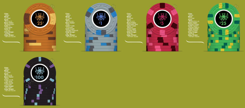
Flying Spaghetti Monster CPC Mockups (1 Viewer)

I think I like the Imp Blue/Charcoal edge on the $1.
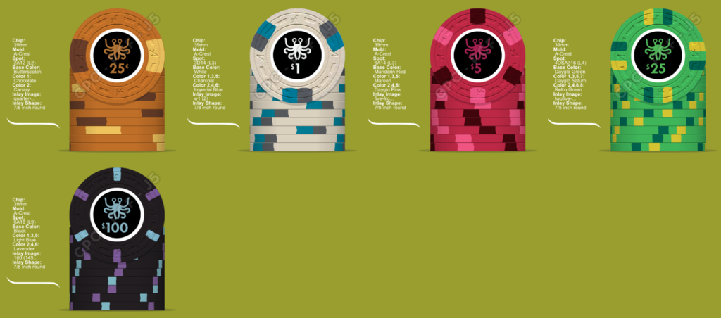
nooooooooooooo.png


noooooooooooooo.png
 
Like that gray $1 as well. How about retro blue or light blue instead of charcoal. If you use this combos with a charcoal base they look pretty good too. I'm on my iPad and it such a pita to copy and paste

That hundo looks off to me as a 1/8 spot. How about making it a 814 using the same colors..... looks killer in the mock ups to me


Nooooo don't change the hundo

Lets entertain that idea just once.

yesagain.png


I think I still like the grey $1, but Retro Blue does look nice on it. I think I like 814 on the hundo. 6A18 is used so infrequently on most CPC I've seen and it would be nice to use this great edgespot, but that 814 is so nice. I didn't think the hundo could look better. Sorry to disappoint but I'll likely change my mind about a dozen times before I finalize.

Also, I like my inlay again after trying a new font with white denoms. I'll never decide. Discouraging.
 
Last edited:
814 reminds me of these. Which is my least favorite of the Boulevards

IMO keep the 618

image.jpg
 
Out of these, the dark blue and imperial blue are my favs. Too close to say...every time I start typing dark blue is my #1, I erase it and start putting imperial blue lol
 
Imperial blue is awesome. My set is all solids but very happy with the choice of imperial blue for the $1s.
 
That retro blue with D14 edges reminds me of the Paulson Pharaoh's quarter.

ane.jpg


I think I'm liking this...what color should the creature be?

wht6.png
 
Last edited:
White denoms ftw, esp with the white ring.

618 hundo looks better to me with your other spots.

Retro blue is a great color but I think almost any set is more playable and looks better with some light/dark base colors. So I'd vote peacock or gray for that $1 base. Love the gray you've got going, maybe use bright white instead of charcoal spot?
yesagain.png
 
purple-lagoon.png
purple-lagoon1.png
purple-lagoon2.png


Thinking of adding text. The simple layout isn't doing it for me currently. I feel there could be more too it. When I tried describing my ideal design to others, I realized that I what I wanted was more elaborate than a demon and a graphic.

The Purple Lagoon is a Frank Zappa song (part of one), which I'm a huge fan of (hence my username). Creatures have been known to come from lagoons. Also FZ was pretty clear about his views on religion. I think it kinda works but will need refinement. My only concern is that there's a chip out there that's used this font. Changed to denom font back to Tw Cen. Keeps it retro looking with the text.
 
Love the colored inlays.

The purple is kind of hard to read now though. Partly bc it's small and partly bc there's not a lot of contrast.

Maybe outline it in white or what if you made Lagoon purple (and a lighter purple) and outlined in white? Not sure how that'd look...
 
Yeah I don't think you're gonna get it to be legible with a colored background. That's why I was thinking maybe Lagoon as purple would work since it's a larger font.

...and it still may be hard to read so that's where the white boarder might help...
 

Create an account or login to comment

You must be a member in order to leave a comment

Create account

Create an account and join our community. It's easy!

Log in

Already have an account? Log in here.

Back
Top Bottom