Looking for feedback on a Tourney CPC set... (1 Viewer)

rebels9999

High Hand
Joined
Feb 8, 2021
Messages
75
Reaction score
104
Location
Mississippi
Folks,

The bug bit again, and after some requests to do tourneys from some of my regulars and seeing David's call for CPC orders I got back and started looking for inspiration (and digging for change under the couch cushions. After making hundreds of mockups in the past few days, today I ran across the awesome City of Dawn set that @Rieguy posted yesterday, and it was very much in the spirit of what I wanted and so I used that for inspiration (or straight up copied) a chip or two. If you haven't seen it check it out. It is awesome!

I have been thinking about doing a colorful and bright tourney set to sit opposite my classic darker colors for my CPC cash game set. I'd love feedback on any and all of these, but my budget doesn't allow for much more super complex spots or shaped inlays at the moment.

My cash chips have white background inlays, but I've been debating about doing a color match inlay as well. Which do you prefer?

Also, I originally had the true purple for my 500 chip, but I was worried about dirty stacks and changed it to Retro Lavender.

My inlays aren't final as I don't really love these yet, but any feedback is welcome. The "Landshark" is a mascot of my college and that is where the name comes from (not the beer, although it is delicious).

Lastly, I will not use all of these chips in one game. This set enables me to have base 25, 100, or 500 games. Keep that in mind that not all will be on the table at once or even over a full night of play.

Any feedback is welcome.

Version 1: White inlays
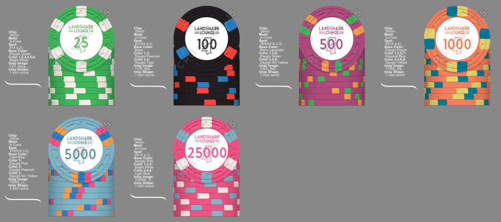
T_Chips_Ver2_White_Labels.png


Version 2: Color match inlays that match the primary color.
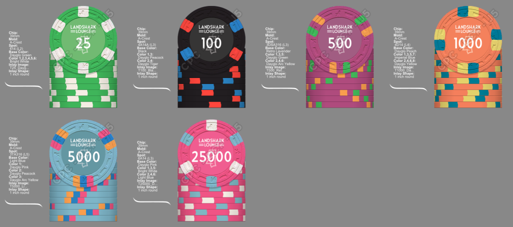
T_Chips_Ver2_Solid_Labels.png
 
Last edited:
To me, it looks a bit disjointed. 25 is nice, but the 100 and 500 to me really don't seem to work. The upper denoms I like a bit more, but really doesn't seem cohesive.

Spot progression is also a bit all over the place, but the base colors work well together.
 
I'm not a great fan of colour-matched inlays, I often see more that don't work vs. those that do.

At the same time, the white background as depicted here looks a little too stark, i.e. too much empty white space.

The balance would be to enlarge the text and existing graphics to fill up that white space or add some additional elements e.g. a large faint background graphic.
 
To me, it looks a bit disjointed. 25 is nice, but the 100 and 500 to me really don't seem to work. The upper denoms I like a bit more, but really doesn't seem cohesive.

Spot progression is also a bit all over the place, but the base colors work well together.
I like the individual chips, but I agree they aren't cohesive as a set. They don't work well together, there is no unification across the set except for the inlay.
 
I'm not a great fan of colour-matched inlays, I often see more that don't work vs. those that do.

At the same time, the white background as depicted here looks a little too stark, i.e. too much empty white space.

The balance would be to enlarge the text and existing graphics to fill up that white space or add some additional elements e.g. a large faint background graphic.
Thank you for your his feedback. This is very helpful. I am still working on the inlay but was just playing around. These are 1” and my last ones were the smaller size and I will likely do that again here along with a better inlay design.

If you have any thoughts on what makes color matched inlays work vs not I’d love to hear it. I’m not convinced with either option yet so just trying to explore. Thanks again!
 
To me, it looks a bit disjointed. 25 is nice, but the 100 and 500 to me really don't seem to work. The upper denoms I like a bit more, but really doesn't seem cohesive.

Spot progression is also a bit all over the place, but the base colors work well together.
Thank you. I’ll keep playing around. I love these chip colors so I will look for a few ways to bring them together without using the same spot pattern on each one. Thanks!
 
Thank you for your his feedback. This is very helpful. I am still working on the inlay but was just playing around. These are 1” and my last ones were the smaller size and I will likely do that again here along with a better inlay design.

If you have any thoughts on what makes color matched inlays work vs not I’d love to hear it. I’m not convinced with either option yet so just trying to explore. Thanks again!
I think an issue with color matching is that it's difficult if not nearly impossible to get the color exactly right.

If you go through the effort to get a match that looks good on screen, there is no guarantee that the print will turn out that way. At that point, the color match looks strange in that it misses and that nice blend and transition that was aimed for now doesn't.

Now, this is mostly talking about full color match to the base of the chip. Color matching can be done, especially if it's not right up against the clay. I color matched the text on the reverse of my Devil's Nest set and did a color match fade on the obverse:

https://www.pokerchipforum.com/threads/a-d-s-devils-nest-cpc-customs.78031/

On the fade, it doesn't matter if it's not 100% right as it's a more of a suggestion to the base color (or spot color in a case). The text is tough to tell if it's "right" or not even with a second chip on top as it's a small amount and doesn't invite a critical eye.


[As a side note to color matching, the dayglo colors can't be matched as the printer can't recreate the high chromaticity in the clay. The color there is produced in a very different way. Your 25, 1000 and 25000 could never be printed as a color match.]
 
One of the best things I found that helps me pull colors together, and I never thought it would, is a quilt. I married into a family that handmakes quilts from small pieces of cloth. It isn't the shape of the design on the quilt, but simply the color patterns on the squares that are thrown together that are inspirational. It gives me ideas on what works together and then I try to use those colors on a chip.

Here is a chip that, to me, looks like the square in the second row, 4th one to the right. Only you can decide if it works for you.
Keep us posted.
1700636827187.png

1700636341254.png
 
I think an issue with color matching is that it's difficult if not nearly impossible to get the color exactly right.

If you go through the effort to get a match that looks good on screen, there is no guarantee that the print will turn out that way. At that point, the color match looks strange in that it misses and that nice blend and transition that was aimed for now doesn't.

Now, this is mostly talking about full color match to the base of the chip. Color matching can be done, especially if it's not right up against the clay. I color matched the text on the reverse of my Devil's Nest set and did a color match fade on the obverse:

https://www.pokerchipforum.com/threads/a-d-s-devils-nest-cpc-customs.78031/

On the fade, it doesn't matter if it's not 100% right as it's a more of a suggestion to the base color (or spot color in a case). The text is tough to tell if it's "right" or not even with a second chip on top as it's a small amount and doesn't invite a critical eye.


[As a side note to color matching, the dayglo colors can't be matched as the printer can't recreate the high chromaticity in the clay. The color there is produced in a very different way. Your 25, 1000 and 25000 could never be printed as a color match.]

IMG_5257.jpeg

This is one badass mofo chip!!!
Love the font on all the numbers you used. What was it?
And the text on this 2000 is outstanding! Love the black outline you had to use with it.
 
View attachment 1228698
This is one badass mofo chip!!!
Love the font on all the numbers you used. What was it?
And the text on this 2000 is outstanding! Love the black outline you had to use with it.
Thanks!

The "Devil's Nest" text and numerals are called "Typewrong". There are a couple different versions if I do a search, but this is the correct one:

https://fontzone.net/font-details/typewrong

It's doesn't have bold option, so I used a faux-bold in Photoshop and actually stacked three of each letter (for the text) each slightly offset to get the weight I wanted.

The outline was out of necessity. I would have color matched the DG Tiger, but as I mentioned above, it wouldn't print right. After a couple emails with David at CPC, the outline at that weight was decided on.


Sorry for the threadjack, @rebels9999 !
 
Hey thanks! No worries if you want to use them but they're not the "best" chips individually, they just fit nicely with respect to my entire set and were built that way (example). I think we can ultimately build something better for yours if you want to give it a shot. Feel free to PM whenever, although I'll be a bit busy through Thanksgiving weekend!
 
Last edited:
I went brighter with my color choices. My $100 is the same color choice and my tourney set had colored inlays (not perfectly matched) and my cash set had the white inlay. Should give you a good look at how it comes out.

IMG_2918.jpg
IMG_2919.jpg
IMG_2920.jpg
IMG_2921.jpg
IMG_2922.jpg
IMG_4150 (1).jpg
IMG_4151 (1).jpg
IMG_4152 (1).jpg
IMG_4153 (1).jpg
IMG_4154 (1).jpg
 
I went brighter with my color choices. My $100 is the same color choice and my tourney set had colored inlays (not perfectly matched) and my cash set had the white inlay. Should give you a good look at how it comes out.

View attachment 1228755View attachment 1228756View attachment 1228757View attachment 1228758View attachment 1228759View attachment 1228760View attachment 1228761View attachment 1228762View attachment 1228763View attachment 1228764
Those are amazing! It is very helpful to see the coloring as well. That $1 chip and $100 are on fire. I love the coordination throughout.
 
I went brighter with my color choices. My $100 is the same color choice and my tourney set had colored inlays (not perfectly matched) and my cash set had the white inlay. Should give you a good look at how it comes out.

View attachment 1228755View attachment 1228756View attachment 1228757View attachment 1228758View attachment 1228759View attachment 1228760View attachment 1228761View attachment 1228762View attachment 1228763View attachment 1228764
So if you could go back and do it again, would you choose not to do a ring of color that matches one of the edge spots?
I love the red/white/blue $100 on the B mold.
 
So if you could go back and do it again, would you choose not to do a ring of color that matches one of the edge spots?
I love the red/white/blue $100 on the B mold.
I like the colored ring on both sets of inlays, I wouldn’t change that on either set. But if I could do my tourney set again I would do the white background behind the logo.
 
Last edited:
If you have any thoughts on what makes color matched inlays work vs not I’d love to hear it. I’m not convinced with either option yet so just trying to explore. Thanks again!

For me, it "doesn't work" when it looks like your graphics/text has effectively been drowned in a sea of base chip colour.

Some people can get around this issue by playing with gradients rather than having one solid background colour.
 

Create an account or login to comment

You must be a member in order to leave a comment

Create account

Create an account and join our community. It's easy!

Log in

Already have an account? Log in here.

Back
Top Bottom