QuailValley
Two Pair
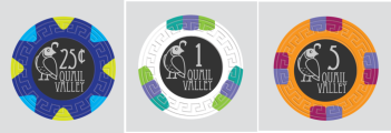
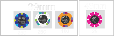
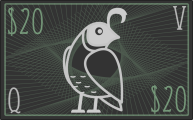
Finally getting around to getting a custom set. I'll be using the Tiberius colors with a custom label. Want some feedback on the labels.
https://www.dropbox.com/scl/fi/uzcy...Mold.png?rlkey=k5j321ydbcocv3bcbaxsygygt&dl=0
I'll be using the $25k for "25"; the $500 for "100"; and the bounty for "500".
Any thoughts on the overall design, or things I should change?
https://www.dropbox.com/scl/fi/uzcy...Mold.png?rlkey=k5j321ydbcocv3bcbaxsygygt&dl=0
I'll be using the $25k for "25"; the $500 for "100"; and the bounty for "500".
Any thoughts on the overall design, or things I should change?


")