Feedback Round 2 - CPC Tourney set (1 Viewer)

rebels9999

High Hand
Joined
Feb 8, 2021
Messages
75
Reaction score
104
Location
Mississippi
Updated Mockups:

Thanks for all of the feedback on my other thread over here: https://www.pokerchipforum.com/threads/looking-for-feedback-on-a-tourney-cpc-set.112560/

I have taken much into consideration and am updating my chips accordingly. Let me know what you think of this lineup. I have decided against color matched solid inlays and will be going with white based that have some color matching possibility. For now, I want to focus on the chips themselves.

This is a tourney set and I am taking the wonderful advice of @BGinGA and designing a set that can play to a Base 25, Base 100, or Base 500 so not all of these chips will be in use for the same game, but it gives me future proof options.

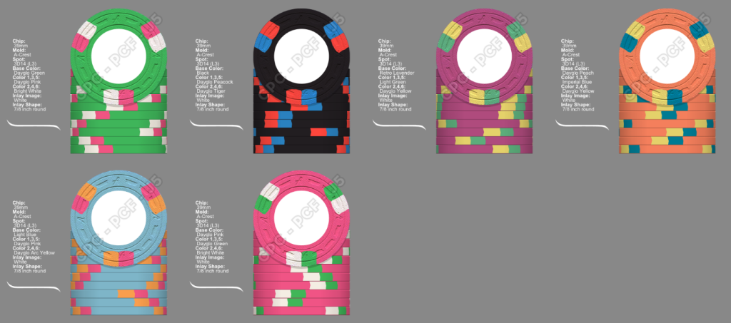
I'm working on different inlays, but these are going to be the following colors/denominations.

Light Green = 25
Charcoal = 100
Retro Lavender = 500
Dayglo Peach = 1000
Light Blue = 5000
Pink = 25000

As I said in the original thread, I had been working on a dayglo based tourney set that would pop and after seeing the amazing chips @Rieguy posted this week, I was convinced this style would work for me.

Thanks for any feedback, comments, and criticism.

EDIT: I've also added two other options that all use the same spot pattern across the entire line. I sparingly reused colors on a few chips, but only when I felt like not doing so would have significantly affected the look to go with something similar. Ex: I just can't in good conscious sub out Dayglo Yellow for Canary or Yellow. It ruins it for me with this type of set.

Option 1:
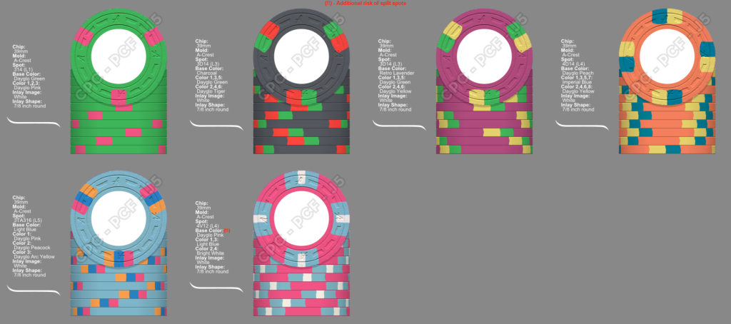
pokerchipforumfeedback2.png


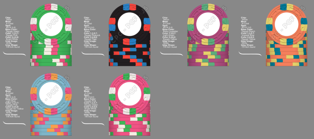
Option 2: All 3D14
All_3D14_Theme.png


Option 3: All 4D14
All_4914_Theme.png
 
Last edited:
On first look, I think there should be some spot progression between the 100 and 500 as the others progress quite nicely.
 
You'll likely want to space out the green usage since you don't want to have the same exact color in three successive chips, especially in a tourney set. I would try 414 on the 100 with two edge colors for a more natural progression from the 25 to the 500. Then the 5k is kind of a jump to thinner spots, to the extent a 614 could be worth exploring. Just a few things to start while I don't have CPC tool access.

Edit - Quick example without too much thought on colors:
02d9d872-2c0a-41ba-a2d4-abb22f29a650.png
 
Last edited:
Too much DG Green and DG Pink IMO. I understand you want the set to pop, but to me it is overkill.

Also, the T500 and T25k are very close in base colors, but if you chip up and aren't going to have them on the table at the same time it shouldn't be a problem.
 
Too much DG Green and DG Pink IMO. I understand you want the set to pop, but to me it is overkill.

Also, the T500 and T25k are very close in base colors, but if you chip up and aren't going to have them on the table at the same time it shouldn't be a problem.
Thanks for this feedback. I've made some alternate versions.
 
You'll likely want to space out the green usage since you don't want to have the same exact color in three successive chips, especially in a tourney set. I would try 414 on the 100 with two edge colors for a more natural progression from the 25 to the 500. Then the 5k is kind of a jump to thinner spots, to the extent a 614 could be worth exploring. Just a few things to start while I don't have CPC tool access.

Edit - Quick example without too much thought on colors:
View attachment 1228964
When you have a moment, let me know if you like either of the two new options that I edited to attach in this thread. I tried using your feedback, but also seeing what it would do to have the same spot pattern throughout and if that would be a net gain or loss. I kind of like it, but I am at the phase where I have done 5,000 different options and everything looks the same. I can't thank you enough for your inspiration and comments!
 
Thanks for this feedback. I've made some alternate versions.
I like each individual chip. The 500, 1000, and 5k in particular really stand out to me as really well done.

I would be careful, however, about using the same color more than once. Maybe sub out one of the DG yellows for Canary.

The one thing that I would certainly consider changing, tho, is that's the 25 and the 25k are the same exact color, just in reverse order.

If it were my set, would stick with one or the other (probably the 25 as it will be in play more and it is a nice looking chip) and do something completely different on the other chip.
 
Last edited:
I like each individual chip. The 500, 1000, and 5k in particular really stand out to me as

I would be careful, however, about using the same color more than once. Maybe sub out one of the DG yellows for Canary.

The one thing that I would certainly consider changing, tho, is that's the 25 and the 25k are the same exact color, just in reverse order.

If it were my set, would stick with one or the other (probably the 25 as it will be in play more and it is a nice looking chip) and do something completely different on the other chip.
Also, I really like both the 3d14 and 4d14. I don't think you can go wrong with either, but my personal preference is the 3d14
 
I like each individual chip. The 500, 1000, and 5k in particular really stand out to me as really well done.

I would be careful, however, about using the same color more than once. Maybe sub out one of the DG yellows for Canary.

The one thing that I would certainly consider changing, tho, is that's the 25 and the 25k are the same exact color, just in reverse order.

If it were my set, would stick with one or the other (probably the 25 as it will be in play more and it is a nice looking chip) and do something completely different on the other chip.
Thanks. I’m not really worried about the 25 and 25000 having the same colors as each other because they will never be on the same table (or even used in the same game) at the same time.
I tried to like the canary to do something different vs multiple DG Yellows but I just can’t get over how much dull it looks from a sample chip standpoint. I’m still working on something to do different but I just can’t bring in the canary, at least not yet.

Thanks for the comments and feedback.
 
Ok, honesty up front, I read the top post, not the prior one. I have no idea if there is a theme you are trying to achieve, or if you have a preference for DG or non DG colors. I have no idea if you prefer a traditional look of using the repeating spot pattern or different spots for each chip (I mean that one literally as you have both above). I do know you are in need of contrast. If everything is bright, nothing is bright, and vice versa.

So here, I've thrown on a generic old inlay I made just to give you something to see in the center besides a giant white spot.

This set uses your listed base color progression and only repeats two colors total - something you seem you are willing to do. However those two repeats are used in places where they should least affect play. As you're likely to only have chips 1-4 or 5, or 2 through 5, or 6 in play at a given time, the first repeat is the least consequential. DG pink as a spot on the T25 and as the body of the T25K. These chips should literally never be played together, so no issue. The second repeat places the colors as far from each other as possible. The DG arc yellow on the T100, and the DG arc yellow on the T25K.. these chips again should be separated as far as possible from one another (no one is likely to be 25,300 etc) and once you color up any T100s, there are no conflicts.


3D14, 4D14, doesn't matter. Your preference. But here is an example of how you can use contrasting and interesting body and spot colors to achieve a beautiful set.

c6fbb3c7-3375-41f1-ab19-3b9761150ff8.png
 
3D14, 4D14, doesn't matter. Your preference. But here is an example of how you can use contrasting and interesting body and spot colors to achieve a beautiful set.

c6fbb3c7-3375-41f1-ab19-3b9761150ff8.png
@aaron2786 seems on to something here. My preference is with the 3D14. I'm curious if switching one of the pink chips for a different colour would brighten the set up overall. Maybe a yellow, though I understand some don't like CPC yellows.
 
Ok, honesty up front, I read the top post, not the prior one. I have no idea if there is a theme you are trying to achieve, or if you have a preference for DG or non DG colors. I have no idea if you prefer a traditional look of using the repeating spot pattern or different spots for each chip (I mean that one literally as you have both above). I do know you are in need of contrast. If everything is bright, nothing is bright, and vice versa.

So here, I've thrown on a generic old inlay I made just to give you something to see in the center besides a giant white spot.

This set uses your listed base color progression and only repeats two colors total - something you seem you are willing to do. However those two repeats are used in places where they should least affect play. As you're likely to only have chips 1-4 or 5, or 2 through 5, or 6 in play at a given time, the first repeat is the least consequential. DG pink as a spot on the T25 and as the body of the T25K. These chips should literally never be played together, so no issue. The second repeat places the colors as far from each other as possible. The DG arc yellow on the T100, and the DG arc yellow on the T25K.. these chips again should be separated as far as possible from one another (no one is likely to be 25,300 etc) and once you color up any T100s, there are no conflicts.


3D14, 4D14, doesn't matter. Your preference. But here is an example of how you can use contrasting and interesting body and spot colors to achieve a beautiful set.

View attachment 1229354
Thank you! This is very interesting. I'm going to play around with this look a bit. Your mockups and colors are very interesting. Thanks for sending it and I love your inlay!

I had been working on different views for my inlay earlier today (before I read your post) and had come up with these two. They feel a bit plain, so I may end up having to hire a designer. My illustrator skills are severely lacking. I was playing around with a front and back view being different.

I've heard the dayglo colors don't really match well on the inlay, so I'll ask David how far off they typically look and if I need to go a whole different route. I matched my cash chip inlay graphic/text to the chip and they came out perfect, but I didn't use any dayglo colors in that set.
V5_Backs.png
V5_Fronts.png
 
Do you have a current CPC color set in hand? That's the first step in CPC customs design, as the actual chip colors cannot be accurately replicated on screen.
 
Do you have a current CPC color set in hand? That's the first step in CPC customs design, as the actual chip colors cannot be accurately replicated on screen.
Yes, I do have the color sample set and thank you for checking.

This is my second set of CPC chips to build. However, it is my first time trying to do inlays or chip bases with dayglo colors and I have read warnings about trying to match inlays with dayglo as the printer can’t print those accurately.

I am going for a light and bright set with this set. Or at least that was my starting goal.
 
it is my first time trying to do inlays or chip bases with dayglo colors and I have read warnings about trying to match inlays with dayglo as the printer can’t print those accurately.
Looking over your initial artwork designs that utilize color-matched denominations, I recommend that you be wary of using light colors (yellow, peach, light blue, light green, pink, even light purple or lavender) for denoms on white background inlays -- the numbers can be very difficult to see.

One way to avoid this --while also adding cohesion to the set design -- is to use a black or dark color thin stroke outline on the light-colored numbers. Adding an outline 'buffer' also helps visually minimize the color difference(s) between the printed inlay and the base chip color.
 

Create an account or login to comment

You must be a member in order to leave a comment

Create account

Create an account and join our community. It's easy!

Log in

Already have an account? Log in here.

Back
Top Bottom