Development Thread for Future Matsui Group Buy (1 Viewer)

I just got a set of 720/730s and the size was 39.75mm. I was told that if they took it down to 39mm it would compromise the spot colors for that mold.
I do like the 620s too. I’m definitely interested to see what designs people come up with.
 
I couldnt get the multi chip layout on my phone, but here are some chip ideas. 25/100/500/1k/5k/25k.

The idea is for the 3rd colour to always be white, for contrast punch and to tie the set together.
 

Attachments

  • A07F0DEA-64F4-4A8E-B04D-DF1161B3B004.jpeg
    A07F0DEA-64F4-4A8E-B04D-DF1161B3B004.jpeg
    98.8 KB · Views: 79
  • E170D323-E810-40C8-90E1-4D2B2246E0E4.jpeg
    E170D323-E810-40C8-90E1-4D2B2246E0E4.jpeg
    84.3 KB · Views: 82
  • EC94241D-DD6D-46DA-ACAE-39938F1F3994.jpeg
    EC94241D-DD6D-46DA-ACAE-39938F1F3994.jpeg
    91.5 KB · Views: 101
  • D5BA12B2-7052-4804-AD84-72A7786D490B.jpeg
    D5BA12B2-7052-4804-AD84-72A7786D490B.jpeg
    101.6 KB · Views: 84
  • C56B6FF8-F789-4094-A8F1-415CE0AEFF2D.jpeg
    C56B6FF8-F789-4094-A8F1-415CE0AEFF2D.jpeg
    99.6 KB · Views: 71
  • 9CAC7721-3AAB-45F0-B9A2-BC9A5309B06D.jpeg
    9CAC7721-3AAB-45F0-B9A2-BC9A5309B06D.jpeg
    80.5 KB · Views: 77
I couldnt get the multi chip layout on my phone, but here are some chip ideas. 25/100/500/1k/5k/25k.

The idea is for the 3rd colour to always be white, for contrast punch and to tie the set together.

I'm of the mindset that if we can avoid every spot having the same spot color, we should. I think the inlay, being uniform across all denoms, will serve to "tie the set together" well enough.
 
I'm of the mindset that if we can avoid every spot having the same spot color, we should. I think the inlay, being uniform across all denoms, will serve to "tie the set together" well enough.

I agree. The second colours are all different. Its only the small middle spot. Bc regardless of the main spot colour, the bright white pops.

How do you like the Aqua w light green?

i would definitely be in for a set like this!
Does anyone else think it would be nice to have the highest 2 denoms with 6 spots like in the pic?
 
I'll be honest: the color samples that Matusi provided I saw in the Horseshoe GB weren't blowing me away. It wasn't until I had the chips in my hand that I really saw how fantastic the colors are together. It could be the patterns fully realized, probably in concert with the inlays, but the color "chips" images just didn't sell it. Get samples and don't take my word for it.

Edit: my gut says the lighter shades are going to to be much more interesting in hand. But, my gut also says the muted shades are just not how these chips do their best work. Especially when they're juxtaposed with a light base. @Advocate That's a lot of white. My critique is that potential for differentiation would get lost in stacks next to each other. Kind of like a Monaco or Elite style - and, if that's the goal, then take this for my subjective view and nothing else. I don't want to call it "boring", but there's room for more enthusiastic combinations. Enthusiastic? Sure, I'll go with that descriptor.
 
Last edited:
I agree. The second colours are all different. Its only the small middle spot. Bc regardless of the main spot colour, the bright white pops.

How do you like the Aqua w light green?

Does anyone else think it would be nice to have the highest 2 denoms with 6 spots like in the pic?

For a 25, I like an aqua/light green/forest green rather than standard/traditional greens. I.E. if I could make our 25's emulate the Caesar's $2's I would.

IMG_2693.JPG

Would need to go to a 4-color chip for that though.

Rather than an edge spot change, I've floated the idea of going with MoP for the higher denoms to differentiate them. Maybe just make the 100K pearl gold. That caught my eye long before I knew @Poker Zombie was pining for it... honest.

I have a question into matsui regarding color kits with the pearl colors. I'm guessing they don't carry them though. Wouldn't be that hard; given you'd only need the faceplate part of the kit.

How about this for the "1000"?

c1000_candidate.pngIMG_2690.JPG

My camera shows the sample chip more yellow than it is. It does have an orange tint to it, perhaps between the mock and the photo. IMHO this would go well with @Darson's "Poker After Midnight" inlay.

If any of you all want to see how a color-kit version of a mock looks, let me know the exact colors and I'll try to oblige. Fair warning, if I get a gazillion requests I'll likely only be able to field a few.

I have sent a question on metallic ink printing on inlays to Matsui. As I said previously, I think making the just the moon on Darson's design a shiny metallic would look really cool. If it's cost-prohibitive, then well... nevermind.
 
I'm watching with mild interest. If we go with 620's or 320's then there's a slight chance I get a small set, moreso if we use rounded edges, less if we use sharp. Guaranteed to be out if the other proposed patterns are used. Don't make decisions on my account, though - if I'm in, I'm likely only in for 400 chips so my potential order carries little weight.

Carry on...
 
Well, nothing is definitive yet but....

Frontrunners:

Mould - CC620
Inlay - @Darson's Poker After Midnight
Edges - 1 vote for round (@Psypher1000) ;) I have no preference on edge sharpness.
Colors - Current set colors will always be at post 2. Not close to lock anything down yet.
 
This is not directed at any particular design, choice of colors, inlay, or spot patterns. But I would highly advocate for thinking outside the box. There is significant talent and experience on this site, and most of the GB designs of the last couple of years, with the exception of Boardwalks (yes, I know, it was a tribute set, but that is a highly differentiated and exceptionally designed set), I don't 'miss' not having participated in any publicly available Group Buy. This is true for Sun-Fly, Matsui and other sets.

As has been mentioned before, many of the themes have been done dozens of times. I understand that some are new to chipping and may like to have some tribute sets, and I wish them well in organizing a GB for small orders. But it would be great to see a truly well designed Matsui and Sun-Fly set offered sometime in 2019.
 
Some more suggestions.
 

Attachments

  • 1D4046C1-E4B5-43E2-A5AE-D741529B8D3F.jpeg
    1D4046C1-E4B5-43E2-A5AE-D741529B8D3F.jpeg
    136.5 KB · Views: 95
  • 3700EE6C-CA85-4A66-8F5C-FA78D088B2E2.jpeg
    3700EE6C-CA85-4A66-8F5C-FA78D088B2E2.jpeg
    153.1 KB · Views: 84
  • 1D5F1816-D57E-4E8A-9479-25F56CB6903F.jpeg
    1D5F1816-D57E-4E8A-9479-25F56CB6903F.jpeg
    156.7 KB · Views: 79
  • D915D4CB-A8EE-482B-9AFC-8A69F03D1715.jpeg
    D915D4CB-A8EE-482B-9AFC-8A69F03D1715.jpeg
    138.6 KB · Views: 84
  • EAC4F228-2AF7-41C4-A2F9-9F988D84E56C.jpeg
    EAC4F228-2AF7-41C4-A2F9-9F988D84E56C.jpeg
    126.1 KB · Views: 85
  • 3E29F7D1-52F0-4ECC-B73E-A0962A88E35C.jpeg
    3E29F7D1-52F0-4ECC-B73E-A0962A88E35C.jpeg
    150.5 KB · Views: 91
  • 88B493E8-327C-42FC-B96B-629E30F351F8.jpeg
    88B493E8-327C-42FC-B96B-629E30F351F8.jpeg
    154.3 KB · Views: 91
  • 8EBDAF7A-AAF8-47F2-8C83-9F1CF35FDE66.jpeg
    8EBDAF7A-AAF8-47F2-8C83-9F1CF35FDE66.jpeg
    149.1 KB · Views: 82
  • 18B7AC83-4A91-40A1-8CA1-DC8C8B111EB1.jpeg
    18B7AC83-4A91-40A1-8CA1-DC8C8B111EB1.jpeg
    139.5 KB · Views: 89
  • FF75112F-C698-47E9-B5D4-1F68C731105C.jpeg
    FF75112F-C698-47E9-B5D4-1F68C731105C.jpeg
    146.7 KB · Views: 84
I wanted to do a 44mm/50mm tournament set and a 44mm Cali color cash set in the future. Originally I thought of doing the outer ring value but if there are enough participants it doesn’t make sense. Plus opens up for relabel potential.
 
I gotta say I’d be out based on the inlay. I think I’d rather see the denominations on the inlay and leave them off the outer ring. I’d rather see a well designed, simple, black inlay. Something along the lines of SDPM, but definitely not a tribute. I think for a chip to appeal as a group buy it should stay away from themes or names. The only text I think would be appropriate would be chip denoms, tournament or possibly NCV...or even just denoms and a classy design.
 
I gotta say I’d be out based on the inlay. I think I’d rather see the denominations on the inlay and leave them off the outer ring. I’d rather see a well designed, simple, black inlay. Something along the lines of SDPM, but definitely not a tribute. I think for a chip to appeal as a group buy it should stay away from themes or names. The only text I think would be appropriate would be chip denoms, tournament or possibly NCV...or even just denoms and a classy design.

Chip denoms on the label add an astonishing $1500 to the cost of a set. While I like the thought of relabel potential to make cash sets, Cali colors, or other projects (and my sole interest is in the "other" category) we need to be aware that denoms on the label are stupid expensive through Matsui.
 
Chip denoms on the label add an astonishing $1500 to the cost of a set. While I like the thought of relabel potential to make cash sets, Cali colors, or other projects (and my sole interest is in the "other" category) we need to be aware that denoms on the label are stupid expensive through Matsui.
Correct -- much cheaper to order no-denom chips with a single generic label (or no label at all) from Matsui and have @Gear produce your denominated labels afterwards.
 
I like the denoms on the inner ring. It leaves the entire inlay for graphics.

I also like an interesting theme, but one which appeals to the broadest base of potential buyers.

We may want to start with a poll of who is realy interested in a Matsui tournament set for 2019.

Then, lets get some input on what are deal breakers, must haves, etc...

We should be able to narrow it down sonewhat.

I want one. I would be in for 1200pcs or so. But I want bold primary base colours, with colourful accents. 39-40mm. Im open to edges.

But the theme of the inlay? I have to agree the “Poker After Midnight” isnt great for a pro-level tourney set, that stands the test of time. Too “cutesy”. Too “boutiqe”.
 
How I'm thinking right now:
- Not a fan of the "Poker after midnight" inlay (yes I know I drew it!)
- I want bright base colours (lemon, day-glo pink, orange) - stuff that you can't get in clay unless it's TRK unobtanium
- The 720-A edgespot or something different. The 620-A is bland, the 620-F is much better. 320 would also be OK

Great discussion though. I'll mock up a few more inlays and let people comment.
Yes!
Aqua
White
Purple/Violet
DG Pink
Lemon
DG Orange
Go!
 
Out on current mold and inlay.

Yeah, I'm out also with the way this is now tracking. The original Eclipse inlay design had strong appeal for me but the only thing left of that now is the moon. Appreciate everyone's contributions here, and all tastes are different, but "poker after dark" reminds me of a movie you'd see on Cinemax at 2:00am back in the day. Encourage some additional creative brain-storming on this. Good luck!
 
We may want to start with a poll of who is realy interested in a Matsui tournament set for 2019.

Then, lets get some input on what are deal breakers, must haves, etc...

We should be able to narrow it down sonewhat.

I want one. I would be in for 1200pcs or so. But I want bold primary base colours, with colourful accents. 39-40mm. Im open to edges.

But the theme of the inlay? I have to agree the “Poker After Midnight” isnt great for a pro-level tourney set, that stands the test of time. Too “cutesy”. Too “boutiqe”.

One thing that I was sure of when I started this thread was that it would be impossible to please everyone.... and that's ok. It's just going to be a question of finding something as close to a consensus as we can get before we're ready to make an official group buy post. If there's enough interest at that point, we go. If not, we don't. Simplicity.

Regarding a poll: you're welcome to start one if you wish but I figure that would be sort of redundant. Given this thread is not just radio silence and has lots of contributions thus far tells me that there IS interest enough in a 2019 matsui GB.

As you all know very well, there are a lot of things that need to coalesce to make a successful set:
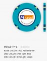
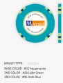
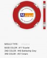
- mould
- tribute or original
- inlay design/theme
- base colors
- spots style
- spot colors


It's not exactly an easy thing to get all of this exactly right... and what "exactly right" is varies depending on which chipper you're talking to. ;)

Thus, if you all will kindly allow me the to put on my project leader hat for a moment, I would suggest that we focus on one issue at a time and come to a decision on it before moving on. If there is no decision or deadlock we can table it temporarily.

Let's start by hashing out the mould. Once we have a consensus of what mould this GB will be we can aptly move on to the next item.

The initial moulds along with others suggested are:

CC730a
CC720a
CC620a
CC320d
CC620f

There wasn't much interest in 730a (likely due to cost?) so I'm striking that. That leaves us with four.

The 720's would look really interesting and unique when stacked IMHO.

Some have said that 620a is too plain, and they're right. I just happen to like the 620a's simplicity (plus seeing how cool @Pinball's looked in his pics really swayed me).

I think I want to renege on my initial stance on the 320. Every mock I see or make involving those just looks too... busy. The rounded spots on the 720 are just so much more appealing.

Regarding the 620f, I think you'd see more edge spot than base chip when they are stacked.

Given the above and everyone's comments so far: can we select the 720a mould and move onward?
 
Last edited:
  • Like
Reactions: BNM
I applaud plaiddragon for taking this on. I feel it is a really difficult task. Without any disrespect, I believe the design should start with the inlay and then choose the mold that fits with the design. Continuety makes the design clean.
For example I choose the 730s because the 3 curvy edge spots fit with my dragon logo.
 

Attachments

  • mB2TVbFHR++pOJoEYQX9YQ.jpg
    mB2TVbFHR++pOJoEYQX9YQ.jpg
    355.3 KB · Views: 107
Some moon ideas and also some mission patches.

For those of you who like the Eclipse logo, can you say why? Just the name? The background?

Matsui GB 09.png


Edit: Just FYI, none of these are my design, just a bit of googling. Lots of eclipse logos out there. More to see what people gravitate to rather than anything finished.
 
Last edited:
For starting out, I believe the bottom row, left corner has the best composition. I also like the movement and energy. I also like the potential for the top row, both on the far right. They could look like logos for a space movie :). Both of them could use a stronger focal point that is not over powered by the flare from the eclips. I find the small circular art board very hard to work with. Great job Darson!
 
I applaud plaiddragon for taking this on. I feel it is a really difficult task. Without any disrespect, I believe the design should start with the inlay and then choose the mold that fits with the design. Continuety makes the design clean.
For example I choose the 730s because the 3 curvy edge spots fit with my dragon logo.

Thx yone. Can you offer any comment on the slickness of your 730's? There have been concerns that they are prone to "barrel explosion". I'd assume 720's would handle similarly.

@Darson, the 4th on the top row is my favorite. Needs something more though. The 1st page Eclipse inlays had planets/nebulae/whatever in the background. Anything you can do with the current design and that?
 
Last edited:
Yes the chips are slick, haven't had any barrel explosions and don't really see that as a future problem. They are a little bit more slippery than used dice chip. Not an unreasonable amount of pressure is needed to keep a barrel together horizontaly. But may seem like a lot more, if you are comparing them to brand new cpc chips. They seem to be what you would expect from plastic.
I don't really have an idea of what is an acceptable level of slickness; this is my first set. I do believe they will get better with play, the sample chips that I have been shuffling around feel pretty good now. Even brand new, I love playing with them. Although the people that I play with are not chippers, everyone thinks they are amazing. In my opinion, they are definitily playable.
 
@Darson, the 4th on the top row is my favorite. Needs something more though. The 1st page Eclipse inlays had planets/nebulae/whatever in the background. Anything you can do with the current design and that?

I've redrawn the logo myself and inserted some star fields. Since I've redrawn, I can change the text colours, position etc.

Matsui GB 10.png
 

Create an account or login to comment

You must be a member in order to leave a comment

Create account

Create an account and join our community. It's easy!

Log in

Already have an account? Log in here.

Back
Top Bottom