You are using an out of date browser. It may not display this or other websites correctly.
You should upgrade or use an alternative browser.
You should upgrade or use an alternative browser.
Development Thread for Future Matsui Group Buy (6 Viewers)
- Thread starter PlaidDragon
- Start date
Yellow text on the right graphic instead of the red?
Venturalvn
Full House
Maybe another non-casino generic theme without a name but killer graphics, like the Samurais.
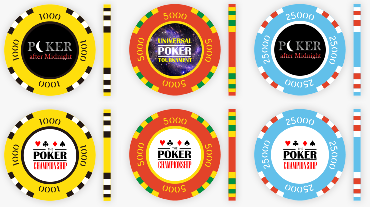
Version 1 Mocks:
View attachment 213767View attachment 213768
Colors are subject to change given everyone's input.
How do you edit the denomination in the chip designer? How do you export the chosen mocks to a saved image?
After picking your mould and size (mould should be "inner ring decal value chips"
You should see sliders below. The top one shows: [Previous] [STND & EP] [Next]
Click the previous and next to advance the denom.
Doing this on a pc works just fine; however, I just discovered that pressing the prev/next buttons on an iphone doesn't actually work.
I used the windows snipping tool to grab just the chip images and then a basic editor to put them all together.
@Darson, the yellow text on the rightmost mock just pops now. I like it a lot.
For the others maybe just "POKER Night" or "POKER after Midnight" ? The moon for the "O" in POKER looks good.
Last edited:
Response from Matsui regarding today's questions:'
"The chips that say 39/40mm can be done in both sizes. The only difference are the edges of the chip. 39mm will get you a more sharper edge where 40mm will have a more rounded edge, but it won’t always be exactly 39mm even if it says 39/40mm. It might be 39.5mm or 39.7mm etc. Although, there are times we can try to get a 40mm to a 39mm, but it just depends on the edge spot design."
If we end up going with 620's we'll have to decide on either sharper edge 39's or a more rounded 40's. My own pref would be the sharper edges.
"As for the samples, I’ll see what I have since we just had the gaming convention in October and a lot of the samples were taken, so sending a stack might not be possible at the moment. I can send you some samples in the summer of next year when we re-order for next year’s gaming convention. If that doesn’t work, I can see what I’m left with late Spring, and if I can send you a stack, I will."
Ugh... well, I DID mean for this GB to go in 2019.
I had to...

lmao
How about something a bit more "in yo face"

I'm thinking more black edge spots if we go for a black inlay. Otherwise white seems to fit better.

I'm thinking more black edge spots if we go for a black inlay. Otherwise white seems to fit better.
Last edited:
Venturalvn
Full House
With that much edge coverage, we'd need to stay away from repeating colors in the spots, and also from spot to base in the other denoms.
You're not gonna like these then!

Right now I'm thinking Darson's Poker After Midnight from post 42 (ironic given his Hitchhiker's inlays  ) is the best inlay idea right now with Mipevi's Eclipse design a close second. I'm also still thinking the Universal Poker Tournament inlay from the same post has potential still. Is "Galaxy Poker Tournament" too close to the actual venue name?
Took some of JoeBGo's colors and applied them to the current mock at post 2. Also added a 100K denom so the order can support SHR in addition to traditional tourney values.
I sincerely appreciate all the input thus far. Keep it up.
For the 100K, note the "mother of pearl" (MoP) base. Maybe we distinguish our higher denoms this way? 5K and 25K too?
Last edited:
I think we should try and avoid having the same colors on the edge spots IE the 25 and 500 (dandelion yellow) and the 5k and 100k look similar. But I’m loving the colors so far. “Mother of pearl” might be cool, I also wouldn’t be opposed to 43mm higher denoms (5k and up).
I was thinking the same thing on the 500 and was altering it about the same time as you made your post. Mock changed.
@PlaidDragon are you sold on the dark brown on the 25? The rest of the set is so bright, it feels out of place?
Not sold on anything.... other than avoiding 43mm and having a few off-standard colors. I do not want a base green for the 25 though given I prefer the lighter greens or aqua.
Sell me.
Sell me.
Last edited:
Absolutely zero interest here in any kind of tribute or knock-off design, especially those that have already been done dozens of times. Please think creatively and get some unique and original designs under consideration...... this isn't the SheepFollowingSheep, MindlessLemmings, or ItsAlreadyBeenDoneForum.com.
Two things.
1) Matsui has reflective/metallic printing available for the inlays. What if the moon in the "poker after midnight" label was shiny metallic provided it's not cost prohibitive?
2) Mocks for potential MoP higher denom chips:

Would it be weird if the lower denoms were flat/base colors and the higher denoms weren't?
1) Matsui has reflective/metallic printing available for the inlays. What if the moon in the "poker after midnight" label was shiny metallic provided it's not cost prohibitive?
2) Mocks for potential MoP higher denom chips:

Would it be weird if the lower denoms were flat/base colors and the higher denoms weren't?
Lots of riffs on the WSOP set have been done, and will be done again in the future. How about a take on the WPT (GPT - Global Poker Tour), High Stakes Poker (Low Stakes Poker), or Poker after Dark (Poker after Night)?
I will these up if there is sufficient interest.
And yet another one... I plan on doing these some time next year. Not sure when, I have some health issues I'm dealing with ATM, so when I'm done with that, I'll look at getting it going.
I'd take creative liberty and make them different. 
Combine the “poker w moon image” with the “Global Poker Tour” somehow, for “Lunar Poker” or “Lunar Poker Tour”, “Moonlight Poker Tour”
Not sold on anything.... other than avoiding 43mm and having a few off-standard colors. I do not want a base green for the 25 though given I prefer the lighter greens or aqua.
Sell me.
I agree on the green. Go aqua. Generally, my vote is for bold, punchy chips designs, but with base/edge combinations that use the most complimentary colours.
I like 620, but I also like 320.
Good news, bad news:
The color kit is in!
The pearl colors aren't included.
I'll leave you all to determine which news is which....
I'll get some kit pics posted of our current non-pearl mock colors.
The color kit is in!
The pearl colors aren't included.
I'll leave you all to determine which news is which....
I'll get some kit pics posted of our current non-pearl mock colors.
Similar threads
- Replies
- 46
- Views
- 2K
- Replies
- 9
- Views
- 453
- Replies
- 9
- Views
- 645
- Replies
- 26
- Views
- 1K


