Working on custom ceramic tournament set (2 Viewers)

Frode789

Two Pair
Joined
Nov 7, 2016
Messages
278
Reaction score
283
Location
Norway
Hi guys.

Working on my first custom set for my home tournaments. Going ceramics, love the feel and look of them more than clay.
Keywords: Clean, vibrant colors, elegant.

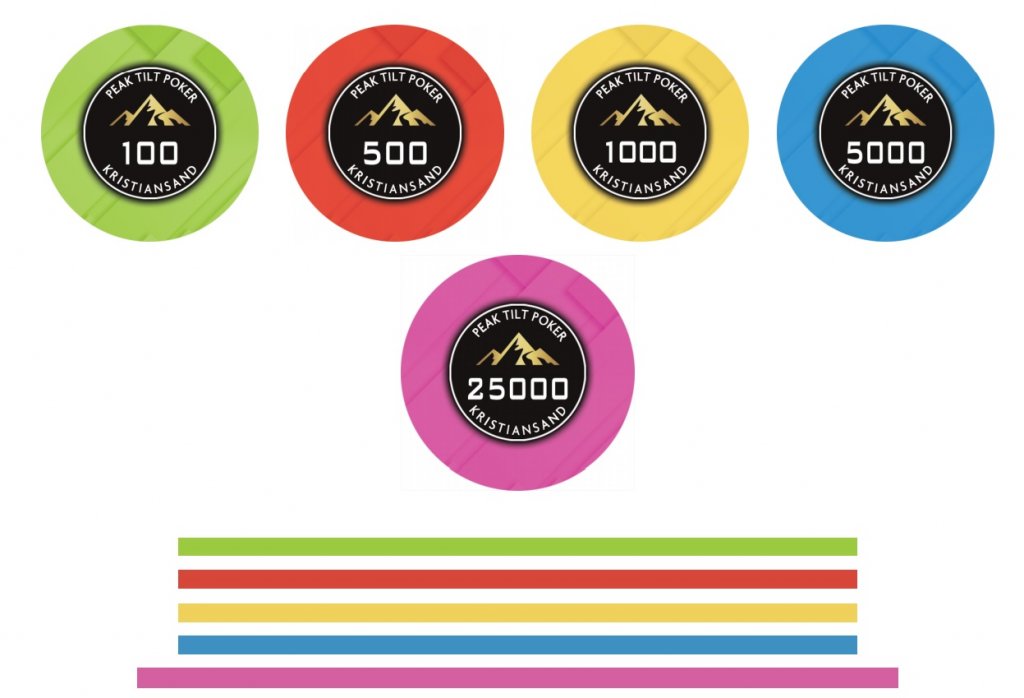
Design A:
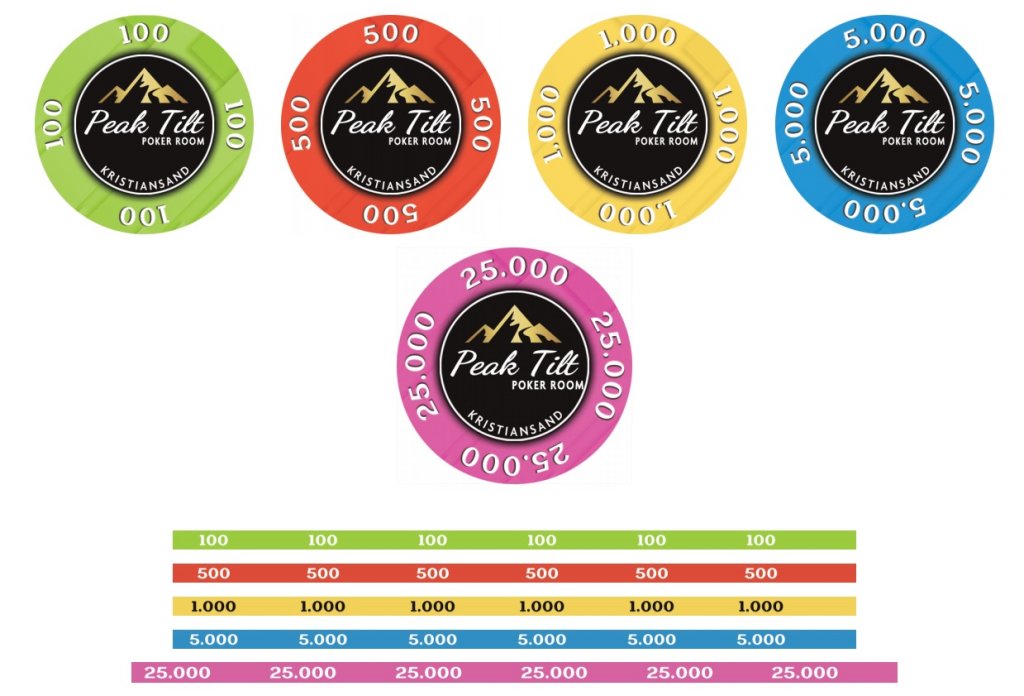
Sjetonger (002).jpg


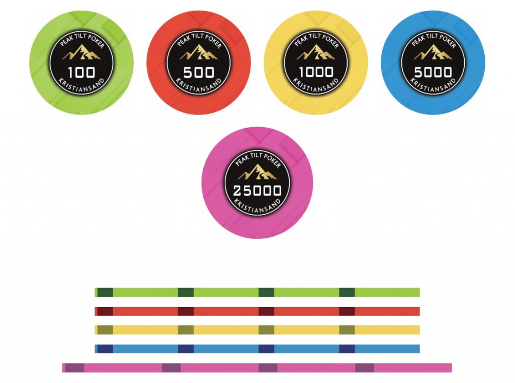
Design B:
Design Empire B.jpg


Design B - 2 (edge modification):
Design pC% sjetonger.jpg


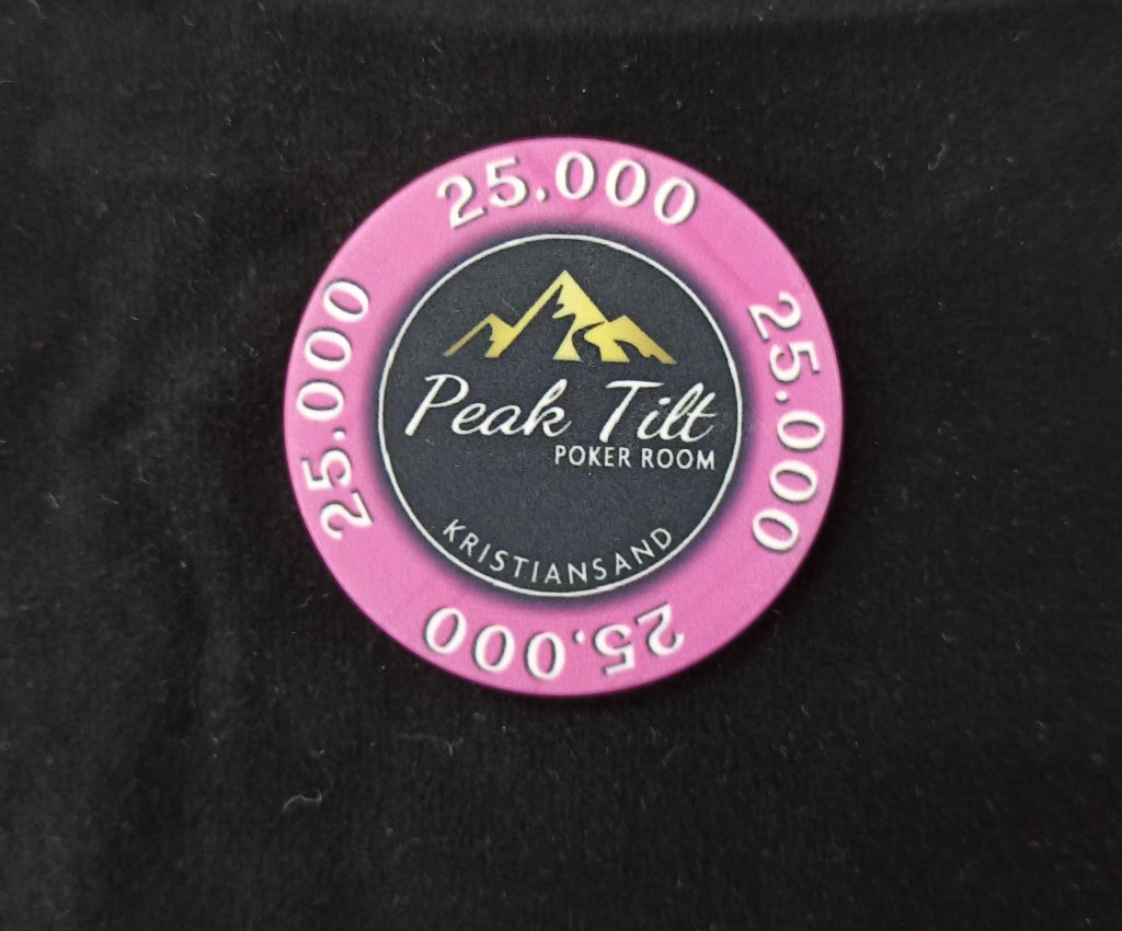
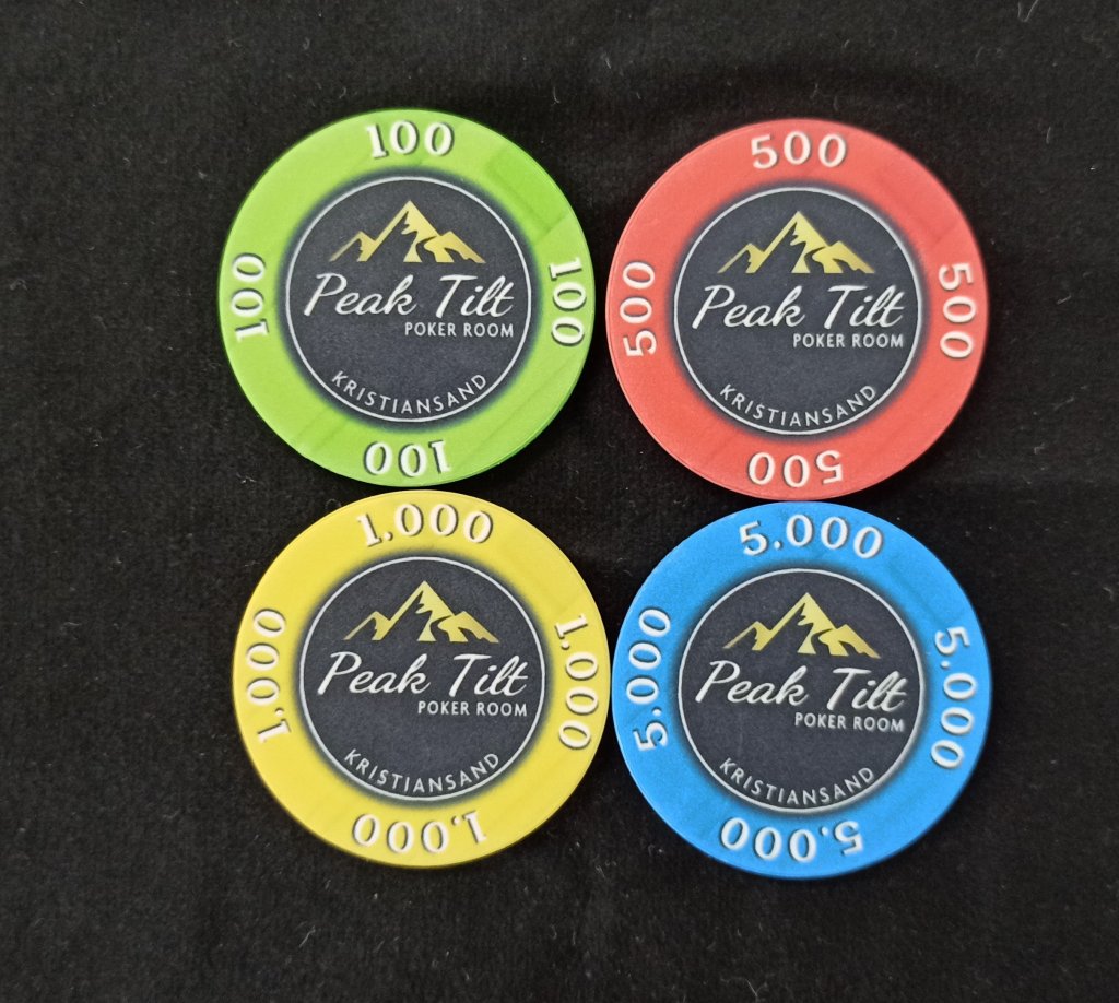
Real samples of design A:
25k (2).jpg
Chips (2).jpg


Since I got a awesome new table top mat on the way, with design from @T_Chan, I need chips with colors that really pop and provide great contrast on the table.

Frode Final (1).png


Denoms in set:
T25K - Light Pink. (43mm)
T5K - Light Blue. (39mm)
T1K - Gold Yellow. (39mm)
T500 - Light Red. (39mm)
T100 - Lime Green. (39mm)

Other suggestions for the T100? Unsure about the color there.
 
Last edited:
No white for heavy-use chips. They can turn cream or grey at no time.
White only for the top value chip, IMHO. (Do as I say and not as I do).:)
Other choices depend on the felt colour the chips are going to be played on.
 
I am toying with colors for a tournament set as well.

I think grey is the better of the two choices.
 
Even ceramics? I'm asking since I might be buying in the future.
I have no experience with them; they have been officially banned here by my great-grandfather, the Duke of Groba (the latter being a peak on the mountain above our village) :p:)

I 'd still buy anything white if I were responsibly informed by the producer on how to clean them.
 
Not a huge fan of white poker chips.

Any other suggestions? :p Grey is an option, just hope it doesn't get too bland.
 
How about green? It should contrast well with the others.

Personally, I would probably have a red 100 and purple 500.

Some pre-pr0n of your design would help.
 
How about green? It should contrast well with the others.

Personally, I would probably have a red 100 and purple 500.

Some pre-pr0n of your design would help.

Lime green f.ex is an option.

Yes, I actually would like purple at the table (love that color), but since I'm going with a bright color scheme on all chips (bright pink/blue/red/yellow), I'm wondering if bright purple and bright pink will be too close.
 
Here's an example of purple and pink together in a set that I have:

PXL_20210127_183500380.jpg


I'll admit it's not the best of lighting in this picture but I think it works (even more with those edge spots on the purple).
 
White has a potential to create extremely tilty results due to the blanks used. A white chip isn't white, it's just a lack of ink since the blank itself is white. Now a high volume producer will likely give you chips all from the same batch so the blanks will all be the same. BUT I have also seen situations where some blanks are a little cream or yellow as they come from different production batches and look noticeably different in stacks.
 
I went with lime green. I think the contrast between the chips in these colors will be cool, but time will tell.. ^^
Design image coming in a few days here :)

If I don't like the color on the chip when I have the sample, I may have to swap for something else.
 
I'm wondering if bright purple and bright pink will be too close.
Since the pink is 25k, it might not be on the felt the same time as the T500, but that of course depends on your stack size and breakdown, and the color-up scheme.

You could of course instead have the T100 as purple. If you love the color, make sure to find a way to get it to the felt (unless you love the other five more).
 
Last edited:
Also I'm curious to see what I think about mixing 43mm and 39mm once the samples come out. I've seen other sets with 43mm on the biggest denom to make them extra special, but from a pure OCD standpoint I may hate it :p
But generally there will only be about 15-20 chips of the T25K at the table.

Anyone else have mixed sets or samples? Loved it/hated it?
 
How about orange?

Yes I have thought about it, so certainly an option. Though since I'm going with an all light color scheme, I'm unsure what I feel about a bright orange chip.
Will have to consider my options though if there is any chip I don't like after reviewing the samples.

Stoked for the updated design, hope it arrives in my inbox tomorrow :)
 
Design for the chips!

Sjetonger (002).jpg

Ps. I notified them about the M touching the white line on the 25K chip. It will be fixed =)

Feedback is welcome :)
Not 100% decided if I want to keep the denoms on the edges or if I want them clean. Will await that decision for when I have the actual sample images. Should be here in a few days max.
 
Last edited:
Charcoal or dark grey might be nice too.
Even a lighter grey could be nice in fact. To try...
 
No white for heavy-use chips. They can turn cream or grey at no time.
White only for the top value chip, IMHO. (Do as I say and not as I do).:)
Other choices depend on the felt colour the chips are going to be played on.

This.

I have two sets of ceramics (1500 abc's and 800 sunfly's) and not a single white chip for that exact reason. The only white chips I have are my CPC Dragon 500's. They're the top denom for the set.
 
Charcoal or dark grey might be nice too.
Even a lighter grey could be nice in fact. To try...

On the T100 yes?
The earlier draft had a T100 in grey. Which I also think looks pretty sweet. :tup:
Empire (2).jpg

But since I've gone with a brighter color palette (to contrast the very dark poker mat and black inlay on the chips), I was questioning if grey would be too bland/dark.
 
I like the choice of bright somewhat "untraditional" colors a lot. I'd say, keep the vibrant green. Having denominations on the rolling isn't my favorite. Hard to read unless they are so close you won't be in doubt anyway. Or they wind up upside down. Maybe plain edges or some simple patterns to keep it in style with the nice cleanly designed faces.
 
Who is manufacturing the chips?

I'm buying through the largest Norwegian poker shop. The dealings I've done with them so far has been excellent with good quality. (pokerutstyr.no).

I like the choice of bright somewhat "untraditional" colors a lot. I'd say, keep the vibrant green. Having denominations on the rolling isn't my favorite. Hard to read unless they are so close you won't be in doubt anyway. Or they wind up upside down. Maybe plain edges or some simple patterns to keep it in style with the nice cleanly designed faces.

Thank you :)

Yes I am too unsure about the denominations.. (where to have them). Remove them from edges and rolling sides, and just place them in the center inlay?
Place the poker "club" name at the top of the inlay? (in similar style/size of the city name at the bottom).
 
Live samples are in. (albeit not the greatest images from the manufacturer, hard to spot the pattern along the colored section and edge :p) :
Love the fresh colors and classy inlay. Those turned out great.

Chips (2).jpg

25k (2).jpg

Edge (2).jpg


Things I'm considering:
- Remove "rolling" denoms on the front (alongside the colored edge), and instead place them center in the inlay. I may have to move the club name then to the top of the chip, so the denom get center stage on the chip.
- Unsure about the edge denoms.
Alternatively add some simple edge patterns? F.ex like the edge pattern here:
spartan-warrior-poker-chip-all1-fi.jpg
 
Last edited:

Create an account or login to comment

You must be a member in order to leave a comment

Create account

Create an account and join our community. It's easy!

Log in

Already have an account? Log in here.

Back
Top Bottom