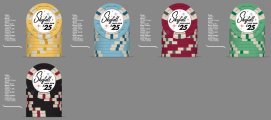
I'm done picking colors/mold/spots for my first cash set and would welcome your feedback. Skyfall Poker Room comes from the fact I like James Bond. I'm shooting for a mid-century modern vibe with the design. I'm still working on the inlay, so the test inlay shows $25, but the actual denominations will be as follows:
.25 - Canary Yellow
$1 - Light Blue
$5 - Red
$25 - Light Green
$100 - Black
I appreciate any thoughts and comments. Thanks!

.25 - Canary Yellow
$1 - Light Blue
$5 - Red
$25 - Light Green
$100 - Black
I appreciate any thoughts and comments. Thanks!