Advice Wanted on Custom Inlay (False Idol - THC Relabel) (1 Viewer)

chicubs1988

Flush
Joined
Aug 27, 2017
Messages
1,732
Reaction score
4,495
Location
Illinois
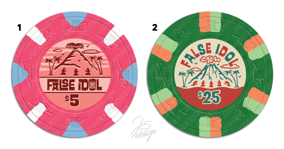
I'm working on a custom label for a project I've been putting together for quite a while. I'm going for a tropical/tiki theme with an art deco/mid-century vibe. Here are some working drafts completed by the talented @Johnny5 - playing around with some different ideas. Any feedback is appreciated.

Note: these are not the chips in my set, just some place holders for working on the inlay.
1710706261852.png
 
I like #2 better but at first I was wondering why there was a hatchet in a cloud on it

#1 is just fine as well.

Do one for tourney one for cash
 
#2 the volcano is more visible, #1 it almost looks like an ant hill

#2 I like the FALSE IDOL much better

#2 I like the denom better
 
I like 1, but can you explain why 'false idol' and are you set only on a volcano? you said tiki

I feel like false idol is also a negative connotation, I think you could have a better slogan?
 
Last edited:
I like both, maybe some larger font for the denoms?

I think it is also difficult to compare on 2 different denoms.
Pretty sure that the design of the 25 on the 5 chip (assume some color adjustments to the chip base color) will look awesome as well.

Good luck!
 
Make it a poll!!! :LOL: :laugh:

Also, 2 is my winner by a landslide. Everything about it feels like it could have come from some casino or cardroom in the 50's or 60's, or even now from some place like Palm Springs. The contrast is great, the details are great. I am green with envy...haha
 
2 - colors and text complements each other. Similar to Bigtop poker - standout more
 
I like the graphic on #1 better, it just needs better color contrast to stand out. The text on #1 is harder to read as is. I would change out the text/layout for the I and D in IDOL.
 
My goodness J5 is a great designer.
Love both of them.

A note from the printing POV:
If you pick #1 and you plan on changing the colors to match the chips...beware the florescent chips.
You can read up on our FAQ or on the original post in here it's based off of.
CMYK ink sets can't reach those beautiful bright colors they are outside of the color gamut.
 
2 by a lot for me. Not a fan of the alternating colors on the text.
Yes!

I feel like false idol is also a negative connotation, I think you could have a better slogan?
Yeah, it’s your theme so you probably don’t care what we think, but in case you do, when I hear false idol I think of two things:

1) Old Testament, first commandment, the minute Moses turned his back, his people were worshipping a false idol. I’m pretty far from a Bible thumper, but this feels off-color to me, at the least.

2) the tv show Survivor, where sometimes people make a false immunity idol to try to trick their opponents - it rarely works.
 
Thanks for the feedback so far. I too prefer #2, however I think I’m going to play around with the colors.

Feel free to keep the opinions coming. I’m also leaning towards using this label on a CPC set instead of a THC relabel.
 

Create an account or login to comment

You must be a member in order to leave a comment

Create account

Create an account and join our community. It's easy!

Log in

Already have an account? Log in here.

Back
Top Bottom