great point
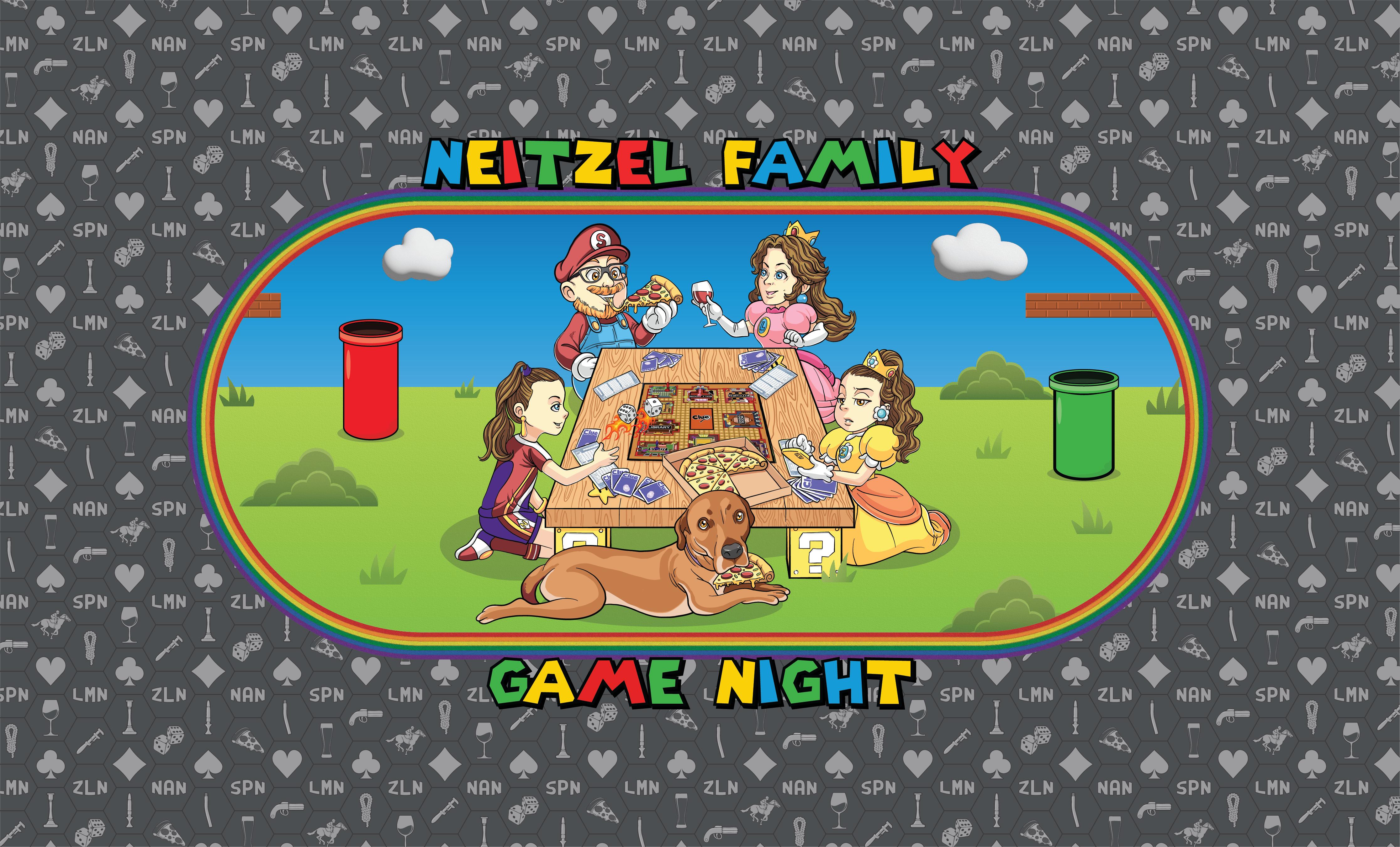
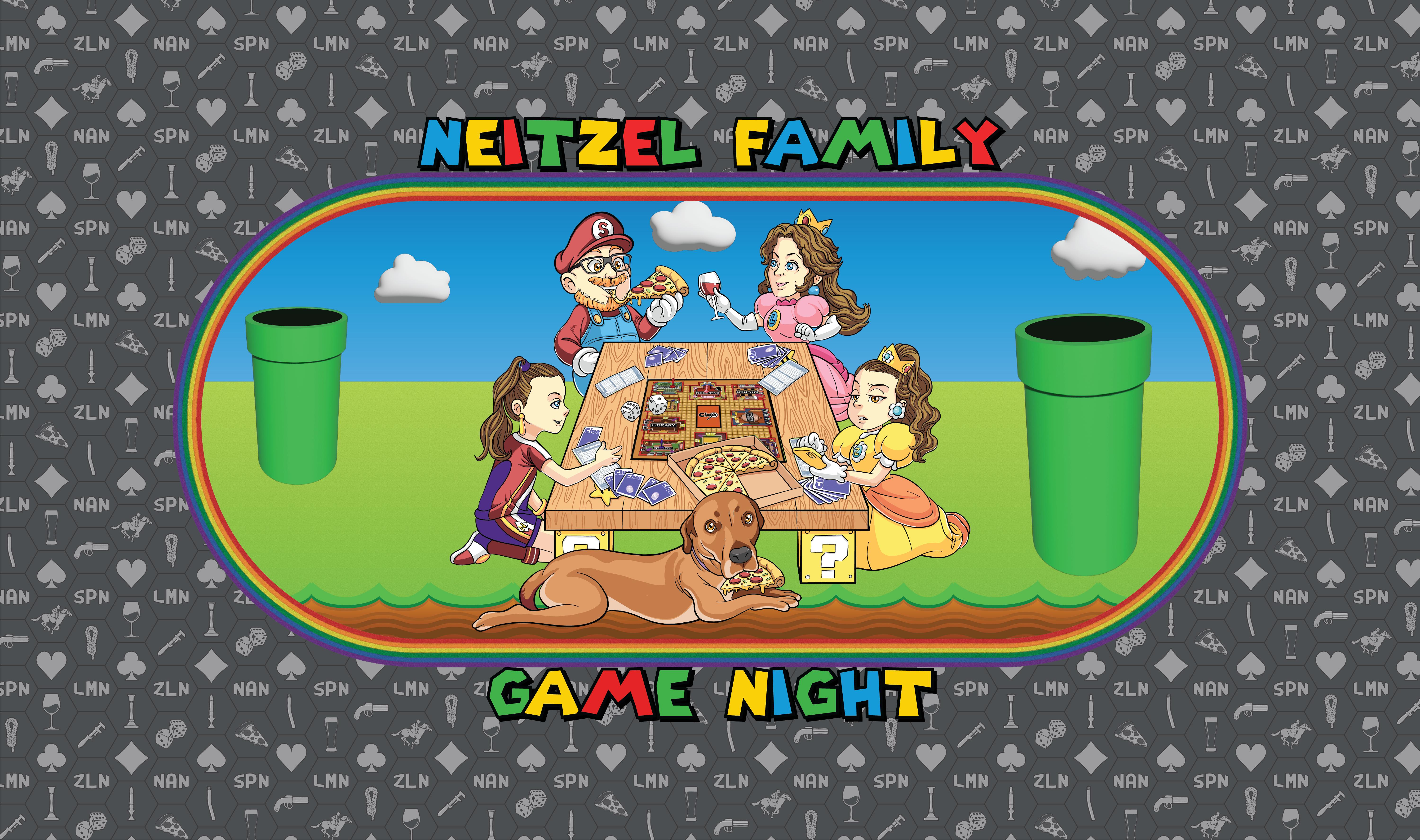
getting closer, I think:
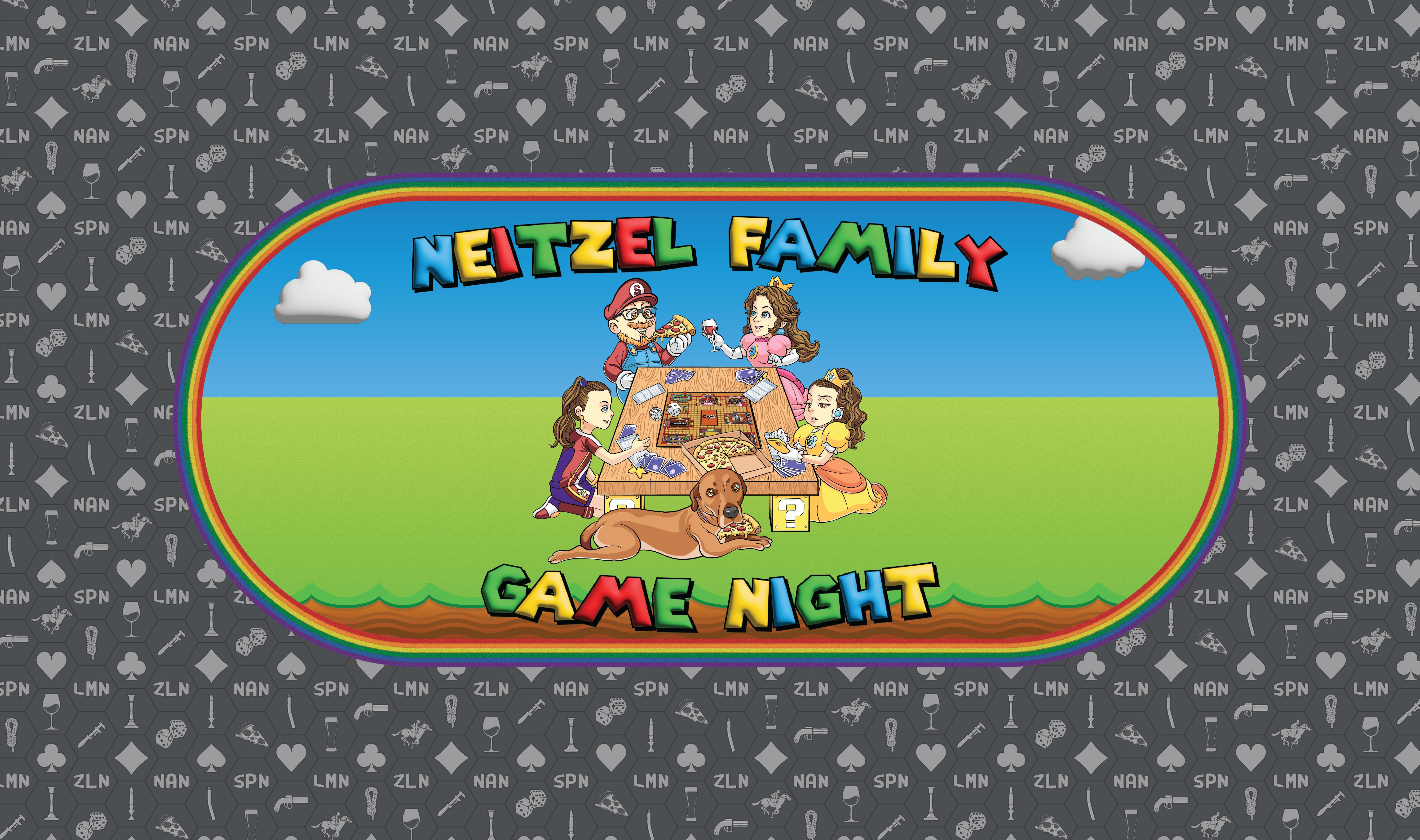
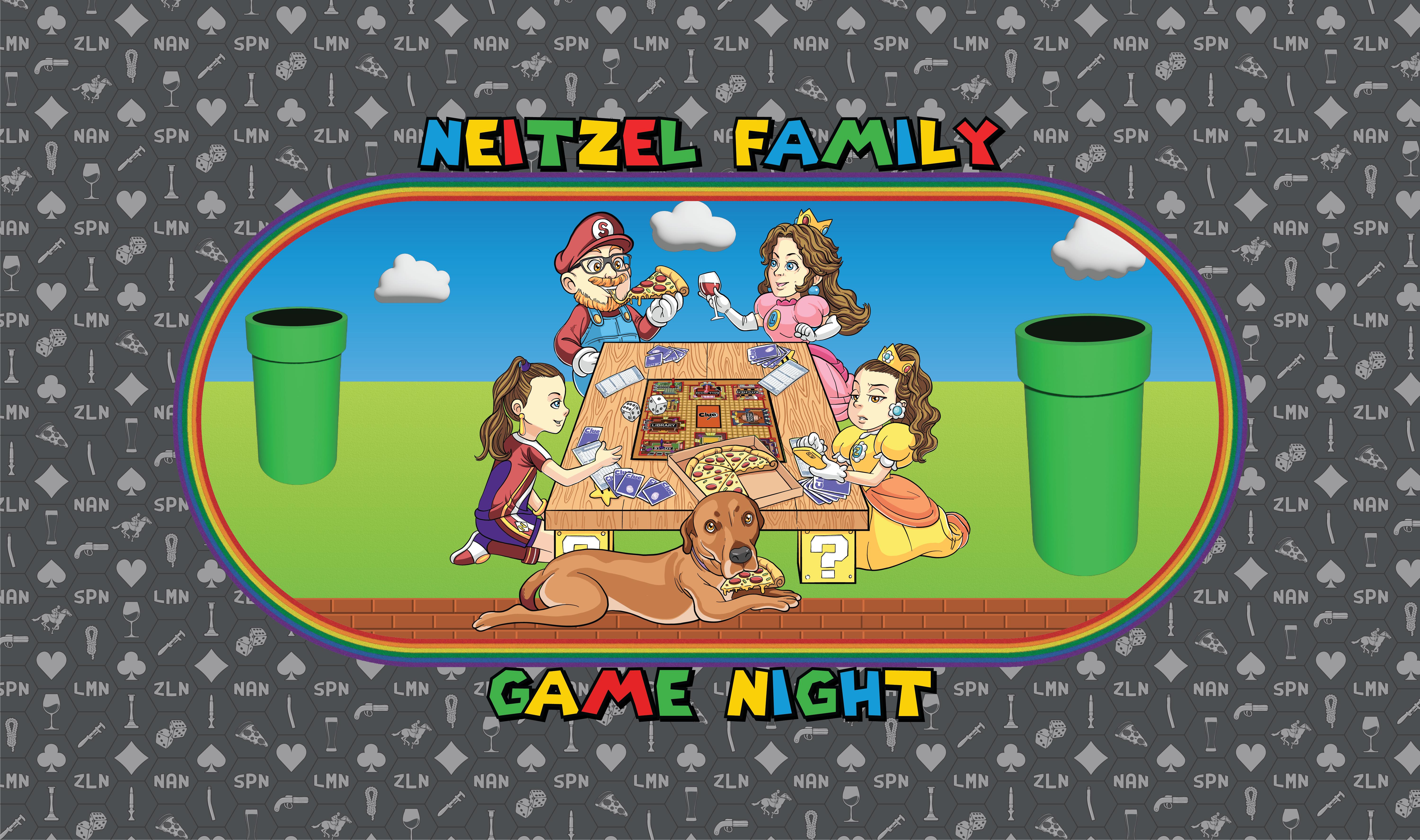
trying to figure out how to re-integrate pipes or some other stuff now
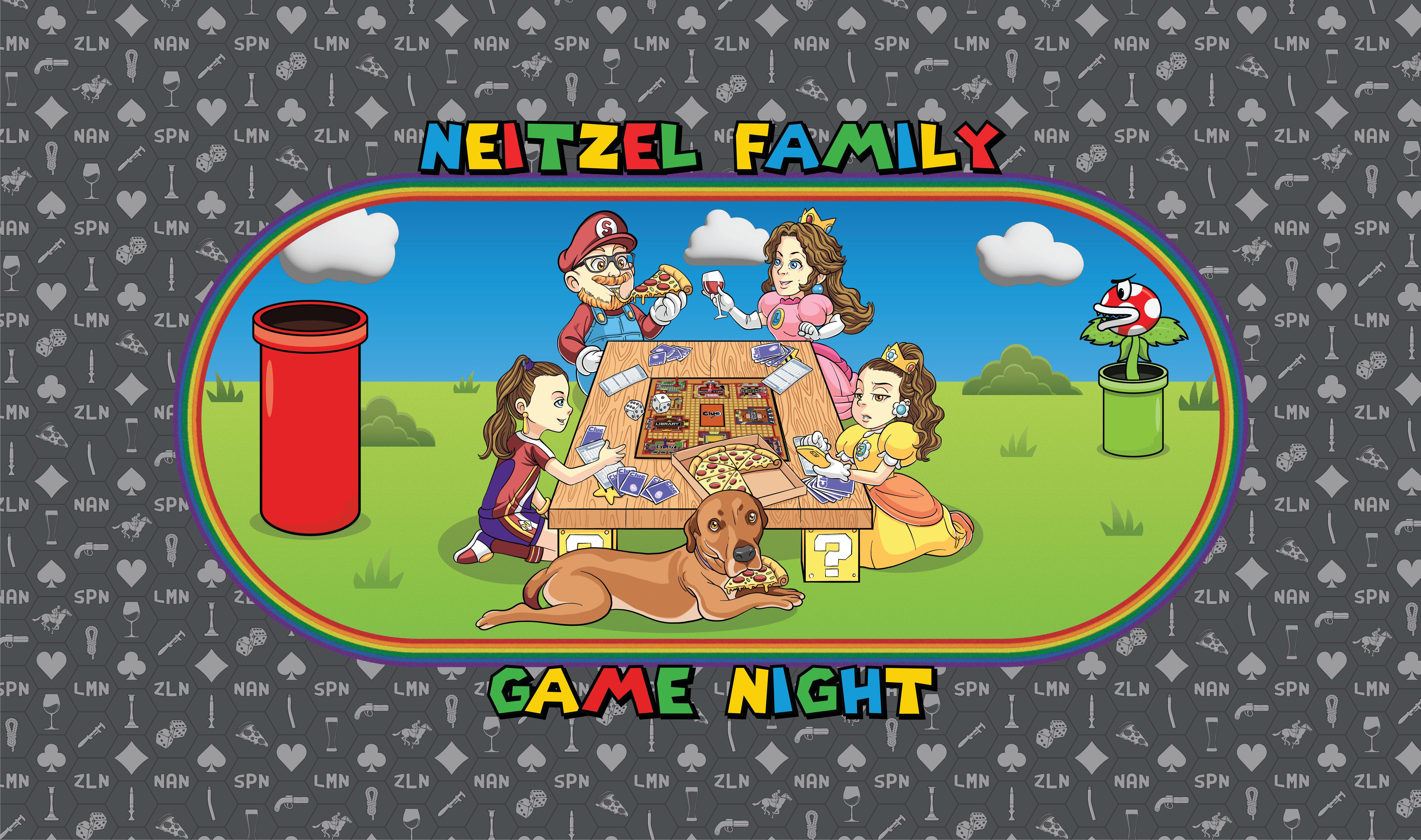
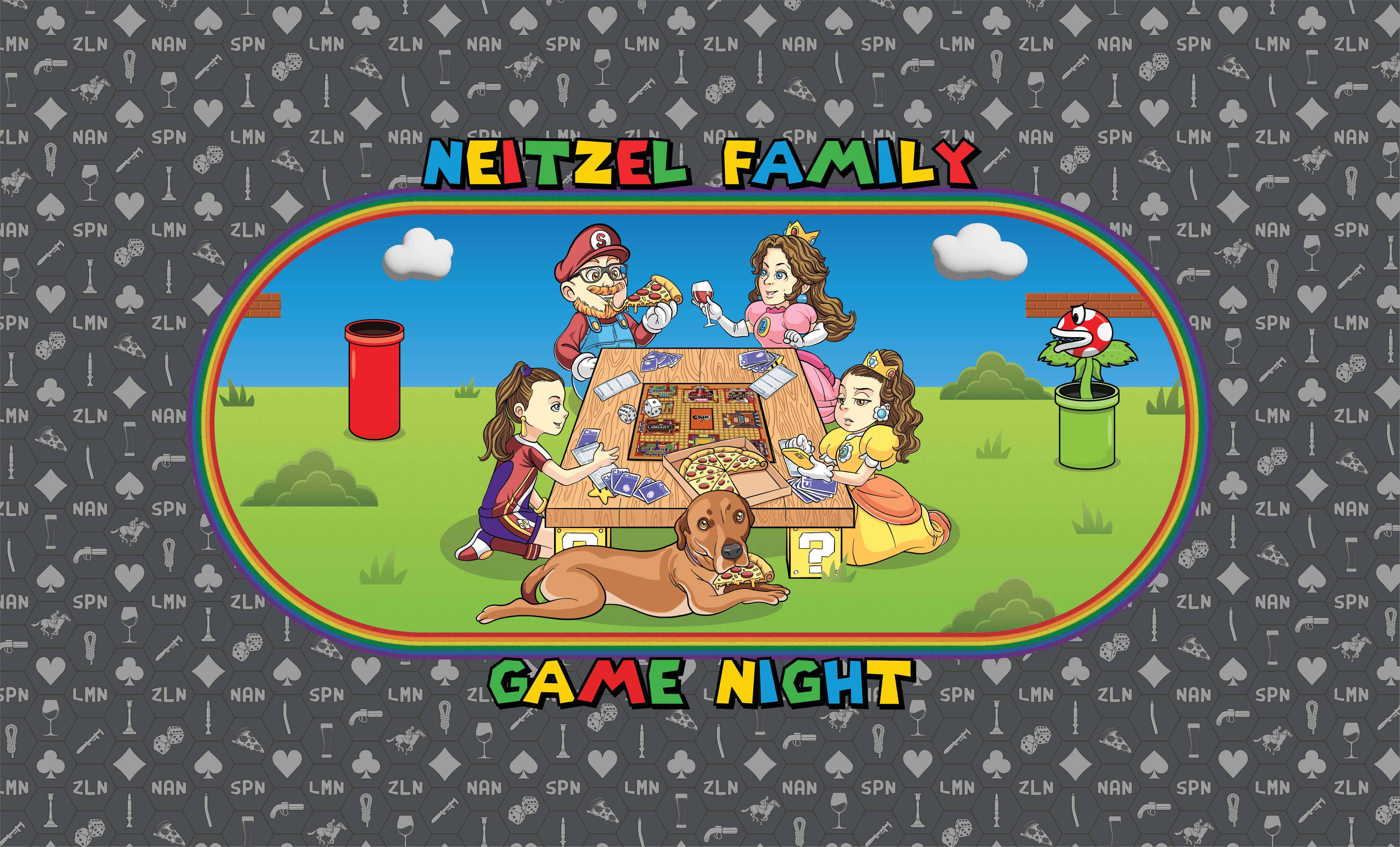
Would it be weird if the center graphic was more of a circle? The open space to the sides around the design has a little too much negative space for my liking, but I don't know how you'd tackle that. I like the second more than the first, doesn't look like the table is floating in space.
 , something like
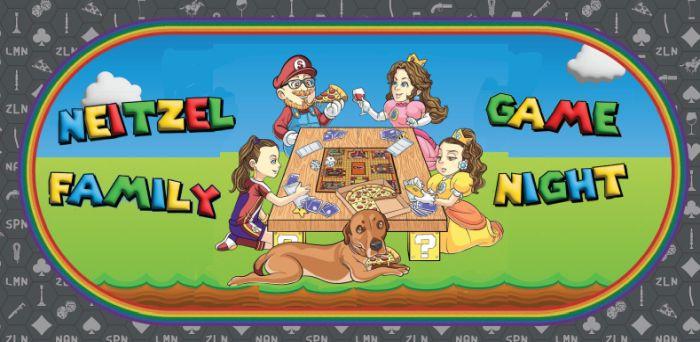
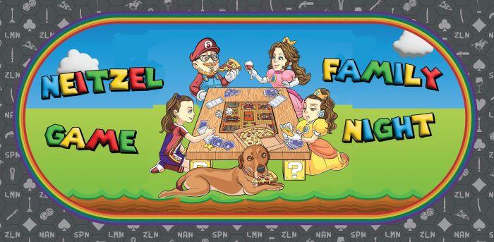
 up your sleeve. Hehe.