Seeking feedback on topper centerpiece (1 Viewer)

eightyWon

Straight
Joined
Jul 17, 2021
Messages
826
Reaction score
2,284
Location
Chicagoland
Hi all,

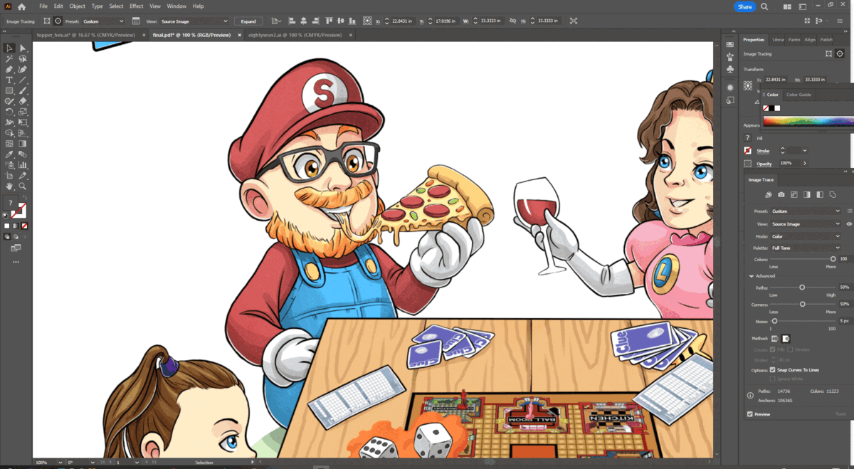
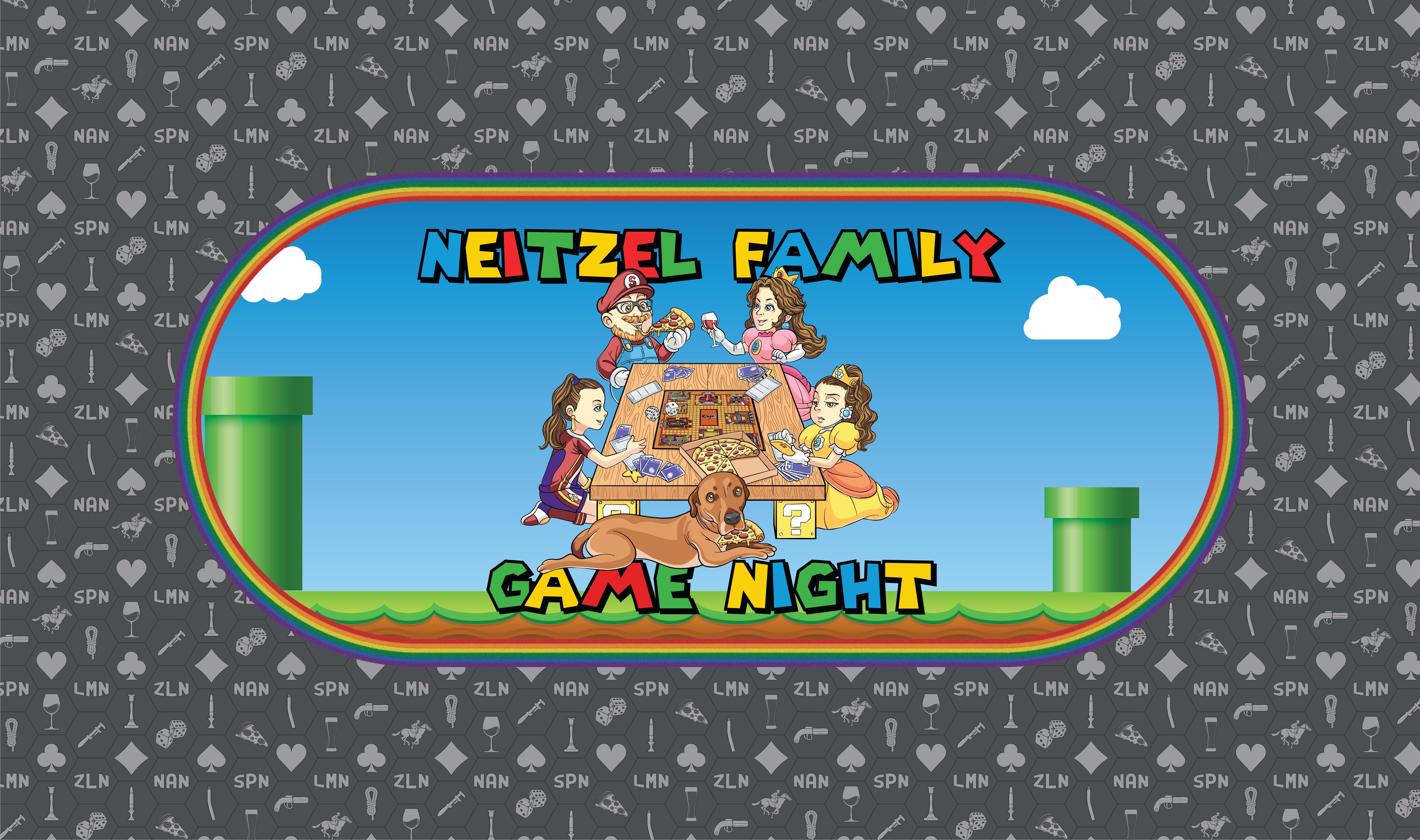
I'm working with a Fiverr artist to design a centerpiece image for a custom topper we'll use on our kitchen table during family game-and-pizza nights. The goal is to have a scene representing me, my wife, my two girls, and our dog, playing games around a table, with a Super Mario flair added to it (because that's something we do a lot of as a family as well - Mario Kart, Smash, Strikers, etc.)

I'm not always great at catching flaws/issues so I'm throwing this initial mockup sketch the artist provided out there to see if there's any general feedback:

topper.png


here's an initial mockup of what the rest of the topper might look like

Some feedback I'm already giving - my wife's eyes look insane, my youngest's forehead is too big (bottom left), and the dice dots aren't accurate. There'll also be some kind of game in the middle of the table in the final version.

Thanks for any input!
 
You might also want more of a "3-D" look on the front legs of the table. They look very 1-dimensional.

I think the letter on your wife's chest is backwards too.. unless it is a "J", then it needs some curvature. (no, I am NOT looking... NO, REALLY, I'M NOT)
 
You might also want more of a "3-D" look on the front legs of the table. They look very 1-dimensional.

I think the letter on your wife's chest is backwards too.. unless it is a "J", then it needs some curvature. (no, I am NOT looking... NO, REALLY, I'M NOT)
Good points.

I'm guessing the "L" is backwards because he initially sketched the characters individually and they were all facing east, then he added them around the table and probably just flipped her without adjusting the letter yet, but I'll be sure this is fixed before final.
 
I like the dog with the pizza. one possible idea: have the dog trading/sliding cards with someone under the table with his paw, like that notorious poker wall pic
 
This is such a fun idea! I assume this is for generic board/card gaming, so should not be too overly poker-infused?

Maybe a small stack of board games in the center of the table? It looks too empty to me.

I think this representation of one of your daughters is funny, but if she is not in on the joke it she might not like it. And it might not age well over time. Maybe she keeps the phone but has a more engaged, happy look rather than annoyed? Not meaning to project my family dynamics on yours though!
1706563241273.png
 
This is such a fun idea! I assume this is for generic board/card gaming, so should not be too overly poker-infused?

Maybe a small stack of board games in the center of the table? It looks too empty to me.

I think this representation of one of your daughters is funny, but if she is not in on the joke it she might not like it. And it might not age well over time. Maybe she keeps the phone but has a more engaged, happy look rather than annoyed? Not meaning to project my family dynamics on yours though!
View attachment 1264017

Yeah, the topper will be for our kitchen table to be used in family game nights. We do play some poker, but also lots of non-poker stuff too.

Here's a more recent revision. Not everything has been addressed yet, but he did finally add Clue to the table as requested.

1000006017.jpg


Cell phone gag is purposeful and daughter approved. Dad didn't want to be the chubby guy going ham on pizza, but we are what we are.
 
It may just be me, but the grass in the colored version seems odd (I liked the previous sketches with nothing better). Not in how it looks or was implemented, more in it being a part of the picture overall.
 
I mean… This was already phenomenal and way ahead of 99% of the competition in the initial draft. I would run with it as is, not tinker too much!
 
I’m with @Taghkanic and say you’re right on the doorstep. I’d get the eye colors right and add a paw to your pupper and ship it.

As a side note, your artist’s attention to detail seems to be impeccable. I’m blown away by how much he packed into the Clue board, cards, and pads. Major kudos to them, and to you for giving good direction
 
Having some trouble with delivery of the final product. Seems like the artist created it in raster-based software and is now trying to convert it to vector. I asked for a vector-based finished product in the original requirements.

Seems like he just tried to take the raster art and convert it in AI which looks horrible:

IjG1xmH.gif


...so now we're trying to work out some kind of solution.

I think the original art was produced at a high enough resolution that, worst case, I can have him export the size I need. Whole point of requesting vector art, though, was so I could edit and/or reuse pieces later if needed.
 
Thinking about this more, maybe it's unrealistic to hope for something this complex to be vector art?

Hopefully one of our great artists will chime in and help balance my expectations
 
Well, happy ending. Th artist was able to make it work and ended up delivering a same quality vector version :love:

I left him a good tip. 10/10, would work with again.
 
Well, happy ending. Th artist was able to make it work and ended up delivering a same quality vector version :love:

I left him a good tip. 10/10, would work with again.
I’ll be honest, I didn’t think vectors would work for some of that image. Turns out my 3 graphic design courses didn’t cover that kind of AI manipulation
 
I’ll be honest, I didn’t think vectors would work for some of that image. Turns out my 3 graphic design courses didn’t cover that kind of AI manipulation
I honestly don't know how he did it. I was worried, too.

His comment was something to the effect of "I’ll redo the color again and use vector based software from the beginning" so I don't know if that meant start over completely or he just had to do some color touch-up work, but it looks exactly like the raster version.

Maybe it just one of those things that seems like magic to me because I'm not a graphic artist but was easy for him.

I hope the exchange rate and cost of living is really favorable for him. I didn't pay pocket change, but I feel a little guilty even after the tip the amount of value I got for my money.
 
My guess is the illustration was done in vector format and the coloration was done in Photoshop.

As for feeling guilty, your artist set the price, and you went above and beyond with your tip. Granted, I’m not sure how much back and forth you did with your artist, but they had to expect some edits along the way. Give them a glowing review on whatever site you booked them through and I’d say you’re good
 
I agree with @krafticus in that the best part of what you’ve put together is the centerpiece artwork, which is phenomenal. I think anything you could do to make it more of the focus would be beneficial. A couple thoughts to bounce off you:

  • What if you rotate the centerpiece 90 degrees, making the topper a portrait instead? Cuts out the negative space on the sides that you would need to fill
  • Can you decrease the width of the racetrack, giving you more real estate for the center image? I’d vote for keeping the rainbow road though
  • Could you place the header and footer on the racetrack instead of in the center, again giving the image room to be expanded?
  • If those changes aren’t hitting right, I would reach out to your artist again to whip up some options to fill in the negative space that will match the style of the centerpiece. I’d build off your last image though if you go that route. I think that’s a better background to work with than the first one
 

Create an account or login to comment

You must be a member in order to leave a comment

Create account

Create an account and join our community. It's easy!

Log in

Already have an account? Log in here.

Back
Top Bottom