Relabel these chips with me in real time (1 Viewer)

GreekRedEye

Flush
Joined
Jun 4, 2023
Messages
1,835
Reaction score
3,032
Location
Germany
Everyone's gone to bed, but I'm still feeling restless. I'm gonna try to knock out a small project in 2 hours to practice my at home relabel technique. I will post in real time - hope it entertains some folks and maybe proves instructive. And let's see if I can actually do it in 2 hours! (probably not)

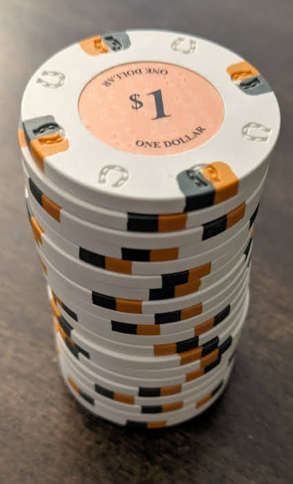
I'm going to take a miserable little barrel of sluggos and convert them into seating chips for 2 tables. The only part of this project that I've done any work on is some design work on the label, but even that is not finished.

Here's the barrel:
1703990911262.png


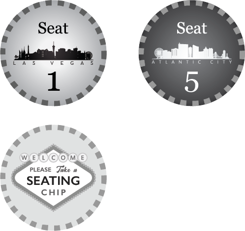
And here's my proposed label design. The Welcome sign is common to all chips. Half the chips will get the Atlantic City Skyline and the other half the Las Vegas skyline. Note, it is in B&W because the printer I have access to right now only does black and white.
Asset 1@3x.png
 
Ok...halfway through the barrel. The first couple took a little time as I figured out technique. Almost sliced my finger. What seems to work is coming in at a perfectly 90 angle like this:
1703991988145.png


Then while pressing down firmly, tilting the blade and sliding it under the label.
1703992029281.png


Then I can peel it off with my fingers like so...
1703992066922.png
 
All right...labels off. And I'm already behind schedule! Strange how some of them have those arched cutouts under the label (see far right)? Anyone have an idea how/why that is?

1703992432897.png
 
These labels seem to measure a bit over 7/8in. So, I'm going to go ahead and size my labels to 7/8in exactly to give myself a little wiggle room. Can someone double check my reading there and let me know if you think I got it wrong?

1703992757843.png
 
All right...labels off. And I'm already behind schedule! Strange how some of them have those arched cutouts under the label (see far right)? Anyone have an idea how/why that is?

View attachment 1247515
It’s likely how the soft plastic spread into the mold during manufacture.
Continue. :ROFL: :ROFLMAO:
 
It’s likely how the soft plastic spread into the mold during manufacture.
Continue. :ROFL: :ROFLMAO:
Glad you're watching. And not too soon. I'm about to get myself into trouble with Illustrator!

I copied over the common label to a new Illustrator file in inches (sorry PCFers in Europe) for 8.5 by 11 inch sheet. And I resized it to 7/8 and placed it at 0.75 inch from edges of sheet.
1703993194392.png
 
There's probably a better way, but I'm going to use move/copy option in Illustrator to make columns then rows of this. I need 20.
 
Just realized I gave myself no bleed! I'm going to quickly expand gray background then copy and paste my columns and rows. Post again in about 5 mintues.
 
Move/copy is fine to do it once. Hit ctrl+D (command+D on Mac) multiple times and it will duplicate using same parameters.

Okay. I added a circle behind these labels. So the total print area is 1 inch. The cut area is 7/8 in. So that gives me 1/16 in bleed around the circle. For PCFers in Europe, 1/16 is about the width of a fairy's little pinky.

Then used Transform -> Move -> Copy like so
1703994040697.png


Then I use @Colquhoun 's Command-D trick to duplicate it to get 5 of them...
1703994081324.png


Then I group the 5 and do the same trick to copy the row down. I now have 10! Woohoo!
1703994166456.png
 
Wait...I need 20 of these because it is the common side for 2 table. I can just use the duplicate command. I'll get the other labels up and post in a few minutes.
 
There's a feature in Sketchup that I love. If you make a copy and move it say, 5 inches..then hit X20, it will make 20 more copies, 5 inches apart.
Or, if you make a copy and place it 20 inches away and hit /20 (divide 20), it will make 20 copies, equally spaced between the two.

Wish Illustrator did that.

BTW, the repeat command in Illustrator is devil's magic. :ROFL: :ROFLMAO:
 
Last edited:
ok...why didn't anybody remind me that I don't need to take photos of my screen? That there is such a thing as screen grab? Maybe it is too late for me to attempt something like this.

Here we go. I have the labels lined up, but I need to change the seat numbers. Does anyone, for the love of God, know how to do that easily? Is there any other way than tediously editing each one?

1703994750041.png
 
There's a feature in Sketchup that I love. If you make a copy and move it say, 5 inches..then hit X20, it will make 20 more copies, 5 inches apart.
Or, if you make a copy and place it 20 inches away and hit /20 (divide 20), it will make 20 copies, equally spaced between the two.

Wish Illustrator did that.

BTW, the repeat command in Illustrator is devil's magic. :ROFL: :ROFLMAO:
Yes, I also wish Illustrator had a way to automatically fit objects within a box or circle or any shape really. Like a lot of CNC software has. No, I have to manually do it, even with shortcuts like duplicate it is still manual!
 
Making a layer for the numbers and locking down the lower chip layer is about as much help as you get. :ROFL: :ROFLMAO:

I do the numbers by hand only because true center of a number doesn't always look centered visually
 
Making a layer for the numbers and locking down the lower chip layer is about as much help as you get. :ROFL: :ROFLMAO:

I do the numbers by hand only because true center of a number doesn't always look centered visually
Especially with currency symbols. To the eye a centered $25 looks off center..too far to the right. I think it's because we tend to ignore the dollar sign. So I always fudge it to the left if it is preceded with a $ and to the right if followed by a cent sign.

Speaking of weird font issues...note to self..."George" font does weird vertical spacing with numbers. See 7, 8, 9 below. I don't have time to manually resize them. The clock says I've been at this an hour already!

1703995366523.png
 
Especially with currency symbols. To the eye a centered $25 looks off center..too far to the right. I think it's because we tend to ignore the dollar sign. So I always fudge it to the left if it is preceded with a $ and to the right if followed by a cent sign.

Speaking of weird font issues...note to self..."George" font does weird vertical spacing with numbers. See 7, 8, 9 below. I don't have time to manually resize them. The clock says I've been at this an hour already!

View attachment 1247580
Georgia font. Not george.
 
I almost forgot. I need to put a border around this thing (why this is important will be clear later). It must be exactly half an inch from the edge of the paper and a quarter inch from the first chip. So...a box that is 7.5 inches by 10 inches, centered. Right?

1703995856514.png
 
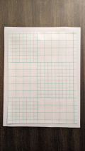
Okay. I'm exporting this as a PDF and then off to print it. By the way, I've tried both of the below vinyl sticker papers. The glossy, expensive one on the left does not work for my laser printer. Smears like crazy. The matte, cheaper one on the right works. Claims to be waterproof and I tested that it is. I did buy an even cheaper paper that does not claim to be waterproof, but have not tried it yet. I'm doing with the one on the right below that I know works.

I have to run down to the business center in the building I'm staying at. Will be about 10 minutes. Wish me luck!

1703996015846.png
 
Sorry, "save as" a PDF. I forgot that PDF is native to Adobe ecosystem and you have to use save as function and not export.
 
The reason the numbers look strange is that typeface uses oldstyle figures. The baseline is different on them and the 1, 2 and 0 are smaller than other characters. Great for text, but not for chips:
A_Oldstyle_Figures.jpg

To outline type quickly, I generally select everything, then choose Type>Create Outlines from the menu. It outlines all text and ignores anything else.
 
The reason the numbers look strange is that typeface uses oldstyle figures. The baseline is different on them and the 1, 2 and 0 are smaller than other characters. Great for text, but not for chips:
View attachment 1247597
To outline type quickly, I generally select everything, then choose Type>Create Outlines from the menu. It outlines all text and ignores anything else.
Thank you! I will use that trick.

I find once I get the font into outline mode, I can resize everything vertically to be uniform. But then if I have to change the text, I need to remake the text in the font. So I try to save that for last as much as possible!
 
Okay. Back from the printer. I printed two copies. Because there is a very good chance I will ruin one during the lamination phase or cutting phase.

1703997146648.png


Closer shot. The text under the skyline that says "Atlantic City" and "Las Vegas" respectively are so small as to be unreadable. This is where good design comes in. And higher res printing too. But I have 30 minutes left on the clock, so I'm not redesigning. These will have to do.
1703997261160.png
 
Thank you! I will use that trick.

I find once I get the font into outline mode, I can resize everything vertically to be uniform. But then if I have to change the text, I need to remake the text in the font. So I try to save that for last as much as possible!
Yeah, outline is a last-step item. I'll often have two saves of an art file....one to work on that has not been outlined, and a FINAL file that is grouped, flattened, and outlined.
 
Okay, let's talk lamination. I don't know how the pros do it, but here is how I do it. You can buy rolls or sheets of "self-sealing" laminate. These are clear adhesive stickers (rather than the kind you run through a heater to melt). The idea is you are supposed to use 2 sheets on either side of whatever you want to laminate. What I do is just put this on the front of the printed label before cutting.

Finding textured self-sealing laminate is tough. Below is the brand I have found. You can buy these off of Amazon. If someone has a better/cheaper source, please let me know! I have tried these four textures. Fine Mesh and Crisp Linen are good and to me have a similar feel to real textured labels or textured stickers. I'm going with fine mesh.

1703997445567.png
 
First step to laminating, is to cut down the laminating sheet while the backing is on. These sheets are bigger than 8.5x11 so you can double side laminate a sheet. But we don't want that! We want one side. So we need to cut it down. Does not have to be precise - as long as you have coverage for your labels.

1703997906736.png


These particular laminating sheets come with a grid on the back that make cutting them down to size super easy.
1703998014079.png
 

Attachments

  • 1703997985743.png
    1703997985743.png
    342 KB · Views: 41

Create an account or login to comment

You must be a member in order to leave a comment

Create account

Create an account and join our community. It's easy!

Log in

Already have an account? Log in here.

Back
Top Bottom