Shoreline Card Room | THC Relabel | Looking for Feedback (1 Viewer)

MichaelBubly

Flush
Joined
May 15, 2022
Messages
1,176
Reaction score
2,897
Location
Vancouver
After months of pondering a custom CPC set, I decided to splurge on a THC Relabel project instead.

This is the first inlay I've made and looking for feedback on it before I start to look into ordering them.

Name: Shoreline Card Room - Vancouver, BC

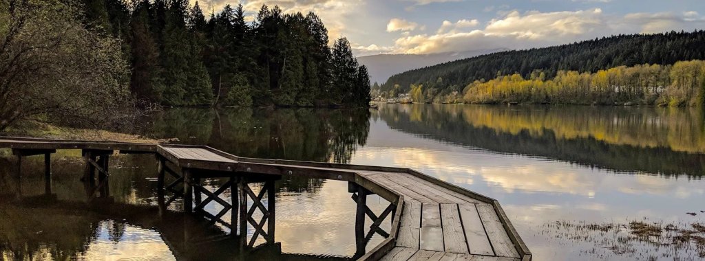
Background and Inspiration: After 5.5 years together, I finally proposed to my then girlfriend, now fiance, on a little boardwalk in Port Moody, British Columbia. The Shoreline Trail. It's a small nature trail and boardway that wraps around a small length of shore of the Burrard Inlet near Rocky Point Park, just outside of the normal urban sprawl of the Greater Vancouver Area. Port Moody has been our usual escape during the Spring and Summer to visit some local breweries, get an ice cream, or go for a nice walk around the trails.
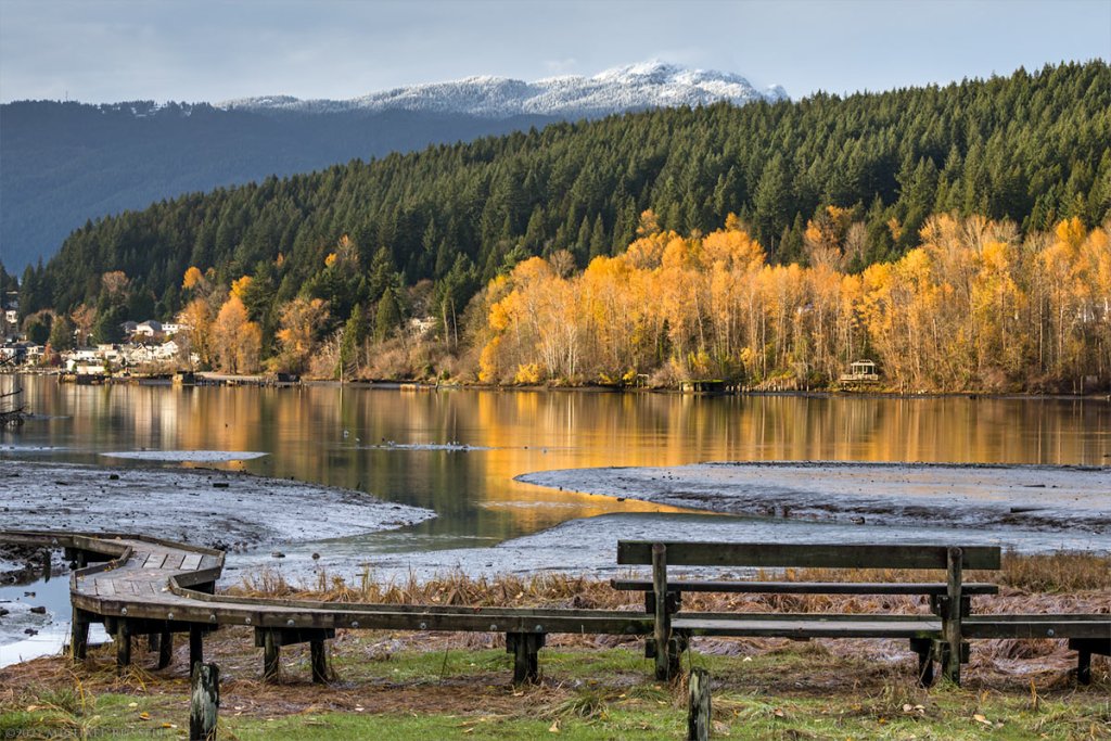
shoreline-trail-port-moody-55925.jpg
ezgif-1-e145939e9c.jpg


The Chips:

So here we go. This is the current lineup I'm starting to put together.
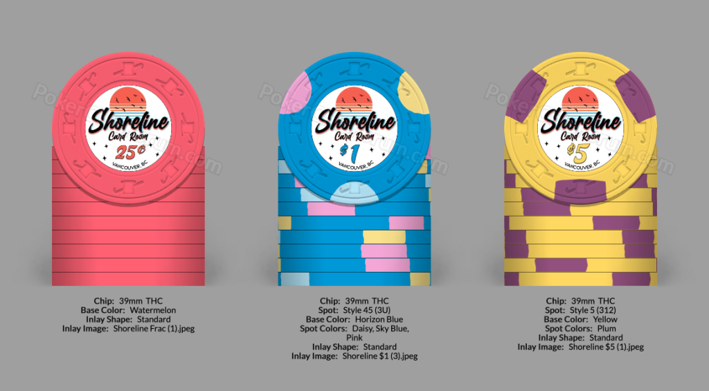
index.png


Frac: Watermelon Solid is my current leading contender. Hoping I might be able to snag a few racks during the Chip Room's next sale as it appears there may be some included in his haul.

Still considering other options and any suggestions would be appreciated! Hoping to keep to a tigheter budget as I've already exceeded my original budget for this set.

$1: Aurora Star $1 Overlabel

$5: CDM $1 Overlabel

I may eventually choose to add some $25s. But that will likely be for more aesthetic purposes. My home games rarely ever exceed a full rack of $5s, let alone 2.

The Inlay / Label:

My complete lack of graphic design skills was a challenge and I was planning to try to rough something together before hiring a designer to pull it together. Somehow though I ended up with something I am quite happy with. I think there is some fine tuning work to get it ready to order, but it's coming together really well.

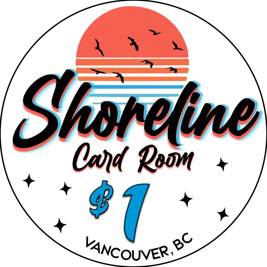
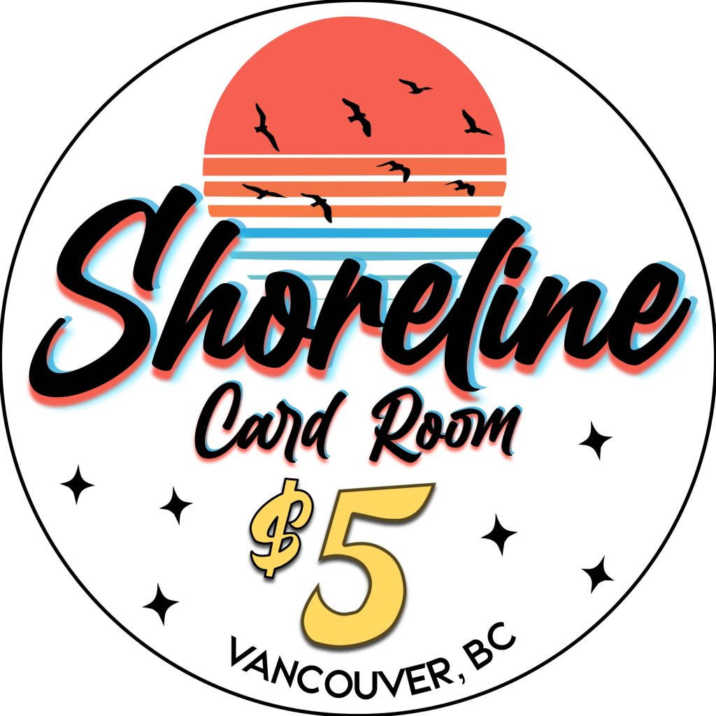
I'd love any feedback you may have on these inlays. I am a little worried some of the smaller text and finer details may not show up as well on a finished label.

I have tried to colour match the denomination text with the base colour of each chip using the Paulson to CMYK database I found on here.

Frac:
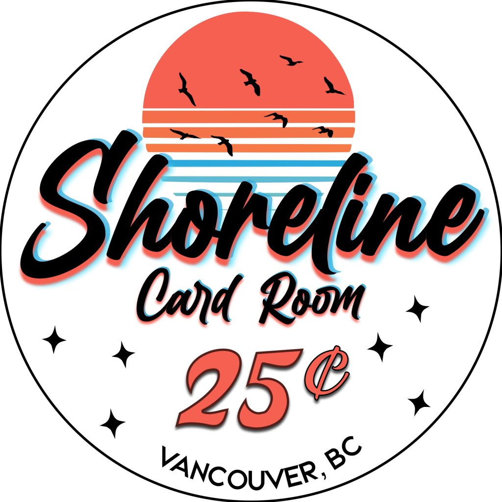
Shoreline Frac.jpeg


$1:


Shoreline $1.jpeg


$5:

Shoreline $5.jpeg
 
Last edited:
I'd love any feedback you may have on these inlays. I am a little worried some of the smaller text and finer details may not show up as well on a finished label.
^^This.

With a THC label being less than 1" diameter (7/8" IIRC), the text of Vancouver at the bottom is going to be very small, (I scaled it and measured it at 0.02" tall) also the 9 birds in the logo at the top are going to be small, and maybe even the Card Room text as well. You may want to play around with increasing the text and maybe going with only a few larger birds, say 3 or 4. In any case, I'd suggest doing some test prints on paper at actual scale to see how it looks on paper in person.
 
The very first thing in noticed was the curvature of Vancouver, BC doesn’t match the curvature of the circle. It needs to match exact.

Other than that I like it, but for a set this meaningful I would still go CPC. I personally don’t like those three THC chips together. I have this weird thing about relabeled sets. I’ve found that a lot of people get so obsessed with THC that they just kind of take what they can get even though it’s not cohesive. With CPC you can make it exactly what you want.
 
I like where you're going with this!

Regarding images being too small, printing it actual size and doing the arms length test should help with that. Less lines/colors in the sunset and bigger and fewer birds will work.

One thing I would change are the stars. IMO they don't have a place with this theme.

@chipinla has a keen eye - I missed the miss alignment on the Vancouver text.
 
If going with the above, I think the name needs better separation. The orange and blue shadow get lost in the sun. I’d also be curious to see what it looks with and without card room (unless you’re attached to that).

If you go with your original- what would it look like if birds replace the stars?

Here’s the best part- you’re going to label the chips. If you don’t like it, rip ‘em off and go again. You can be really risk tolerant here.
 
Other than that I like it, but for a set this meaningful I would still go CPC. I personally don’t like those three THC chips together. I have this weird thing about relabeled sets. I’ve found that a lot of people get so obsessed with THC that they just kind of take what they can get even though it’s not cohesive. With CPC you can make it exactly what you want.
So, my two cents on the CPC versus Paulson relabel (having owned a set of CPC rounders and currently working on a Paulson relabel).

If you are going to do the Paulson relabel, pick awesome chips you like or don't do it. Don't just pick what is what is available or affordable. You will spend a lot of time on removing labels, cleaning, etc. You might as well use great looking chips and go for exactly what you want. (I picked what is affordable and available and find myself rethinking certain chips). Especially given that Paulsons have come down in price recently.

I don't like how brand new CPC's feel and that was always one of my hangups (along with yellow). But I got to use @Trihonda 's broken in Fat Tire chips and have changed my opinion on CPC's. Some people may find this controversial, but I think a broken in set of CPC's is competitive with leaded Paulsons as far a feel, weight, sound. I am considering switching my inlay to a custom CPC set now.
 
I personally love your design and think it's very clean.

Only possible changes if it were me is to lose the stars at the bottom as I didn't see how they were a part of your story and somehow figure out how to incorporate the boardwalk that has special memories to you. Perhaps it could fit in the bottom of the sunset?
 
Made some adjustments. Still have some things I'm planning to tweak. Didn't change as much as I was expecting to. I tried adding in a boardwalk, but wasn't able to come up with anything that I was happy with.

I removed the stars and the "Card Room" font in order to increase the size of the remaining inlay. I'm going to give the sun another run to clean it up and bit and probably adjust the size of the birds at that point. Font could use some adjustments to clean up the shadow effects as well. It's gotten a little less legible. Switched over to Affinity designer now and still learning some of the new tools.

But overall, I'm happy with the cleaner look. Thanks for all the feedback so far! Been really helpful!

Shoreline Inlay.jpg
 
Well, after shelving the idea for a bit and coming back with the idea to do a cheap solids set followed by likely a CPC set when the budget allows, here is where we've gotten.

Got some help from @aaron2786 with the inlay as I couldn't quite get where I wanted to be at.

My fiancé wants me to do the hex inlays for the $1, but still debating between it and just a normal round inlay.

Very happy with how everything is shaping up. Last rack of Sea Green is getting milled currently and samples are off to ChipUp for color matching.

350384124_6723165781028442_4593093089554647775_n.png


and because I can't stop using the CPC designer, here is my pipe dream custom set when the writers strike ends and my wedding gets paid off.

92b905e9-866d-4617-99e4-f846322b6bef.png
 
Well, after shelving the idea for a bit and coming back with the idea to do a cheap solids set followed by likely a CPC set when the budget allows, here is where we've gotten.

Got some help from @aaron2786 with the inlay as I couldn't quite get where I wanted to be at.

My fiancé wants me to do the hex inlays for the $1, but still debating between it and just a normal round inlay.

Very happy with how everything is shaping up. Last rack of Sea Green is getting milled currently and samples are off to ChipUp for color matching.

View attachment 1144244

and because I can't stop using the CPC designer, here is my pipe dream custom set when the writers strike ends and my wedding gets paid off.

View attachment 1144246
Feels like THE and CARDROOM need to be a smaller font than SHORELINE
 
Well, after shelving the idea for a bit and coming back with the idea to do a cheap solids set followed by likely a CPC set when the budget allows, here is where we've gotten.

Got some help from @aaron2786 with the inlay as I couldn't quite get where I wanted to be at.

My fiancé wants me to do the hex inlays for the $1, but still debating between it and just a normal round inlay.

Very happy with how everything is shaping up. Last rack of Sea Green is getting milled currently and samples are off to ChipUp for color matching.

View attachment 1144244

and because I can't stop using the CPC designer, here is my pipe dream custom set when the writers strike ends and my wedding gets paid off.

View attachment 1144246
Nice mockup … Can’t wait for the CPC set ;)
 

Create an account or login to comment

You must be a member in order to leave a comment

Create account

Create an account and join our community. It's easy!

Log in

Already have an account? Log in here.

Back
Top Bottom