Mr Tree
Straight Flush
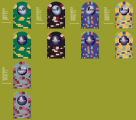
more food for thought:
View attachment 6670
What was the final verdict on these? Are you ordering them?
more food for thought:
View attachment 6670
What was the final verdict on these? Are you ordering them?
What was the final verdict on these? Are you ordering them?
Welcome to the club, I had to redesign my inlay almost completely due to clarity on the inlay. Shoot me a PM and ill email you the mockups CPC forwarded to me showing the size differences on the inlays to see how text and images look on each size.That's the plan, but I'm kind of stalled out at the edge spot design phase. I also printed some out to see how they looked and has slight concern still over the size of the text.
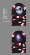
After a brief pause in design efforts (only 6 years!), I’ve picked this project back up. Been working on the labels. Any thoughts on the current direction? (Thinking possibly different designs for each chip).
View attachment 678870View attachment 678872View attachment 678874View attachment 678875
After a brief pause in design efforts (only 6 years!), I’ve picked this project back up. Been working on the labels. Any thoughts on the current direction? (Thinking possibly different designs for each chip).
View attachment 678870View attachment 678872View attachment 678874View attachment 678875
5000 I think? Here's where i am with spots.I like it! What's your top tourney denom? 5000? 25000?
Yeah this is A good idea. I can find other silhouettes. I was trying for different things, like a bandoneon player or close-ups, but they get sort of weird looking. The earlier one with the whole orchestra is impossible to tell what you’re looking at at chip size.If your top denom is 5000, then on your crescent moon side you can probably afford to go bigger on the denom font size, just to make it clearer.
I'd consider playing with a different position of the dancers for each chip. Maybe one with a dip, and one with a lift? (don't know the technical terms)
Here’s my latest run at it. Added different silhouettes to each chip. I think just fine tuning now. I might still brighten up the red on the denom but I think I’m at the max on size. Anyone thoughts for fine tuning? Sending this in next week.If your top denom is 5000, then on your crescent moon side you can probably afford to go bigger on the denom font size, just to make it clearer.
I'd consider playing with a different position of the dancers for each chip. Maybe one with a dip, and one with a lift? (don't know the technical terms)
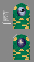
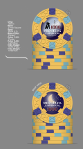
love the changes. also all your chips are L2-L4 spots which will help with the budget as your old T500 was a L9. My only suggestion it to potentially look at another spot pattern for T25 as its only 2 colours vs the rest of the set which all have 3 colours.Here’s my latest run at it. Added different silhouettes to each chip. I think just fine tuning now. I might still brighten up the red on the denom but I think I’m at the max on size. Anyone thoughts for fine tuning? Sending this in next week.
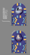
Definitely appreciate the feedback! Actually I really like that suggestion for the new T500. I edited it similarly to yours below. Also, on the T25, or somewhere in the set, I really want to get in the 3TRIM edge spots to sort of mimic the crescent moon theme there.love the changes. also all your chips are L2-L4 spots which will help with the budget as your old T500 was a L9. My only suggestion it to potentially look at another spot pattern for T25 as its only 2 colours vs the rest of the set which all have 3 colours.
if you wanted progression you could T25 3DSA316, T100 4DSA316, T500 3D14, T1K 4D14, T5K 6A14.
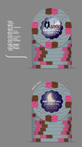
Do you have a colour sample. You will find that some of the colours you have selected aren't as bright in real life. You probably will want to choose dayglo yellow over canary and dayglo pink over pink. You will also have dirty stack issues with the T500 and T1K as currently, they are using the same three colours in both chips. This should be avoided at all costs.
Edit I did some mock ups to avoid dirty stack issues.
if you are set on using that spot pattern maybe look to use it on the T5K chip and have 4 colours on it on may a bounty chip / or seating chip out of that spot pattern to accompany the seat. Usually, people make the bounty chip the brightest in their sets. the ability to use four colours will allow you to get the most out of that spot pattern vs 2 that is currently on it.Definitely appreciate the feedback! Actually I really like that suggestion for the new T500. I edited it similarly to yours below. Also, on the T25, or somewhere in the set, I really want to get in the 3TRIM edge spots to sort of mimic the crescent moon theme there.
I do have a color sample set. I pulled them out to look at them again after you posted and think I'm more or less ok with those slightly more muted colors.
trimoon T5K
I still think you are at risk of dirty stacks between T500 and T1K as you still have 2 identical colours on both chips especially since they will both be in play at the same time.
you would think so but from everything I have read and seen it will most likely be an issue given you are sharing 2 colours out of the three. It's ultimately your decision. You will have to refer to your samples to see the difference between the black and the purple to see if thats going to be an issueOn the question of dirty stacks, wouldn't much more dominant yellow eliminate that possibility versus the very dark purple? I actually wonder if I should be more worried about dirty between the 100 and 500. Purple is very dark at CPC.
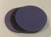
Here’s purple, black and lavender top to bottom unoiled. Gonna switch the 500 to lavender.you current set with the inclusion of bounty chips. Also i dont know if its a thing but it is for me, I try to select where possible shaped inlays that allign / connect / interact with the spot pattern .
Part of my thinking is to order a tournament set now, then sort of add on to it after a while with a cash set with a similar theme, but have the whole thing continue the spot progression. Something like this below. Should someone disavow me of this idea?you current set with the inclusion of bounty chips. Also i dont know if its a thing but it is for me, I try to select where possible shaped inlays that allign / connect / interact with the spot pattern .
One thing I’ve been contemplating is whether I should do all shaped inlays, or all round. The design has to shrink a bit for the shaped inlays, and I wonder if it would look funky to have smaller art/font on one chip than on another. Anyone around here mixed with OK results? I’d like to take a look.I would remove 4-notch and tri-moon shapes and replace with scallop and hub
Actually, I found a CPC set on here that did circle inlays with some shaped ones — Story Hill. Looks like his round inlay graphic (image/font size) is ever so slightly larger on the round inlays. I also for comparison looked at the Paulson World Top Hat 5000 chip, which is the only round inlay in that set. Looks like to my eye the image/font size is the same size as the shaped inlays.One thing I’ve been contemplating is whether I should do all shaped inlays, or all round. The design has to shrink a bit for the shaped inlays, and I wonder if it would look funky to have smaller art/font on one chip than on another. Anyone around here mixed with OK results? I’d like to take a look.
@MarquetteMonkey . any feedback?Actually, I found a CPC set on here that did circle inlays with some shaped ones — Story Hill. Looks like his round inlay graphic (image/font size) is ever so slightly larger on the round inlays. I also for comparison looked at the Paulson World Top Hat 5000 chip, which is the only round inlay in that set. Looks like to my eye the image/font size is the same size as the shaped inlays.
You aren't too late. I'm planning to put this order in this week. But I'm still messing with the artwork a little, and deciding on whether to do shaped inlays or not. I totally agree the font color was too dark. I had already updated to this but hadn't uploaded a new version. Take a look:Wow. I really like how these have progressed. Another example of how you can make a lovely set with a great mix of colors and spots while not exceeding L4.
I might be too late, but are you set on the denomination color used on the reverse? It looks low contrast against the other colors and a bit hard to read here- not sure how it would show in person.