Custom CPC Mock Up Critique (1 Viewer)

Sixtoo31

Sitting Out
Joined
Apr 23, 2017
Messages
29
Reaction score
39
Location
Cicero, IL
Good morning everyone,

I'm not new to PCF. But I haven't posted in a while and haven't been active for a bit. I've been looking around the forum and I see a lot of cool things, as usual.

I've been looking to buy a new tournament set. I've debated on purchasing some sets that I've seen here, but ultimately feel a custom set, for the money would be ideal.

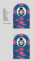
I am looking to purchase from CPC. I am hoping some of you would be able to critique my initial mock ups, provide some tips from previous experiences, and shed some insight on the process. Thanks you tto anyone who provides feedback. Any and all criticism is welcome.

Thanks!

Diego
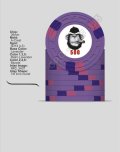
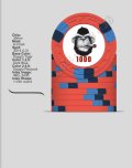
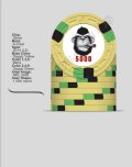
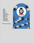
IMG_3591.jpgIMG_3590.jpgIMG_3589.jpgIMG_3588.jpgIMG_3587.jpg
 
Got a Rounders feel to it. Nice spot consistency, really enjoying the color combos on the 100 and 1000.

I'd shrink the image a bit to give the denom some room, increase the denom size by a few points, and change the pink retro lavendar spot on the 500 to something with a bit more contrast.

EDIT: But I don't have color samples, maybe it looks fine IRL.
 
Last edited:
I think the 25k would look better as a flag (USA!)
 
I agree with shrinking the image. I think you need more contrast on the 500 with brighter colors.
 
I think the 25k would look better as a flag (USA!)
I agree! That was my initial intent with this color. But somehow the chip designer wont let me use the base blue with the red, white and blue spots. Something about split spotting.
 
Cool! Big, bold, with a unique feel despite the classic pattern and the Rounders hommage.

Your illustration is great. Did you draw it? Or know the person who did it? If so, something potentially really interesting would be to have slightly different head expression. Or at least one, to put on the other face.

I would either shrink the illustration a bit too, or push the denom a bit down. The denom need some space to breath, or you could embrace the opposite and mask more of the denom, but more frankly. Just the hairs that brush it up does not work.

There is something "floaty" about the dynamic/balance. That may be resolve with the adjustments of the head/denom sizes. Or you could perhaps try to add a discreet circle, or rather two arcs, that would fill a bit optically. Or some very light cigar smoke volutes? Or not. That could break the bold minimalist effect. Hard to know without seeing.

As you only have two elements, one of them being typographic, I would perhaps try to find a font with more personality.
 
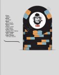
How does the color contrast on this look now?

This was my initial color scheme for this purple 500

View attachment 1184269
Not sure I would add two DG colours to the spots, I feel it breaks some of your logic and could be at bit much compared to the others. I would try with either one of them, and keep the other tint more muted.

And you could eventually swap the white of the 25K to another DG (Peach?) and so have one on each chip.
 
I made some changes to the purple to see the options in color schemes. I also added the peach to the blue. I like it better.

I'll adjust the image later to see if I can make it look better.

thanks for the input so far everyone.


500 new.png
500 Light Blue.png
25k peach.png
 
Like others have said, more room for the denomination, and more contrast on the purple chips spots.

Also, why A mold? Does A work with your theme?
 
Like others have said, more room for the denomination, and more contrast on the purple chips spots.

Also, why A mold? Does A work with your theme?
Hey Steve,

It’s just the initial mock up. I was actually considering the Horsehead mold or even the Dice Mold. Similar to this one. I’m more interested in how the inlay and color scheme look at the moment.
IMG_3429.png
 
Hey Steve,

It’s just the initial mock up. I was actually considering the Horsehead mold or even the Dice Mold. Similar to this one. I’m more interested in how the inlay and color scheme look at the moment.
View attachment 1184321
Ok just don't be like me with your first custom set. I live in the city and horses have nothing to do with me or my theme, but I used the Horsehead mold.
 

Create an account or login to comment

You must be a member in order to leave a comment

Create account

Create an account and join our community. It's easy!

Log in

Already have an account? Log in here.

Back
Top Bottom