Feedback and help with first CPC design (1 Viewer)

AN236

Waiting List
Joined
Feb 20, 2024
Messages
8
Reaction score
11
Location
Australia
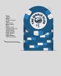
Hey guys, looking to get some feedback on a design I've been making today on the CPC website. Been incorporating stuff from different custom and stock sets that I've seen and liked. Also been hoping to get some help with the inlay, I'm using a 1124x1116 PNG file and it's showing up very low res for some reason. Will likely add denoms (0.25,1,5,25,100) once resolution problem is fixed. Looking forward to hearing some experienced opinions!

Thinking of a 500 chip set for a 0.25/0.50 game (100/180/160/40/20). Usually a group of 4-6 playing, $100 buy in. We have a rule where max number of rebuys for the table = no. people on the table to keep things friendly. Will likely increase, along with stakes, over the next few years as careers advance.

Screenshot 2024-02-22 at 10.14.21 pm.png
Screenshot 2024-02-22 at 9.37.40 pm.png
 
Simpler inlay tip worked really well, does look cleaner/less gimmicky now (haven't fully decided on what graphic to use yet):View attachment 1278652
Everyone definitely has their own preferences, but on the green I would switch the placement of the DG Pink & Dark Green for better contrast and on the Black Chip I would personally change the Charcoal to Gray for a better pop. Just what came to mind. I think you have a really good start. Best of luck on your set.
 
You certainly selected some a tried and true pallet- those colors work well together. I’d be curious to see a DG green / dark green swap on the $25, I think @Huskerchipper is on to something, but the $25 definitely works as is.

The inlay is the fun part. Just remember how small the inlay is going to be. The old print it out and look at it tip works. I went with the scale the image on a computer monitor at arms length trick and that worked as well. Folks aren’t going to spend much time looking at the fine details of the chip, so it’s important to know what everyone will see as the chips get tossed around the table.

The black opera house silhouette in @CallingStation614 post #2 above is in the direction in terms of simplicity- you don’t have to go black, you could pastel the heck out of it, but in terms of design, I’d suggest something closer to that.

Good luck, this really is the fun part.
 
Do you have a CPC color sample set? If not I would highly recommend buying one, especially given the direction you're going with the clay design and monochrome color approach. A couple of these chips will look pretty different in person, some will pop more than you probably think, and others not as much. A slight tweak in color shade (especially with the reds and blues) may have a pretty big impact on the chip.
 
Just to confirm— are you familiar with CPC spot levels and their pricing? If not, I suggest reviewing their pricing list and comparing against your budget to avoid unpleasant surprises down the line. The green chip in particular is going to be pricy (which is fine, if you’re ok with that going in!).
 
Everyone definitely has their own preferences, but on the green I would switch the placement of the DG Pink & Dark Green for better contrast and on the Black Chip I would personally change the Charcoal to Gray for a better pop. Just what came to mind. I think you have a really good start. Best of luck on your set.
Turned out very nicely, I prefer it as well!
Unknown.png


You certainly selected some a tried and true pallet- those colors work well together. I’d be curious to see a DG green / dark green swap on the $25, I think @Huskerchipper is on to something, but the $25 definitely works as is.

The inlay is the fun part. Just remember how small the inlay is going to be. The old print it out and look at it tip works. I went with the scale the image on a computer monitor at arms length trick and that worked as well. Folks aren’t going to spend much time looking at the fine details of the chip, so it’s important to know what everyone will see as the chips get tossed around the table.

The black opera house silhouette in @CallingStation614 post #2 above is in the direction in terms of simplicity- you don’t have to go black, you could pastel the heck out of it, but in terms of design, I’d suggest something closer to that.

Good luck, this really is the fun part.
Agreed, had to remind myself of how small the inlay is going to be in real life. Ended up changing the inlay theme to above, probs gonna put denoms on the second side. Swapping the greens looks really nice as well, pops lot more, not sure which I prefer yet:
Screenshot 2024-02-26 at 1.39.50 pm.png


Do you have a CPC color sample set? If not I would highly recommend buying one, especially given the direction you're going with the clay design and monochrome color approach. A couple of these chips will look pretty different in person, some will pop more than you probably think, and others not as much. A slight tweak in color shade (especially with the reds and blues) may have a pretty big impact on the chip.
Not currently, but definitely plan on ordering one soon.

Just to confirm— are you familiar with CPC spot levels and their pricing? If not, I suggest reviewing their pricing list and comparing against your budget to avoid unpleasant surprises down the line. The green chip in particular is going to be pricy (which is fine, if you’re ok with that going in!).

Yeah the green one hurts, but after seeing how good that setup looked on the rainier club custom set that was here a while back, I can make peace with it for 40 chips
 
That frac is very similar to my frac that I’m going to receive from CPC this week (also on CSQ). So needless to say I like it!
 
I might switch the two blues on your $1 chip, so that the base color is the brighter of the two.

Dark blues tend to blend with blacks like your $100 chip in bad lighting. Also show up better on most darker felts.
 

Create an account or login to comment

You must be a member in order to leave a comment

Create account

Create an account and join our community. It's easy!

Log in

Already have an account? Log in here.

Back
Top Bottom