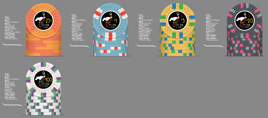
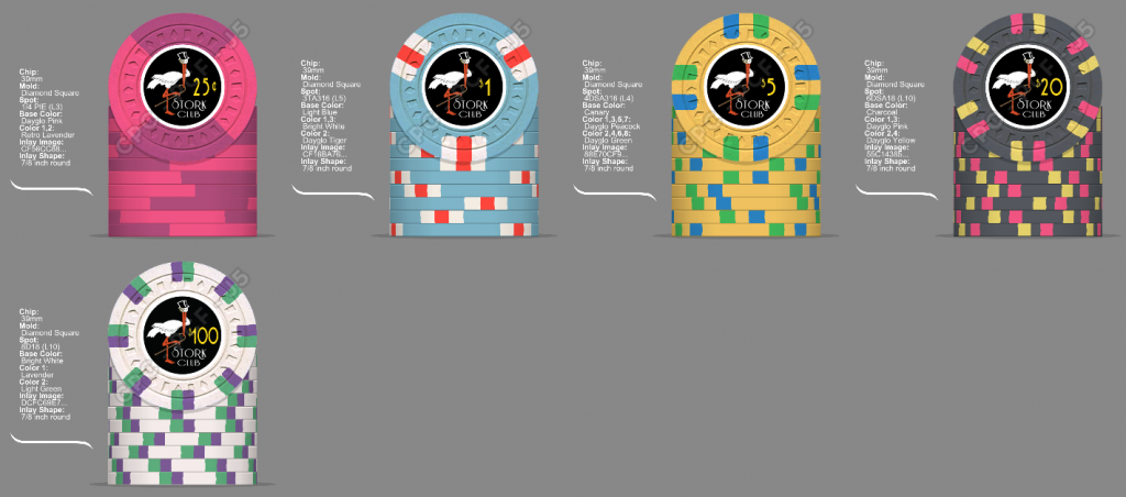
CPC cash set mock up (1 Viewer)

Same as above but different frac
43EFB795-2FF5-48C8-9337-1A2A7C9260A7.png


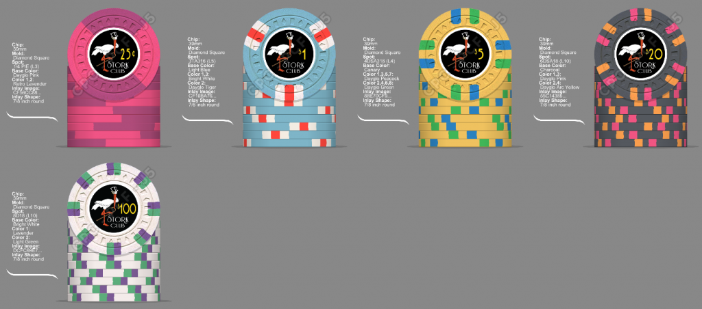
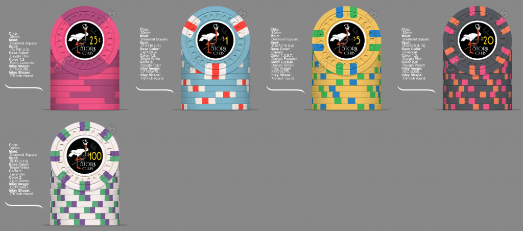
Options on $20s
05F648FE-7EB5-4784-9D68-C0A7F8FD71E1.png
68157149-68DD-447D-B15F-35589EB37561.png
CA926485-4819-46B1-8F81-ADEEC5603DB0.png
 
  • Like
Reactions: Nex
Get samples!

So I was pretty sure I was just about set on the design, ordered color samples from CPC and was devastated when they arrived.

Canary is soooooo disappointing. It’s strange too, on all the pictures of others’ customs, it looks fairly vibrant. Must be the flash I dunno. But in person it is so muted and drab to me.

So back to the drawing board. Looked at HP and lakeshore as inspiration. Thought I wanted a spot progression but those sets look really nice without one.

Latest try:
C79FF511-C7C6-456F-A390-C64ACE7DA162.png


Seahawks and Hokies $20/$100 lol
B779BD4C-F5C3-4F16-8388-50C8D6220916.png


Thoughts?
 
I like the marroon $100 a lot!!!

DG yellow would give you the vibrant color you were hoping canary would have been. But the GB arc yellow looks great too.

I really like this set!
 
I don’t like the dg yellow as a base. It’s too light or washed out or something for me as the base.
 
The quarter looks to monotone against the rest of the set. Maybe Light Green instead of red for a spot? Just something to give it a bit of color?

I agree with @doughboy63. Not a huge fan of dg yellow as a base color. I really like the older version with canary/dg peacock/dg green.

LOVE, LOVE, LOVE the maroon as a base for $100! I may have to steal that idea for my custom set. ;)


I have color samples as well and don't share your observations about canary as a base. But that is why this is YOUR custom set. You get what you like. I'll still be up for a sample set if you are offering them.
 
I agree on the .25, it was a ripoff of the HP spotted HS quarter. I like this version of the frac better. Not sure if charcoal is too close to maroon. Will have to compare when I get home. I’m good with gray at $20 if need be. A lot of blue in this set though.

2669C59B-D7AD-4E4D-9F94-44F02E0336D9.png
 
Canary is soooooo disappointing.
Their entire yellow lineup leaves something to be desired, IMO, although canary and DG Yellow have grown on me a bit and I've used each in custom sets.


Looked at HP and lakeshore as inspiration. Thought I wanted a spot progression but those sets look really nice without one.

Latest try:
You can do far, far worse than the Lakeshore. Great starting point! And no, spot progression isn't always necessary - static spots can be great!


Re: this lineup....

On the frac, I might suggest using maroon for the spot instead of red to gain greater contrast.

On the $20, I'd *definitely* use DG Peacock instead of Light Blue for greater contrast against the DG Green. You have to be careful with CPC greens and blues next to each other as they can tend to blend in.
 
Their entire yellow lineup leaves something to be desired, IMO, although canary and DG Yellow have grown on me a bit
This!
They can look disappointing especially in daylight, but you' re supposed to play poker under strong artificial light, not outdoors.
Even the greenish DG Yellow and mustardy Yellow have a definite charm under artificial light, if properly combined with other colors. If asked about those 4 yellows in daylight, and wasn't even told they 're about poker chips, I would go DG Yellow - which may, in turn, look too pale under strong artificial lighting.
At any rate, I cannot imagine a set without a good dose of yellow, especially for darker playing surfaces.

@doughboy63 : I very much like the Maroon 100 in this set.

Off topic: Two colors that I miss in the CPC color chart are a Burgundy between Red and Maroon, and a Terra Cotta, something between an earthier Peach/Orange and Pink. Thank God they 're not there - they would make choices even harder! :)
 

Create an account or login to comment

You must be a member in order to leave a comment

Create account

Create an account and join our community. It's easy!

Log in

Already have an account? Log in here.

Back
Top Bottom