CPC cash set mock up (1 Viewer)

doughboy63

Straight
Joined
Jan 9, 2018
Messages
986
Reaction score
1,041
Location
Ohio
So I'm pretty close to pulling the trigger on a custom cash set. I don't have an inlay yet but have a couple ideas working.

For mock up purposes I "borrowed" the inlays from this set which J5 designed and I believe belongs to "Empty Pockets" back on CT, pm me if a correction is needed:
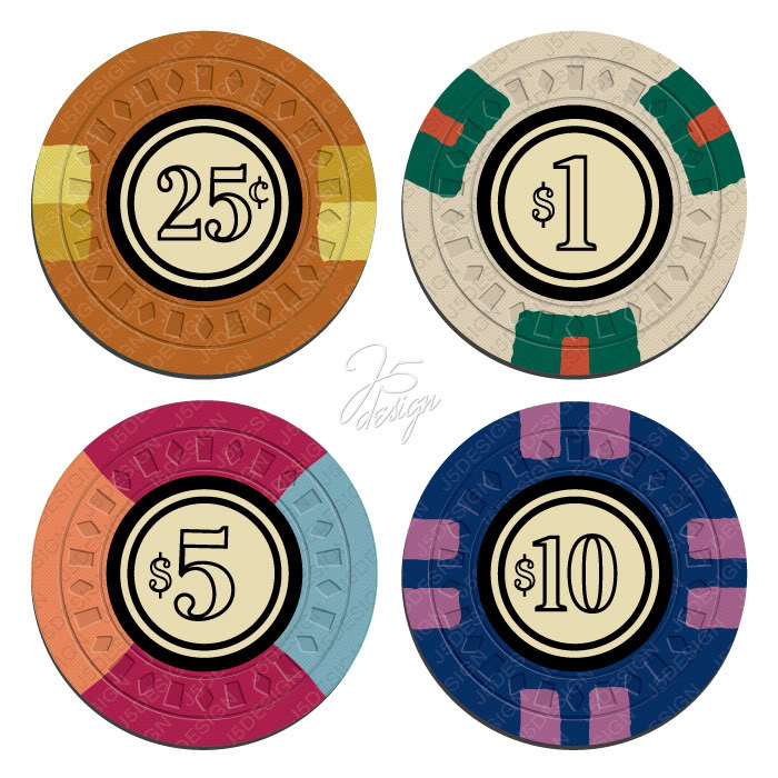
ep_md50_mock_final-1.jpg


I love the simplicity of the design.

Going for a Cali colors set: 25c, $1, $5, $20 here is my first crack at it:
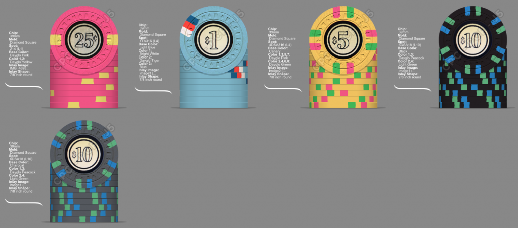
simple.png


The $10 will be a $20 in the final set. Not sure if I want to go black or charcoal.

I was playing around on the google and found a cool logo for a 1930s era club called the stork club:

Stork_Club_logo.jpg


Thought it could be a cool start for a fantasy card club, so I threw it in the old chip designer:
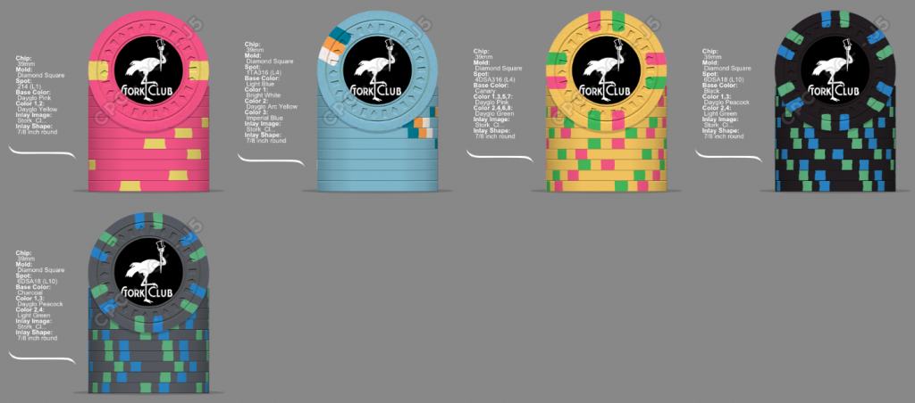
stork.png


obviously needs some sizing and such and would want denoms.

So I would love some opinions on colors and spot choices and the stork inlay.

Thanks,
Erik
 
Hey Erik,

I think you may want to vary the spot colors a bit more. When I think cali colors, I think bright and varied. You basically have two colors working. The .25 and 5 are primarily pinks and yellows, while the 1 and 20 are blues and blacks ( counting the inlay color ). Also you have green spots on both the 5 and 20. So keeping your same spot progression and base colors, I quickly mocked up this tweeking the spot colors to make each chip 'unique'. ( I may have gone a bit overboard with the $20 :whistle: :whistling: )


be50581a-4de7-4e5d-9601-ee815656a034.png


I'm not saying this is great by any means ( I have a thread going right now working on my own custom tourney set for like a week now, dozens of attempts and I still can't "get it right" ), but I just wanted to show a more varied, brighter spot colors.

Anyway, just my $0.02. Good luck with the set.
 
I'm not personally having an issue with color variation other than a DG green spot on the five then a LT green spot on the 20. But with the difference in base color I don't think there's any chance fire confusion.

Overall I like them.
 
I like them too. Black hundo. That empty pockets set is a classic.
 
IF you go with the black 20, the bright colors pop better on black then the charcoal..

Good start, I like set #2, less the one dolor chip, Try 3 shades of blue, or wight and 2 shades of blue. Maybe.
 
So I'm pretty close to pulling the trigger on a custom cash set. I don't have an inlay yet but have a couple ideas working.

For mock up purposes I "borrowed" the inlays from this set which J5 designed and I believe belongs to "Empty Pockets" back on CT, pm me if a correction is needed:

View attachment 147030

I love the simplicity of the design.

Going for a Cali colors set: 25c, $1, $5, $20 here is my first crack at it:

View attachment 147033

The $10 will be a $20 in the final set. Not sure if I want to go black or charcoal.

I was playing around on the google and found a cool logo for a 1930s era club called the stork club:

View attachment 147038

Thought it could be a cool start for a fantasy card club, so I threw it in the old chip designer:
View attachment 147039

obviously needs some sizing and such and would want denoms.

So I would love some opinions on colors and spot choices and the stork inlay.

Thanks,
Erik
I think the bottom set is great (I think I like the black slightly better than the charcoal, but the charcoal is really nice too). Only thing I would change is to make the dg pink edge spot on the 5 DG Tiger, since you already have the yellow/pink on the frac. Very nice!
 
5996EB10-A72D-4E14-97A3-73C1757927A5.png
Made some tweaks. Still not sure on charcoal vs black.

Thoughts?
 
View attachment 148823 Made some tweaks. Still not sure on charcoal vs black.

Thoughts?


To follow spot progression, consider 1D14 for the frac. Allows you to bring another color to the DG pink chip. like burple. Or maybe 2D14 for the frac, then 3D14 for the 1 and keep 4D14 for the 5?
The 1 is the only chip that uses a spot color that is in the same family as the base color, so it looks a bit 'flat' to me in comparison to the rest of the chips. Consider changing out the blue spot element for another color, like maybe retro lavender or purple?
Love the 5!
I'd vote for the black over the charcoal for the 20.

Like where they are heading.

Again, just my $0.02.
 
It’s my experience that all CPC chips/colors look much more vibrant and alive in person, compared to the designer images
 
4D14 for your $10?

What you picked is fine. I just like the synergy of like-styles for spots. :D
 
E924763D-50C3-41D1-9242-C03E197D835A.png
Changed things up a bit. My five was way to close to @Trihonda $5. Its gourgeous but I don’t want to copy his design. Still not sure about the red spots on the $1. Really like how the colors pop on the charcoal $20.

And the first $10 should be a .25. Oops :).
 
If you are unhappy with the red on the $1, have you considered something in the brown family? Butterscotch? Light Chocolate? Chocolate? Or maybe a DG Orange?
 
CB99C433-6476-48C4-A268-884A386FCCC1.png
If you are unhappy with the red on the $1, have you considered something in the brown family? Butterscotch? Light Chocolate? Chocolate? Or maybe a DG Orange?

Don’t like the brown family too much. Made me look at arc yellow though. It has promise. I also like the lavender better on the frac.
 

Attachments

  • 7E157461-F910-4CEE-B564-73B55960C201.png
    7E157461-F910-4CEE-B564-73B55960C201.png
    226.2 KB · Views: 129
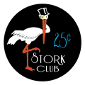
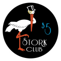
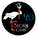
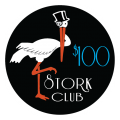
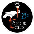
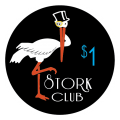
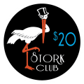
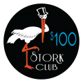
So behind the scenes @p5woody has been working magic on my inlay idea. We are pretty close to finalizing the design. I’m stuck on a couple decisions and would love some feedback from the masses.

First: font for the numerals. The first set is the same font as the lettering. I really like it but am a little worried about readability. The second is a little more bold but not as stylized. These are thumbnails click on them for sharper images.

E547D69C-A29C-46F1-893C-CAD8F3431F72.png F0117214-9FC8-4550-AD57-40874C5D3FB6.png AB2442BB-7028-4D5F-9975-9093CBF4FBF6.png F6F61FFE-794C-4093-BC2B-F11AC72CA553.png E2B22A22-AC46-424E-AA31-5611488AD055.png


AA0C844C-C393-47FC-800A-15D9EAC9307E.png 8CAD7F20-6941-4B38-AAFD-1876B708E3B3.png 4E54AA1A-F38E-40C8-9A0C-D0DCE07FEB96.png 11E16082-F6D2-474C-90F4-0499C574099E.png E288E5C5-4AE0-46BA-98B5-E6E7FAB43F51.png

Second: the monocle on the stork, Gold vs black. $20 and $100 have black the rest gold.

Third: getting close on the chip colors as well, feed back on these as well would be appreciated. Pretty set on the $1 and $5. Not so sure on the franc and $20.

0AEB5448-1118-4416-8E06-34B65AC59E88.png
85362BAD-E9E7-4902-ADC7-5CA4525AE9A2.png
 
I like the second font (bolder and easier to read but still goes with the theme) and the black monocle. When I think of top hat and cane dressed people wearing those, I think of them as black and not gold. As far as the colors of the chips, the only one that is "meh" is the quarter.... I am not crazy about the orange spot color. The other chips are really good (especially the $1)
 
I like the second font as well. Much easier to read. Have you thought about using a different color for the denomination? Blue on Black is hard to see in general. A pink could look really good.

I really like the overall design of the inlay though!!!
 
The second font is great, you may want to have a small white boarder around the denoms so they pop..

Very nice set all around.
 

Create an account or login to comment

You must be a member in order to leave a comment

Create account

Create an account and join our community. It's easy!

Log in

Already have an account? Log in here.

Back
Top Bottom