Yin Yang Chip Feedback (1 Viewer)

TheFlyingDrunkman

Sitting Out
Joined
Jan 25, 2023
Messages
24
Reaction score
14
Location
Gainesville, Virginia
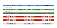
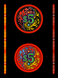
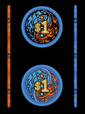
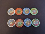
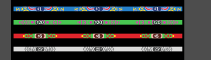
I recently started a small home game and I'm working on creating some chips. I like a bolder/more interesting design with large denoms. I got a guy on fiverr to come up with some designs and I bought some samples from BR Pro.

Since aligning edge spots is more expensive and the website says that there can be some misalignment, I thought I would try a unique design on each chip instead.

I would love to hear your feedback.
 

Attachments

  • EDGES.png
    EDGES.png
    158.9 KB · Views: 147
  • GREEN.png
    GREEN.png
    379.6 KB · Views: 93
  • RED.png
    RED.png
    345.8 KB · Views: 81
  • BLUE.png
    BLUE.png
    428.7 KB · Views: 140
  • PXL_20240326_162136777.jpg
    PXL_20240326_162136777.jpg
    214.2 KB · Views: 141
I think it will be difficult to tell how much is in the pot from a general glance.

I feel like with so many colors it will difficult to tell the pot size from across the table.

Image below for reference: at a quick glance you can tell it's about $20 bucks pot.
IMG_4833.jpeg
 
It’s definitely different. I don’t know that it’s my cup of tea, but I don’t think they’re bad at all. Something different is good.
 
Interesting point @Tonystark137 . I was thinking about going with the ones on the top, so it would only be 3, maybe 4 colors in play at a time, but I just threw the samples on the table next to some solid color chips and it does feel like it takes more effort to interpret the pot.

I have looked around the forum and haven't seen anyone say why most people go with simpler chips, but this makes a lot of sense.

My game is not very 'serious', so I'm not sure I'm going to abandon the design, but it's definitely making me think.

Thanks for sharing!
 
I think you will need to re-evaluate your colour choices because in a pot everything will blend in together.

For each base colour, choose a lighter shade of the same colour for the flames behind the denom, and a contrasting colour for the other set of flames.

Pick a consistent denom colour throughout the series, e.g. white.

Try not to repeat a similar shade of a colour among chips within two adjacent denoms.
That makes sense. Thanks for the feedback!
 
I think the samples turned out good, and I like the design.

I would change the .25 to a different color other than white, I don't really like white in a set unless its 100 or 500, I'm not really even a fan of white 1s, there are exceptions.

the white .25 text breaks the pattern, a bit tilting.

also when you line up samples you should do it in order from LEFT to RIGHT! (even if you're from Asia) to see the contrast.
Agreed that I also don't love white quarters or ones
 
Bold colors! (Since screens and pics can't always convey - How did the colors turn out with the samples?)
Any side profile pics to see how that edge art turned out?

Purely from the denomination standpoint, I would try out a version where the value itself is centered, and the $ or ¢ is a separate entity offset to the left or right as appropriate. Here's an example with reference to your designs center line:
centeralign.png
 
I think the samples turned out good, and I like the design.

I would change the .25 to a different color other than white, I don't really like white in a set unless its 100 or 500, I'm not really even a fan of white 1s, there are exceptions.

the white .25 text breaks the pattern, a bit tilting.

also when you line up samples you should do it in order from LEFT to RIGHT! (even if you're from Asia) to see the contrast.
Thanks for the feedback. I don't know if the picture really captured it, but the chip is more of a grey with a white edge. Looking at them in person, the white/grey chip actually looks the best, IMO because of the color contrast and because they don't have the ring around the outside of the yin yang.

One of my pics is lined up left to right. The others ones were sent to me as individual files.
 
Bold colors! (Since screens and pics can't always convey - How did the colors turn out with the samples?)
Any side profile pics to see how that edge art turned out?

Purely from the denomination standpoint, I would try out a version where the value itself is centered, and the $ or ¢ is a separate entity offset to the left or right as appropriate. Here's an example with reference to your designs center line:
View attachment 1301365
The grey/white turned out awesome. Green is a pretty close second. The red is a bit orange/peachy but I think it looks good. The blue has a little bit of a powdery look to it for lack of a better description.

Overall I would say the colors are somewhat muted from the designs, but I expected that printing om ceramics.

Per other comments in the thread, I threw all of the samples on the table like they were in a pot and the ones with black backgrounds kind of hurt my brain interpreting the pot. The white/grey chip was the easiest for my brain to understand. I think that's because of the contrast and simplicity on the white chip. So, I'm asking the artist to drop the rings around the outside and change up the colors a bit for more contrast.

Centering the numbers is probably a good idea too.

Unfortunately BR Pro doesn't print edges on samples so these just have blank edges.
 
Thanks for all of the feedback, everyone. I had the designer update the color scheme and simplify the design a bit by removing the ring around the yin yang and updated the colors per @Tonystark137 @allforcharity 's recommedations. I think this will really help with interpreting the pot and will make any off-center printing less noticeable with the larger gap around the outside.

We also centered the numbers per @Bozz 's recommendation and made all of the denoms white.

I just noticed the $5 chip looks like the denom is tilted so I will get that fixed.

I should have the fun chip designs sometime next week then I will order the next set of samples. I may get the min stacks of 25 so I can see the edge designs.
 

Attachments

  • Blue 3.png
    Blue 3.png
    227.6 KB · Views: 13
  • Edge Snip.png
    Edge Snip.png
    96.3 KB · Views: 14
  • Green 3.png
    Green 3.png
    228.3 KB · Views: 12
  • Red 3.png
    Red 3.png
    225.2 KB · Views: 17
  • White 3.png
    White 3.png
    233.2 KB · Views: 16

Create an account or login to comment

You must be a member in order to leave a comment

Create account

Create an account and join our community. It's easy!

Log in

Already have an account? Log in here.

Back
Top Bottom