You are using an out of date browser. It may not display this or other websites correctly.
You should upgrade or use an alternative browser.
You should upgrade or use an alternative browser.
The Signal, 1940s MD-50 Custom - All Denoms (1 Viewer)
- Thread starter dew4au
- Start date
I agree with the others. Bottom row still.
For the other design with the larger tower, you can make the text smaller but then you are left with too much empty space in the top portion of the inlay. Unless you can think of something to fill that space, I like the bottom row for the overall design.
For the other design with the larger tower, you can make the text smaller but then you are left with too much empty space in the top portion of the inlay. Unless you can think of something to fill that space, I like the bottom row for the overall design.
OP
OP
dew4au
Flush
Thanks, guys for all of your input! It just confirmed what I felt in my gut the first time I saw the inlay concepts from @machinelf. I'm really glad that I went down the large tower rabbit hole because now I won't have to wonder "what if..."
The choice has been made. Large. Text.
Now I just need the rest of the denoms before the hardest part: the wait. Order has already been placed and it looks like it'll be in the press sometime late December or early January. If anyone else is sitting on a MD50 order, go ahead and get it submitted!
The choice has been made. Large. Text.
Now I just need the rest of the denoms before the hardest part: the wait. Order has already been placed and it looks like it'll be in the press sometime late December or early January. If anyone else is sitting on a MD50 order, go ahead and get it submitted!
OP
OP
dew4au
Flush
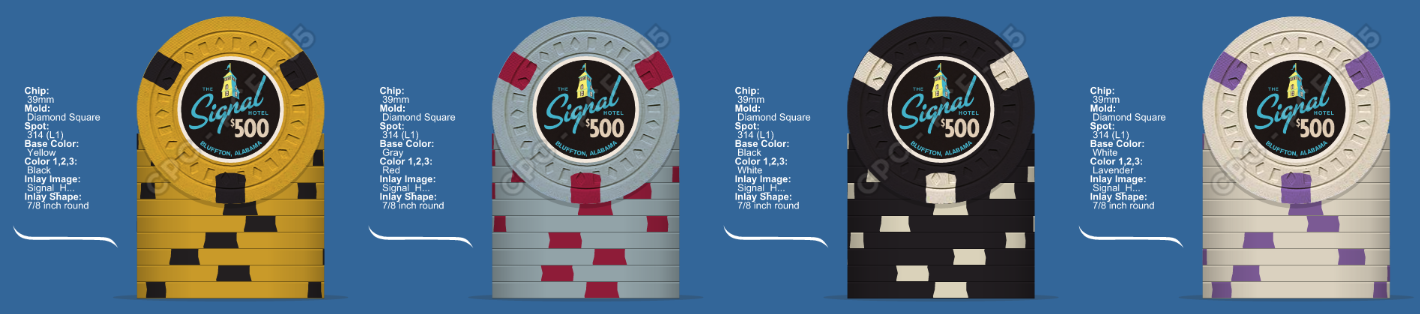
One final decision to make, and I know this is just a matter of personal preference, but I figured I'd share. The inspiration chips from the same era did not use uniform denomination font sizes. The screen printers just filled the available space of the inlay with the denomination. I've always liked the variation and I wanted to capture it in this set. Anyway, @machinelf was kind enough to draw up both and here they are. Alright, now lets see who is OCD on PCF. 


Inspiration chips for reference.

Inspiration chips for reference.
Definitely the non-uniform sized denoms imo. Those look perfect.
RowdyRawhide
Full House
another vote for non uniform
chipjoker
Flush
Very nice, text looks the best..
johnnycnote
Flush
Damn nice looking chips there! Another non uni vote here
The $5 in the non-uniform looks a little off when viewing side by side with other denoms, but i'm sure that in a game the difference would not even register though. I gotta say the uniform denoms looks better to me. Still a classic set.
OP
OP
dew4au
Flush
The $5 in the non-uniform looks a little off when viewing side by side with other denoms, but i'm sure that in a game the difference would not even register though. I gotta say the uniform denoms looks better to me. Still a classic set.
Found the OCD PCFer!
Thanks for all you input guys. I'm going non uniform. And now the wait...
OP
OP
dew4au
Flush
That's strange. They're all hosted on imgur. Your work may be blocking Imgur. I'll attach the photos so you can see.I wish I could see the latest pictures in post #96. For some reason, they are blocked/not showing up for me at work even though all the other pictures ITT show up. Weird.
OP
OP
dew4au
Flush
No worries! All credit to @machinelf! I just made a few crappy concept inlays and he delivered a set of production ready inlays in his first shot.Ewww I don't like either row.
Yup top row. Nice work man. And thanks for posting the pics for me. I was feeling left out.
non uniform It looks great
It looks greatLabMonkey
Flush
Great looking set of chips. Love the old school vibe. Samples?
johnnycnote
Flush
Great looking set of chips. Love the old school vibe. Samples?
Samples (y) :thumbsup:
OP
OP
dew4au
Flush
Great looking set of chips. Love the old school vibe. Samples?
Yeah, samples thread coming as soon as final artwork is submitted and approved. The order is in, but I have plenty of time to add on. I'll be sure to tag those interested when I post the order thread.
SteveHNo96
Flush
Non-uniform. I must say I really like the way this is coming to a head.
OP
OP
dew4au
Flush
Just got the last of these guys in the mail today. The 5 I got is a bit on the dull side compared to others, but that chip seems to be very popular on the eBay.
Artwork has been submitted and we're working on a few minor issues. Once it gets the go ahead I'll be posting the samples order thread.

I just had to see the 25 for myself. It definitely looks more blue than purple in person. Looking at the color sample, I definitely feel like gray is the right color. I love this color, though. I wish we had access to it!
Artwork has been submitted and we're working on a few minor issues. Once it gets the go ahead I'll be posting the samples order thread.
I just had to see the 25 for myself. It definitely looks more blue than purple in person. Looking at the color sample, I definitely feel like gray is the right color. I love this color, though. I wish we had access to it!
OP
OP
dew4au
Flush
Just a little bumpity to say I remembered these today and was hoping I'd look back and see that I'd missed the pr0n unveiling and would find fresh pr0n awaiting me.
Soon I hope!
Yeah, It shouldn't be long now. @MikesDad just got his H-Mold chips this week and he's waiting on a MD-50 Add-on. His artwork was due mid-February, so hopefully that means they'll be in the presses soon. Who knows, when I submitted my order David needed my artwork by mid-November, so I guess things change! Patiently waiting for sure.
Last edited:
ranger764
Flush
Those look great. I thought they weren't making the md-50 anymore? Obviously they are, is it a special order or something?
Similar threads
- Replies
- 73
- Views
- 2K
- Replies
- 3
- Views
- 285
- Replies
- 59
- Views
- 2K
- Replies
- 21
- Views
- 555