The Signal, 1940s MD-50 Custom - All Denoms (1 Viewer)

dew4au

Flush
Joined
Nov 8, 2014
Messages
1,455
Reaction score
2,017
Location
Rocket City, USA
Hey guys,

I currently have a custom set that I use for a cash set. I'm looking at adding a tourney set based on the same theme. For those of you who weren't around for the original, the idea is based on an iron ore boom town from the reconstruction era that was close to where I grew up. The inspiration came from a beautiful piece of stationary from the hotel in that town.

signal%20invitation%20outside.jpg


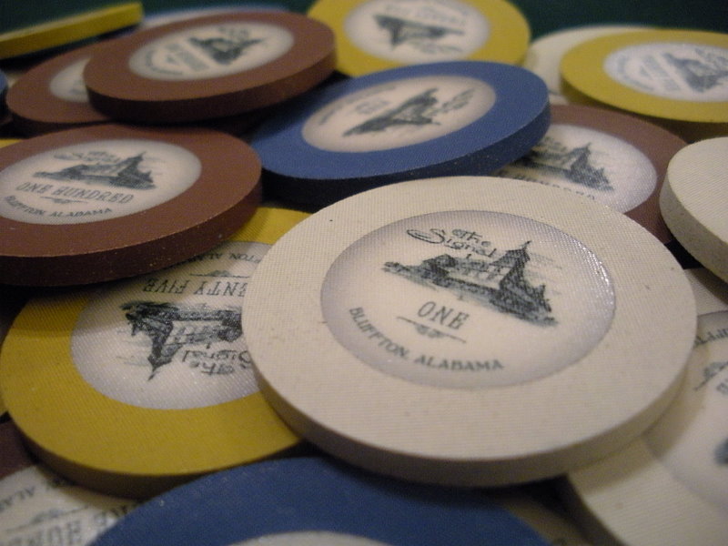
The No Mold had just been mad available again, so I decided to make them a very basic crest a seal type. They turned out very well and I still like the set buuuuut.... I'm a chip degen, so naturally I want to tinker with it.
eYu0a8r.jpg


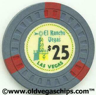
I'd like to bring the design into the 1940s with a MD-50 with basic spots treatment. My inspiration for this is the El Rancho Vegas from the 1940s.

GRNbCsa.png


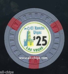
Now the tricky part with the chip colors is the $25. The chip is listed as Blue/Grey, but in some scans it looks more grey, and sometimes (like above) it looks almost purple. I don't have the latest CPC color sample, but looking at my 2010 ASM sample, the grey looks like the best fit. Lavender looks a bit too dark.

Here is my first cut at a color and spot progression. The inlays are placeholders left over from the original Signal design work. I could definitely see using an inlay like this, but with updated fonts that look era appropriate. I don't believe there was a $500 in the series, so I'm open suggestion. My gut was to fall back to the Vegas alt color of white. Definitely looking for thoughts here.

UPDATE: I've settled on these colors.

0XYz89y.png


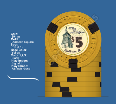
Another option for the inlay is to use the most prominent feature of the building for the focus. The El Rancho and The Signal both have towers. Using the existing inlay layout, but swapping towers, something like this could be used. Maybe even swap out the stylized text of "The Signal" for something more era appropriate.
6rxcvq6.png


UPDATE: For designers, I'm going with the original artist, Machinelf from CT. He hasn't joined PCF yet, so maybe this will put him over the edge. :)

Anyway, If you have any suggestions or feedback I'd love to hear it!
 
Last edited:
Oh great, one of m'y favorite custom set ever comes back.
This new project looks as awesome as the first one!
Will follow this with attention. Im already in for a sample if theyre available down the way :)
 
Mate, I love the solids, and would welcome more pron along those lines. I love the spots and the idea of keeping the whole image on the new ones. Looking awesome. I love nostalgic sets :)
 
I LOVE The Signal! Great to see them back. Great idea for a project, love that inlay style! :)
 
Oh great, one of m'y favorite custom set ever comes back.
This new project looks as awesome as the first one!
Will follow this with attention. Im already in for a sample if theyre available down the way :)

Thanks, fishy. I've got you down for th first sample.

Mate, I love the solids, and would welcome more pron along those lines. I love the spots and the idea of keeping the whole image on the new ones. Looking awesome. I love nostalgic sets :)

Thanks! I'll be sure to post a gallery of the solids soon. I take that as one vote for whole image inlay.

I LOVE The Signal! Great to see them back. Great idea for a project, love that inlay style! :)

Which style do you prefer, original / whole image or the El Rancho style?
 
Thanks, fishy. I've got you down for th first sample.


Thanks! I'll be sure to post a gallery of the solids soon. I take that as one vote for whole image inlay.


Which style do you prefer, original / whole image or the El Rancho style?

El Rancho, for me!
 
The Signal rides again!

Gray is probably the way to go. You might consider making a $2 chip instead of a $500 and getting a ton for limit.

El Rancho tower style gets my vote!
 
The Signal rides again!

Gray is probably the way to go. You might consider making a $2 chip instead of a $500 and getting a ton for limit.

El Rancho tower style gets my vote!

Another one for El Rancho style! Thank you, courage. BTW, this is for a separate tournament set. I added clarification in the OP.
 
Another one for El Rancho style! Thank you, courage. BTW, this is for a separate tournament set. I added clarification in the OP.

OK, cool. I'd definitely do the t500 then but perhaps white with imperial blue?
 
For me, it would be just the tower, with your original script.

But I really *love* that original El Rancho $25 lavender / purple color! It looks great with the dark yellow $5, IMO.
 
Oh great, one of m'y favorite custom set ever comes back.
This new project looks as awesome as the first one!
Will follow this with attention. Im already in for a sample if theyre available down the way :)
Yup pretty much this! Always loved this set.
I like the idea of the El Rancho style myself. Maybe white with lavender or light green spots.
 
OK, cool. I'd definitely do the t500 then but perhaps white with imperial blue?

That sounds tasty. I'll have to give it a shot

For me, it would be just the tower, with your original script.

But I really *love* that original El Rancho $25 lavender / purple color! It looks great with the dark yellow $5, IMO.

I totally agree. I'm just not sure how purple it is. Take these pictures for reference.

elranchovegas25.jpg
LiE7gZ9.jpg


These looks more blue-grey. When I get home I'll get out the lavender sample again. My feeling in chip designer was that lavender T25 into black T100 was too dark. I'll take a scan of the lineup later.

Yup pretty much this! Always loved this set.
I like the idea of the El Rancho style myself. Maybe white with lavender or light green spots.

I'll give the lavender and green spots a shot as well.

It looks like the consensus for the overall design is for El Rancho style. The quick and dirty mock-up that I posted is just a starting point. I'm not going to keep the rope around the border of the inlay, but I may replace it with a black line or something similar.
 
Last edited:
Ok, so here's some lunchtime food for thought.

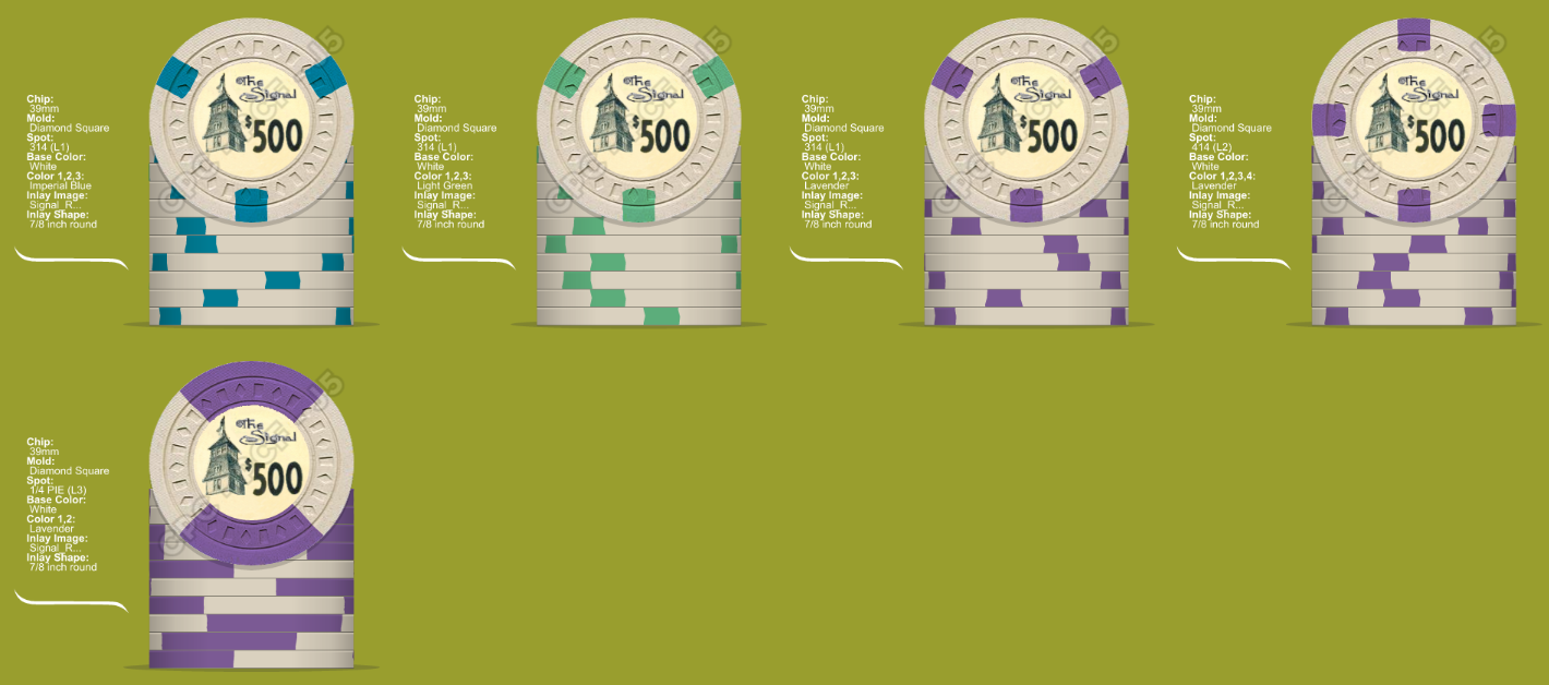
As per the consensus, I've mocked up all of the denoms with the tower only "El Rancho" style. I also changed the spots on the T500 to Lavender as per @72o suggestion. The more I got to looking at the T500, the more it's making me thing that it might need another pattern besides 314.

MX5KDIp.png


9fHTf12.png


My initial impression of the 414 is that it makes it a bit more special, but doesn't depart from the theme. Quarter pies are cool, but I'm not sure if it fits here.
 
The No Mold had just been mad available again, so I decided to make them a very basic crest a seal type. They turned out very well and I still like the set buuuuut.... I'm a chip degen, so naturally I want to tinker with it.

an absolute beautiful set. Normally I'm not a fan of the No Mold chips. Your design works perfect on them. Well done sir. You probably don't have any samples available.
 
Man that's a tough decision between the 314 & 414. Maybe 414 with the spots rotated to resemble the 314 pattern but with the extra bonus spot?

A870CF3E-4233-4A92-AD5F-00C367E28082.png
 
Loving the resurrection of this set and really, really loving the direction of the new design.

My opinions on the various questions so far:

(1) El Rancho font or something similar for font. I love the original, but for this design you gotta get something more appropriate for the period and region.
(2) White/lavender for T500 with white/imp. blue as a close second.
(3) 314 >>>>>>>>>>>>>>>>>>>>> 414. It's not close. Stick to the original imo.
 
Man that's a tough decision between the 314 & 414. Maybe 414 with the spots rotated to resemble the 314 pattern but with the extra bonus spot?

View attachment 56881

I guess I've never noticed. Does CPC align all inlays to edge spots? If so, how to do specify you would like the pattern rotated? Is it just a 614 with two white inserts? I really like this
 
I guess I've never noticed. Does CPC align all inlays to edge spots? If so, how to do specify you would like the pattern rotated? Is it just a 614 with two white inserts? I really like this
By default, CPC aligns the inlays exactly how the mock-ups look that you send them. You can have them unaligned of course if requested as well.

The spot pattern shown above is still 414 but you can rotate any pattern by clicking the rotate buttons in the CDT. And CPC will align accordingly if desired.

Capture.JPG
 
By default, CPC aligns the inlays exactly how the mock-ups look that you send them. You can have them unaligned of course if requested as well.

The spot pattern shown above is still 414 but you can rotate any pattern by clicking the rotate buttons in the CDT. And CPC will align accordingly if desired.

View attachment 56886

Ahh, I see now. Sure has come a long way since the CT tool. Thanks!
 
  • Like
Reactions: 72o
Now that I really think of it, most of the old school chips just used the 314 spots and nothing else so maybe just stick with that. Or maybe the 2 lower denoms use 314 and the 2 upper denoms use 414?

Just throwing options out there.
 
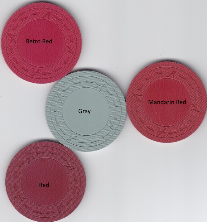
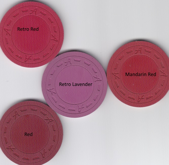
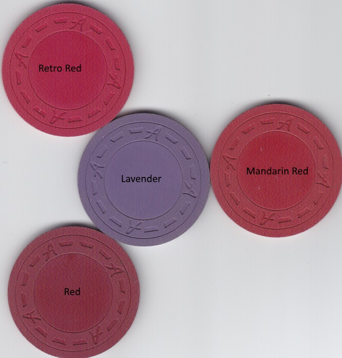
I think I'm leaning towards the White / Lavender 314 for the 500. Time to move on to settling the issue of the T25 base color. We don't really have access to a color that has as much blue in the gray as the El Rancho $25 does, but while holding the gray sample I really got a feeling for how much blue is in it. It seems like a decent amount. Going purple almost seems like getting further away from the mark. What do you think, @pltrgyst ?

jB1VARI.jpg

I0sAeBI.jpg

AK3i8lZ.jpg


Base colors with red edge spot candidates
hwjGljM.jpg

uleL4KA.jpg

J2olh8s.jpg


I agree that Retro Lavender lightens it up a little bit compared to Purple, but I'm still not sure if I like it over gray.

Lineup #1: Gray $25
0XYz89y.png


Lineup #2: Retro Lavender $25
corXlJQ.png


Lineup #3: Lavender $25
hzBu9je.png


Right now Lineup #1 is winning the chip race in my mind.
 
Lineup 1 for me, but I'm surprised how much I like lineup 3. Lavender/red is a great combo.
 
Now that I really think of it, most of the old school chips just used the 314 spots and nothing else so maybe just stick with that.

As I look through 1940s chips this seems to be the case. It's either none, two, or three.
 
Now about getting an artist. Obviously, J5. I've seen p5woody's name thrown around. Who else is doing chip work these days?
 

Create an account or login to comment

You must be a member in order to leave a comment

Create account

Create an account and join our community. It's easy!

Log in

Already have an account? Log in here.

Back
Top Bottom