The Signal, 1940s MD-50 Custom - All Denoms (1 Viewer)

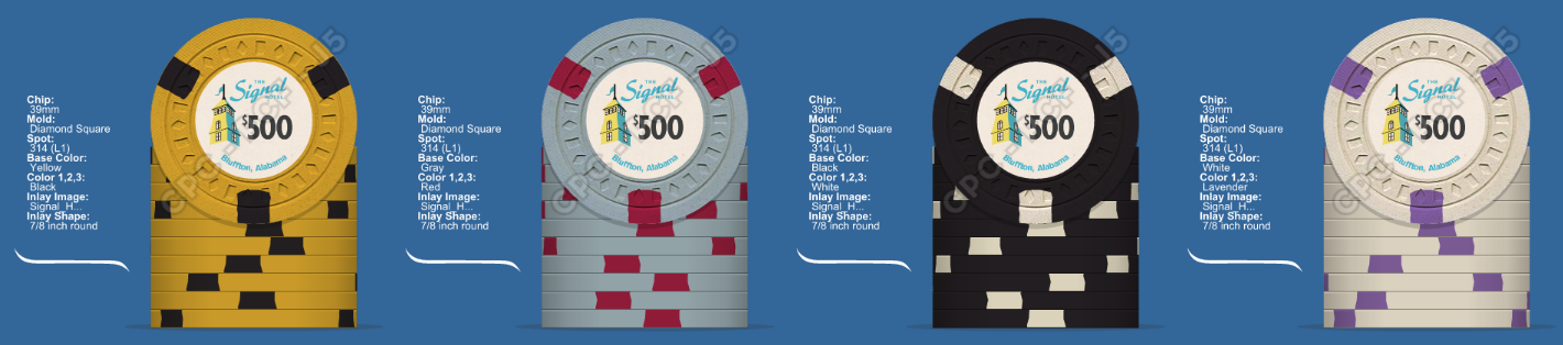
Thanks for all the responses, guys. My first impressions were that I really liked 7, 9, and 20. I like @MacGrad's suggestion that we try a combo. I'm going to take the favorites and apply them to the chips for a lineup for further discussion

Thanks for the shoutout -- I hope, if you like it, my suggestion is worthy of a sample set. ;-)

Just for reference, here's why I made my selection:

* The spire / hotel image is just so nice, that I'd want it to have some prominence on the face. I felt you'd lose some of the impact of the design work if it was smaller (like in 9-16 or 18-20)
* I like the script you've used in 7 -- simple, somewhat reminiscent of the font used on the "Flamingo" chips, and also reminiscent of the font used on the original letterhead
* Black background -- the blue and yellow really pop against the dark background, and it provides another visual point of difference between the tournament and cash set.
 
Alright. Here are the top choices when placed on the chips. After looking at this it looks like black background all day everyday. Now, do I want to focus on the text or the art. I really like how the text version fills the entire inlay, but I''ll hold judgement until I get the new black background version of #7. Here they are as is.

To me the black background takes the $5 and $25 to a whole different level.

SsfWlra.png

AuoeMdJ.png

dUuVp11.png
 
Black inlay wins by a hair but both top & bottom row FTW.

Yep, next lineup is going to be the bottom row of the previous post plus the second row with a black inlay. Then I just have to decide I like the text focus or the building focus better.
 
I like the Black label and the text focus, how would it look with the building large and behind everything?
 
Alright. Here are the top choices when placed on the chips. After looking at this it looks like black background all day everyday. Now, do I want to focus on the text or the art. I really like how the text version fills the entire inlay, but I''ll hold judgement until I get the new black background version of #7. Here they are as is.

To me the black background takes the $5 and $25 to a whole different level.

SsfWlra.png

AuoeMdJ.png

dUuVp11.png
Middle row here but with black background.

Yep, next lineup is going to be the bottom row of the previous post plus the second row with a black inlay. Then I just have to decide I like the text focus or the building focus better.
Which is what I am assuming you are talking about here^^^^^^^^^^


BTW these look great!
 
Alright, so a mashup of the styles and fonts is in. As it turns out @Toby was correct in that a taller font is needed to effectively use the space when the tower is larger. It's a shame because I really like the font. I'll see if we can squeeze a little more space out to bump up the font a bit, so we'll see. Between these two I'm liking the larger text version.

Xx1jwUj.png

dUuVp11.png
Bottom row. No question.
 
We're going to take one more run at the large tower using @Toby suggestion, but if it's still not there I'm going to move on with the bottom row.

On the top row, can Signal be angled from top down or does it only work uphill left to right?
If you move the demon down slightly to where it is on the bottom row, you can then have more space for larger text if it works angling from top left to bottom right.
or I'm just thinking backwards.o_O
 
On the top row, can Signal be angled from top down or does it only work uphill left to right?
If you move the demon down slightly to where it is on the bottom row, you can then have more space for larger text if it works angling from top left to bottom right.
or I'm just thinking backwards.o_O

Uphill has just felt more natural to me, but downhill may work. If we move the denom down low, it will be a pretty steep slope. You still need room for "Hotel" below signal, so that somewhat limits the angle of slope as well.
 
On the top row, can Signal be angled from top down or does it only work uphill left to right?
If you move the demon down slightly to where it is on the bottom row, you can then have more space for larger text if it works angling from top left to bottom right.
or I'm just thinking backwards.o_O

I was thinking just the same, top row might look better with a different angle (and a very sligthly smaller tower).
 
I wanted to love the top row more because I love the tower image, but I agree with the others that right now, the bottom looks like a better overall layout.
 
Alright, so a mashup of the styles and fonts is in. As it turns out @Toby was correct in that a taller font is needed to effectively use the space when the tower is larger. It's a shame because I really like the font. I'll see if we can squeeze a little more space out to bump up the font a bit, so we'll see. Between these two I'm liking the larger text version.

Xx1jwUj.png

dUuVp11.png


Bottom row is epic sweet. Very nice indeed!
 
Alright, so @machinelf has been a busy man. Here's his last attempt at the larger tower design. I think he nailed the large tower with this batch. Now the question goes back to: Tower or Text?

1.
DkbTdeP.png

2
.
u5woEHe.png

3.
7L9LhYX.png

4.
axrUGIE.png


Current Leader:
dUuVp11.png
 
Excellent work with the new batch, but I'm sticking with the current leader...
 
Wow... this set is going to look awesome.

If I'm choosing, I'll go with current leader over the tall tower -- however, I like 4 the best out of the tall tower versions. My biggest issue with the TT versions is that it appears there isn't a separation between "Signal" and the graphic -- on my monitor, they look like they touch, and I don't think you can make the name any smaller without introducing too much black space.

The balance looks much nicer on the Small Tower (ST) version -- my $0.05 CDN.
 

Create an account or login to comment

You must be a member in order to leave a comment

Create account

Create an account and join our community. It's easy!

Log in

Already have an account? Log in here.

Back
Top Bottom