If going with number 4 as primary then maybe bring the horseshoe to the bottom with the denom at the top kinda like this (my art skilz suk)
View attachment 42198
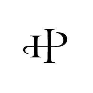
something about the circle HP is a little off maybe reduce the letters inside the circle a tad to make it less "cluttered" at the outside edges. Most of the time when brands are made the there are common intersections for lines such as have the bottom of the loop of the P intersect with the cross bar of the H. Just a thought, it doesn't look crazy off the way it is now though
View attachment 42202
here is a good link for some other brand info (maybe you have already done this)
http://www.tscrabrands.com/design-brand.html
Here are a couple I played with
Rocking HP
View attachment 42199
Reverse rocking HP
View attachment 42200
I also stumble across this in a googol image search #13 is my relatives (like 6 or 7 greats grandfather) when the settled central Kansas in the mid 1800's. My cousin still uses it today Bar C
View attachment 42201
maybe I got a little carried away here. Not trying to nitpick, these are going to be awesome