Can't figure out which one to use on the denom side. IMHO they all seem too "clean" compared to the logo? But count me in for samples no matter what
It's funny - to my eye they looked too ornate. The "HP" logo is so simple with its single line that I wouldn't want to go too complex on the reverse. On the other hand, it looks a bit stark to have simply a denom with no accentuating design feature.
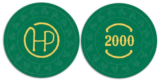
Maybe something super simple like a mimicking of the circle from the HP on the denom side like this (well, an ultra-cleaned up version of my 3rd grade MSPaint version)?
")


