The Hitching Post solid tournament hot stamp set (1 Viewer)

Mr Tree

Straight Flush
Joined
Oct 29, 2014
Messages
8,424
Reaction score
13,898
Location
Roswell, GA
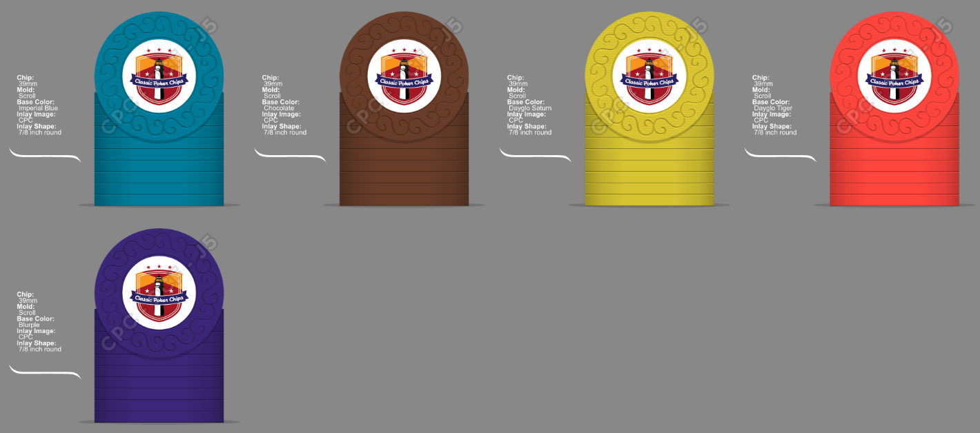
Ok so can I get some advice on my colors?

This is my original thought running 25/100/500/2000/10000


I run into two things with this. One is David S at CPC informed me the gold foil looks silver on yellow. Do I live with the optical illusion or change the chip? Also I think the chocolate T100 and Orange T2000 look very close in color


I can substitute DG Tiger and you don't have the closeness between the orange and chocolate but I'm not sure if it fits the set as well. I prefer the DG Tiger normally but for this set normally the more muted color is more appropriate.


Also maybe I sub in either lavender or pink for the yellow as either the T500 or T2000? Or stick with the yellow?


Thoughts?
 
Of the options, Set with the Lavender 500 feels like it offers the greatest range of colors. Greater range = fewer dirty stacks.
 
i don't have a tiger sample but dg pink and dg tiger look way to close together in those pics.
 
Loved the first set above as soon as I saw them. But how about imp blue/choc/dg saturn/dg tiger/blurple? Could maybe go canary instead of dg saturn.

I4TXTKZ.png
 
Loved the first set above as soon as I saw them. But how about imp blue/choc/dg saturn/dg tiger/blurple? Could maybe go canary instead of dg saturn.

I4TXTKZ.png
So the question becomes, if DG Saturn and yellow have the same optical effect where gold foil looks silver do I just say it is what it is?
 
So if we go yellow is this


Better than this?


And are they both better than this?


Comparison

 
I too second the retro lavender 500, I just pulled out my sample sets and put two orange and two chocolate alternating in a stack and my basement is fairly dim right now due to remodel and I do not see a problem using them together (took them upstairs to the kitchen and definitely not a problem up there in the daylight, cloudy rainy day here). That said, if you are concerned and wanted to keep the orange you could use a maroon or gray 100, they both offer more contrast to the orange than the chocolate. I do not see a problem with DG tiger here either, it is a little brighter than the other colors but fits as does the blurple (I could argue for retro blue here too)

This is going to be a great set!

ETA: you posted again before I was finished with my reply. I think if you are concerned about the stamps looking differently on yellow then maybe don't use it. However if it doesn't concern you and you like it who am i to tell you no.
I actually had the maroon 100 in there for a while I just think the transition from ImpBlue 25 to chocolate 100 is a nice look for the bulk of a starting stack,
 
David just sent me an email saying the results of the "silver" foil on yellow may have been user error by him not applying enough pressure. So if the yellow is still reflecting gold foil I think I prefer the yellow range to the lavender range.
 
I pulled out the ol' sample set (who am I kidding, I have them at my desk), and to my eyes the DG Saturn looks the best if going with any of the yellow hues
 
I'd scratch using a yellow chip (any hue) for three reasons:

1. gold foil won't look as good on yellow chips (any hue), no matter what anybody says
2. retro lavender looks eleventy-bajillion times nicer with your other selected chip colors
3. yellow (any hue) is a poor choice for a T500 chip

The colors you need to focus most on are the T100 - T500 - T2000 chips, as those will see the most time on the felt, individually and together. T25 chips only see play about 1/3 the total time (or less), and the T10K chips will rarely see the felt at all (or maybe an hour, tops).

I'd go with chocolate / retro lavender / dayglo tiger or light chocolate / retro lavender / dayglo tiger for the three workhorse chips. Your imperial blue and blurple bookends will work with either.

29B82A47-CFF0-4756-BF9E-1E8FF7532519.jpg
 
gold foil won't look as good on yellow chips (any hue), no matter what anybody says

Are you saying this specifically for CPC color palette? I think there are some killer Yellow and gold hot stamps out there.... but true, I can't think of any CPC stamped chips.
 
I love the colors in your initial post. If you're worried about the yellow and orange being to close, why not change the yellow to DG Saturn (or even DG Yellow or canary) and leave everything else as is?
 
I love the colors in your initial post. If you're worried about the yellow and orange being to close, why not change the yellow to DG Saturn (or even DG Yellow or canary) and leave everything else as is?
I wasn't worried about yellow orange. More about orange and chocolate being too close.


I do agree a yellow 500 is a little hinky. Just a thought. What if I did DG Saturn for the 25 and flipped the Imp Blue to the 500?
 
I wasn't worried about yellow orange. More about orange and chocolate being too close.


Ahh ok. How about DG arc yellow then instead of the orange? if you're worried about the DG arc yellow and the blurple being too far apart you could switch the blurple to lavender or purple maybe.
 
Ahh ok. How about DG arc yellow then instead of the orange? if you're worried about the DG arc yellow and the blurple being too far apart you could switch the blurple to lavender or purple maybe.
I'd really rather have something in the orange spectrum. If the orange doesn't work with the chocolate I'd go with the DG Tiger
 

Create an account or login to comment

You must be a member in order to leave a comment

Create account

Create an account and join our community. It's easy!

Log in

Already have an account? Log in here.

Back
Top Bottom