Ben8257
Royal Flush
That Organeish/yellow DB is bad ass! Hope you do decide on that one atleast on one side. That color is very unique! Cool design
Yep! White one one side and That one on the otherThat Organeish/yellow DB is bad ass! Hope you do decide on that one atleast on one side. That color is very unique! Cool design
Send me a private message so I don't forget. The dealer button comes with the setLooks great! I'm in for a sample set and a dealer button.
Shoot me a private message so I can add it on and not forget about itHi @KarateMaster72 I'm in for any dealer buttons you make as I collect dealer buttons. Thanks.
Yeah my cash set was just shy of $1,700. Like $1,677 or something like that. And I got 800 playable chips and one extra of each denomination for six sample sets. I know damn well. Then in about a month I'm going to be doing an add-on to make it an even thousand lol. Already starting my second set which I will probably order some time early to mid 2023Also I like lineup #2. I sort of went your route and tried to go with less expensive edge spots when I did my custom set, but it still ran me close to $2500 as I did a cash and tournament set at the same time.


Mess around a bit more and you can pull the design from the back now the inlay, color match to the denoms for the Chefs KissI think the artwork for the duck is great, and could work well on a chip. The typeface used has some very thin lines that may not reproduce well, and may just be too hard to see well at a small size.
I fiddled around a bit, (using a different duck) by putting the duck on the top and changing some of the sizes of the text:
View attachment 967038
But then going further, some great inlays I've seen have almost a 3D quality to them, with gradients and shadows. I added a texture background and changed the typeface to show something different, but a similar treatment could be made with any face.
View attachment 967039
For fun, I thought to add some bird poop on the top of some of the text...but thought maybe the duck is just not THAT angry.
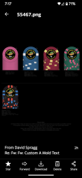
Pic or it didn’t happen.Who just got their proof from CPC? THIS GUY RIGHT HERE!!
")
Pic or it didn’t happen.
Sooooo..... What next? I mean saying I don't color match the denominations and leave it as is. Does that mean it's going into production soon? Or no. This is my first rodeo. If not, I may color match the denominationPic or it didn’t happen.
So what's your opinion? I'm fine with the white denomination. I think it shows up nice against the black background and I feel that with all the color in the duck and the yellowish text the white stands out. Nice. So I originally was going to have color denominations as you saw early on but I feel the white is just okay by me. And to be honest, I don't want to delay my chips anymore than necessary. LolYou could always use a faded (or pale) version of each color if you didn't want to go full on each one.
Until David says, "no more changes!", this could be a long road.
It doesn't matter to me...if you're happy with them, go with it.So what's your opinion? I'm fine with the white denomination. I think it shows up nice against the black background and I feel that with all the color in the duck and the yellowish text the white stands out. Nice. So I originally was going to have color denominations as you saw early on but I feel the white is just okay by me. And to be honest, I don't want to delay my chips anymore than necessary. Lol
how did you design these, MS Word? and what format do you need to upload them to the designer tool?I am starting my first CPC design for a cash set. A couple things to know, one. I have no idea how to use design programs. So I did this using Adobe Express on my phone.
Also, I want my first set to be fairly inexpensive. Because it is going to be my first set, there will be others to come eventually.
Also, I like simple edge spots. The only difference from the pictures I am going to post are on the $0.25 chip instead of a white edge spot. It is going to be bright white. And the $500 chip will be a bright white base instead of white.
I am using dayglo colors for the edge spots. And as I mentioned, I like simple edge spots. Maybe when I design a more expensive set I'll get a little more intense.
Going to post these with the link so you could view the slide. But for some reason they are not showing up on my phone with my inlay. They were last night and that's how I got the screenshots. But today they are not. So bear with me.
Looking for any advice that might help me make this look a little better. But I'm actually very happy with the way they look. Thank you!
We play stakes from .25¢ / .50¢ All the way up to $2/ $5. The only reason why I have a $500 chip is I wanted one lol. I'm only making 10 of them. I call the $500 chip birthday cake. Because it reminds me of a funfetti cake lol
I have no idea how to use computers lol. I just got a bunch of pictures off the internet and tried different things with them. Put them through a background remover then took them over to another program and sized them and everything was garbage till I got @Colquhoun to clean up my mess and fix it for mehow did you design these, MS Word? and what format do you need to upload them to the designer tool?
Besides the background eraser program, I think I used Adobe illustrator. Did it all on my phone and then @Colquhoun cleaned up my messhow did you design these, MS Word? and what format do you need to upload them to the designer tool?
Yep, the later versions and the dealer buttons were Illustrator. Word is fine for putting together ideas, but for flat art, you'll need a vector-based drawing app capable of handling CMYK colors. A raster-based app like Photoshop can also be used but only when photos are needed.how did you design these, MS Word? and what format do you need to upload them to the designer tool?
Dealer buttons from BR. Pro came in yesterday. Now all we need is the chips to go with them from CPC. Like Tom Petty said," The waiting is the hardest part"Yep, the later versions and the dealer buttons were Illustrator. Word is fine for putting together ideas, but for flat art, you'll need a vector-based drawing app capable of handling CMYK colors. A raster-based app like Photoshop can also be used but only when photos are needed.
There are plenty of apps like Illustrator out there, not sure which ones are better than others, though. If you need any help, send me a PM.

All @ColquhounThe drop shadow on the 2nd side works really well