Starting first design (1 Viewer)

Joined
Aug 9, 2020
Messages
1,048
Reaction score
1,098
Location
Pennsylvania
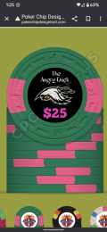
I am starting my first CPC design for a cash set. A couple things to know, one. I have no idea how to use design programs. So I did this using Adobe Express on my phone.

Also, I want my first set to be fairly inexpensive. Because it is going to be my first set, there will be others to come eventually.
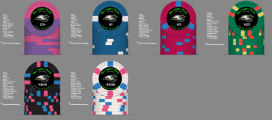
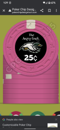
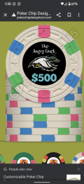
Also, I like simple edge spots. The only difference from the pictures I am going to post are on the $0.25 chip instead of a white edge spot. It is going to be bright white. And the $500 chip will be a bright white base instead of white.

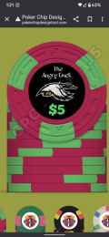
I am using dayglo colors for the edge spots. And as I mentioned, I like simple edge spots. Maybe when I design a more expensive set I'll get a little more intense.

Going to post these with the link so you could view the slide. But for some reason they are not showing up on my phone with my inlay. They were last night and that's how I got the screenshots. But today they are not. So bear with me.

Looking for any advice that might help me make this look a little better. But I'm actually very happy with the way they look. Thank you!

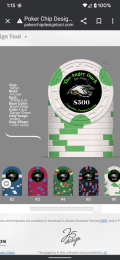
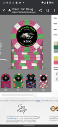
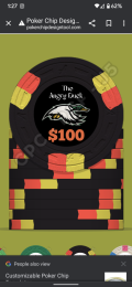
We play stakes from .25¢ / .50¢ All the way up to $2/ $5. The only reason why I have a $500 chip is I wanted one lol. I'm only making 10 of them. I call the $500 chip birthday cake. Because it reminds me of a funfetti cake lol
 

Attachments

  • Screenshot_20220813-012904.png
    Screenshot_20220813-012904.png
    327.9 KB · Views: 217
  • Screenshot_20220813-012730.png
    Screenshot_20220813-012730.png
    258.6 KB · Views: 221
  • Screenshot_20220813-013536.png
    Screenshot_20220813-013536.png
    377.1 KB · Views: 176
  • Screenshot_20220813-012111.png
    Screenshot_20220813-012111.png
    347.6 KB · Views: 162
  • Screenshot_20220813-012524.png
    Screenshot_20220813-012524.png
    319.4 KB · Views: 159
  • Screenshot_20220813-011403.png
    Screenshot_20220813-011403.png
    343.3 KB · Views: 209
Looking for any advice that might help me make this look a little better. But I'm actually very happy with the way they look. Thank you!
I think that matching the denomination color to one of the edge spots is a very good idea. But you might also consider matching it to the base color as well, especially when you have multiple edge spot colors to choose from. Just a suggestion to try out.

One personal preference that I actually like is to make the denomination symbol smaller than the actual numbers. I find that it helps the numbers retain their size or their easy to read, and doesn't crowd anything especially with the 100 and the 500 that have an extra digit.

So much anger coming from water fowl on this site.
I've been kicking around an idea for a Scrooge McDuck-themed set. With all this anti-duck propaganda, maybe it's the kick in the pants I need!
 
I think that matching the denomination color to one of the edge spots is a very good idea. But you might also consider matching it to the base color as well, especially when you have multiple edge spot colors to choose from. Just a suggestion to try out.

One personal preference that I actually like is to make the denomination symbol smaller than the actual numbers. I find that it helps the numbers retain their size or their easy to read, and doesn't crowd anything especially with the 100 and the 500 that have an extra digit.


I've been kicking around an idea for a Scrooge McDuck-themed set. With all this anti-duck propaganda, maybe it's the kick in the pants I need!
I was considering matching the base color. Either way is fine with me. Also, I agree about making the denomination a little smaller. But my eyes are getting bad lol So I wanted to kind of big. Maybe I'll take it down a little bit. I was going to wrap the text around the border of the top of the chip but I really like it the way it is
 
@Himewad One of the parents at my karate school is hilarious. And I call her" angry duck" whenever she is in a grumpy mood or the boys annoy her. Because when she says "what" it sounds like a quack. So I was trying to think of a unique name for the poker chips and that just popped to mind. I love your design as well
 
Last edited:
I was considering matching the base color. Either way is fine with me. Also, I agree about making the denomination a little smaller. But my eyes are getting bad lol So I wanted to kind of big. Maybe I'll take it down a little bit. I was going to wrap the text around the border of the top of the chip but I really like it the way it is
I didn't mean the whole denom; I think the size is fine. I meant just the currency symbol. I like it smaller compared to the rest of the numbers. It lets the numbers stay at the current size so they're easier to see. Like this:

 
Good start.. looking forward to how these work out
1. agree with making the currency symbol smaller
2. I'd switch the spots on the $5 and $25 so there's a better (IMO) progression
solid, 214, 212, 312, 3d14, 614
3. also not loving the color combos on the $5 and $25, especially with green in both
Perhaps (bright) white spots on the $5 and some other spot on the $25, although nothing jumps out at me

Also, it's helpful to post the details (base color, spot color, etc) when posting pics. You can get these
with the design tool output

just my 0.02... I'm not a designer
 
I didn't mean the whole denom; I think the size is fine. I meant just the currency symbol. I like it smaller compared to the rest of the numbers. It lets the numbers stay at the current size so they're easier to see. Like this:

Oh I see. Yeah that was the font I used for the denomination and the symbol. Maybe I should try a different font. Like I said, I'm not very design literate
 
I think the artwork for the duck is great, and could work well on a chip. The typeface used has some very thin lines that may not reproduce well, and may just be too hard to see well at a small size.
I fiddled around a bit, (using a different duck) by putting the duck on the top and changing some of the sizes of the text:
mockup1a.jpg


But then going further, some great inlays I've seen have almost a 3D quality to them, with gradients and shadows. I added a texture background and changed the typeface to show something different, but a similar treatment could be made with any face.
mockup1b.jpg


For fun, I thought to add some bird poop on the top of some of the text...but thought maybe the duck is just not THAT angry. :ROFL: :ROFLMAO:
 
Last edited:
Lables are quite small, so higher contrasts are usually a good idea.

Duck #1 for better visibility.
Type #2 for better visibility.

Red denom on black is not ideal in terms of visibility. You could try a white stroke like you have on your duck.
 
Do not rush it, take your own sweet time and make sure you are fully satisfied before committing the big buy

I got a feeling you are focusing to save on cost, it better to spend a bit more based on what you prefer and not based on the cost.

You may want to at least get some sample of the Mold as not all the Mold Are the same, don’t choose A-Mold just because it running all the time for example

Also, Good luck with the design.
 
Super quick tutorial:
Design chip one. Click the chip and Save as New.
052C7858-FA36-4E16-992D-420877EB5197.jpeg

Build your second chip, click on it and Save as New (or place it in whichever position you want with Save as (number).
4CC3E3E3-EB3D-4695-8502-1BE99CD0C53C.jpeg

When you’re ready, select Save as PNG on the left, unselect Export 2 Chip Sides, select All Chips
F2B1940F-C66C-4919-98F9-982B710E162A.jpeg

Watch the magic
1660480207804.png

Don’t forget to save the set and post the results using the photo icon so we can all share in the wondrous glory.
36E7B473-60E7-4936-99AE-BF3269F9DE0D.jpeg
 
As for chips, peruse the ChipDB and the Chip Guide (Search > ChipGuide Query Facility) then filter by color then mold-say (H&C) SLV for starter). Note which color combos you like and don’t like, remembering that Paulson colors are different.

DG Arc Yellow and DG Tiger are fire on black. There are other great combos as well using blues, DG pink, DG green, bright white…

Have fun!
 
Super quick tutorial:
Design chip one. Click the chip and Save as New.
View attachment 967073
Build your second chip, click on it and Save as New (or place it in whichever position you want with Save as (number).
View attachment 967075
When you’re ready, select Save as PNG on the left, unselect Export 2 Chip Sides, select All Chips
View attachment 967076
Watch the magic
View attachment 967077
Don’t forget to save the set and post the results using the photo icon so we can all share in the wondrous glory.
View attachment 967078
Yeah I did that but for some reason it's not showing all my phone and only shows all my computer at the karate school. So when I go there today I'll re-upload
 
As for chips, peruse the ChipDB and the Chip Guide (Search > ChipGuide Query Facility) then filter by color then mold-say (H&C) SLV for starter). Note which color combos you like and don’t like, remembering that Paulson colors are different.

DG Arc Yellow and DG Tiger are fire on black. There are other great combos as well using blues, DG pink, DG green, bright white…

Have fun!
I originally had DG pink and DG green on the $100 chip but I switched it to the DG Saturn yellow or it might be art yellow. I'll have to look and DG tiger
 
Good start.. looking forward to how these work out
1. agree with making the currency symbol smaller
2. I'd switch the spots on the $5 and $25 so there's a better (IMO) progression
solid, 214, 212, 312, 3d14, 614
3. also not loving the color combos on the $5 and $25, especially with green in both
Perhaps (bright) white spots on the $5 and some other spot on the $25, although nothing jumps out at me

Also, it's helpful to post the details (base color, spot color, etc) when posting pics. You can get these
with the design tool output

just my 0.02... I'm not a designer
Ok here's where I'm at. I think I'm pretty set on the colors. I've been getting a lot of help from @Colquhoun and @Samuel . They sent me several ideas and mockups. I hope they don't feel like I disregarded them. I actually tried to learn from them. But I wanted the more" classy writing" I also went with a 1-in inlay. I think it just looks a little better with this design. I'm far from done. I'm going to be trying different fonts and a few other things but this is the basic gist I think

http://pokerchipdesigntool.com/?imp_sets=1uNyQSAL
 

Attachments

  • 74022264-ef32-44a2-9486-6919a10a4637.png
    74022264-ef32-44a2-9486-6919a10a4637.png
    269.8 KB · Views: 121

Attachments

  • Screenshot_20220815-131530.png
    Screenshot_20220815-131530.png
    269.1 KB · Views: 74
I was trying not to get too deep ...

I wouldn't use a White base for anything other than a 1 or a 100 (okay maybe a 100k too)

I suggest changing the 500 to purple base since you have a black hundo.

The pink base for people with sight issues might have a hard time with the contrast of red and pink, here is what I would do,

Orange or Yellow for a frac
Blue is fine for a 1
Red or Yellow for a 5
Black or yellow 20
White 100
Purple, Charcoal or Grey for the 500

Find your base first, your inserts are all over the place and I'm not sure about a tri moon that high up in the set with this insert progression.

@Colquhoun's profession is design, he does it for a living, if you plan to not take his advice you should think about it again, and then again ;)

I think this looks great:

I might shrink the text a little and make the duck larger, or just make the duck larger, let the wings take the blank space by 'The'

mockup1a-jpg.967038
 
Last edited:
I was trying not to get too deep ...

I wouldn't use a White base for anything other than a 1 or a 100 (okay maybe a 100k too)

I suggest changing the 500 to purple base since you have a black hundo.

The pink base for people with sight issues might have a hard time with the contrast of red and pink, here is what I would do,

Orange or Yellow for a frac
Blue is fine for a 1
Red or Yellow for a 5
Black or yellow 20
White 100
Purple, Charcoal or Grey for the 500

Find your base first, your inserts are all over the place and I'm not sure about a tri moon that high up in the set with this insert progression.

@Colquhoun's profession is design, he does it for a living, if you plan to not take his advice you should think about it again, and then again ;)

I think this looks great:

I might shrink the text a little and make the duck larger, or just make the duck larger, let the wings take the blank space by 'The'

mockup1a-jpg.967038
Yes I know he's a designer. I'm definitely going to take his advice. I was just showing you something I did myself. I'm going to incorporate his things into my design. I'm just very bad at using programs and trying to figure everything out
 
Last edited:
Yes I know he's a designer. I'm definitely going to take his advice. I was just showing you something I did myself. I'm going to a corporate his things into my design. I'm just very bad at using programs and trying to figure everything out
I've been in IT for over 20 years, I would log into BBS when I was kid. I'm working on some index cards for mixed games and I'm making my way through it.

Getting a rough mock is one thing, and putting text on a curve is cool, but save yourself the headache, there are so many small things you just don't want to take the time to get right. Here is my mock, this label is very simple, but I knew better than to try to tackle it myself when spending CPC sized money =)
If you do shaped inlays thats another level and CPC wants .ia files, meaning you have to have adobe as far as I know ...

9f90b7ae-1e9f-48e0-a65c-3c9e61b25b4d.png

 
I've been in IT for over 20 years, I would log into BBS when I was kid. I'm working on some index cards for mixed games and I'm making my way through it.

Getting a rough mock is one thing, and putting text on a curve is cool, but save yourself the headache, there are so many small things you just don't want to take the time to get right. Here is my mock, this label is very simple, but I knew better than to try to tackle it myself when spending CPC sized money =)
If you do shaped inlays thats another level and CPC wants .ia files, meaning you have to have adobe as far as I know ...

That looks awesome. Yeah I've been going back and forth with straight text and curved text. I just applied some of your suggestions real quick here, I see what you meant about my edge spots being all over the place.

http://pokerchipdesigntool.com/?imp_sets=0btzT8Rb
 

Attachments

  • Screenshot_20220815-141429.png
    Screenshot_20220815-141429.png
    266.7 KB · Views: 87
  • Screenshot_20220815-141445.png
    Screenshot_20220815-141445.png
    278.2 KB · Views: 96
I've been in IT for over 20 years, I would log into BBS when I was kid. I'm working on some index cards for mixed games and I'm making my way through it.

Getting a rough mock is one thing, and putting text on a curve is cool, but save yourself the headache, there are so many small things you just don't want to take the time to get right. Here is my mock, this label is very simple, but I knew better than to try to tackle it myself when spending CPC sized money =)
If you do shaped inlays thats another level and CPC wants .ia files, meaning you have to have adobe as far as I know ...

I tried the 500 and pink and purple. Here's a picture of the pink. But I'm not sold on it. I could easily go to the purple, but I definitely like the yellow frac
 
But personally I would do something closer to this
.25/1/5/20/100/500

Something about an angry duck on a yellow 20 just makes me happy.

1660590475398.png
 

Create an account or login to comment

You must be a member in order to leave a comment

Create account

Create an account and join our community. It's easy!

Log in

Already have an account? Log in here.

Back
Top Bottom