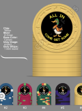
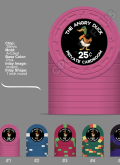
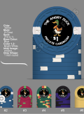
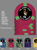
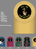
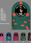
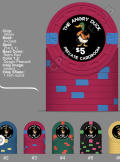
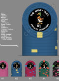
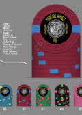
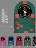
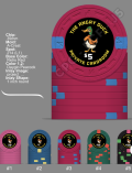
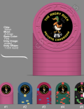
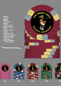
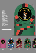
Starting first design (1 Viewer)

There is a reference by @timinater that has CMKY values that do a quite good job at color matching to CPC colors:

https://www.pokerchipforum.com/threads/cpc-colour-code-matching-list.52094/

The day-glo colors don't work too well, mostly because those colors can't really be printed by CPC or most printers, but the are surprisingly good:

https://www.pokerchipforum.com/threads/a-d-s-devils-nest-cpc-customs.78031/

Maybe this will help a bit. I wouldn't try to match inlay to the base color to make a faux-shaped inlay, but to match for a denomination or text, they should do the job.

@Colquhoun beat me to the answer....
Yeah you guys are a wealth of information and I really appreciate it. Ultimately I think I'm just going to go monotone white for all texts. Against the black. It really shows up and it kind of gives it a uniform look. I'm thinking that the duck itself has enough color in it. Plus the edge spots are pretty bright
 
White text on black can be tricky. Because of print bleed issues you want to size the font as reasonably large as possible.

When testing for legibility, just do a series of scale printouts and hold them at arms length.
 
White text on black can be tricky. Because of print bleed issues you want to size the font as reasonably large as possible.

When testing for legibility, just do a series of scale printouts and hold them at arms length.
Yep a few others have told me that as well. When I get back into the office at the karate school tomorrow I will do that. I've done it on my phone with a screenshot then reducing it's size to a regular poker chip. And it seems to be fine but I will find out once it's on paper.
 
Last edited:
@allforcharity I really appreciate all the help I'm getting from you guys. I should just break down and let a designer do it which I probably will. But I just really want to give it a shot myself. If that makes sense?

I am a proponent of self design when it can be done, but that's very much an individual thing. The professionals here really do provide a professional product, though.
 
Made the white text larger to prevent edge bleed. Moved it away from the edge enough I believe. Made the duck a lighter color so it would show better. Made the denomination symbols smaller. Changed some text. Changed a few chip colors as well. I printed it out the size of a regular chip and it is readable at arms length or even further
 

Attachments

  • Screenshot_20220818-125833.png
    Screenshot_20220818-125833.png
    473.3 KB · Views: 62
  • Screenshot_20220818-125804.png
    Screenshot_20220818-125804.png
    409 KB · Views: 54
  • Screenshot_20220818-130419.png
    Screenshot_20220818-130419.png
    456.8 KB · Views: 54
  • Screenshot_20220818-125653.png
    Screenshot_20220818-125653.png
    436.4 KB · Views: 50
  • Screenshot_20220818-125743.png
    Screenshot_20220818-125743.png
    441.3 KB · Views: 51
  • Screenshot_20220818-125705.png
    Screenshot_20220818-125705.png
    446.7 KB · Views: 61
Here we go again. Of course, any advice is welcome. But I think I'm set on the colors and edge spot patterns.
 

Attachments

  • Screenshot_20220820-193958.png
    Screenshot_20220820-193958.png
    483.5 KB · Views: 51
  • Screenshot_20220820-193938.png
    Screenshot_20220820-193938.png
    437.1 KB · Views: 55
  • Screenshot_20220820-193920.png
    Screenshot_20220820-193920.png
    442.4 KB · Views: 42
  • Screenshot_20220820-194124.png
    Screenshot_20220820-194124.png
    466.4 KB · Views: 49
  • Screenshot_20220820-193857.png
    Screenshot_20220820-193857.png
    451.2 KB · Views: 40
  • Screenshot_20220820-193848.png
    Screenshot_20220820-193848.png
    465.1 KB · Views: 48
Just for fun ( because trying to perfect one set of chips just isn't nerve-wracking enough) lol
 

Attachments

  • Screenshot_20220820-161718.png
    Screenshot_20220820-161718.png
    473.4 KB · Views: 45
Did you choose those edgespots because they're awesome or for budgetary reasons?
If it's the latter, I'd safe up a little more and get what you really want, not what you can afford right now.

Not trying to throw shade though!
As it stands I think it's a very classy old school set and I like all the color combinations. :love:
Budgetary is always a thing with me even when I have money to burn lol. It's just in my nature. But I actually just like the clean, simple progression.
 
Did you choose those edgespots because they're awesome or for budgetary reasons?
If it's the latter, I'd safe up a little more and get what you really want, not what you can afford right now.

Not trying to throw shade though!
As it stands I think it's a very classy old school set and I like all the color combinations. :love:
Also, I don't know when I'll be putting the order in. I don't think it's going to be within the next few weeks or days by any mean. I was wondering though, maybe you know the answer, does the A mold run all the time or is it like the others and goes in rotation?
 
Also, I don't know when I'll be putting the order in. I don't think it's going to be within the next few weeks or days by any mean. I was wondering though, maybe you know the answer, does the A mold run all the time or is it like the others and goes in rotation?

A mold runs all the time.
 
Ok both lineups will have the pink frac. But which one do you like better? Line up number one or line up number two? Also, I guess I'm going to hire a designer. Because I have no idea how to make my duck into a vector file or find a vector file of a duck that looks pretty much like this or even open a vector file lol. Be gentle, it's my first time

LINE UP #1
 

Attachments

  • Screenshot_20220820-214031.png
    Screenshot_20220820-214031.png
    490.3 KB · Views: 30
  • Screenshot_20220820-214006.png
    Screenshot_20220820-214006.png
    422.8 KB · Views: 32
  • Screenshot_20220820-213950.png
    Screenshot_20220820-213950.png
    457.8 KB · Views: 39
  • Screenshot_20220820-213932.png
    Screenshot_20220820-213932.png
    463 KB · Views: 34
  • Screenshot_20220820-213912.png
    Screenshot_20220820-213912.png
    453.8 KB · Views: 35
  • Screenshot_20220820-213854.png
    Screenshot_20220820-213854.png
    480.6 KB · Views: 43
LINE UP #2
 

Attachments

  • Screenshot_20220820-213854.png
    Screenshot_20220820-213854.png
    480.6 KB · Views: 44
  • Screenshot_20220821-092116.png
    Screenshot_20220821-092116.png
    419.3 KB · Views: 42
  • Screenshot_20220821-092132.png
    Screenshot_20220821-092132.png
    439.7 KB · Views: 45
  • Screenshot_20220821-092149.png
    Screenshot_20220821-092149.png
    403.7 KB · Views: 36
  • Screenshot_20220821-092204.png
    Screenshot_20220821-092204.png
    397.1 KB · Views: 41
  • Screenshot_20220820-214031.png
    Screenshot_20220820-214031.png
    490.3 KB · Views: 40
I know this argument goes over like a lead balloon here, but I’ll say it again: In a home game full of regulars, no one relies on printed numbers to determine chip values after the first couple orbits of the first game you use the chips.

Even in a random casino where I’ve never played, the denoms are just a decorative element. People use base color, then spots, then inlay shape, not to mention verbalization and common sense before they lean over to read some 9 point type.

If I’m in a 2/5 game, for example, it is automatic that I know the big blind’s chip color is the $5 chip.

But it’s your game, your chips! Many people feel a chip design looks naked without a big printed denom.
I can definitely play without denominations. But I kind of agree with you on how some people feel. I do like to have a denomination on it just for design preferences. Now. It doesn't have to be huge, but I also don't want it to be an eyelash
 
You can consider doing 2 side of the chip with different print, 1 side with a huge Denomination like the example below

View attachment 972050
Several others have also suggested two different sides. I considered it but for some reason my OCD won't allow it. I like to have it the same on both sides.... Yes I know I am weird
 
I hosted for years with just Starburst solids. For new players I had a small card with the denoms, but people knew the values within their first few orbits.

For my cash game, I mostly use a suits mold set which is mainly PCRs with hotstamps including denoms. But there are a few matching Avalon NCVs mixed in. If I toss in a green Avalon with no denom (instead of the otherwise identical green PCR $25), no one ever says, “Whoa, whoa, how much is that!”

I’m currently creating a new cash set which does have denoms on it, but that is more for graphic design variety than any actual need for the numerals.

Anyway, sorry to derail the thread. Your designs are coming along very nicely.
 
Several others have also suggested two different sides. I considered it but for some reason my OCD won't allow it. I like to have it the same on both sides.... Yes I know I am weird
Np, most people design & customize both side with the same design.

I just felt like it's a waste to not utilize both sides, and 1 side with a big denomination is something I considering in my future project
 
Np, most people design & customize both side with the same design.

I just felt like it's a waste to not utilize both sides, and 1 side with a big denomination is something I considering in my future project
I do like the two different side design. But like I said then I start getting anxious lol. It seems like the older I get the more OCD I get
 
I hosted for years with just Starburst solids. For new players I had a small card with the denoms, but people knew the values within their first few orbits.

For my cash game, I mostly use a suits mold set which is mainly PCRs with hotstamps including denoms. But there are a few matching Avalon NCVs mixed in. If I toss in a green Avalon with no denom (instead of the otherwise identical green PCR $25), no one ever says, “Whoa, whoa, how much is that!”

I’m currently creating a new cash set which does have denoms on it, but that is more for graphic design variety than any actual need for the numerals.

Anyway, sorry to derail the thread. Your designs are coming along very nicely.
You haven't derailed anything. I appreciate all the insight and your experiences and preferences. That's how I learn. Yeah I would say for me like I said, it is more of a design element than a need. And now I am probably reached my The end of my proficiency level and I'm going to find a designer. Because I have no idea how to convert things to vector or CMYK or any of that other stuff lol. I did all of this on my phone. Took me hours because I had to resize everything and do everything individually between a couple apps. I am really not up on technology when it comes to this stuff
 
Okay, here is the final inlay design. Thank you so much to @Colquhoun for transferring the files into the proper format and tweaking everything. Absolutely amazing And so very appreciated! Also thanks to @Samuel for letting me bounce ideas off of you and all the inspiration you gave me also.Thanks to @p5woody for your suggestions. And thank you to every one on this thread that shared their knowledge , opinions and ideas as well.

I hope you guys like the final design. I am still ironing out the edge spots. I should have it done tonight then I will post renders and most likely send my order off tomorrow.

After I post the renders, if anyone would like a sample set let me know. I am probably going to get a few.
 

Attachments

  • inlay_final.jpg
    inlay_final.jpg
    110.2 KB · Views: 56

Create an account or login to comment

You must be a member in order to leave a comment

Create account

Create an account and join our community. It's easy!

Log in

Already have an account? Log in here.

Back
Top Bottom