-
PCF is an Amazon Associate and an eBay Partner. If you make a purchase through one of our links, we may earn a commission at no extra cost to you. Thank you for your support!
You are using an out of date browser. It may not display this or other websites correctly.
You should upgrade or use an alternative browser.
You should upgrade or use an alternative browser.
Starting first design (1 Viewer)
- Thread starter KarateMaster72
- Start date
OP
OP
KarateMaster72
Flush
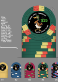
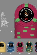
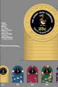
Well I have a lot to do on the designs. I've done this from my phone. I'm going to give it a shot at the karate school on the computer. So I guess I'm going to do like seven different sets and then pick one after you guys give me your input lol I never knew it would be so in-depthI think I like 4 the best
View attachment 967901
OP
OP
KarateMaster72
Flush
Thanks!I found finding the base color you want first seems trivial but its good to save them as just a base so you can start over quickly or save off an ideal.
Check the size of the scroll bar...
OP
OP
KarateMaster72
Flush
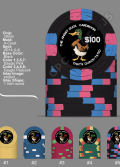
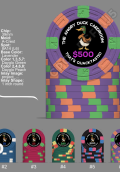
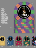
Yes! I actually liked the two tone. But I am a noob so I got the advice and I tried it. I definitely don't want anyone thinking I am disregarding their skills. I am so faaaaaaar from being committed to anything yet lol This was way more intense than I knewJust playing around, two-tone chips are underrated IMO. A very straightforward progression and cheapo levels excluding the 500.
View attachment 967921
OP
OP
KarateMaster72
Flush
See I did not know you could save them. I just wrote everything down lol. I am so stone aged. I finally went digital at the karate school for attendance and payments. Only took me 30 years lolI found finding the base color you want first seems trivial but its good to save them as just a base so you can start over quickly or save off an ideal.
Check the size of the scroll bar...
OP
OP
KarateMaster72
Flush
Ok. Here we go Again. I guess once you start playing around doing this you don't sleep or do anything else.
http://pokerchipdesigntool.com/?imp_sets=zDggwMAl
http://pokerchipdesigntool.com/?imp_sets=zDggwMAl
OP
OP
KarateMaster72
Flush
I like that. I may go in and change it. For the 10 millionth time lol. But right now I'm going to bed. Thanks for everything But right now I'm going to bed. Thanks for everything
OP
OP
KarateMaster72
Flush
Okay I lied. I went in and made the changes. Now I'm going to bed
OP
OP
KarateMaster72
Flush
OP
OP
KarateMaster72
Flush
@mipevi @Machine @Colquhoun And everyone else that has been giving me ideas and helping me out. Thank you very much. This is far from over lol but I appreciate it. Have a great night!
Personally I prefer the flying duck. I would try to make the artwork without any color-matching though, as I think the chips are plenty colorful on their own and things can quickly start looking too busy (messy). You can always add some color-matching to the design later, if you want.
OP
OP
KarateMaster72
Flush


I think it might be easiest to get one of the experienced artists here to help you realize your vision. The price of that should be pretty miniscule compared to the price of the chips, while the artwork is a very large part of the overall design and can really make or break a set. ")
OP
OP
KarateMaster72
Flush
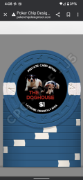
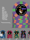
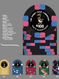
sitting at home. Recovering from oral surgery. Just killing some time and I was thinking. Just out of curiosity, can CPC do photos? I'm still going with the angry duck but down the road I may want to do this set. The guy on the left is Chuck. He is 12. The guy on the right is Jake. He was 16 when I put him down in 2018 this was one of their last good photos together.
Attachments
Dezmond
Pair
I do like the two tone as well. Less distractingJust playing around, two-tone chips are underrated IMO. A very straightforward progression and cheapo levels excluding the 500.
View attachment 967921
OP
OP
KarateMaster72
Flush
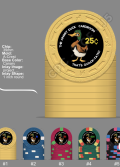
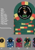
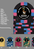
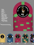
Ooooooooook! I think I have settled on everything. If anyone thinks I should do something a little different with the font, please let me know, but I'm actually pretty happy about this. I had another design just like this but around the bottom arch it said. " That's quacktastic"
But I felt The text was a little bit too small even though it looked really awesome. So I opted for this. Just a bit cleaner.
As I said before, this is quite the rabbit hole and I've only been down it for a few days. I don't know how you guys do it all the time lol. Anyway, since I was home recovering from oral surgery today I had time to play around..
Dezmond
Pair
Looks awesome! Love the canary Yellow.
OP
OP
KarateMaster72
Flush
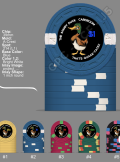
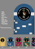
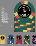
Okay several helpful people informed me to keep my text further away from the edge and also to make it a little bigger. So I tried this
Attachments
-
 Screenshot_20220817-110010.png478.4 KB · Views: 96
 -
 Screenshot_20220817-110033.png469.7 KB · Views: 102
 -
 Screenshot_20220817-110049.png481.4 KB · Views: 93
 -
 Screenshot_20220817-110059.png452.9 KB · Views: 87
 -
 Screenshot_20220817-110115.png453.2 KB · Views: 91
 -
 Screenshot_20220817-110252.png524.8 KB · Views: 93
OP
OP
KarateMaster72
Flush
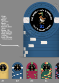
And I am back with more revisions. Text is a little bigger. Definitely far enough away from the edges. Images is slight bit smaller. Denomination is bigger. And I am done for the day. This is really hard and I have a lot of respect for those who do it for a living. I'm sure understanding how to use programs would be a help and not doing it on my phone would be a bigger help lol. Anyway, here we are
Attachments
-
 Screenshot_20220817-143537.png456 KB · Views: 96
 -
 Screenshot_20220817-143510.png424.4 KB · Views: 104
 -
 Screenshot_20220817-143618.png489.7 KB · Views: 96
 -
 Screenshot_20220817-143556.png434.3 KB · Views: 90
 -
 Screenshot_20220817-143455.png449.4 KB · Views: 101
 -
 Screenshot_20220817-143440.png447.3 KB · Views: 98
Dezmond
Pair
Did you try and see what it would look like if you were to match the denom colour with the chip colour? Of course black chip would have to be white for denom. But the others? Might look smoother.
Just a thought
Dezi
Just a thought
Dezi
And I am back with more revisions. Text is a little bigger. Definitely far enough away from the edges. Images is slight bit smaller. Denomination is bigger. And I am done for the day. This is really hard and I have a lot of respect for those who do it for a living. I'm sure understanding how to use programs would be a help and not doing it on my phone would be a bigger help lol. Anyway, here we are
OP
OP
KarateMaster72
Flush
Yep, I was just informed that Adobe should let me use a eye drop feature to color match. So I'm going to go try that and I'm going to try to type the dollar symbol and sent symbol independently so I can make them smaller than the actual numbers. So back to my phone I goDid you try and see what it would look like if you were to match the denom colour with the chip colour? Of course black chip would have to be white for denom. But the others? Might look smoother.
Just a thought
Dezi
Dezmond
Pair
Awesome. Soooooooo the only thing I would be careful with is to make sure the colour does match the actual chip. You are selecting a screen colour and matching that yes BUT the chip may be slightly different when you hold it in your hands. Maybe before you have them made, get a sample of the colour chips you are using just to make sure?
OP
OP
KarateMaster72
Flush
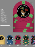
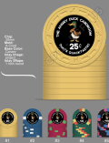
Went back on my phone. Literally typed the denomination symbols first sized to them so they'd be slightly smaller then typed the denominations. For the 100 and 500 I resized them a bit smaller and reposition them as to not look so cramped. I also went all white on all text. Including the nominations. I really loved the idea of the denomination matching the chip or edge spots. But in all honesty, to me I think the white shows up the best on the black and it keeps everything fairly uniform. If anyone has any input please by all means let me know. I will look at it on the actual computer tomorrow. Maybe print it out but if it's all good to go then I am done. I like simple and that's why I'm doing with the all white. I know some will say it's a little busy with the writing around the edges and the picture and all. But I have seen a lot busier and to me it doesn't seem too busy. But I will have to look at it for a while. Honestly, I'm not ready to order yet. Anyway, I'm still just feeling everything outAwesome. Soooooooo the only thing I would be careful with is to make sure the colour does match the actual chip. You are selecting a screen colour and matching that yes BUT the chip may be slightly different when you hold it in your hands. Maybe before you have them made, get a sample of the colour chips you are using just to make sure?
Attachments
-
 Screenshot_20220817-175147.png515.5 KB · Views: 92
 -
 Screenshot_20220817-175053.png467.8 KB · Views: 84
 -
 Screenshot_20220817-175039.png423.5 KB · Views: 90
 -
 Screenshot_20220817-175126.png451.6 KB · Views: 92
 -
 Screenshot_20220817-175109.png496.1 KB · Views: 90
 -
 Screenshot_20220817-175026.png511 KB · Views: 90
Colquhoun
4 of a Kind
Step away and put down the eye dropper. 
@timinater made a CMYK color chart for CPC chips. Have at it:
https://www.pokerchipforum.com/threads/cpc-colour-code-matching-list.52094/#post-983898
@timinater made a CMYK color chart for CPC chips. Have at it:
https://www.pokerchipforum.com/threads/cpc-colour-code-matching-list.52094/#post-983898
OP
OP
KarateMaster72
Flush
I am putting the eyedropper away lol. I'm just going to go monotone for all text. I know it may seem a little boring to some, but the white really shows up on the black and keeps things a little uniform. I think that the graphic itself of the duck has enough color in it. What do you think about that route?Step away and put down the eye dropper.
@timinater made a CMYK color chart for CPC chips. Have at it:
https://www.pokerchipforum.com/threads/cpc-colour-code-matching-list.52094/#post-983898
AlbinoDragon
Flush
There is a reference by @timinater that has CMKY values that do a quite good job at color matching to CPC colors:Yep, I was just informed that Adobe should let me use a eye drop feature to color match. So I'm going to go try that and I'm going to try to type the dollar symbol and sent symbol independently so I can make them smaller than the actual numbers. So back to my phone I go
https://www.pokerchipforum.com/threads/cpc-colour-code-matching-list.52094/
The day-glo colors don't work too well, mostly because those colors can't really be printed by CPC or most printers, but the are surprisingly good:
https://www.pokerchipforum.com/threads/a-d-s-devils-nest-cpc-customs.78031/
Maybe this will help a bit. I wouldn't try to match inlay to the base color to make a faux-shaped inlay, but to match for a denomination or text, they should do the job.
@Colquhoun beat me to the answer....
Similar threads
- Replies
- 13
- Views
- 750