OP
OP
bentax1978
4 of a Kind
This is my favorite as well. along with some LE labels in grayscale like below
I will definitely add a few of the LE labels into the mix. I'll work on tweaking some of those in the next few days and posting some additional ideas.
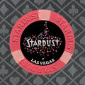
I like number 6 easily. How about just losing the Las Vegas completely? It is a different font then Stardust and tilts me a bit. No location and that label is the tits.
It's funny, my original mock-ups before I got the chips in hand didn't have any location listed. I added later because I thought it needed it to look more like actual inlays as opposed to a picture stuck on a label. But I agree that it would look cleaner without it. And to be honest, I didn't spend anytime picking the font or trying to match as I figured I could play around with that before finalizing the design if I went in that direction.
I like all the ideas here. I would favor a more simplistic design. These look great when blown up on my monitor. However, I think a lot of that detail will muddy the overall image in pots and in stacks.
I share this concern, and I will certainly have a better idea of how much of an issue this is after getting some sample printed up.
")